Structr
Admin User Interface
Overview
The Structr Admin User Interface is a web-based console for building and managing Structr applications. From here, you can design your data model, build pages, manage users, and monitor your running application.
Quick Reference
| I want to… | Go to |
|---|---|
| Define data types and relationships | Schema |
| Write business logic and methods | Code |
| View and edit data in the database | Data |
| Build web pages and templates | Pages |
| Manage static files (CSS, JS, images) | Files |
| Manage users, groups, and permissions | Security |
| Export or import my application | Dashboard |
| Model and monitor business processes | Processes |
| Run scripts and queries interactively | Admin Console (Ctrl+Alt+C) |
Interface Structure
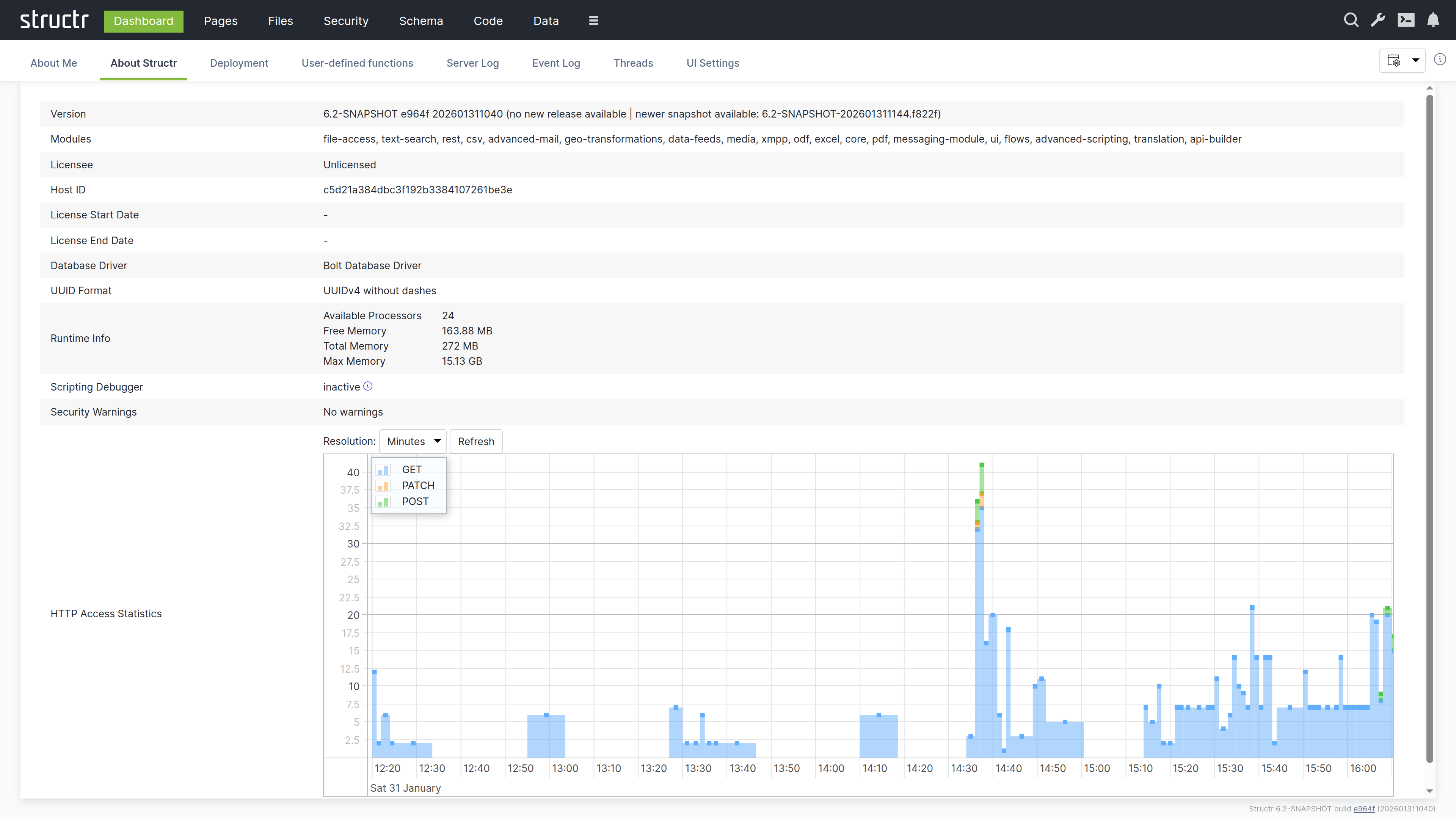
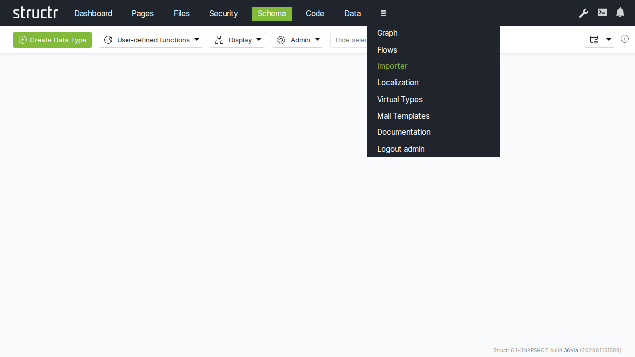
The interface is organized around a header bar that stays visible across all areas. The main navigation on the left side of the header takes you to the different functional areas: Dashboard, Pages, Files, Security, Schema, Code, Data, and more. Less frequently used items are available in the burger menu, which also contains the Documentation entry and the logout link. You can configure which items appear in the main navigation through the UI Settings on the Dashboard.
On the right side of the header, tools are available regardless of which area you are working in:
Search
The magnifying glass icon opens a global search across all your data.
Configuration
The wrench icon opens the Configuration Interface in a new browser tab. This separate interface provides access to all runtime settings that control Structr’s behavior, from database connections to scheduled tasks. It requires authentication with the superuser password defined in structr.conf, adding an extra layer of security for these sensitive operations. For details, see the Configuration Interface section below.
Documentation
The book icon opens the built-in documentation inside the Admin UI, the same content you are reading now.
Admin Console
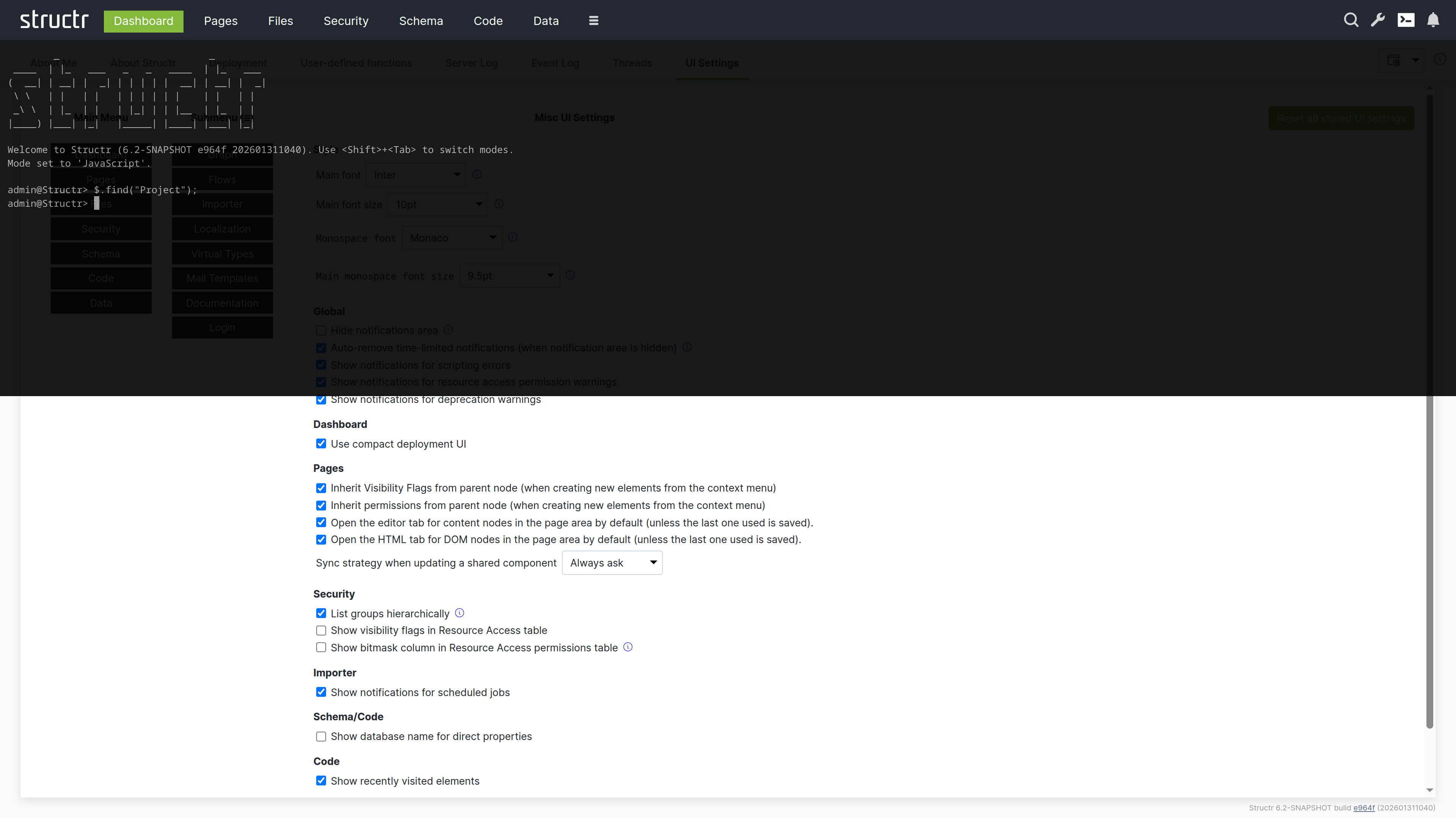
The terminal icon opens the Admin Console – a Quake-style terminal that slides down from the top of the screen. This is a powerful REPL for executing JavaScript, StructrScript, Cypher queries, and administrative commands. You can also open it with Ctrl+Alt+C.
Notifications
The bell icon shows notifications and system alerts.
The Main Areas
Dashboard
This is the default landing page after login. Here you can view system information, check server logs, and use deployment tools to export and import your application.
Pages
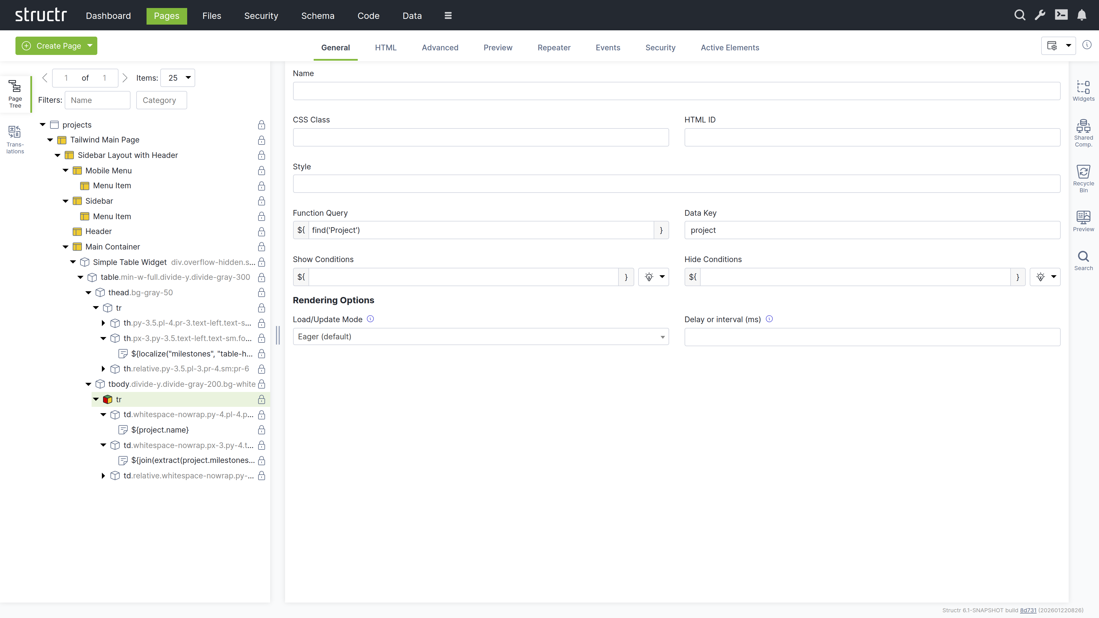
This is the visual editor for building web pages. You can use the tree view to see your page structure, drag and drop widgets, and preview your pages in real time.
Files
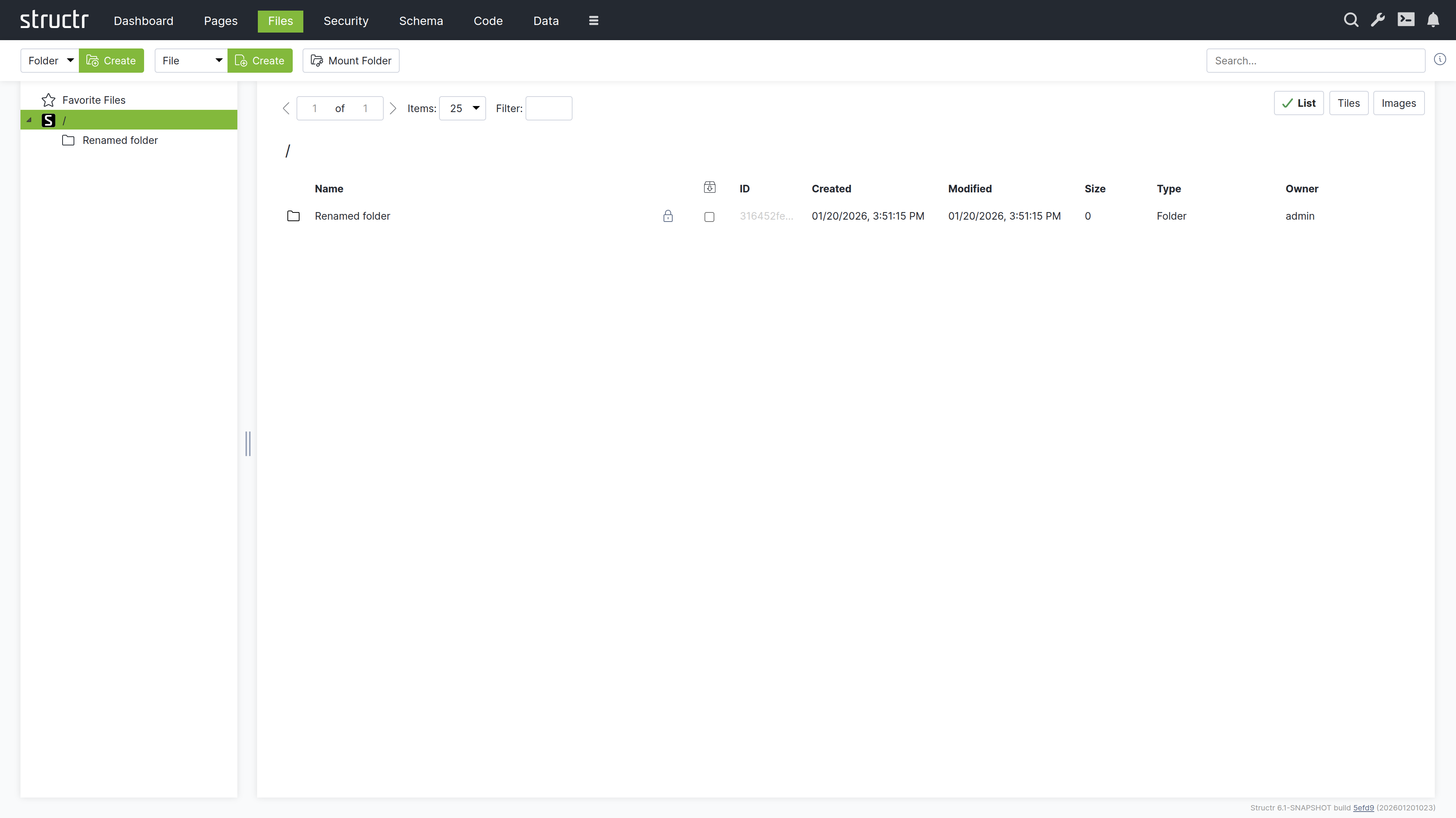
This is where you manage your static assets – CSS, JavaScript, images, and documents. You can upload files, organize them in folders, and reference them in your pages.
Security
Here you can manage users and groups, configure resource access grants, and set up CORS.
Schema
This is the visual data modeler. Types appear as boxes, relationships as connecting lines. You can drag them to arrange the layout and click to edit their properties.
Code
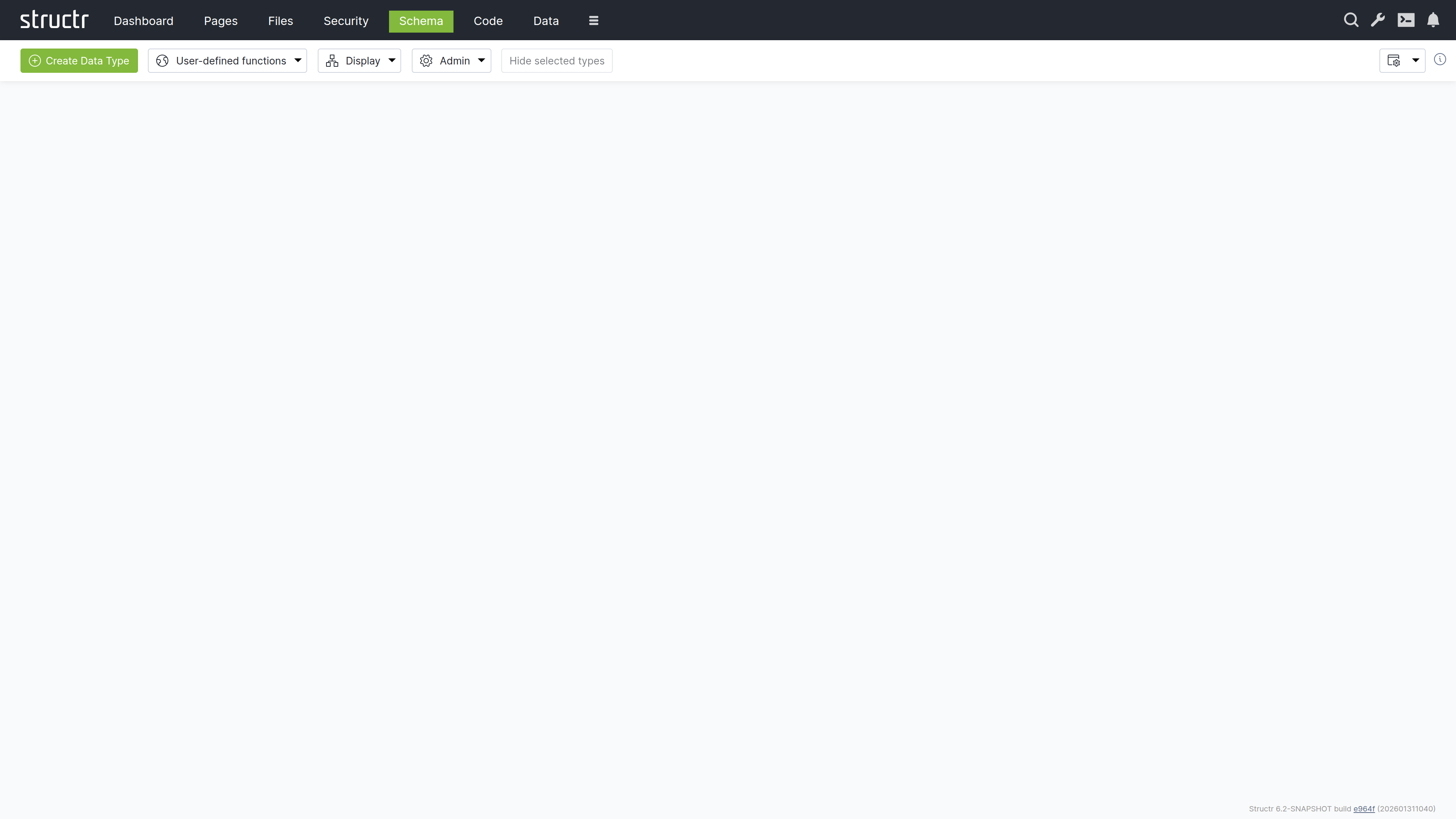
Here you can write and organize your business logic. The same types as in the Schema area are displayed, but organized for writing and editing methods rather than visualizing relationships.
Data
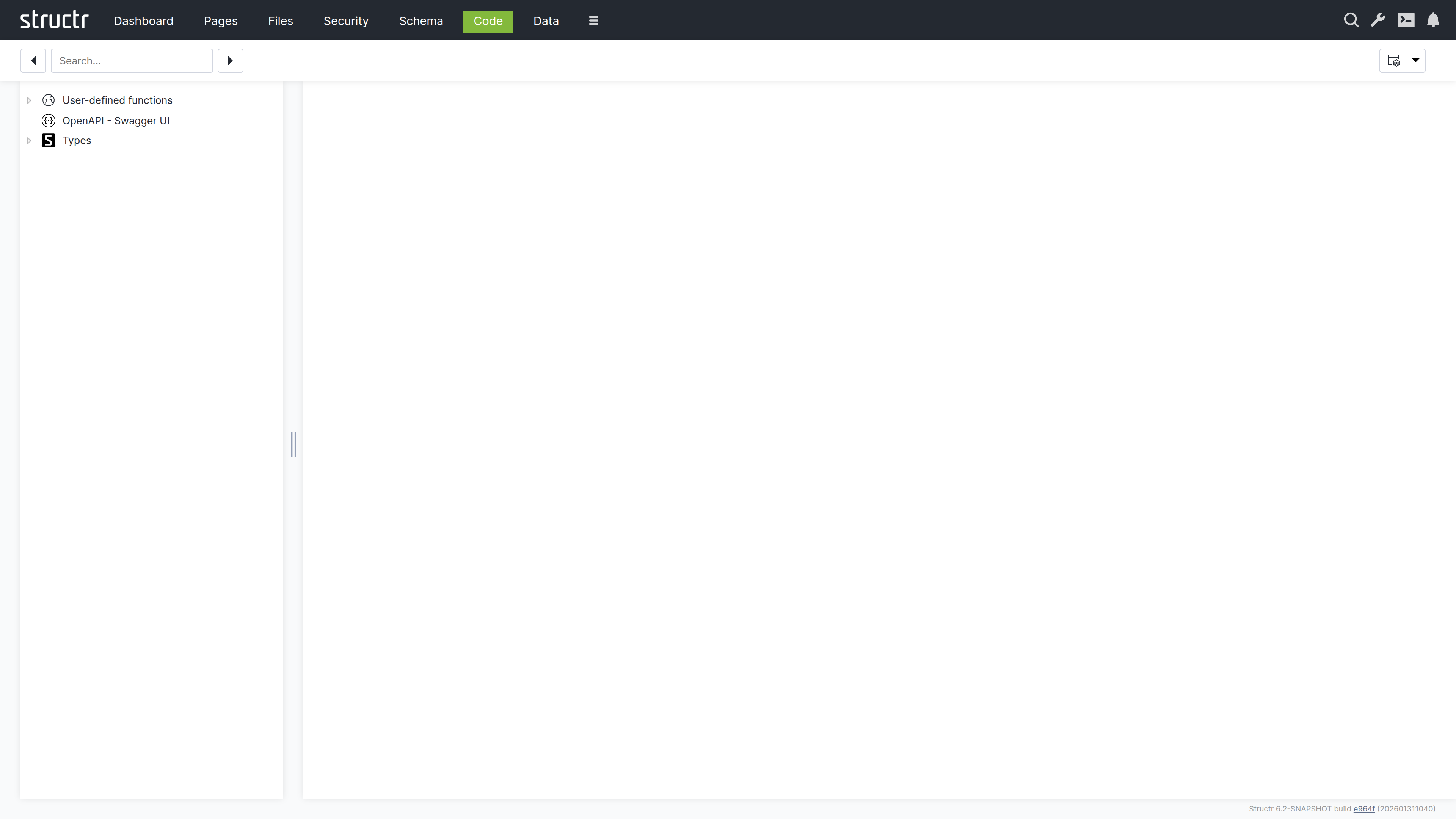
Here you can browse and edit the objects in your database. Select a type, view all instances in a table, and edit values directly.
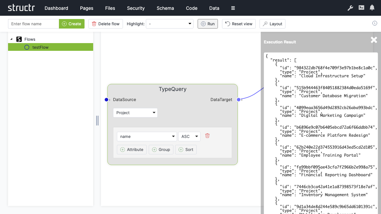
Flows
This is a visual workflow designer where you can create automated processes and data transformations.
Processes
This area holds the BPMN editor for modelling business processes and the monitoring views for running process instances, their tokens and the tasks that wait for users. It requires the process module and is hidden in the burger menu by default.
Job Queue
This area shows scheduled jobs and background tasks. Jobs created with $.schedule() appear here and can be monitored or cancelled.
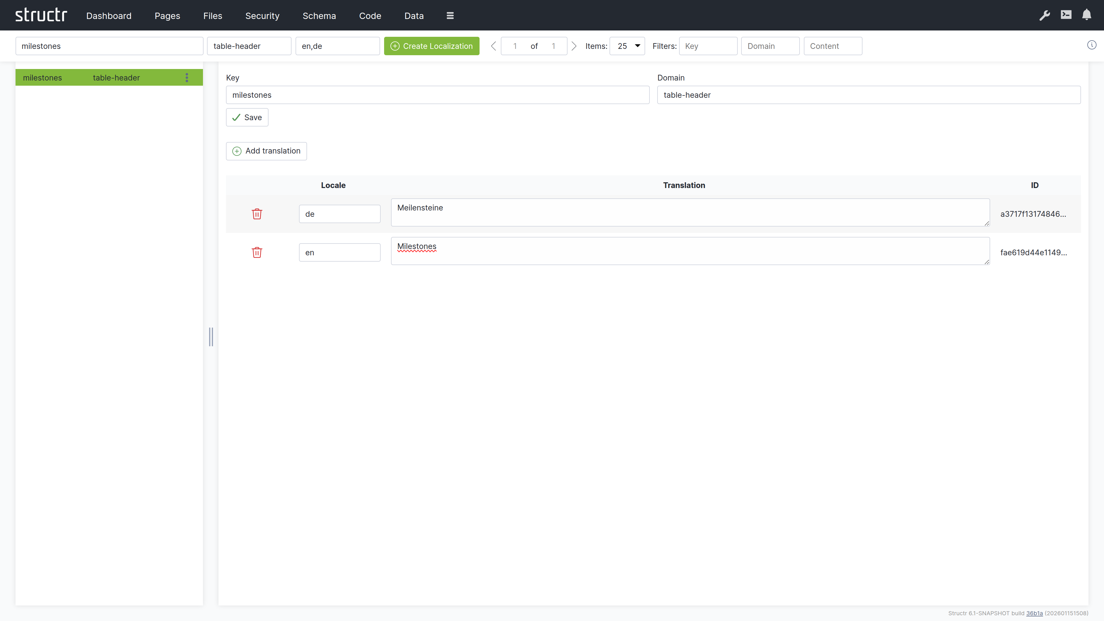
Localization
Here you can manage translations for multi-language applications.
Graph
This is an interactive graph explorer where you can visualize your data objects and their relationships.
Mail Templates
Here you can create and edit email templates used in automated notifications.
Keyboard Shortcuts
A few shortcuts work in every area of the Admin UI. On macOS, Ctrl+S is Cmd+S.
| Shortcut | Action |
|---|---|
| Ctrl+Alt+C | Toggle the Admin Console |
| Ctrl+Alt+F | Show the favorites |
| Ctrl+Alt+P | Open the properties dialog for an object by UUID |
| Ctrl+Alt+O | Jump to a DOM element in the page tree by UUID |
| Ctrl+Alt+M | Open the editor for a content element or file by UUID |
| Ctrl+Alt+E | Open the Bulk Editing Helper |
| Ctrl+S | Save the currently open dialog |
Browser Compatibility
The Admin UI is supported in Chrome, Firefox, Safari, and Edge. For the best experience, keep your browser updated to the latest version.
Dashboard
The Dashboard provides system information, server logs, deployment tools, and configuration options for the Admin UI. This is the default landing page after login and gives you a quick overview of the system state.
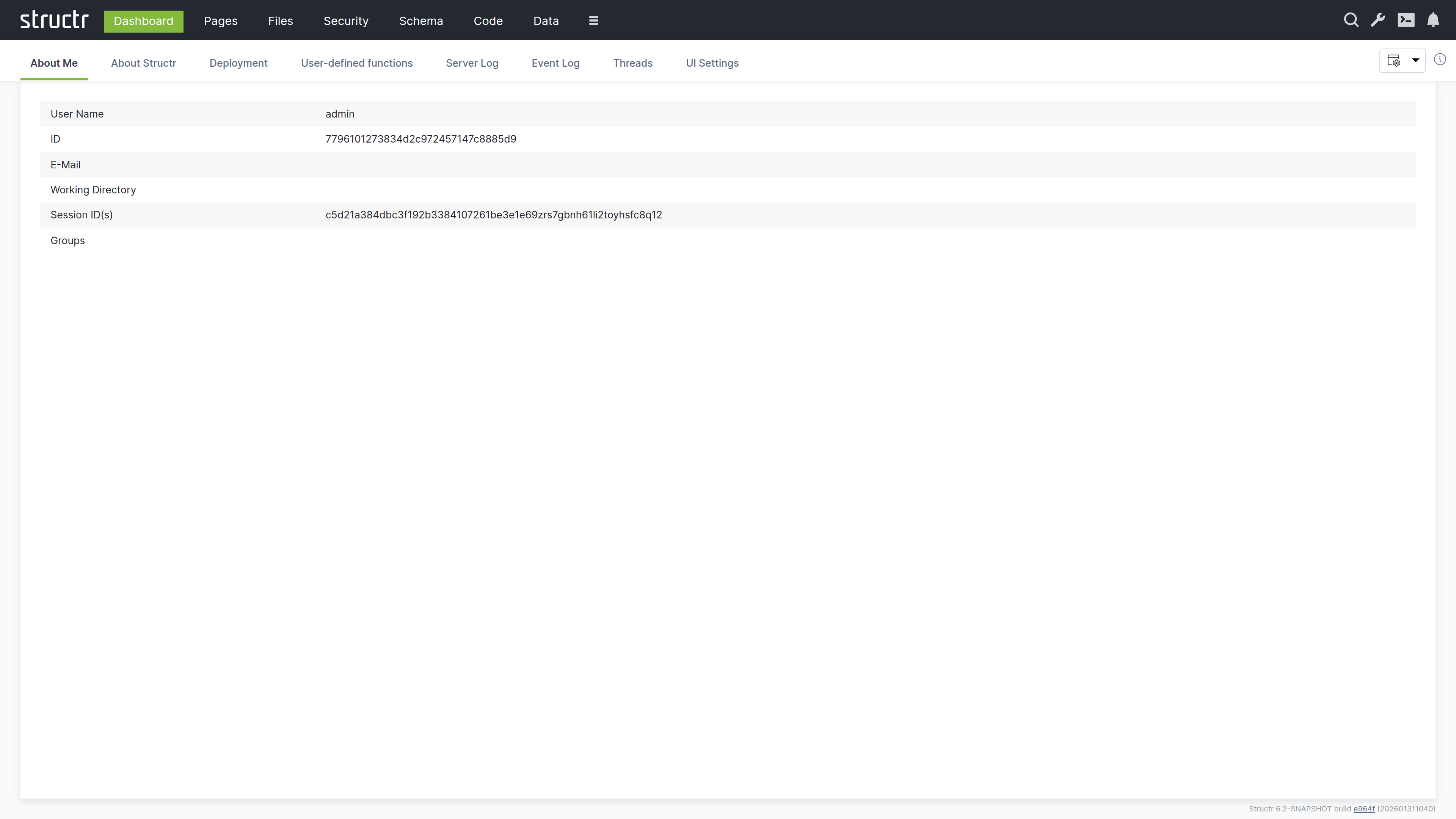
About Me
This tab shows information about the currently logged-in user. You can verify your identity, check which groups you belong to, and see your active sessions. This is useful when troubleshooting permission issues or when working with multiple accounts.
The tab displays:
- Username and UUID
- Email address
- Working directory
- Session IDs
- Group memberships
The Session ID is particularly useful for debugging. If you need to see your application from another user’s perspective, you can copy their Session ID from the table and set it in your browser. This allows you to experience exactly what that user sees without knowing their password.
About Structr
This tab shows detailed information about the Structr server instance. You can verify which version is running, which modules are available, and whether your license is valid.
Version and Modules
The version number identifies the exact build you are running. Indicators show whether newer releases or snapshots are available. Below the version, you will see a list of all active modules. Modules extend Structr’s functionality – for example, the PDF module adds PDF generation capabilities, and the Excel module enables spreadsheet import and export.
License and Database
The license section shows your licensee name, host ID, and the validity period (start and end date). You need the host ID when requesting a license from Structr.
The database section shows which driver is in use. Structr supports both embedded and external Neo4j databases.
UUID Format
This displays the current UUID format. Structr supports UUIDs with and without dashes. The format is configured at installation time and should not be changed afterwards.
Runtime Information
This section shows server resource information: number of processors, free memory, total memory, and maximum memory. You can monitor these values to assess server capacity and diagnose performance issues.
Scripting Debugger
This shows whether the GraalVM scripting debugger is active. The debugger allows you to set breakpoints and step through JavaScript code using Chrome DevTools. To enable it, set application.scripting.debugger = true in structr.conf. See Logging & Debugging for details.
Security Warnings
This row lists security-relevant findings about the current configuration, for example a default superuser password or an insecure setting. An empty row means no warnings were found.
Access Statistics
This is a filterable table showing request statistics: timestamps, request counts, and HTTP methods used. You can use this to analyze usage patterns and identify unusual access behavior.
Deployment
This tab provides tools for exporting and importing Structr applications and data.
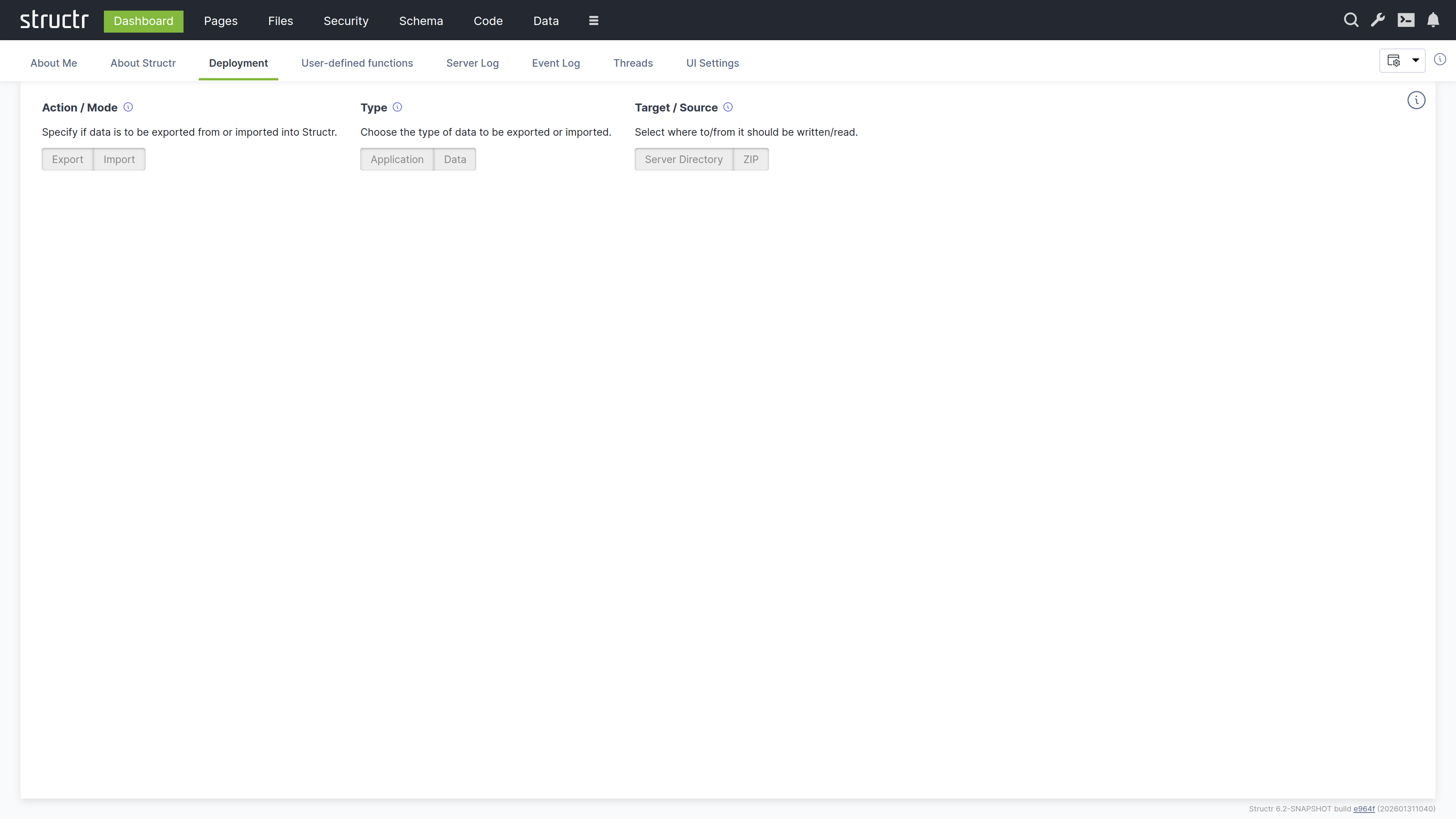
Choosing an Operation
By default the tab shows the compact deployment UI. Three switches at the top narrow down what you want to do: Action (Export or Import), Type (Application or Data) and Target or Source (Server Directory or ZIP). Only the panel that matches the selected combination is shown. If you prefer to see all panels at once, disable “Use compact deployment UI” in the UI Settings; the tab then shows the classic layout with all application panels in the upper half and all data panels in the lower half.
Application Deployment
Application deployment exports and imports the structure of your application (schema, pages, files, templates, security settings, configuration). The panels are:
- Export application to a server directory: enter an absolute path on the server filesystem and click the button to export
- Export and download application as a ZIP file: set the ZIP file prefix, optionally append a timestamp, and download the export directly to your browser
- Import application from a server directory: enter the path to an existing export and click to import
- Import application from URL or upload a ZIP file: enter the download URL of a ZIP file or choose a local ZIP file for upload. If the webapp folder is not at the top level of the archive, enter its path in “Path to the webapp folder inside the ZIP file”
Data Deployment
Data deployment exports and imports the actual objects in your database. The panels mirror the application panels:
- Export data to a server directory: select the types to export, enter a path, and click to export
- Export and download data as a ZIP file: select the types, set the ZIP file prefix and optionally append a timestamp
- Import data from a server directory: enter the path to an existing data export and click to import
- Import data from URL or upload a ZIP file: enter a download URL or choose a local ZIP file, optionally with the path to the data folder inside the archive
The ZIP variants require the deployment servlet to be enabled; the corresponding inputs are disabled otherwise.
You can follow the progress of any export or import operation in the Server Log tab or via the notifications in the UI.
For details on the export format, pre/post-deploy scripts, and alternative deployment methods, see the Deployment chapter in Operations.
User-Defined Functions
This tab displays a table of all user-defined functions in the system. You can view and execute any function directly from this interface.
Each function is listed with its name and can be executed by clicking on it. This provides a quick way to run maintenance tasks, test functions, or trigger administrative operations without using the API or Admin Console.
Server Log
This tab displays the server log in real-time. The log contains technical information about what Structr is doing: startup messages, errors, warnings, request processing, and transaction details.
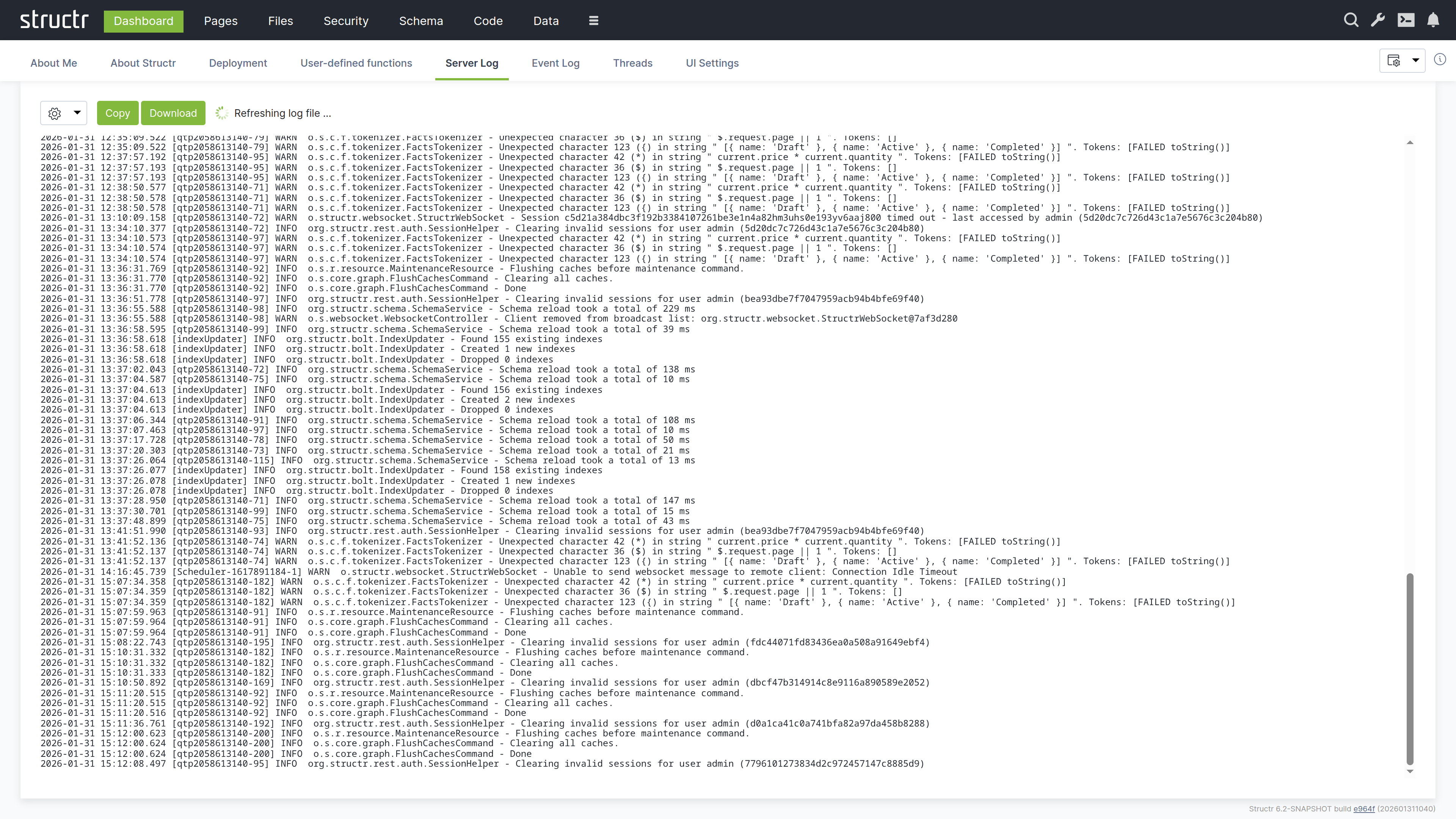
Controls
The log refreshes every second by default and scrolls to the end after each refresh. Scrolling up in the log area stops the automatic scrolling so you can read a specific message; the content itself keeps refreshing until you scroll back to the end or set the interval to manual. The available controls are:
- Copy to clipboard
- Download log file
- Refresh interval (10s, 5s, 2s, 1s, or manual, which shows a Refresh button)
- Number of lines to display
- Truncate lines at: cuts off long lines after the given number of characters
- Filter: shows only lines containing the entered text
- Log source selection (Structr supports multiple log files when rotation is enabled)
Log Format
Each log entry follows the format: Date Time [Thread] Level Logger - Message
For example:
2026-01-28 09:40:18.126 [main] INFO org.structr.Server - Starting Structr 6.1-SNAPSHOT
The log levels are INFO (normal operation), WARN (potential issues that do not prevent operation), and ERROR (problems that need attention).
Event Log
This tab shows a structured view of system events: API requests, authentication events, transactions, and administrative actions. Unlike the server log which contains free-form text, the event log presents events as filterable table rows with consistent columns.
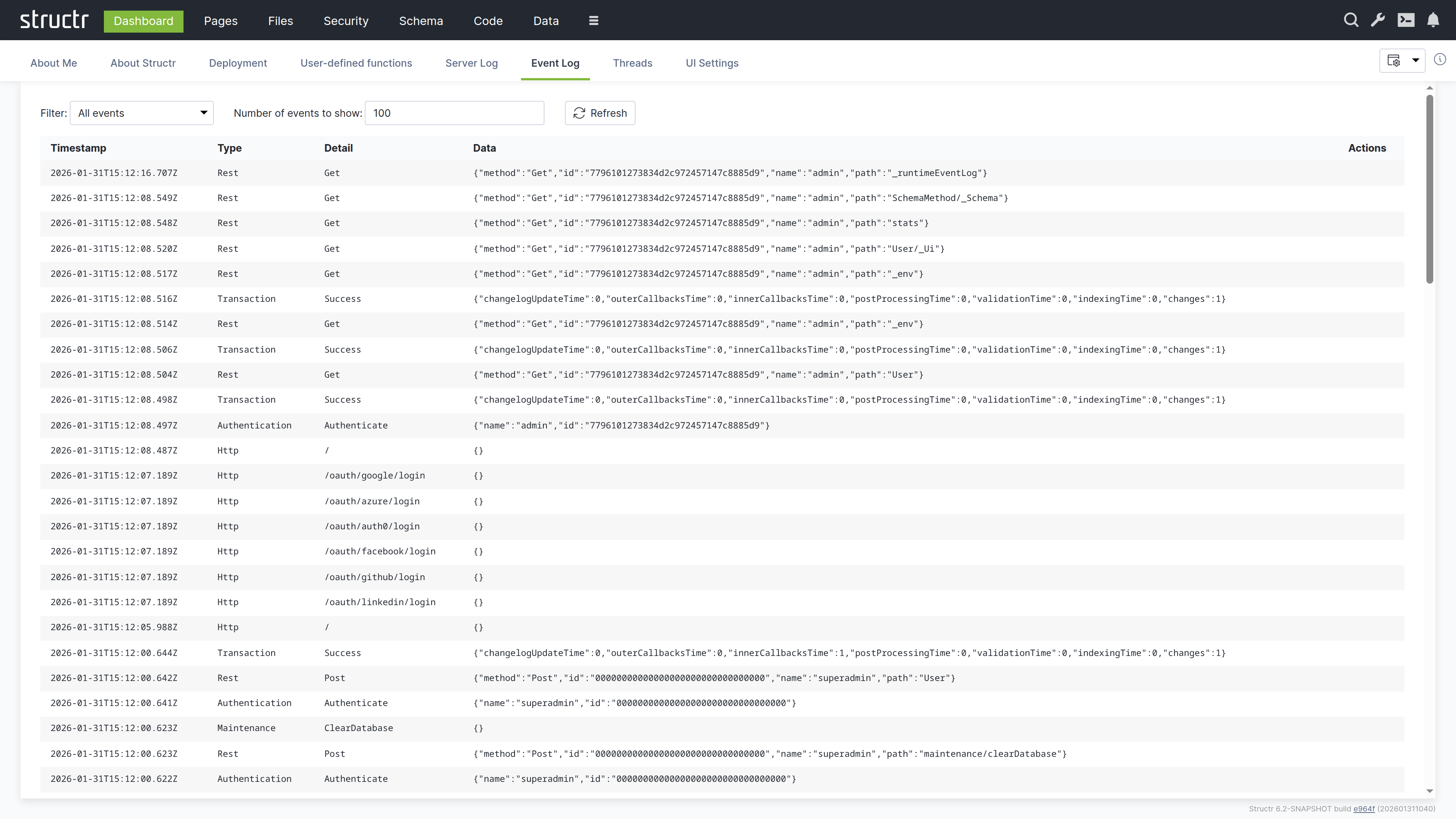
Event Types
The type filter offers the following event types:
- Authentication: login and logout events with user information
- Cron: scheduled function runs
- Http: page requests and OAuth login attempts
- Maintenance: administrative commands
- Scripting: scripting errors and warnings
- REST: API requests with method, path, and user details
- ResourceAccess: denied requests due to missing resource access permissions
- Transactions: database transactions with performance metrics (changelog updates, callbacks, validation, indexing times)
- SystemInfo: system messages
Using the Event Log
The event log does not auto-refresh. Click the refresh button to update it. You can filter by event type and by thread name to focus on specific activities, and set the page size to control how many events are loaded. The table has the columns Timestamp, Type, Thread Name, Detail, Data, and Actions. The transaction events include timing breakdowns that can help you identify performance bottlenecks.
Threads
This tab lists all threads running in the Java Virtual Machine. The table has the columns ID, Name, State, Deadlock detected, CPU Time, Stack, and Actions. You can use this tab to diagnose hanging requests, infinite loops, or deadlocks.
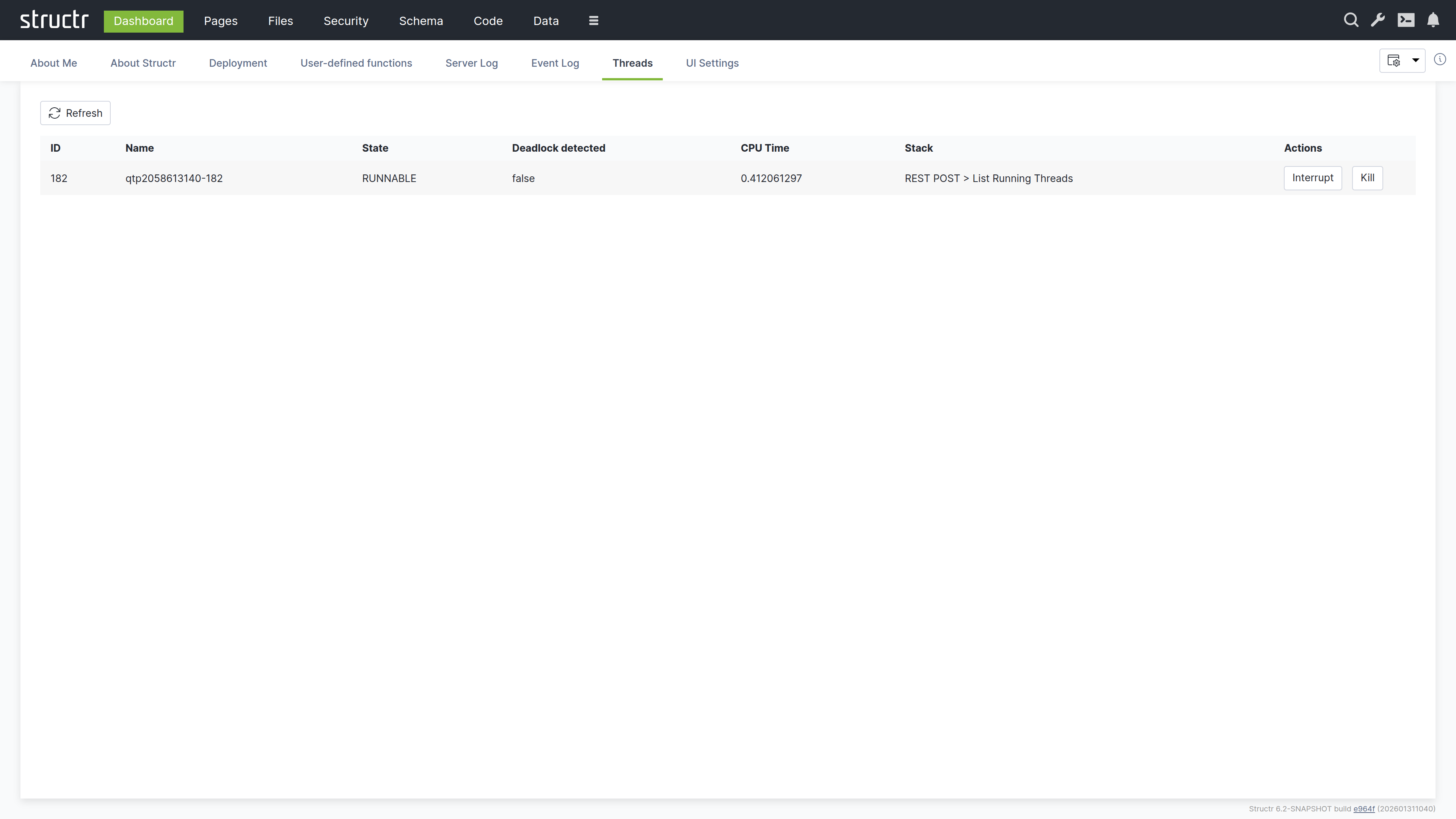
Thread Management
Two actions are available for each thread:
- Interrupt – Requests graceful termination
- Kill – Forces immediate termination (use with caution)
Long-running threads may indicate problems in your application code, such as infinite loops or deadlocks.
UI Settings
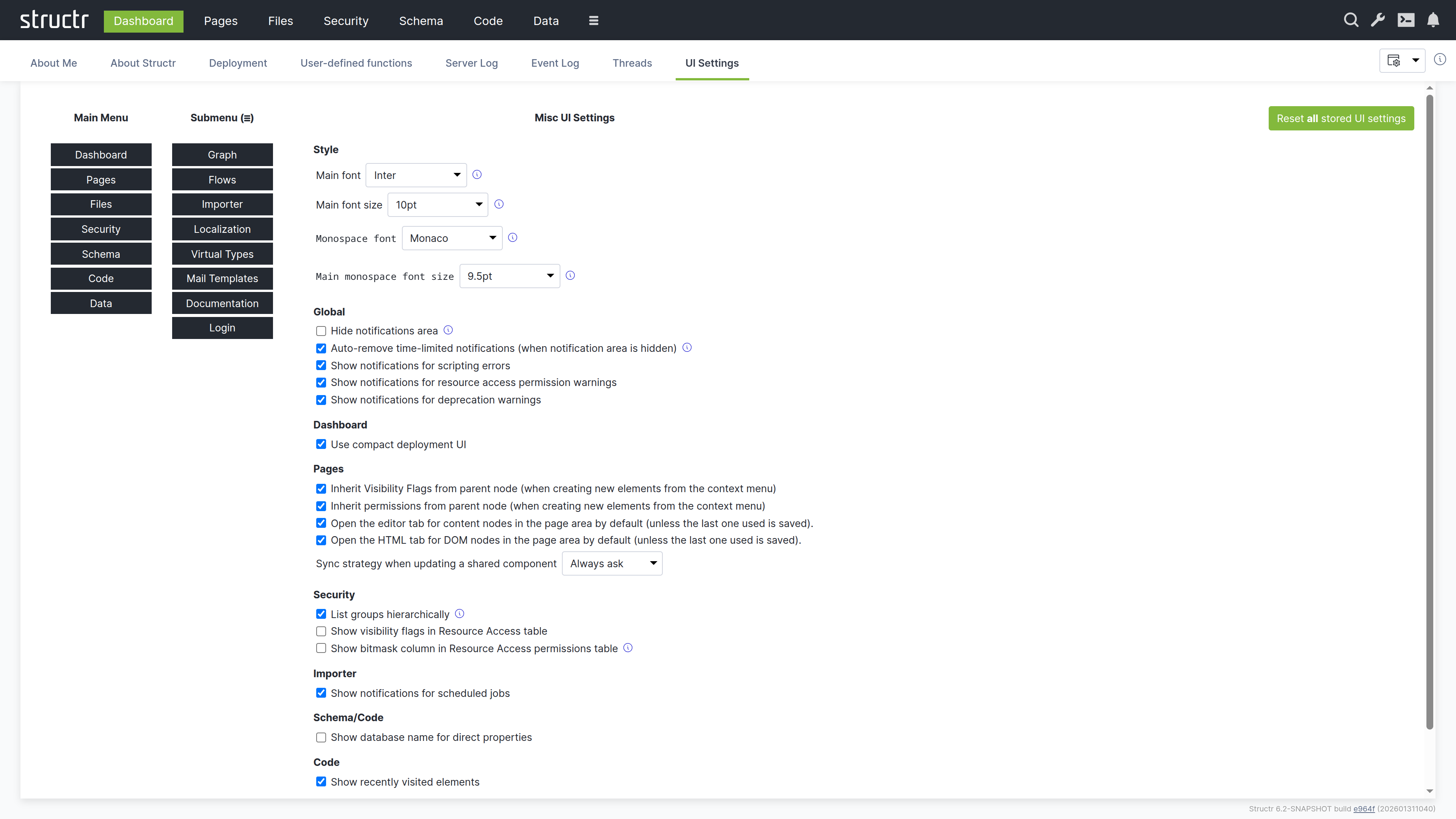
This tab lets you configure the Admin UI appearance and behavior. Changes take effect immediately and are stored per user.
Menu Configuration
Here you can configure which items appear in the main navigation bar and which are moved to the burger menu. This lets you prioritize the areas you use most frequently.
Font Settings
You can set the main font, font size, and monospace font for the Admin UI. The monospace font is used in code editors and log displays.
Behavior Settings
This section contains the settings grouped by area. The Style group holds the font settings described above. The remaining groups are:
- Global: hide the notifications area, auto-remove time-limited notifications, and show notifications for scripting errors, resource access permission warnings (authenticated and unauthenticated requests) and deprecation warnings
- Dashboard: use the compact deployment UI
- Pages: enable edit features in the page preview, inherit visibility flags and access rights from the parent node when creating elements from the context menu, and the sync strategy when updating a shared component
- Security: list groups hierarchically, show visibility flags and the bitmask column in the Resource Access table
- Job Queue: show notifications for scheduled jobs
- Schema/Code: show the database name for direct properties, ignore non-unique relationship type warnings
- Data: only show the contents of array attributes if they are shorter than the given size
The button “Reset all stored UI settings” at the bottom removes every stored setting and restores the defaults.
Note that the settings relevant to a specific area also appear in a Settings menu within that area. For example, the Pages settings are available both here and in the Pages area’s own Settings menu. This allows you to adjust settings without navigating back to the Dashboard.
Admin Console
The Admin Console is a text-based interface for advanced administration tasks. It provides a REPL (read-evaluate-print loop) where you can execute JavaScript, StructrScript, Cypher queries, and Admin Shell commands directly.
Opening the Console
The Admin Console is integrated into the Admin UI as a Quake-style terminal that slides down from the top of the screen and overlays the current view. You can open it in two ways: click the terminal icon in the header (available in all areas), or press Ctrl+Alt+C (on macOS: Control+Option+C) to toggle the console.
Console Modes
The console has four modes (JavaScript, StructrScript, Cypher and Admin Shell) that you can cycle through by pressing Shift+Tab.
JavaScript Mode
A full JavaScript REPL where you can execute JavaScript expressions. Variables you declare persist across commands, so you can build up state interactively. This mode is useful for data manipulation, quick fixes, and exploration.
// Find all projects and store in a variable
let projects = $.find('Project');

// Use the variable in subsequent commands
$.print(projects.length + ' projects found');

// Modify data interactively
for (let p of projects) {
    if (p.status === 'draft') {
        $.set(p, 'status', 'archived');
    }
}
Since all parts of a Structr application are stored in the database, you can use JavaScript mode to create schema types and data objects directly:
$.create('SchemaNode', { name: 'Project' });
$.create('Project', { name: 'Project #1' });
$.find('Project').map(p => p.name).join(', ');
StructrScript Mode
Execute StructrScript expressions directly. This mode is useful for testing expressions before using them in pages or templates. Unlike JavaScript mode, you cannot declare persistent variables here.
find('User', 'name', 'admin')
join(extract(find('Project'), 'name'), ', ')
Cypher Mode
Execute Cypher queries directly against the Neo4j database. This mode is useful for database maintenance tasks like setting labels, modifying data, or exploring relationships.
MATCH (n:Project)-[:HAS_TASK]->(t:Task) RETURN n.name, count(t)
By default, the output is limited to 10 results to prevent overwhelming the display with large result sets. If your query returns more objects, Structr displays an error message asking you to use LIMIT in your query. You can change this limit through the application.console.cypher.maxresults setting in the Configuration Interface.
Admin Shell Mode
A command-line interface for administrative tasks. Type help to see available commands, or help <command> for detailed information about a specific command.
export
Exports the Structr application to a directory on the server filesystem.
export <target>
- target - Absolute path to the target directory
export-data
Exports data from specific types to a directory.
export-data <target> <types>
- target - Absolute path to the target directory
- types - Comma-separated list of type names to export
import
Imports a Structr application from a directory on the server filesystem.
import <source>
- source - Absolute path to the source directory
import-data
Imports data for specific types from a directory.
import-data <source> <doInnerCallbacks> <doOuterCallbacks> <doCascadingDelete>
- source - Absolute path to the source directory
- doInnerCallbacks - Run onCreate/onSave methods during import (true or false)
- doOuterCallbacks - Run afterCreate/afterSave methods during import (true or false)
- doCascadingDelete - Enable cascading delete during import (true or false)
file-import
Imports files directly from a server directory into Structr’s virtual filesystem.
file-import <source> <target> [mode] [existing] [index]
- source - Path to a directory on the server
- target - Target path in Structr’s virtual filesystem
- mode - copy (default) or move
- existing - skip (default), overwrite, or rename
- index - Fulltext-index imported files: true (default) or false
init
Rebuilds indexes, sets UUIDs, or updates labels on nodes and relationships.
init [node|rel] <operation> [for <type>]
- operation - index, ids, or labels
- node|rel - Restrict operation to nodes or relationships
- for
- Restrict operation to a specific type
user
Manages user accounts in the database.
user <command> [arguments]
- list - List all users
- add
[ - Create a new user] [isAdmin] - delete
- Delete a user - password
SSH Access
The Admin Console functionality is also available via SSH for admin users. Connect to the configured SSH port (default 8022):
ssh -p 8022 admin@localhost
You can configure the SSH port through the application.ssh.port setting in the Configuration Interface. Authentication works via password or public key. For public key authentication, store the user’s public key in the publicKey property on the user node.
Related Topics
- Business Logic - JavaScript and StructrScript syntax and capabilities
- Deployment - Using Admin Shell commands for application export/import
- Configuration Interface - Changing console-related settings
Schema
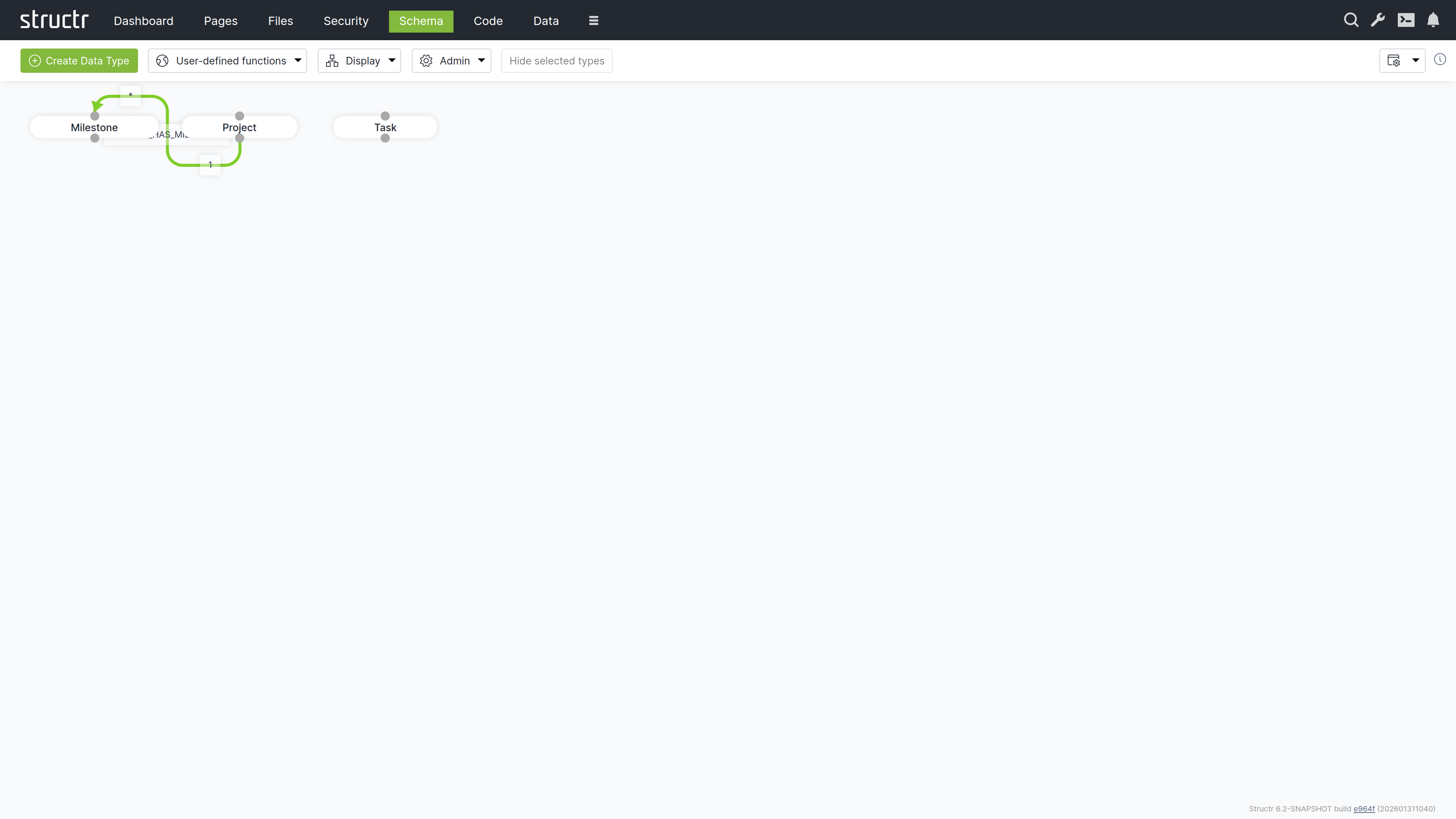
The Schema area is the visual editor for designing your data model. Types appear as boxes on a canvas, and relationships appear as connecting lines between them. You can drag types to arrange them, click to edit their properties, and draw connections between types to create relationships.
The Canvas
The main area displays your data model as a graph. Each type appears as a box showing the type name. Hover over a type to reveal the pencil icon (edit) and delete icon. Connection points at the top and bottom of each box let you create relationships by dragging from one type to another – drag from the source type’s connector to the target type’s connector, and Structr opens the relationship configuration dialog.
Navigating Large Schemas
Use the mouse wheel to zoom in and out. Click and drag on empty canvas space to pan. For applications with many types, these controls help you focus on the part of the schema relevant to your current task.
Relationship Colors
Relationship lines are color-coded:
- Green – Normal relationships
- Orange – Relationships configured for permission propagation (see User Management for details on graph-based permission resolution)
Schema and Data Are Loosely Coupled
The schema and your data are loosely coupled. If you delete a type from the schema, the type definition and its relationships are removed, but the data objects of that type remain in the database. You can recreate the type later and the data becomes accessible again. This flexibility is useful during development but means you need to manage data cleanup separately from schema changes.
Editing Types and Relationships
Click the pencil icon on a type box to open the Edit Type dialog. Relationships are edited via the pencil icon on the relationship label in the middle of the line, which is only shown while “Relationship labels” is enabled in the Display menu. Both dialogs provide access to all configuration options – properties, methods, views, and more. For details on these options, see the Data Model chapter.
Secondary Menu
The menu bar above the canvas provides tools for managing your schema.
Create Data Type
The green button opens the Create Data Type dialog where you enter a name and select traits for the new type. After creation, the Edit Type dialog opens automatically so you can add properties and configure the type further.
User Defined Functions
Opens a table listing all global schema methods. This is a legacy location – the same methods are more conveniently accessible in the Code area under Global Methods.
Display Menu
Controls the visual appearance of the schema editor.
Type Visibility
Opens a dialog where you show or hide types on the canvas. Types are grouped into categories: Custom Types, User/Group Types, File Types, HTML Types, Flow Types, Process Types, Schema Types, and Other Types. Each type has a checkbox to toggle its visibility.
This is essential for focusing on specific parts of the schema. In a typical application, you work primarily with your custom types and rarely need to see the built-in HTML, Flow, or Process types.
Display Options
Two toggles control what information appears on the canvas:
- Relationship labels – Shows or hides the relationship names on connecting lines, including the edit and delete icons for the relationship
- Trait Inheritance arrows – Shows or hides arrows indicating trait inheritance
Edge Style
Controls how relationship lines are drawn: Flowchart, Bezier, State Machine, or Straight. Choose whatever makes your schema most readable – Flowchart works well for hierarchical schemas, while Straight lines are cleaner for simpler models.
Layouts
Schema layouts save the visual arrangement of types on the canvas. If you’ve organized a complex schema to make it readable, you can save that layout and restore it later. The Saved Layouts section of the Display menu has a dropdown of the stored layouts with three buttons: Load restores the selected layout, Save overwrites it with the current arrangement, and Delete removes it. To store the current arrangement under a new name, enter the name in the input below and click Create.
Reset Layout / Reset Zoom
Reset Layout returns all types to their default positions. Reset Zoom returns to the default zoom level.
Apply Automatic Layout
An experimental feature that arranges types on the canvas automatically. Results vary depending on schema complexity.
Hide Selected Types
Hides all currently selected types from the canvas. Select types by clicking them (hold Ctrl to select several), then click the button. The types remain in the schema and can be shown again via Type Visibility.
Admin Menu
The Admin menu provides database maintenance functions.
Indexing – Nodes
A type selector lets you pick a single node type or all node types. The buttons next to it act on the selection:
- Rebuild node index – Recreates indexes for the selected node types. Run this after adding indexed properties to a type that already has data.
- Add UUIDs – Adds UUIDs to nodes that lack one. Use this when importing data from an external Neo4j database.
- Apply Labels – Creates Neo4j labels based on the type property. Use this when importing data that has type values but is missing the corresponding labels.
Indexing – Relationships
A second type selector picks a single relationship type or all relationship types:
- Rebuild relationship index – Recreates indexes for the selected relationship types.
- Add UUIDs – Adds UUIDs to relationships imported from an external database.
Rebuild all indexes
Triggers a complete rebuild of all indexes for both nodes and relationships. Use this after importing data or when you suspect index inconsistencies.
Maintenance
- Flush Caches – Clears internal caches. Rarely needed in current versions.
- Clear Schema – Removes all custom types and relationships from the schema. Use with extreme caution – this erases your entire data model definition (though not the data itself).
Settings
The gear icon opens configuration options for the Schema area. These are the same settings available in the Dashboard under UI Settings, filtered to show only schema-relevant options.
Data
The Data area is a generic interface for viewing and editing all objects in your database. You can select a type from the list, view all its instances in a table, and edit values directly. This is useful for data inspection, quick fixes, bulk operations, and CSV import/export.
Browsing Your Data
The left sidebar displays all your custom types. Click on a type to view its instances in a paginated table on the right.
Type Filter
A filter button above the list lets you expand what’s shown. You can include:
- Custom Types (shown by default)
- Custom Relationship Types
- Built-In Relationship Types
- HTML Types
- Flow Types
- Process Types
- Other Types
Recently Used Types
Below the type list, recently accessed types are shown for quick navigation.
The Data Table
When you select a type, the main area displays all objects of that type in a table. Each row represents an object, and each column represents a property.
Pagination and Views
Above the table, the following controls are available:
- Pager controls for navigating through pages
- A page size input to set how many objects appear per page
- A view dropdown to select which properties appear as columns
A gear icon in the table header opens the “Configure columns for type X” dialog, where you hide individual attributes of the selected view. The id and type columns are always shown first.
Editing Values
System properties (like id and type) are read-only, but you can edit other properties directly in the table cells by clicking on them.
Navigating Related Objects
Properties that reference other objects are clickable. Click on one to open a dialog showing the related object, where you can view and edit it. From that dialog, you can navigate further to other related objects, allowing you to traverse your entire data graph without leaving the Data area.
Creating Relationships
For relationship properties, a plus button appears in the table cell. Click it to open a search dialog limited to the target type. Select an object to create the relationship. The dialog respects the cardinality defined in the schema – for one-to-one or many-to-one relationships, selecting a new object replaces the existing one.
Creating and Deleting Objects
Create Button
The Create button in the header creates a new object of the currently selected type. The button label changes to reflect the type currently being viewed. Hold Shift while clicking to open the Create Node dialog instead, where you fill in property values before the object is created.
Delete All
The “Delete all objects of this type” button does exactly what it says – use it with caution. The checkbox “Exclude inheriting types” next to it affects both the object list and the delete function: when checked, only objects of exactly the selected type are listed and deleted; when unchecked, objects of all inheriting types are included as well.
Import and Export
Export as CSV
Downloads the current table view as a CSV file.
Import CSV
Opens the Simple CSV Import dialog. See the Importing Data chapter for details on the import process and field mapping.
Search
The search box in the header searches across your entire database, not just the currently selected type. Results are grouped by type, making it easy to find objects regardless of their location. Click the small “x” at the end of the search field to clear the search and return to the type-based view.
The REST Endpoint Link
In the top right corner of the content area, a link to the REST endpoint for the current type is displayed.
HTML REST View
When you access a REST URL with a browser, Structr detects the text/html content type and returns a formatted HTML page instead of raw JSON. Objects appear with collapsible JSON structures that you can expand and navigate. A status bar at the top lets you switch between the available views for the type.
This feature makes it easy to explore your data and debug API responses directly in the browser, without needing external tools like Postman or curl.
Pages
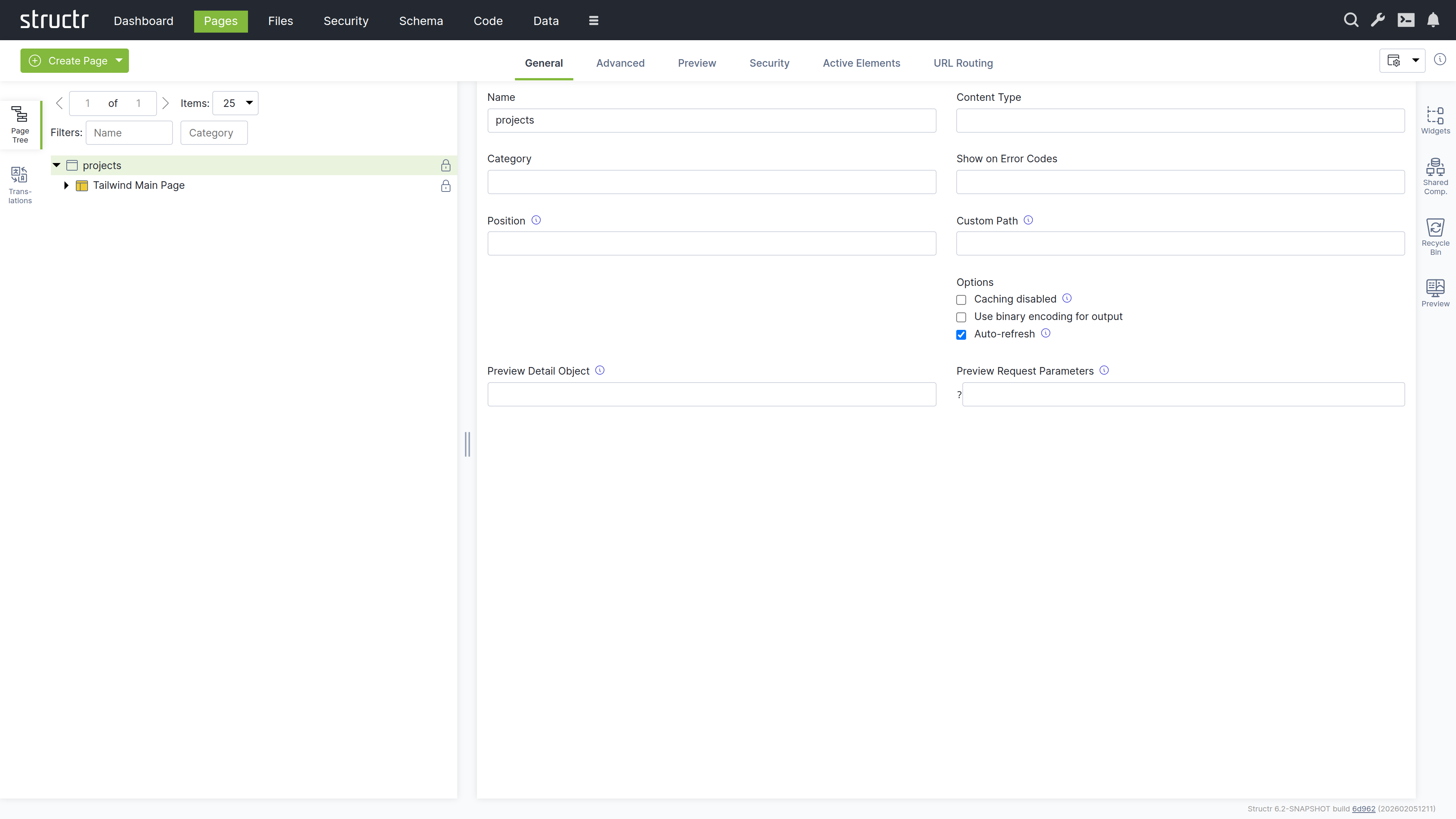
The Pages area is the visual editor for building your application’s user interface. It combines a page tree, property panels, and live preview in one workspace. Here you design layouts, configure data bindings, set up interactions, and preview the results.
The Workspace
The screen is divided into three parts: a left sidebar with the page tree, the site list and the translation tools, a main area for properties and preview, and a right sidebar with widgets, shared components, recycle bin, and preview panel. All sidebars are collapsible, so you can expand your workspace when you need more room.
Left Sidebar
The Page Tree
The Pages panel shows all your pages as expandable trees. Each page reveals its structure when expanded: HTML elements, templates, content nodes, and their nesting relationships.
Element Icons
Different element types have distinct icons:
- Window icon – Page elements
- Box icon – HTML elements
- Colored box (red, green, yellow) – Repeater elements
- Application icon – Template elements
- Document icon – Content elements (these cannot be expanded because they have no children)
Visibility Indicators
An icon on the right of each element indicates its visibility settings. An open lock means both visibility flags are set, so public and authenticated users can see the element. A key means exactly one of the two flags is set. A closed lock means neither flag is set, so only the owner and users with explicit permissions can see the element.
Interaction
Click an element to select it and view its properties in the main area. Right-click (or hover and click the menu icon) to open the context menu. Drag elements to reorder them or move them between parents.
Sites
The Sites panel lists the sites of your application. A site binds a set of pages to a hostname and port, so that the same Structr instance can serve several applications. Click “Create Site” to add one; the context menu of a site offers the usual property and security dialogs.
Translations
The Translations panel lets you manage translations for the current page. Select a page, enter a language code, and click refresh to see all localize() calls used in that page. You can create, edit, and delete translations directly here.
Right Sidebar
Widgets
The Widgets panel contains reusable page fragments. You can drag a widget onto your page tree to insert it. If the widget has configuration options, a dialog appears where you can enter values before insertion.
Suggested Widgets
Widgets can also appear as suggestions in the context menu when their selector matches the element you’ve right-clicked. Suggestions appear in three places: directly in the context menu for inserting a widget as a child, in the “Wrap Element In” submenu for widgets that can take the selected element as their content, and in the “Replace Element With” submenu for widgets that fit into the parent of the selected element. This speeds up common patterns and keeps the page structure valid.
Importing and Creating Widgets
All widgets are stored in your database. On a new application the panel is empty and offers to import the default widget set from structr.com with a single click. Click the plus button to create a new widget. Right-click a widget to edit or delete it, or to open its advanced properties.
Shared Components
Shared components work differently from widgets. When you insert a widget, Structr copies its content into your page. When you insert a shared component, Structr creates a reference to the original. If you edit the shared component, every page that uses it updates automatically.
You can create a shared component by dragging an element from the page tree into the Shared Components panel. Headers, footers, and navigation menus are ideal candidates – anything that should look and behave the same across multiple pages.
Recycle Bin
When you delete an element from a page, it goes to the recycle bin rather than being permanently removed. You can drag elements back into the page tree to restore them. This safety net is especially valuable when restructuring complex pages.
Note that pages themselves are not soft-deleted. When you delete a page, only its child elements go to the recycle bin.
Preview
The Preview panel shows your page as users will see it. You can keep the preview visible while working with other tabs in the main area, watching your changes take effect in real time.
Editing Elements
When you select an element in the page tree, the main area shows its properties organized in tabs. The available tabs depend on the element type.
General Tab
This contains basic settings: name, CSS classes, HTML ID, and inline styles. For repeaters, the Function Query and Data Key fields are located here. Show and Hide Conditions control whether the element appears in the output.
When a template element has a ComponentConfiguration (because its Widget source contained a config attribute), the General tab shows the component configuration dialog. This dialog lets you set up the DataSource, configure which fields are displayed and how they are rendered, control pagination and filtering, and set the component’s role in channel communication. For a detailed description of the dialog and all its settings, see the Widgets & Components chapter.
HTML Tab
This is available for HTML elements. Here you can manage HTML attributes – both global attributes and tag-specific ones. Click “Show all attributes” to reveal event handlers like onclick. You can add custom attributes with the plus button.
Editor Tab
This is available for templates and content elements. It provides a Monaco-based code editor with syntax highlighting and autocompletion. The Content-Type selector at the bottom offers text/plain, text/html, text/xml, text/css, text/javascript, text/markdown, text/textile, text/mediawiki, text/tracwiki, text/confluence and text/asciidoc. The markup formats (Markdown, Textile, MediaWiki, TracWiki, Confluence and AsciiDoc) are converted to HTML when the page is rendered; the other types are output as they are.
Repeater Tab
Here you can configure data-driven rendering. Select a source (Flow, Cypher Query, or Function Query), define the data key, and the element renders once for each object in the result.
Events Tab
Here you can set up Event Action Mappings – what happens when users interact with the element. Select a DOM event, choose an action, configure parameters, and define follow-up behaviors.
Process Tab
This tab connects an element to a BPMN process. The Component Binding section attaches the component configuration of a process-bound component to a user task of a process; the task’s process then determines the subject type the component works on. The Visibility section holds process visibility rules: the element is shown only while one of the configured process states is active for the current user. Several rules are OR-combined, and the show and hide conditions of the General tab still apply on top. See BPMN Process Control for the underlying concepts.
Link Tab
This tab is available for elements that can point to a file or page: a, link, script, img, video and object. It shows the pages and files of your application; click one to link the element to it, and click the highlighted entry again to remove the link. If the element’s link attribute (href for link elements, src otherwise) is still empty, Structr sets it to ${link.path}, so the rendered path follows the linked target when it is renamed or moved.
Security Tab
This shows access control settings: owner, visibility flags, and individual permissions.
Advanced Tab
This provides a raw view of all attributes in an editable table. It is useful for properties that are not exposed in other tabs.
Preview Tab
This shows the rendered page. Hover over elements to highlight them in both the preview and the tree. Click to select for editing.
Active Elements Tab
This gives you an overview of key components: templates, repeaters, and elements with event action mappings. Click any item to jump to its location in the tree.
URL Routing Tab
This is available for pages. Here you can configure additional URL paths with typed parameters. See the Navigation & Routing chapter for details.
The Context Menu
Right-click any element to open the context menu. What you see depends on the element type.
Insert Options
These let you add new elements as children or siblings. Suggested Widgets appear when widgets match the current element’s selector. Suggested Elements offer common children for the current tag (for example, <tr> for tables, <li> for lists).
Edit Options
- Edit: Opens an inline editor for the text content of an empty
divelement - Clone – Copies the element and inserts it after the original
- Clone Page: Copies a whole page including all its elements
- Wrap Element In – Wraps the element with a new parent
- Replace Element With – Swaps the element while keeping its children
- Convert to Shared Component – Moves the element to shared components
Select/Deselect
This marks elements for move or clone operations. After selecting, you can right-click elsewhere and choose “Clone selected element here” or “Move selected element here”. If the selected element is a shared component, the entry “Link shared component here” inserts a reference to it instead of a copy.
Expand / Collapse
For elements with children, this submenu offers Expand subtree, Expand subtree recursively and Collapse subtree.
Remove Node
This sends the element to the recycle bin. It is available for elements that have a parent.
Delete
Pages, sites and elements without a parent show a “Delete
Creating Pages
The Create Page button in the secondary menu offers two options:
Create
Opens a dialog with the built-in tiles Empty Page, Simple Page and Custom Page, followed by the page templates of your application. Page templates are widgets with the “Is Page Template” flag enabled. The default widget set contributes the Default Page, a layout with header, sidebar and menu. If no page template exists yet, the dialog offers to import the default widget set.
Import
Lets you create pages from HTML source code or by fetching from an external URL. This is how you bring existing designs into Structr and make them dynamic.
Related Topics
- Pages & Templates – Explains how to build page structures, work with templates, and create widgets and shared components
- Dynamic Content – Covers data binding, template expressions, and repeaters
- Event Action Mapping – Details how to handle user interactions
- Navigation & Routing – Describes URL configuration and the
currentkeyword - Security – Explains visibility flags and access control
Security
The Security area is where you manage access control for your application. Here you create users and organize them into groups, define which REST endpoints are accessible to authenticated and anonymous users, and configure cross-origin request settings for browser-based clients. The permission model supports both role-based access through groups and fine-grained object-level permissions. Each of these concerns has its own tab.
Users and Groups
The first tab, “Users and Groups”, displays two lists side by side: users on the left, groups on the right. Both lists are paginated and filterable, which is helpful when you have many users.
Creating Users and Groups
Click the Create button above either list to add a new user or group. If you’ve extended the User or Group types (by creating subclasses or adding the User trait to another type), a dropdown appears next to the button that lets you choose which type to create.
Organizing Your Security Model
You can drag users onto groups to make them members, and drag groups onto other groups to create hierarchies. This flexibility lets you model complex organizational structures: departments containing teams, teams containing members, with permissions flowing through the hierarchy.
Editing Users
Click a user to edit the name inline. For more options, hover over the user and click the menu icon to open the context menu.
General Dialog
Here you can edit essential user properties: name, password, and email address. Three flags control special behaviors:
- Is Admin User – Grants full access, bypassing all permission checks
- Skip Security Relationships – Optimizes performance for users who do not need fine-grained permissions
- Enable Two-Factor Authentication – Adds an extra security layer for this user
- Two-Factor Authentication confirmed for this User - this user has previously logged in via 2FA and will not be shown the setup QR code on next login
- Device Trust Possible for this User - Per-user setting to allow/disallow device trust (depends on global configuration)
The Failed Login Attempts counter (useful for diagnosing lockouts) and the Confirmation Key (used during self-registration) are also available here. The button “Rotate Device Trust Secret” replaces the secret that signs the device trust cookies of this user, which invalidates all devices the user has marked as trusted.
Advanced Dialog
This shows all user attributes in a raw table format.
Security Dialog
This opens the access control dialog for the user object itself.
Delete User
This removes the account.
See the User Management chapter for detailed explanations of these settings.
Editing Groups
Groups have names and members but fewer special properties. Click to edit the name inline. Use the context menu to access the Advanced dialog (all attributes), Security dialog (access control for the group object), or Delete Group. Groups of type LDAPGroup additionally offer the entry “LDAP Config”, which opens the dialog for the LDAP path and filter settings of that group.
Resource Permissions
The second tab, “Resource Permissions”, controls which REST endpoints are accessible and to whom.
The Resource Access Table
The “Filter/Search…” input above the table narrows the list down to grants whose signature contains the entered text. Each row represents a grant with:
- Signature – The URL pattern this grant applies to
- Permissions – Checkboxes for each HTTP method (GET, POST, PUT, DELETE, OPTIONS, HEAD, PATCH), separately for authenticated and non-authenticated users
Creating Grants
Enter a signature in the input field next to the Create button and click Create. For details on signature syntax and configuration patterns, see the User Management chapter.
Per-User and Per-Group Grants
Resource Access grants are themselves objects with their own access control. Click the lock icon at the end of any row to open the access control dialog for that grant.
This means you can create multiple grants for the same signature, each visible to different users or groups. One grant might allow read-only access for regular users, while another allows full access for administrators. Each user sees only the grants that apply to them.
Visibility Options
The Settings menu on the right side of the tab bar includes options for showing visibility flags and bitmask columns in the table. The bitmask is a numeric representation of the permission flags, which can be useful for debugging.
CORS Settings
The third tab, “CORS Settings”, configures Cross-Origin Resource Sharing settings.
The CORS Table
Each row configures CORS for one URL path. Enter a path in the input field, click Create, then fill in the columns. A “Filter/Search…” input above the table filters the rows by request URI.
Accepted Origins
This specifies which domains can make requests. Use * to allow any origin, or list specific domains like https://example.com. This becomes the Access-Control-Allow-Origin header.
Max Age
This tells browsers how long to cache the CORS preflight response, in seconds. Higher values reduce preflight requests but delay the effect of configuration changes.
Allow Methods
This lists which HTTP methods are permitted: GET, POST, PUT, DELETE, etc.
Allow Headers
This specifies which request headers clients can send: Content-Type, Authorization, etc.
Allow Credentials
This controls whether browsers include cookies and HTTP authentication with cross-origin requests.
Expose Headers
This determines which response headers JavaScript can access. By default, only a few headers are exposed; list additional ones here.
The delete button is in the second column.
For details on CORS concepts and configuration patterns, see the Authentication chapter in REST Interface.
Related Topics
- User Management – Concepts behind users, groups, and permissions
- REST Interface/Authentication – Resource Access Permissions and CORS
Code
The Code area is where you write and organize your application’s business logic. While the Schema area gives you a visual overview of types and relationships, the Code area focuses on what those types actually do – their methods, computed properties, and API configuration.
Working with the Code Area
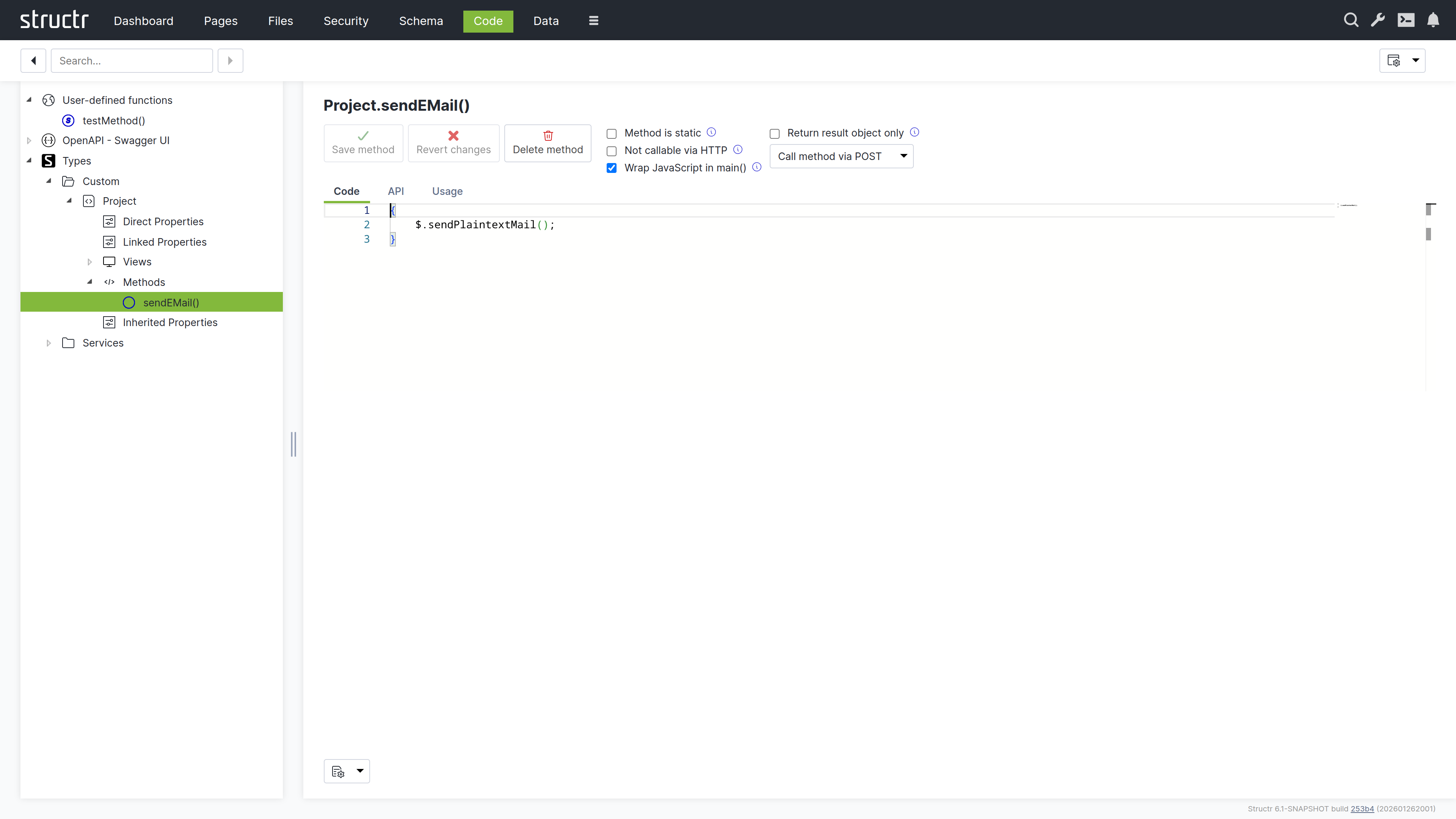
The screen is divided into a navigation tree on the left and a context-sensitive editor on the right. The tree organizes your code by type: expand a type to see its properties, views, and methods. Click any item to edit it.
Here you also have access to user-defined functions (global utilities available throughout your application) and service classes (containers for business logic that does not belong to a specific type). The OpenAPI output is also available here, which is useful for verifying how your methods appear to API consumers.
The Navigation Tree
The tree contains the following sections:
Scratchpads
Scratchpads are simple blocks of code that you can develop and run without creating a method. Use them for experiments and one-off scripts; click the plus icon in the Scratchpads view to add one.
User-defined functions
This shows global functions in a table format – the same view that is available in the Schema area. These functions are callable from anywhere in your application.
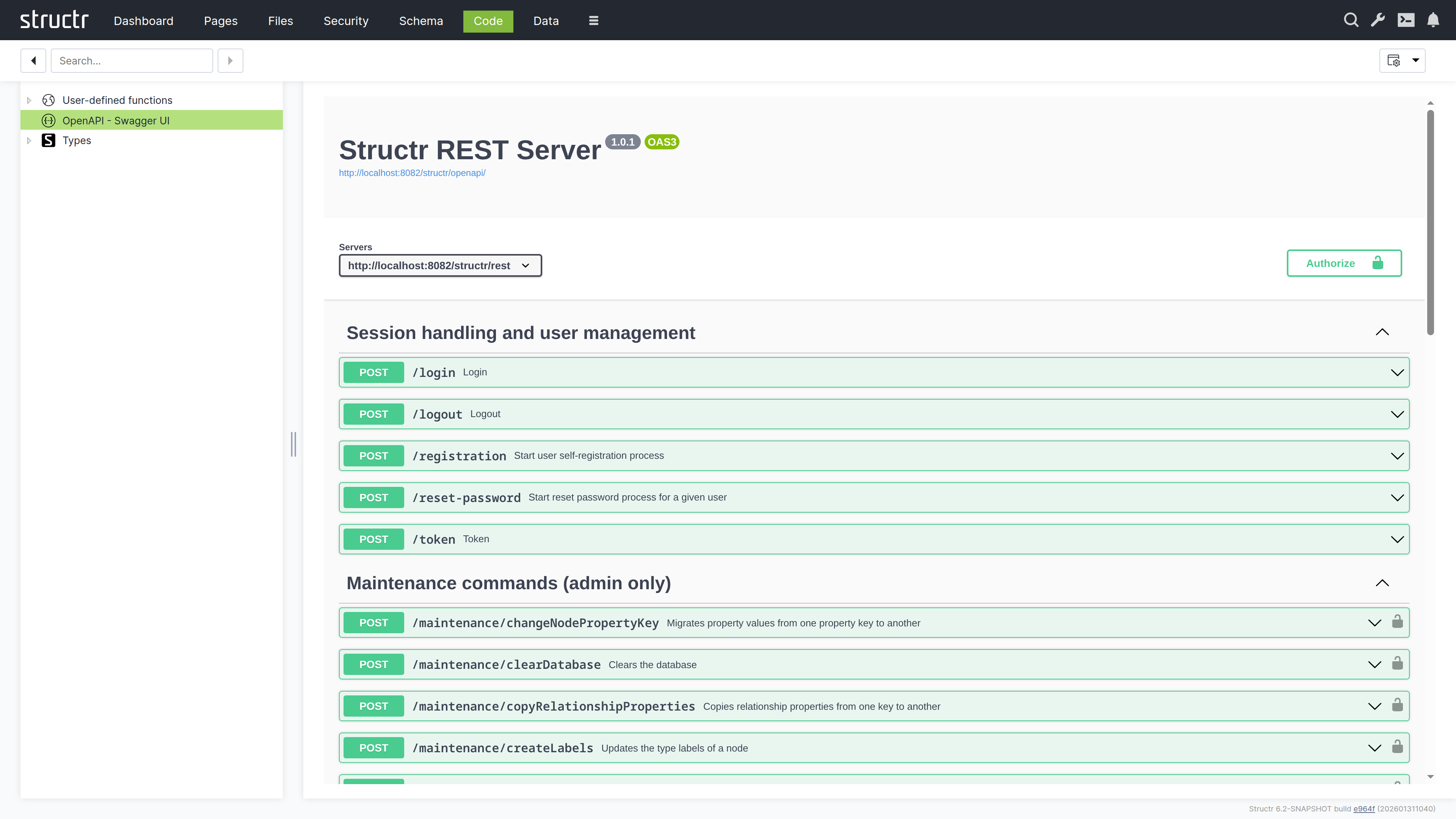
OpenAPI - Swagger UI
This section displays the OpenAPI specification for your application in Swagger UI. The specification is also exposed as a public endpoint that external consumers can access to discover and interact with your APIs. It serves as the authoritative reference for all API endpoints defined in your application, documenting available methods, their parameters, and expected responses.
Data Sources
This section lists the script-based and query-based data sources that feed data-driven components. Each data source is a piece of code (a script or a query) that returns the objects a component displays, and this is where you edit that code. How components use data sources is described in Widgets & Components.
Processes
This section lists the BPMN processes of your application and gives access to the scripts attached to their elements, for example the code of script tasks and the expressions on gateways, so that process logic can be edited with the same editor as any other method. The processes themselves are modelled in the Processes area.
Types
This lists all your custom types and service classes in the two subsections Custom and Services. Expand a type to see its contents:
- Direct Properties – Properties defined on this type
- Linked Properties – Properties from relationships
- Views – Property sets for different contexts (API responses, UI display)
- Methods – The business logic attached to this type
- Inherited Properties – Properties from parent types or traits
This structure mirrors what you see in the Schema type editor, but it is organized for code navigation rather than visual modeling.
Services
This is a category under Types for service classes. Service classes can only contain methods, not properties. They are useful for grouping related business logic that does not belong to a specific data type – things like report generators, external integrations, or utility functions.
The Method Editor
Click any method to open the editor.
Writing Code
The editor is based on Monaco (the same engine as VS Code), with syntax highlighting for JavaScript and StructrScript, autocompletion, and all the features you would expect from a modern code editor.
At the bottom of the screen, a settings dropdown lets you configure the editor to your preferences: word wrap, indentation style, tab size, code folding, and more.
Method Configuration
Above the editor, several options control how the method behaves:
Method is static
This means the method can be called without an object instance – it is a class-level function rather than an instance method.
Not callable via HTTP
This hides the method from the REST API. Use it for internal utilities that should not be exposed.
Wrap JavaScript in main
This wraps your code in a main function, which affects scoping and is sometimes needed for compatibility.
Return result object only
This strips metadata from the response, returning just the result.
HTTP verb dropdown
This specifies which HTTP method triggers this function when called via REST API: GET for read operations, POST for creating things, PUT for updates, DELETE for removals.
Testing Your Code
For user-defined functions and static methods, a Run Dialog button appears in the action bar alongside Save, Revert, and Delete, provided the method is callable via HTTP. Click it to open a testing interface where you can enter parameters and execute the method immediately. The return value displays in the dialog, making it easy to test and debug without leaving the editor.
API Tab
Here you can define typed parameters for your method. Structr validates incoming requests against these definitions before your code runs, catching type mismatches and missing required parameters automatically. This also generates OpenAPI documentation.
Usage Tab
This shows how to call the method from different contexts: JavaScript, StructrScript, and REST API. The examples use your actual method name and parameters, so you can copy them directly into your code.
Searching Your Code
The search field in the secondary menu searches across all code in your application – schema methods, user-defined functions, and service classes. This is invaluable when you need to find where something is defined or used.
Note that the search does not include page content. For that, use the Pages area.
Two Views, One Model
The Code area and Schema area are two perspectives on the same underlying data. Changes you make in one immediately appear in the other.
Use the Schema area when you are thinking about structure – what types exist, how they relate to each other, what properties they have. Use the Code area when you are thinking about behavior – what methods do, how they are implemented, how they are called.
Files
The Files area is Structr’s virtual file system – a familiar file browser interface where you can manage your application’s static assets. CSS, JavaScript, images, documents, and any other files live here.
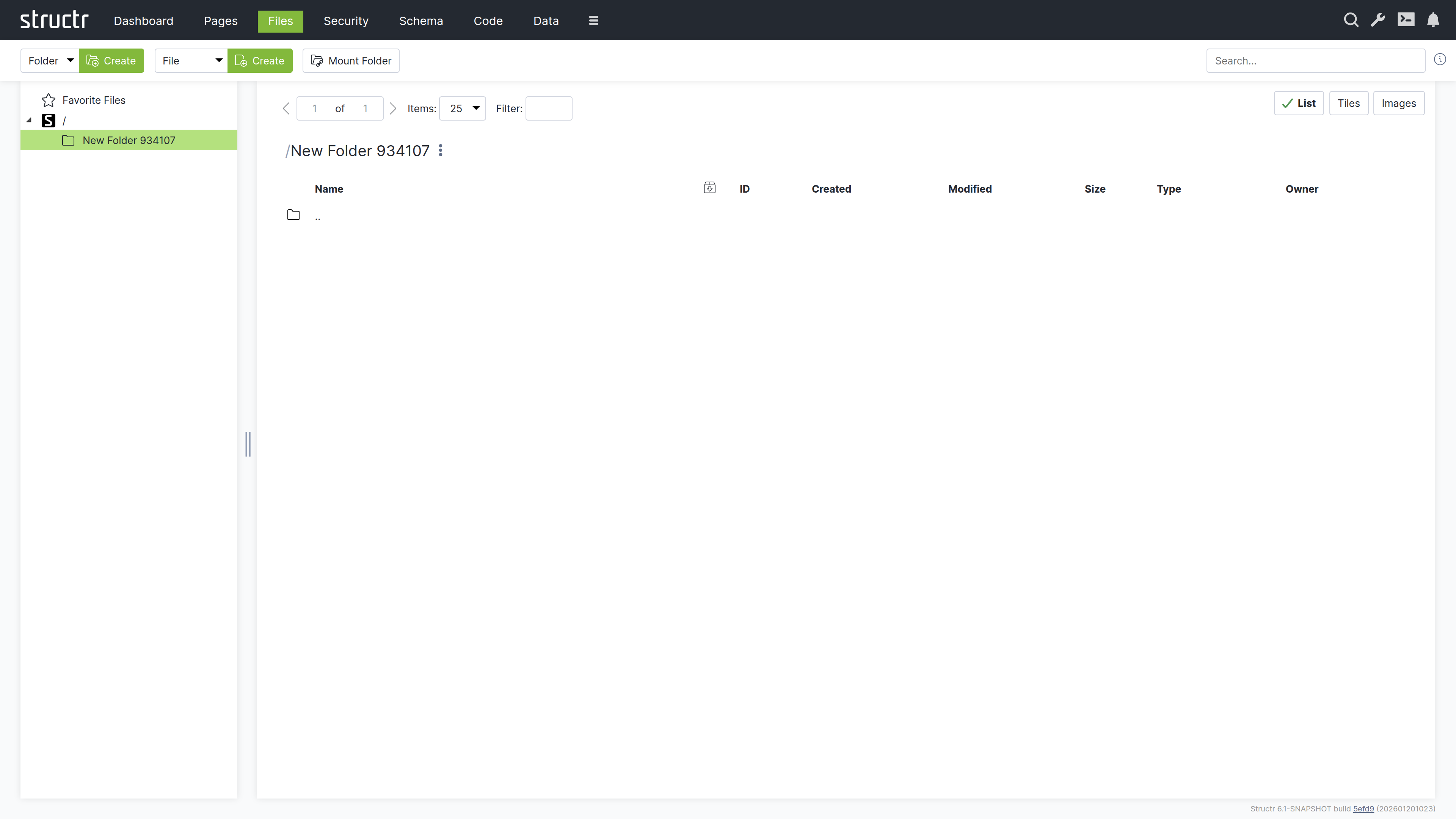
Secondary Menu
Create Folder
The first Create button, together with the type select in front of it, creates a new folder in the currently selected directory. The select offers Folder and any types you have created that extend Folder.
Create File
The second Create button creates a new empty file in the current directory. Its type select offers File and your custom file types.
Upload File(s)
Opens the file chooser of your browser to upload one or more files into the current folder.
Mount Folder
Opens the Mount Dialog for connecting external storage locations to Structr’s virtual file system.
The Mount Dialog
Mounting lets you integrate external directories or storage providers into Structr. When you mount a folder, Structr monitors it for changes and automatically updates metadata when files are added or modified.
The dialog includes:
- Storage Provider: Select the storage backend (currently the local file system of the server)
- Name: The name for the new mounted folder in Structr
- Do Fulltext Indexing: Index the contents of the mounted files for the full-text search
- Scan Interval (s): Interval for the periodic scans of the mount target
- Mount Target Folder Type: The type used for folders found below the mount point
- Mount Target File Type: The type used for files found below the mount point
- Enabled Checksums: The checksums calculated on file creation (crc32, md5, sha1, sha512)
- Watch Folder Contents: Registers the path with a watch service so that changes are picked up immediately, if the operating system supports it
- Mount Target: The provider-specific location to mount; for the local file system, the absolute path of the directory
Search
The search field on the right searches across all files, including their contents. This full-text search is powered by Apache Tika and can index text from PDFs, images (via OCR), Office documents, and many other formats. Type your query and press Enter to see results.
Left Sidebar
Favorites
At the top of the directory tree, Favorite Files provides quick access to frequently used files. Drag any file here during development to keep it handy – this is useful for JavaScript files, stylesheets, or configuration files you edit often.
Directory Tree
Below Favorites, the familiar folder hierarchy shows your file system structure. Click a folder to view its contents on the right. Click a file or folder name to rename it inline.
Main Area
The main area shows the contents of the selected folder.
View Controls
At the top right, three buttons switch between view modes:
- List – Compact rows with detailed information
- Tiles – Medium-sized previews with thumbnails
- Images – Larger previews, ideal for browsing image folders
A pager on the left handles large directories, and a filter box lets you narrow down the displayed files.
The File Table
In list view, each row shows:
- Icon – Click to download or open the file (depending on content type)
- Name: The file name
- Export checkbox – Marks the file for inclusion in deployment exports (only available below the top level)
- ID: The file’s unique identifier
- Created: Creation timestamp
- Modified – Last modification timestamp
- Size – File size
- Type – Both the Structr type and MIME type
- Owner – The file’s owner
Hold Ctrl while clicking to select multiple files for bulk operations, or hold Shift to select a range. Ctrl+A (Cmd+A on macOS) selects all files in the current folder.
Uploading Files
Drag files from your desktop onto the right side of the Files area to upload them. Files are Base64-encoded and uploaded in chunks via WebSocket. This works well for smaller files; for large files or bulk uploads, consider using the REST API or deployment import.
Search Results
When you search, results appear in a table similar to the file list. A magnifying glass icon at the start of each row shows the search context – click it to see where your search term appears within the file.
Context Menu
Right-click a file or hover and click the menu icon to open the context menu.
Edit File
Opens the file in a built-in editor. The editor warns you before opening binary files or files that are too large. For text files, you get syntax highlighting based on the file type.
The editor has two checkboxes: “Replace template expressions” sets the isTemplate flag of the file, and “Show preview” (enabled only for template files) displays the rendered output with the template expressions evaluated.
General
Opens the file’s property dialog with:
- Name: The file name
- Content Type – The MIME type (affects how browsers handle the file)
- Cache for n seconds: Controls HTTP cache headers when serving the file
- Is template (dynamic file): When enabled, Structr evaluates template expressions in the file content before serving it, allowing you to mix static and dynamic content
- Caching disabled – Prevents browser caching
- Include in Frontend Export – Marks the file for deployment export
Advanced
The raw attribute table, same as in other areas.
Add to Favorites
Adds the file to the Favorites section for quick access.
Copy Download URL
Copies the file’s download URL to your clipboard.
Download File
Downloads the file directly.
Security
A submenu with:
- Access Control / Visibility – Opens the full access control dialog
- Quick toggles – Make the file visible to authenticated users, public users, or both
Delete File
Removes the file. The entry is labelled “Delete File” (or “Delete
Folder Context Menu
Folders have a simpler context menu with General (just name and export checkbox), Advanced, Security, and “Delete Folder”.
Content Type Features
Some content types unlock additional functionality.
CSV and XML Files
Files with text/csv or text/xml content type show an “Import CSV” or “Import XML” menu entry that opens the import wizard documented in the Importing Data chapter.
ZIP Archives
ZIP files show two additional options:
- Extract Archive Here – Extracts contents into the current folder
- Extract Archive to New Folder – Creates a new folder and extracts there
Images
Images get special treatment:
Automatic Thumbnails
Structr generates thumbnails on first access, stored in a hidden ._structr_thumbnails folder. Two thumbnail sizes are created automatically and linked to the original image via database relationships.
Metadata Extraction
EXIF data like camera settings, GPS coordinates, and timestamps are automatically extracted and stored as properties. Width and height are also read and stored.
Edit Image
Opens a simple editor for cropping images.
Checksums
Structr automatically calculates checksums for all files. By default, a fast xxHash is computed; you can configure additional algorithms in structr.conf.
Naming Conflicts
If you create a file with a name that already exists in the folder, Structr automatically appends a timestamp to make the name unique.
Related Topics
- Importing Data – CSV and XML import wizards
- Data Model – Creating custom file types with the File trait
- Security – File permissions and visibility
- Pages & Templates – Using files in pages, the isTemplate feature
Graph
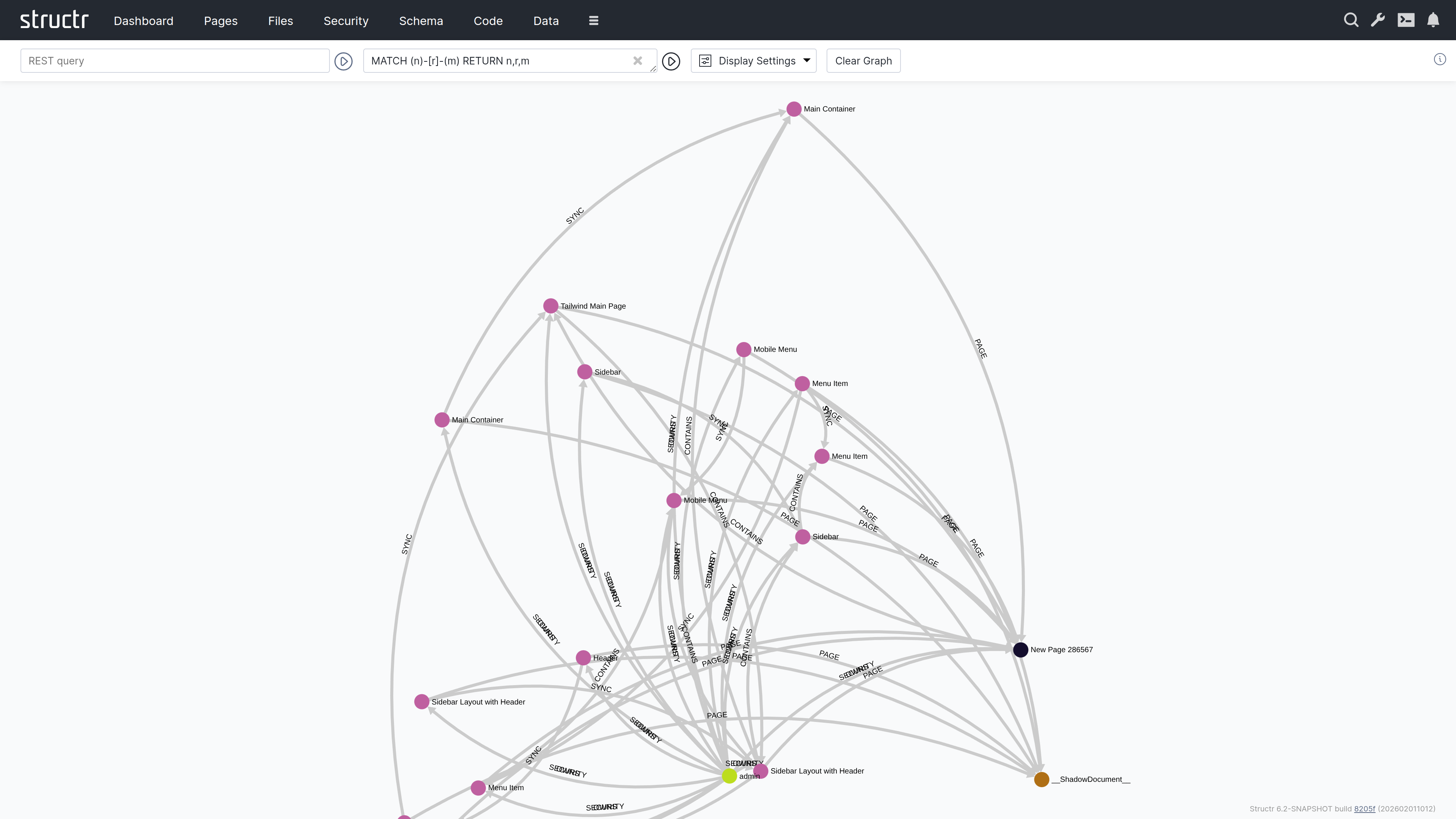
The Graph area is an interactive graph explorer where you can visualize your data objects and their relationships. This area is particularly useful when you need to understand the connections between objects in your database, explore how data is interlinked, or navigate complex relationship structures. By starting from a query result, you can progressively expand the visualization to discover related objects step by step. By default, this area is hidden in the burger menu.
Querying Data
The header contains two input fields for specifying which data to display.
REST URL
In the left input field, you can enter a REST URL to load objects. The results will be displayed as nodes in the graph visualization.
Cypher Query
In the right input field, you can enter a Cypher query to further filter or transform the results.
The Graph Visualization
Each object returned by your query appears as a filled circle on the canvas, with its name displayed as a label.
Exploring Relationships
When you hover over a node, additional colored circles appear around it. Each colored circle contains a number indicating how many outgoing relationships of a particular type exist. The colors distinguish different relationship types.
Click on one of these colored circles to follow all relationships of that type. The related nodes are then added to the visualization, and you can see the connections between them. This way, you can progressively navigate through your data graph, expanding the view step by step.
Node and Edge Tooltips
Clicking a node opens a tooltip with three buttons: Properties opens the property dialog of the object, Remove takes the node out of the visualization without touching the database, and Delete deletes the object from the database. The tooltip of an edge offers Properties and Delete.
Display Options
A dropdown menu next to the input fields provides configuration options:
Display Options
Two checkboxes control what’s shown in the visualization:
- Node Labels – Shows or hides the names on nodes
- Edge Labels – Shows or hides the names on relationship lines
Node Types
Checkboxes let you show or hide nodes by type group: Core Types, UI Types, Custom Types, HTML Types, Log Types and Other Types. This keeps the visualization readable when a query returns objects of many different types.
Layout Algorithm
The “Set Layout” section offers two static layouts, Fruchterman and Dagre, that arrange the nodes once. “Dynamic Layouting On/Off” toggles ForceAtlas2, a continuous force-directed layout that keeps rearranging the nodes while it is active.
Clear Graph
This button resets the visualization, removing all displayed nodes and relationships so you can start fresh.
Flows
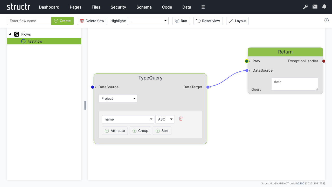
The Flows area is a visual workflow designer where you can create automated processes using flow-based programming. This approach is similar to visual scripting tools like Unity’s Visual Script. By default, this area is hidden in the burger menu.
Secondary Menu
Create Flow
An input field and Create button on the left let you create a new flow. A flow is a container for flow nodes that you connect to define a process.
Delete flow
Deletes the currently selected flow.
Highlight
A dropdown that highlights different aspects of your flow: Execution Flow, Data Flow, Logic Flow, or Exception Handling. This helps you focus on specific channels when working with complex flows.
Run
Executes the current flow.
Reset view
Resets the canvas zoom and pan position.
Layout
Automatically arranges the flow nodes on the canvas.
Left Sidebar
The sidebar shows a tree of all flows in your application. Click on a flow to open it on the canvas.
The Canvas
The main area displays the flow nodes and their connections. You can zoom and pan the canvas to navigate larger flows.
Adding Nodes
Right-click on the canvas to open the context menu, which lets you add new nodes. The menu is organized into categories:
Action Nodes
Action, Call, ForEach, Aggregate, Filter, ExceptionHandler, Log, Return. The Fork and ForkJoin nodes exist in the editor but are currently disabled in the context menu.
Data Nodes
Datasource, Constant, CollectionDatasource, ObjectDatasource, KeyValue, ParameterInput, ParameterDataSource, Store, GetProperty, First, TypeQuery
Logic Nodes
Decision, Not Null, Not Empty, Not, Or, And, Is True, Comparison, Script Condition, Switch, Switch Case
Actions
Execute Flow, Reset View, Select and Apply Layout
Connecting Nodes
Each node has input and output connectors. You connect nodes by dragging from an output connector to an input connector. The connectors are color-coded by channel type:
- Green – Execution channel (controls the order of operations)
- Blue – Data channel (passes data between nodes)
- Red – Exception handling channel (handles errors)
- Orange: Logic channel (passes boolean values); an unconnected condition socket is shown in a darker ochre
You can only connect connectors of the same type.
Related Topics
- Flows – Detailed documentation on flow-based programming, node types, and building workflows
Processes
The Processes area is where you model BPMN processes and watch them run. It contains the BPMN diagram editor, the list of process definitions, and monitoring views for running instances, their tokens and the tasks that wait for users. The area belongs to the process module and appears in the extended menu behind the burger icon when the module is installed.
The area has four tabs. Process Definitions holds the models. Process Instances, Process Tokens and Task Instances show what the engine is doing at runtime. Wiring a process to pages happens in the Pages area and is described in the BPMN Process Control chapter.
Process Definitions
A process definition is a BPMN file: it holds one or more processes, their diagram, and the Structr-specific settings that the BPMN standard does not carry. The table lists every definition with its version, the number of processes it contains, the number of active, suspended and completed instances across those processes, and its security level.
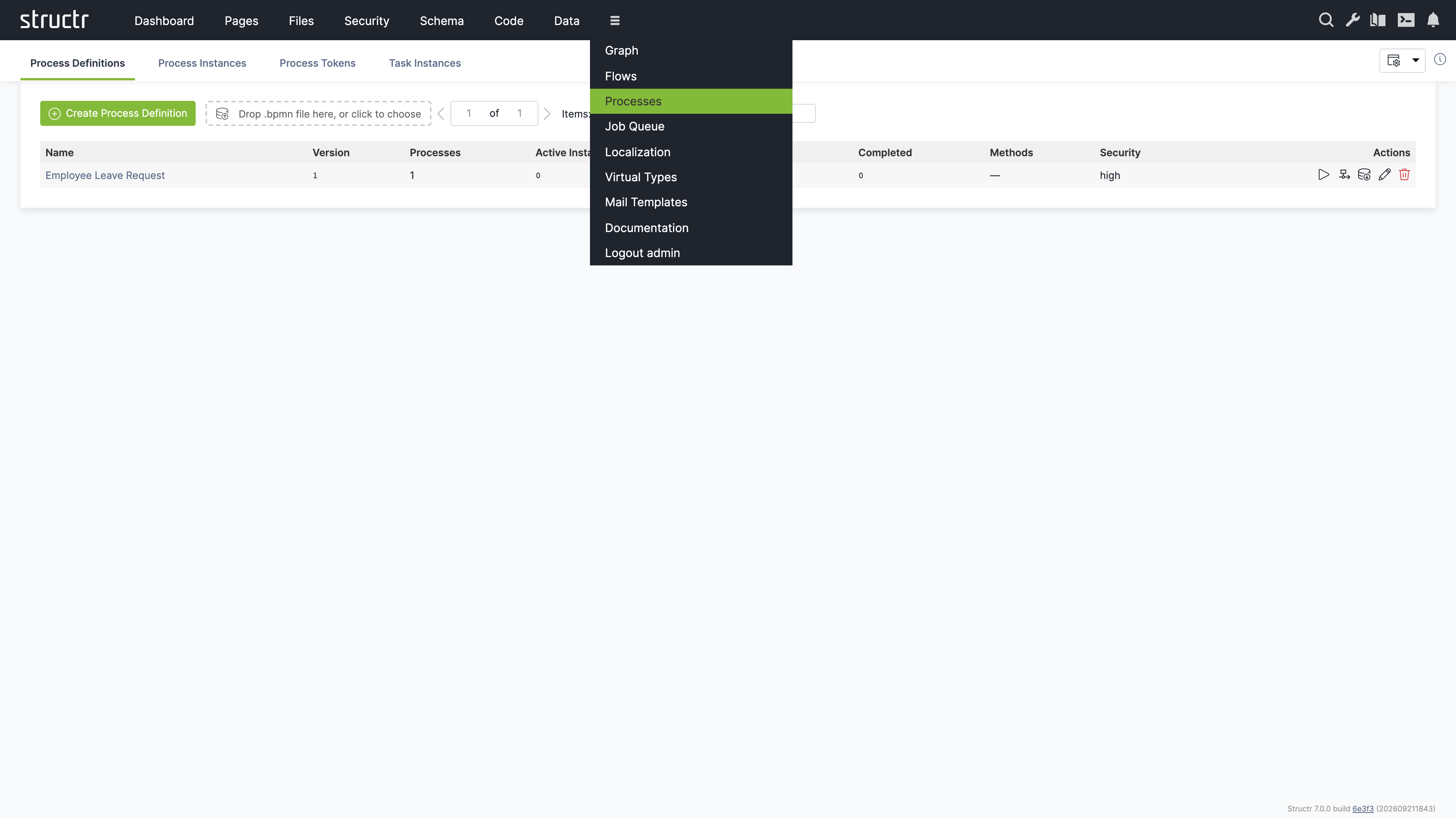
Creating and Importing Definitions
Click “Create Process Definition” to create an empty definition with one process and a blank diagram. The editor opens immediately. The definition receives a generated name that you can change later via its properties.
To import an existing model, drop a .bpmn or .xml file onto the dropzone next to the button, or click the dropzone to choose files. Structr reads BPMN 2.0 XML and creates the process graph from it. Files exported by Camunda 7, Camunda 8 and Zeebe, and Flowable or Activiti are recognized, and the form definitions these tools attach to user tasks are translated: Structr synthesizes a subject type from the union of all form fields, creates one view per task with that task’s fields, and sets it as the form view of the step, so that the process can be used with process-bound widgets right away. Importing a file whose process id already exists creates a new version of that process instead of overwriting it. See Versions below.
Actions
Each row offers five actions. The play icon starts an instance of the first process in the file, which is useful for testing a model without a page. The diagram icon and the name of the definition open the BPMN editor. The export icon downloads the definition as a .bpmn file. The pencil icon opens the properties dialog, where you rename the definition and set its security level. The trash icon deletes the definition.
Security Level
The security level of a definition is high by default. Users then interact with tasks through the pages of your application while logged in. The level low additionally allows sessionless access to a task through a signed link, which the processToken and processNotify functions create. This is intended for processes whose participants do not have an account, for example an approval sent by email. Set it only for processes that are designed for this kind of access.
Versions
Every process carries a version number. Running instances keep executing the version they were started on, so you can change a model while older instances finish on the old one. Importing a file with a known process id creates the next version and copies the handler methods of the previous version onto it. Pickers in the Pages area show the version next to the process name, for example “Request Process (v2)”, so you can bind a page element to a specific version.
The BPMN Editor
The editor opens as a full-size dialog with a toolbar at the top, the palette on the left, the canvas in the middle and a side panel on the right.
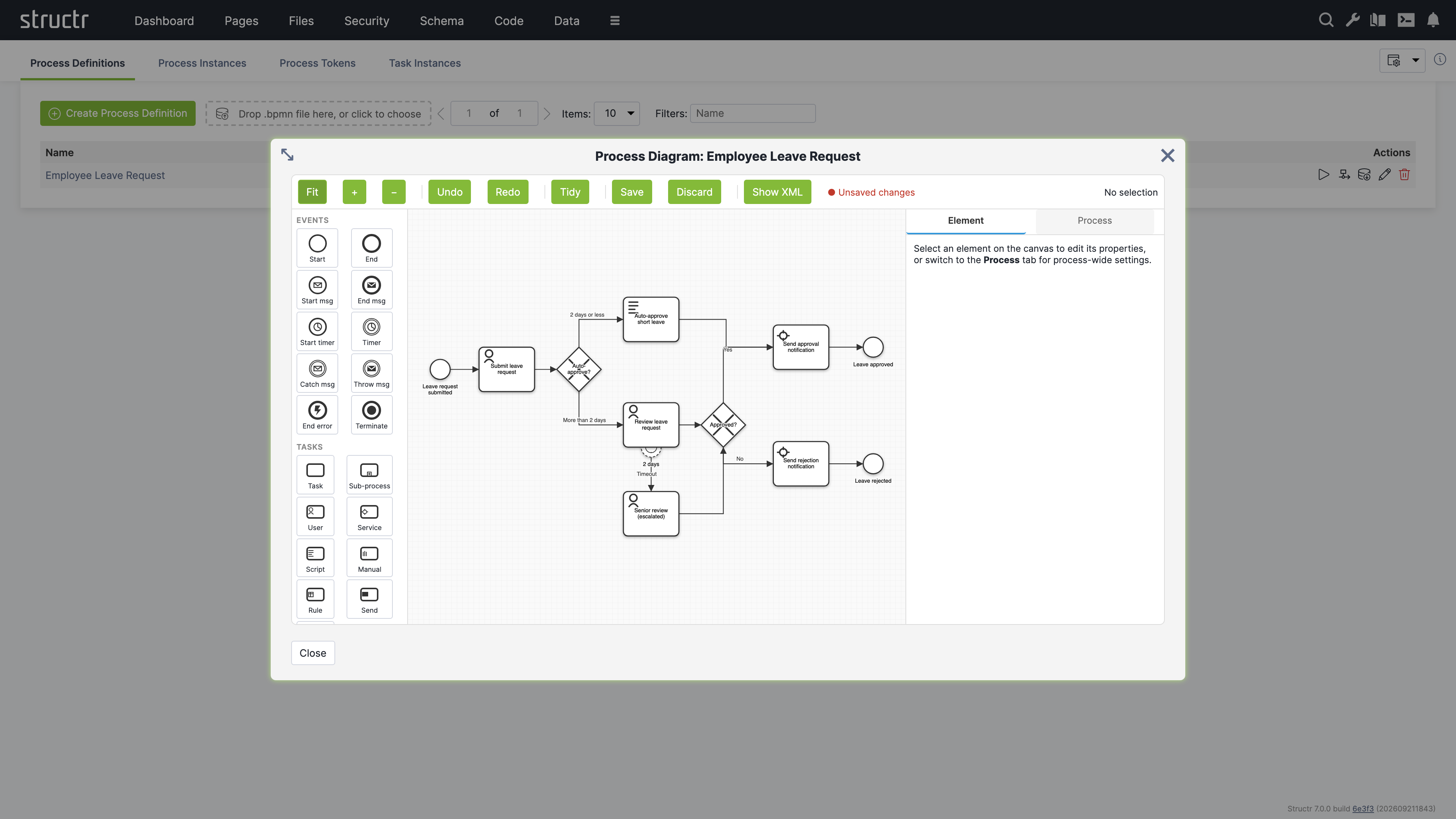
Toolbar
Fit, plus and minus control the zoom. Undo and Redo step through your changes. Tidy snaps all shapes to the grid and moves lanes inside their pools. Save writes all pending changes in one transaction, Discard drops them. Both are disabled while nothing has changed, and the label next to them tells you when the diagram has unsaved edits. Show XML opens a read-only preview of the BPMN XML including your pending edits, with a Copy button.
Palette and Canvas
The palette is grouped into Events, Tasks, Gateways, Boundaries and Data. Events cover start and end events, message and timer start events, intermediate timer, message catch and message throw events, error end events and terminate events. Tasks cover the generic task, sub-process, user, service, script, manual, business rule, send and receive tasks. Gateways cover exclusive, parallel, inclusive, event-based and complex gateways. Boundaries attach timer, message, error, escalation and signal events to a task. Data covers data objects and data stores.
Click a palette entry, then click on the canvas to place the element. To connect two elements, select the source and drag from the plus handle at its edge onto the target. Selecting an element on the canvas switches the side panel to its properties.
The Element Tab
The Element tab of the side panel shows the properties of the selected element. Every element has a name. Sequence flows and other attributes that the panel does not expose as fields are available in the BPMN attributes editor at the bottom, a list of key and value pairs that round-trips to the XML attributes of the element. This is where you set a gateway’s default flow or a script task’s script format without editing the XML.
User tasks have the most settings, because they are the steps where people interact with the process:
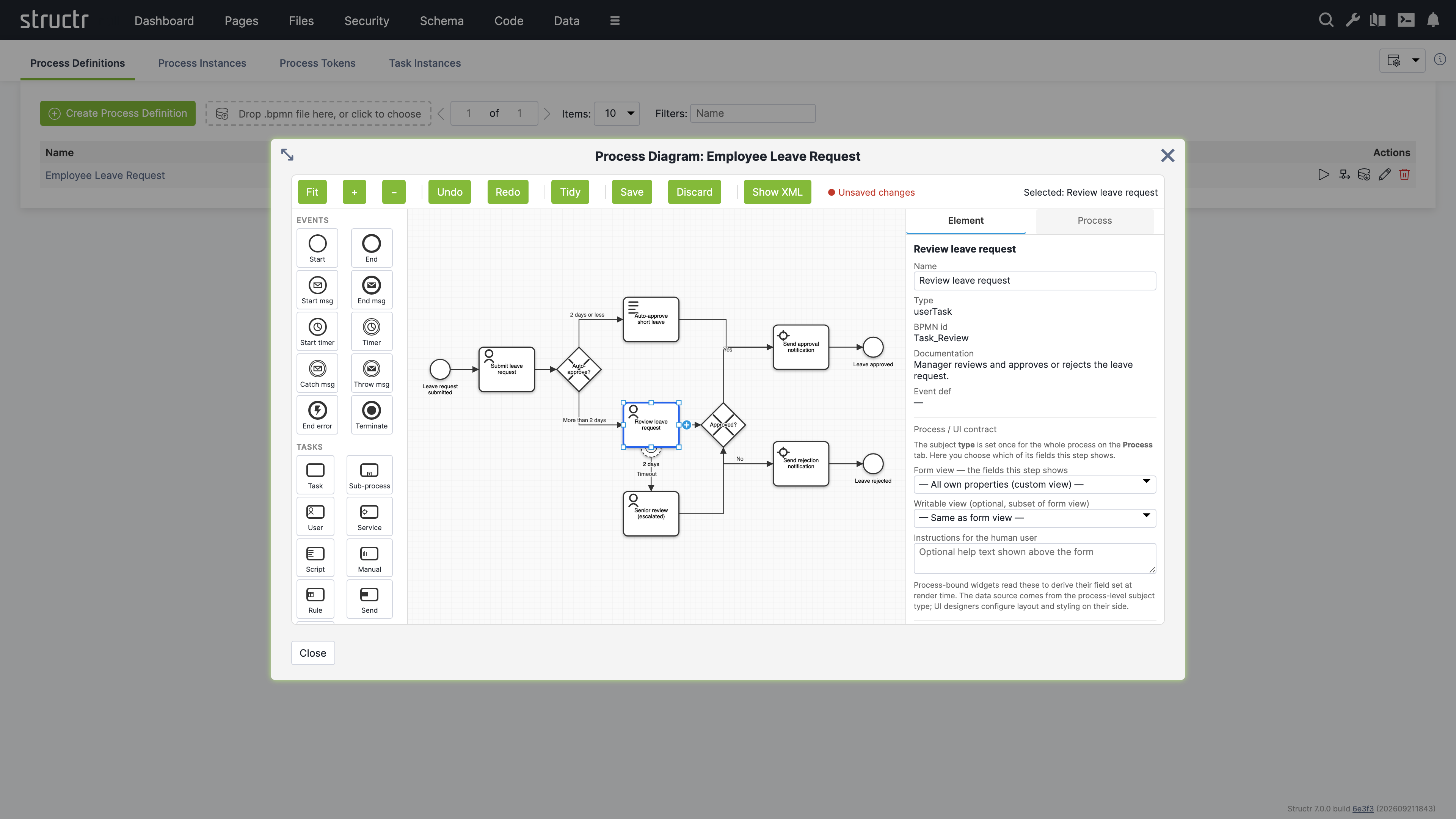
| Setting | Description |
|---|---|
| Assignee (humanPerformer) | An expression that names the user who receives the task, for example ${initiator} for the user who started the instance, or user(alice). |
| Candidates expression (potentialOwner) | An expression that names the users or groups who may claim the task, for example user(alice), group(managers). |
| Candidate principals | The users and groups resolved from the candidates expression, for reference. |
| Form view | The view of the subject type whose fields this step shows. The subject type itself is set on the Process tab. |
| Writable view | An optional subset of the form view that this step may change. |
| Instructions for the human user | Help text shown above the form of a process-bound widget. |
Below these settings, the panel lists the task event handlers. A handler is a schema method that the engine runs when the task fires one of the events created, assigned, claimed, available, declined, completed or cancelled. Click “Add handler”, choose the event and the phase, and Structr creates a method named after the task, the phase and the event, which you open in the Code area with the edit button. The phase on runs before the transition is committed and can veto it by throwing an error. The phase after runs after the commit and is the place for side effects such as notifications. There is one handler per event and phase.
The Process Tab
The Process tab holds the settings that apply to the whole process. They are Structr-specific and are not part of the BPMN standard, so a re-import of the same file does not restore them.
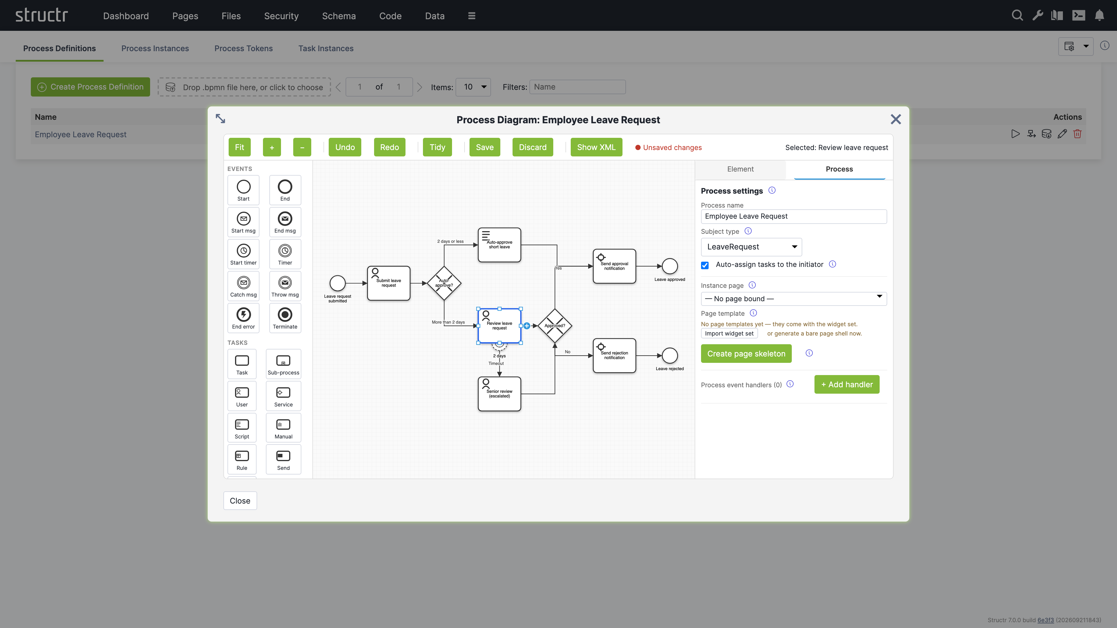
| Setting | Description |
|---|---|
| Process name | The name shown in all process pickers and in the Process Definitions table. |
| Subject type | The schema type of the single domain object this process operates on. Each instance has exactly one subject. User tasks pick which fields of this type they show through their form view, and process-bound widgets use the type to derive their fields. |
| Auto-assign tasks to the initiator | When a user task has no assignee, the engine reserves it for the user who started the instance. Off by default so that imported models keep their standard semantics. |
| Instance page | The page that renders an instance of this process. The start action of Event Action Mapping navigates to this page with the instance id as path segment. Without a bound page, the URL falls back to the slugified process name. |
| Page template | The page template widget that “Create page skeleton” builds the page from. Page templates come from the widget set, and the panel offers to import it when none is present. |
The “Create page skeleton” button generates the instance page for you. The page contains one empty div per step that needs a human, in flow order: the start event, every user task, manual tasks and message catch events. Each div carries a visibility rule bound to its step, so it renders only while that step is actionable, and a heading that reads the name of the step. Machine steps such as service tasks and gateways get no div. The new page is bound as the instance page when none is set. You then fill the sections in the Pages area, typically with the process-bound widgets of the default widget set.
The Process tab also lists the process event handlers. They work like task event handlers but react to the lifecycle of the instance with the events created, started, subjectAttached, completed, terminated, suspended and resumed.
Process Instances
The Process Instances tab lists every instance with its definition and version, its subject, the user who started it, its status and its start and end time. The filter input narrows the list by status. The possible states are running, suspended, completed, terminated and error.
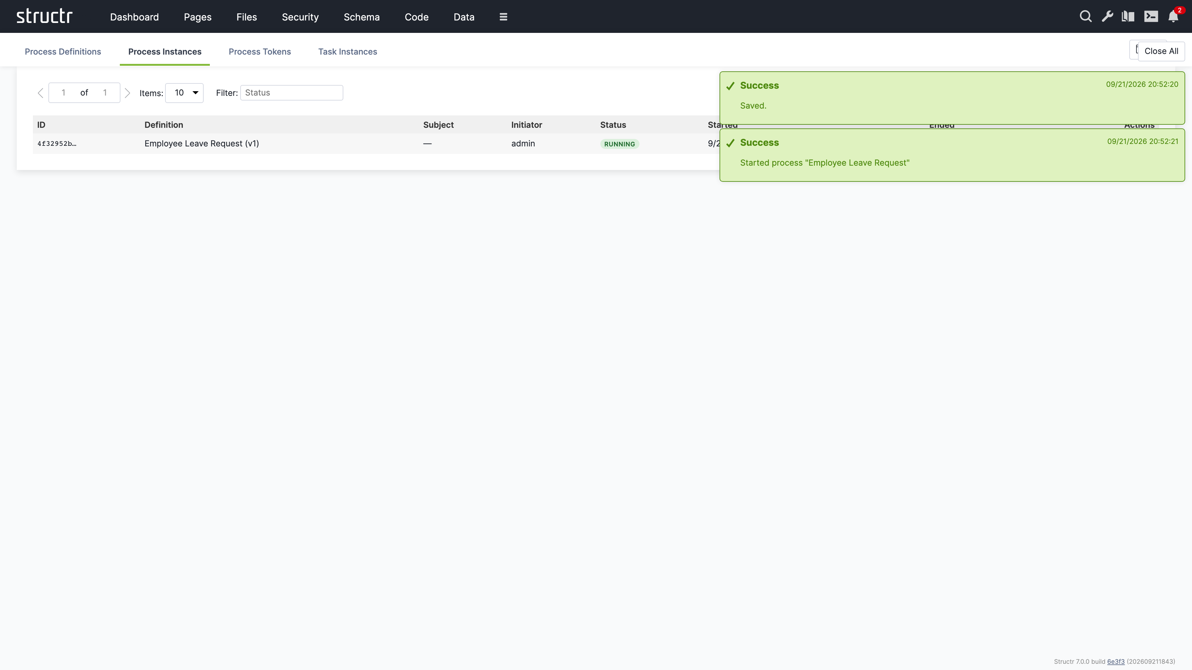
The actions pause and resume an instance, terminate it, or open its properties. Suspending stops the engine from advancing tokens while leaving them in place. Terminating ends the instance and consumes all waiting tokens. Both operations run through the engine, so process event handlers fire as they would for the same operation triggered from a page.
Process Tokens
A token marks where an instance currently is. The Process Tokens tab lists all tokens with the instance they belong to, the element they wait at, and their status. This view is mainly useful for diagnosis: a running instance with no waiting token has stalled, and a token that sits at an unexpected element points to a modelling problem. Tokens have no actions besides editing their properties and deleting them.
Task Instances
The Task Instances tab lists the tasks the engine has created for user tasks. Each row shows the task name, its process instance, the element in the model, the current assignee, the candidates, the status, and the times it was created, claimed and completed. The status filter narrows the list, and the checkbox “Show stalled only” reduces it to available tasks that every candidate has declined, which are the tasks that need an administrator.
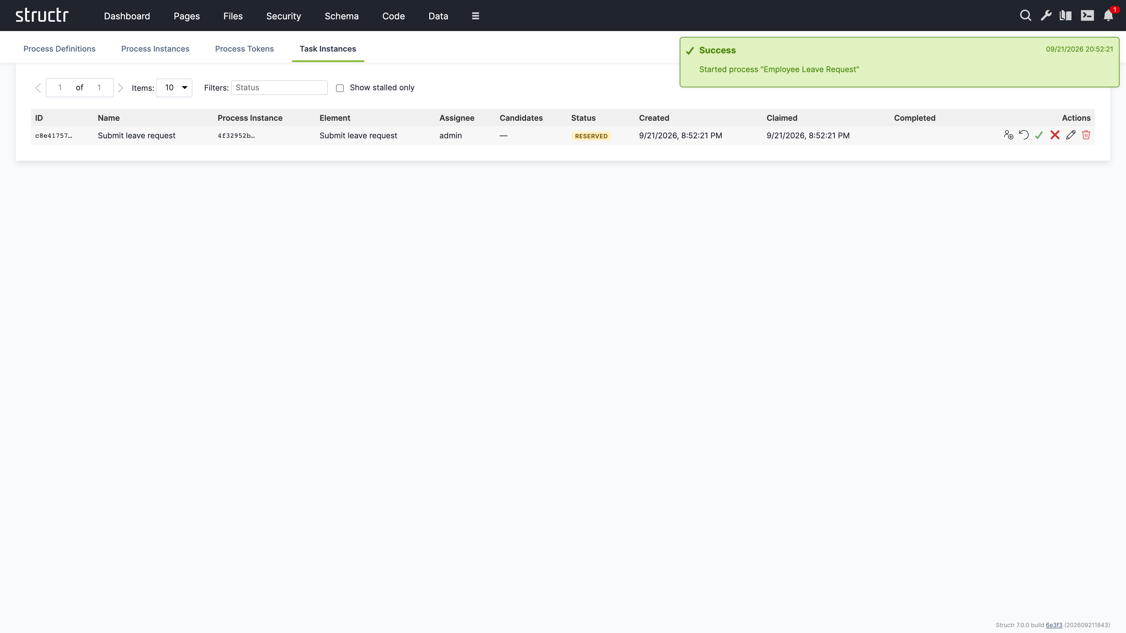
The actions cover the administrative operations of the engine. Assign opens a dialog to pick a user or group and sets the assignee directly, overriding the candidate declarations. The reset icon returns a reserved task to the available pool and re-notifies the candidates. The checkmark completes a reserved task without going through a page. The cross cancels a task, which consumes its token without advancing the instance. The participant operations claim, release, decline and delegate are performed by the users themselves through Event Action Mapping and are not part of this view.
Related Topics
- BPMN Process Control - Wiring pages to processes with Event Action Mapping and process visibility rules
- Building A BPMN Process Based App - A tutorial that builds a complete process with one user task
- Widgets & Components - Process-bound components that render the subject of an instance
- Code - Where task and process event handlers are edited
Job Queue
The Job Queue area displays scheduled jobs and background tasks. It is not limited to import operations – it shows all jobs created with the $.schedule() function as well as batch import jobs. By default, this area is hidden in the burger menu.
Secondary Menu
Refresh
The button on the left refreshes the job list.
Cancel Jobs
An input field labeled “Cancel ALL queued jobs after this ID:” lets you specify a job ID. Click the “Cancel Job” button next to it to cancel all queued jobs with IDs higher than the specified value. This is useful when you need to stop a large number of scheduled jobs at once.
Settings
On the right side, the usual configuration options are available.
The Job Table
The main area displays a table of all jobs with the following columns:
- Job ID – The unique identifier for the job
- Job Type – The type of job (e.g., scheduled function, import batch)
- User – The user who created the job
- File UUID / Job Title: For import jobs, the UUID of the file being imported; for scheduled jobs, the title given to
$.schedule() - File Path – For import jobs, the path to the file
- File Size – For import jobs, the size of the file
- Processed Chunks – For chunked imports, shows progress as processed/total chunks
- Status – The current state of the job (queued, running, completed, failed)
- Action – Actions you can perform on the job, such as cancelling it
Background
This area was originally designed to display import jobs – when you import a large file that gets split into chunks, each batch appears here so you can monitor progress. Later, the area was extended to also show jobs created with the $.schedule() function, making it a general-purpose job monitor.
Related Topics
- Importing Data – Details on CSV and XML import processes
- Business Logic – Using
$.schedule()to create background jobs
Localization
The Localization area is where you manage translations for multi-language applications. Here you create and edit the translation entries that the localize() function looks up when rendering pages. Each entry consists of a key, an optional domain for organizing related translations, and one or more locale-specific translations. When a page calls localize() with a key, Structr returns the appropriate translation based on the current user’s locale setting. By default, this area is hidden in the burger menu.
Note: This area appears empty until you create your first localization entry.
Secondary Menu
Create Localization
Three input fields let you create a new localization entry by entering Key, Domain (optional), and Locale(s). The locale field accepts a comma-separated list such as en,de,fr; Structr then creates one entry per locale in a single step. Click the Create Localization button to create them. After creation, select the entry in the list to add the actual translated text.
Pager
Navigation controls for browsing through large numbers of entries.
Filter
Three input fields let you filter the list by Key, Domain, and Content.
Left Sidebar
The sidebar lists all localization entries. Each entry shows its key, and entries with the same key but different locales are grouped together. Click an entry to select it and edit its translations in the main area.
The context menu on each entry provides Edit (opens the properties dialog) and Delete options.
Main Area
When you select a localization entry, the main area shows an editor for that key and all its translations across different locales.
Key and Domain
Two input fields at the top let you edit the key name and domain. Changing the key here updates all translations that share this key.
Save Button
Saves changes to the key and domain fields.
Add Translation Button
Adds a new translation row for an additional locale.
Translations Table
The table shows all translations for the selected key:
| Column | Description |
|---|---|
| (Actions) | Delete and Save buttons for each translation |
| Locale | The language code – edit directly to change |
| Translation | The translated text – edit directly to change |
| ID | The unique identifier (read-only) |
You edit the Locale and Translation fields directly in the table. Click Save on the row to persist your changes.
Related Topics
- Pages & Templates – The Translations section explains the
localize()function, locale resolution, and the Translations flyout
Mail Templates
The Mail Templates area is where you create and manage email templates for your application. These templates define the content and structure of automated emails such as registration confirmations, password resets, or notification messages. Templates can include template expressions that are replaced with dynamic content when the email is sent, allowing you to personalize messages with user-specific information. Each template can have multiple locale variants to support multi-language applications. By default, this area is hidden in the burger menu.
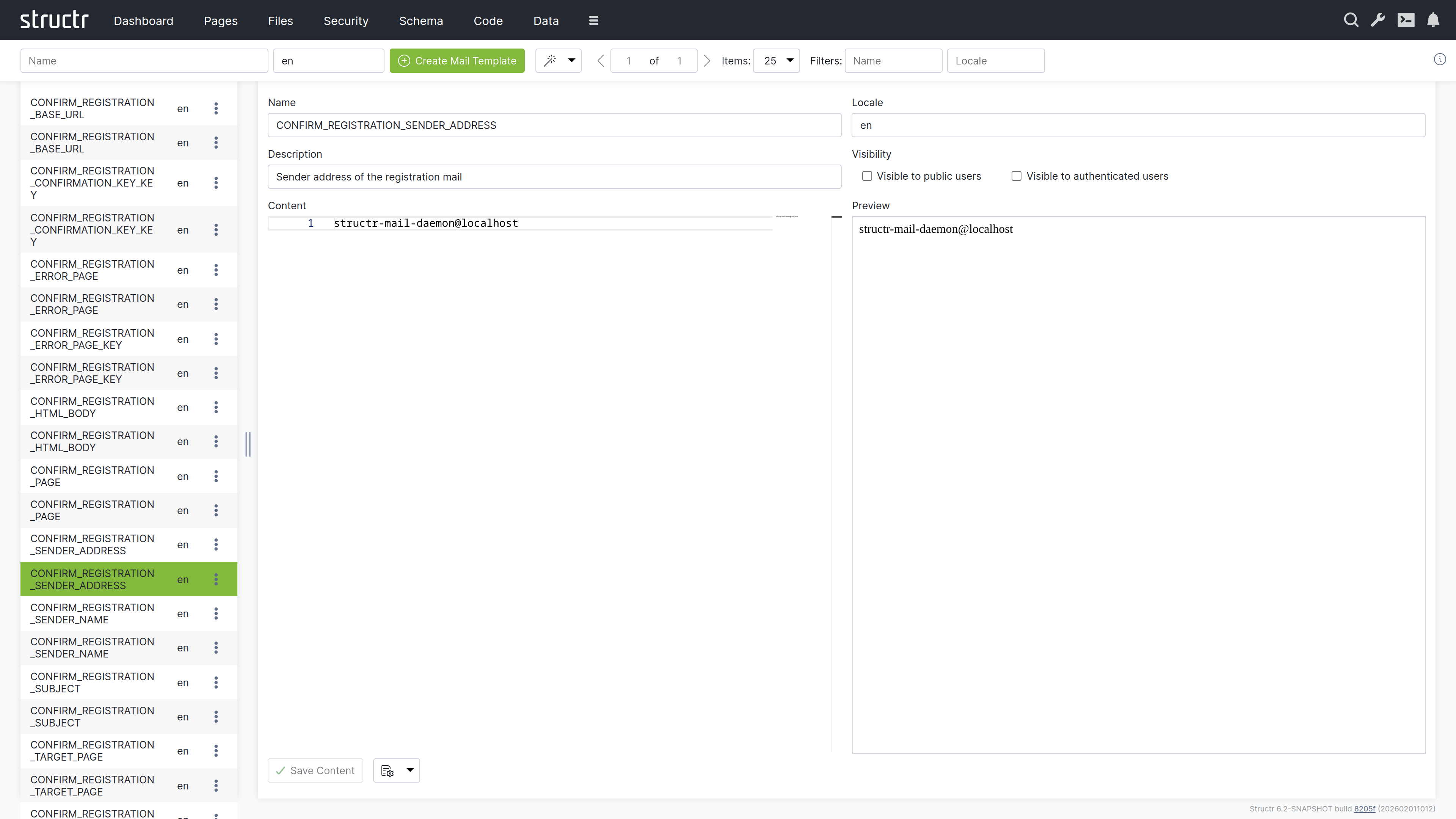
Note: This area appears empty until you create your first mail template.
Secondary Menu
Create Mail Template
On the left, two input fields let you enter the Name and Locale(s) for a new mail template. The locale field accepts a comma-separated list such as en,de,fr; Structr then creates one template per locale in a single step. Click the Create button to create them. The same locale list is used by the template wizard described below.
Template Wizard
The wand button labeled “Create Mail Templates for Processes” opens a wizard that automatically generates mail templates for common workflows:
- User Self-Registration – Templates for the registration confirmation email
- Reset Password – Templates for the password reset email
This saves time when setting up standard authentication workflows.
Pager
Navigation controls for browsing through large numbers of mail templates.
Filter
Two input fields on the right let you filter the list by Name and Locale.
Left Sidebar
The sidebar shows a list of all mail templates. Click on a template to open it in the editor on the right.
Each entry has a context menu with:
- Properties – Opens the Advanced dialog for the mail template, which also includes the Security section
- Delete – Removes the template
Main Area
When you select a mail template, the main area shows an editor with the following sections:
Template Settings
The upper section contains:
- Name – The template name (used to reference the template in code)
- Locale – The language/locale code for this template
- Description – An optional description of the template’s purpose
- Visible to Public Users – Visibility checkbox
- Visible to Authenticated Users – Visibility checkbox
Content Editor
On the left side, a text editor lets you write the email content. You can use template expressions with the ${...} syntax to insert dynamic values that are replaced when the email is sent.
Preview
On the right side, a preview panel shows how the template will look.
Related Topics
- SMTP – Configuring email sending
- User Management – User self-registration and password reset workflows that use mail templates
Configuration Interface
The Configuration Interface provides access to all runtime settings that control Structr’s behavior. You can open it by clicking the wrench icon in the header bar. The interface opens in a new browser tab and requires a separate login with the superuser name and password defined in structr.conf (superuser.username and superuser.password).
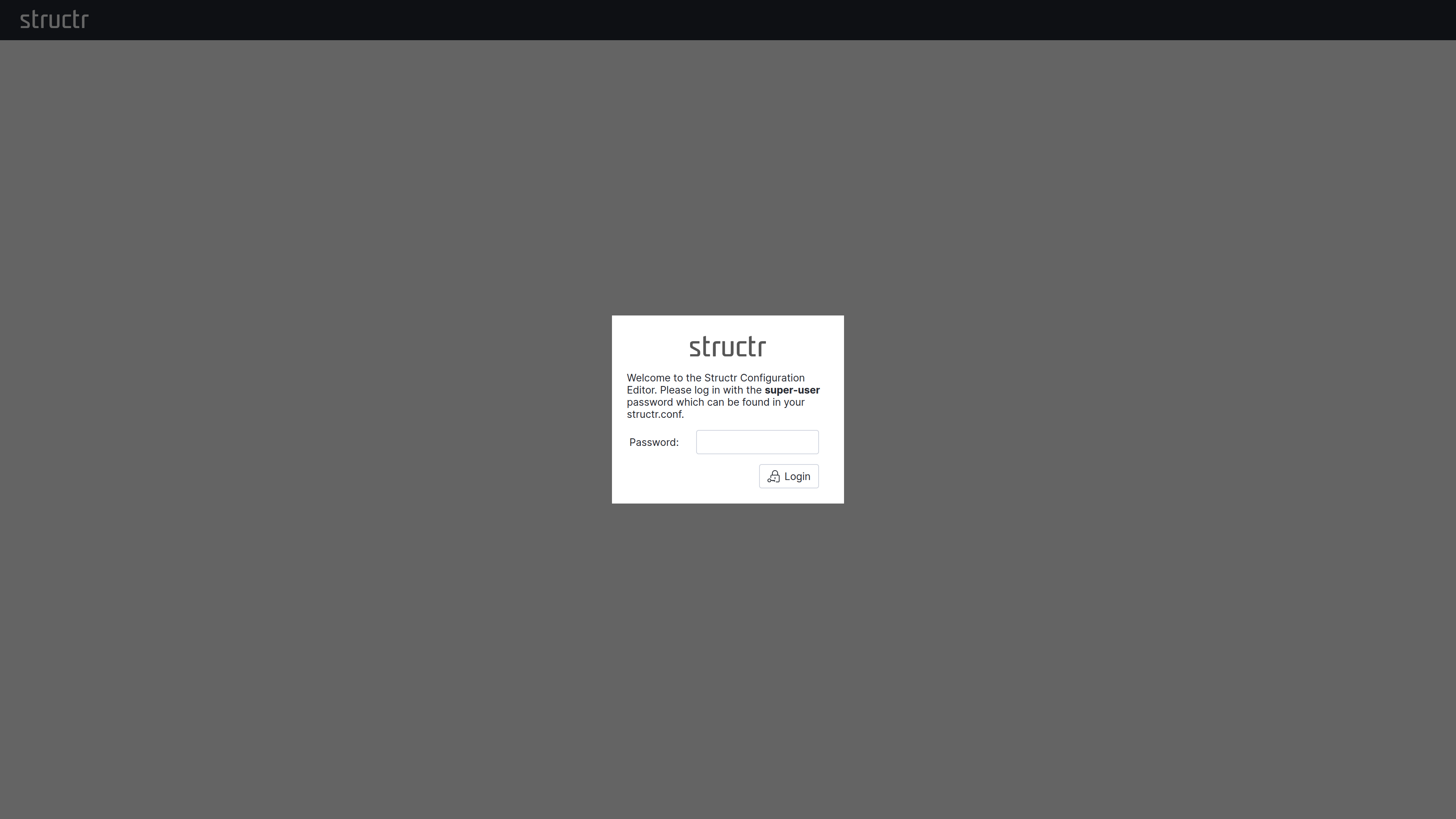
This separation is intentional. The Configuration Interface provides access to sensitive operations that go beyond normal application administration: you can configure database connections, restart services, and define cron expressions for scheduled functions. These capabilities would otherwise require direct access to maintenance commands or configuration files. By requiring a separate authentication with the superuser password, Structr adds an additional layer of security that protects these critical settings even if an attacker gains access to a regular admin account.
Interface Layout
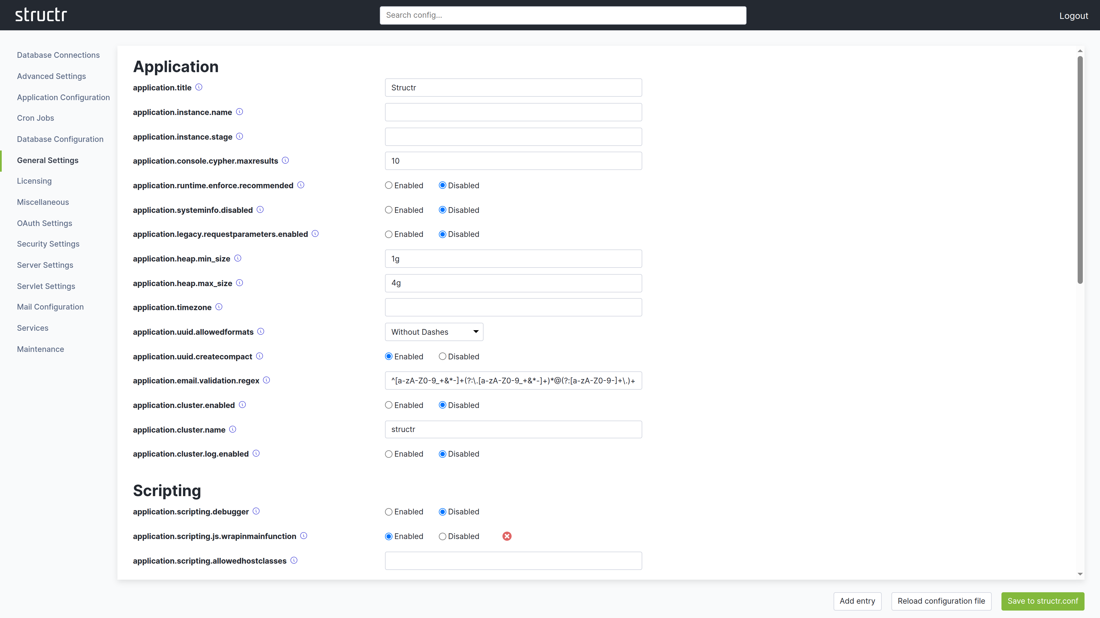
The Configuration Interface uses a different layout than other areas of the Admin UI. The header bar is present at the top, but it contains no main navigation menu. In the top right corner, you find a logout link to end your session in the Configuration Interface.
Instead of a menu, the secondary area below the header provides a search field that filters configuration options by name or description.
The main area is divided into two sections. The left side displays a list of categories. Depending on your screen resolution, this list may appear at the top instead of on the left. Click a category to display its settings on the right side. Each setting shows its current value, default value, and a description of its purpose.
At the bottom of the screen, you find buttons to create new configuration entries, reload the configuration file, and save your changes. When you modify a setting, click Save to structr.conf in the bottom right corner to persist your changes.
Some settings display a small red button next to them. Clicking this button resets the setting to its default value and saves the change automatically. You do not need to click the save button separately for these reset operations.
What You Can Configure
Settings are organized into categories such as application settings, database configuration, HTTP server options, security settings, and more. Most changes take effect immediately, though some require a server restart.
Beyond simple configuration values, the Configuration Interface is currently the only place where you can define cron expressions for user-defined functions. This allows you to schedule functions to run at specific intervals without writing additional code.
Database Connections
The Database Connections section manages the database connections. Each connection has a Name, a Driver, the Connection URL, the Database Name and the Username and Password of the database user; “Set Neo4j defaults” fills in the usual values for a local Neo4j instance. Three drivers are available: Neo4j Remote (Bolt) connects to a running Neo4j server, Neo4j Embedded runs a Neo4j database inside the Structr process and stores its data in the folder configured as database.path, and In-Memory keeps all data in memory and loses it when the server stops. You add a connection with “Create new database connection” and “Add connection”, optionally with “Connect immediately”. Each configured connection can be saved, connected, disconnected or deleted. Only one connection is active at a time.
First Start
When Structr starts for the first time without a configured database, the Configuration Interface opens in configuration-only mode. Because no superuser password exists yet, it asks for a setup token instead. Structr generates the token at every start until the setup is completed and writes it to the server log in a line beginning with Initial setup:. Only someone who can read the log can run the setup. The token is never stored and becomes worthless as soon as the setup is completed.
After entering the token, a Start tab lists the two steps that are required before the server can start: set up the superuser credentials, and configure a database connection. The Database Connections section offers three ways to do the latter: “Create new database connection” for a running Neo4j server, “Use Neo4j Embedded”, which creates and connects an embedded Neo4j database in the folder configured as database.path with one click, and “Start in demo mode”, which runs without a persistent database and loses all data when the server stops. Once both steps are done, Structr starts the server and the regular login with the superuser credentials applies from then on.
A login to the Configuration Interface expires after the period configured in application.session.timeout, like any other session.
For a complete reference of all available settings, see the Settings chapter in the References section.
Basics
Admin User Interface
Only administrators can use the Structr Admin User Interface. Regular users cannot log in, and attempting to do so produces the error message User has no backend access. That means every Structr application with a user interface needs a Login page to allow non-admin users to use it. There is no built-in login option for non-admin users.