Structr
Building Applications
Overview
This chapter provides an overview of the individual steps involved in creating a Structr application.
Basics
First things first - there are some things you need to know before you start.
Admin User Interface
Only administrators can use the Structr Admin User Interface. Regular users cannot log in, and attempting to do so produces the error message User has no backend access. That means every Structr application with a user interface needs a Login page to allow non-admin users to use it. There is no built-in login option for non-admin users.
Access Levels
Access to every object in Structr must be explicitly granted - this also applies to pages and their elements. There are different access levels that play a role in application development.
- Administrators (indicated by
isAdmin = true) have unrestricted access to all database data and REST endpoints. - Each object has two visibility flags that can be set separately.
visibleToPublicUsers = trueallows the object to be read without authentication (read-only)visibleToAuthenticatedUsers = truemakes the object accessible for authenticated users (read-only)
- Each object has an ownership relationship to the user that created it.
- Each object can have one or more security relationships that control access for individual users or groups.
- Access rights for all objects of a specific type can be configured separately for individual groups in the schema.
Access Control
- The data model may only be changed by administrators, as it is a security-critical component.
- Access to pages and templates is usually controlled by visibility flags or, in rarer cases, by group membership.
- Access to files in the file system is usually controlled by visibility flags or by ownership.
Define the Data Model
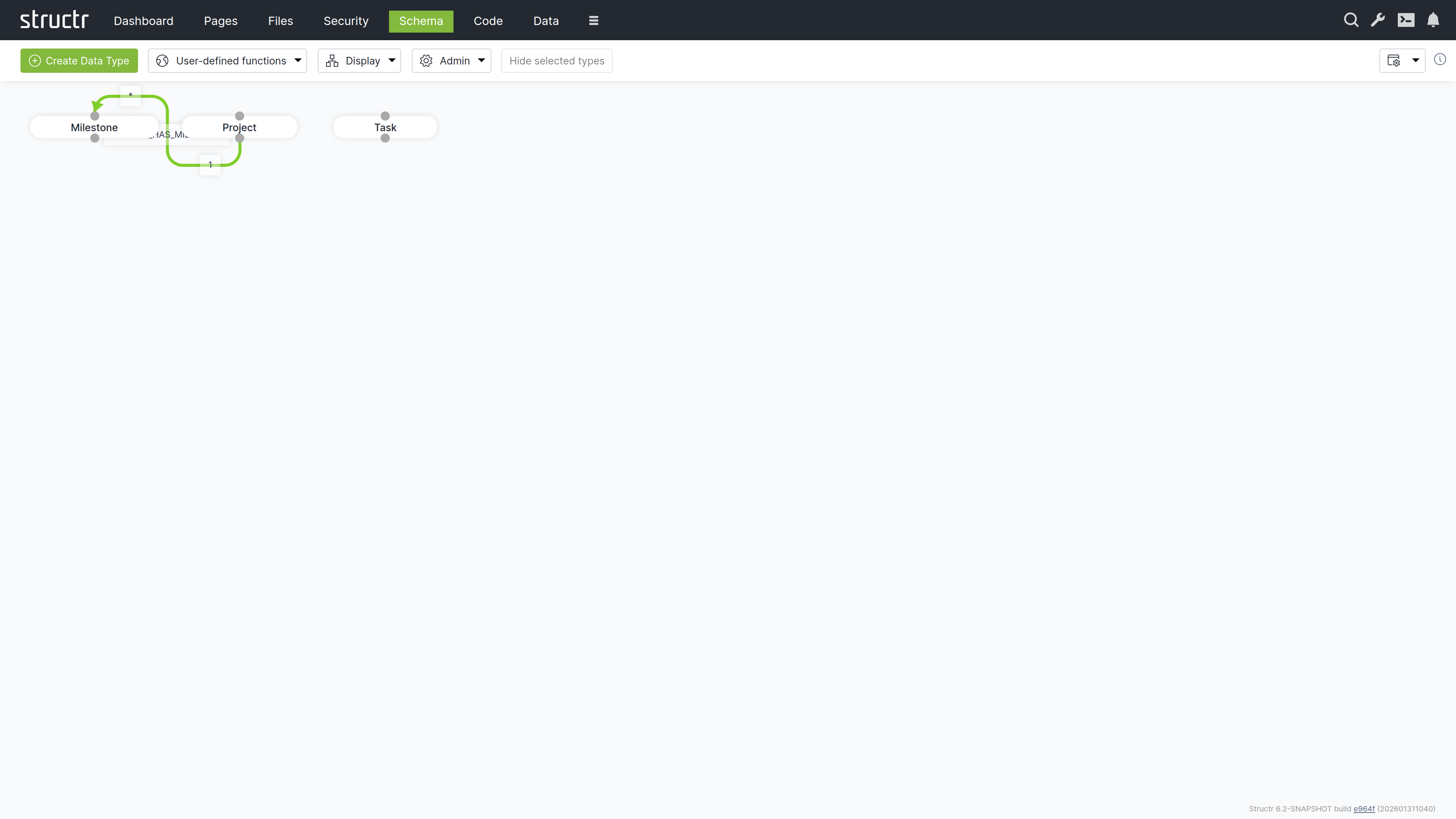
Defining the data model is usually the first step in developing a Structr application. The data model controls how data is stored in the database, which fields are present in the REST endpoints and much more. It contains all information about the data types (or classes), their properties and how the objects are related, as well as their methods.
Types
The data model consists of data types that can have relationships between them. Types can have attributes to store your data, and methods to implement business logic.
Data Modeling
If you are unsure how best to design your data model, the chapter on the Data Model provides a short introduction to this topic.
Relationships
When you define a relationship between two types, it serves as a blueprint for the structures created in the database. Each type automatically receives a special attribute that manages the connections between instances of these types.
Attributes
Data types and relationships can be extended with custom attributes and constraints. Structr ensures that structural and value-based schema constraints are never violated, guaranteeing consistency and compliance with the rules defined in your schema.
For example, you can define a uniqueness constraint on a specific attribute of a type so that there can only be one object with the same attribute value in the database, or you can require that a specific attribute cannot be null.
Where To Go From Here?
There are currently two different areas in the Structr Admin User Interface where the data model can be edited: Schema and Code. The Schema area contains the visual schema editor, which can be used to manage types and relationships, while the Code area is more for developing business logic. In both areas, new types can be created and existing types can be edited.
Read more about data modeling.
Create or Import Data
If you are building an application to work with existing data, there are several ways to bring that data into the system.
Create Data Manually
You can create data in any scripting context using the built-in create() function, in the Admin Console, via REST and in the Data area.
Using the Create Function
This JavaScript example assumes that you already have a data model with Project and Task linked together. You could put this code into a user-defined function or a method on the Project type.
{
    let project = $.create('Project', { name: 'My first project' });

    $.create('Task', { name: 'A task', project: project });
}
CSV
You can import CSV data in two different ways:
- Using the CSV Import Wizard in the Files Section. This is the preferred option, although it is somewhat difficult to find. To use it, you first have to upload a CSV file to Structr. An icon will then appear in the context menu of this file, which you can use to open the import wizard.
- Using the Simple Import Dialog in the Data Section. This importer is limited to a single type and can only process inputs of up to 100,000 characters, but it is a good option for getting started.
XML
The XML import works in the same way as the file-based CSV import. First, you need to upload an XML file, then you can access the XML Import Wizard in the context menu for this file in the Files area.
JSON
If your data is in JSON format, you can easily import individual objects or even larger amounts of data via the REST interface by using the endpoints automatically created by Structr for the individual data types in your data model.
Read more about Creating & Importing Data.
Create the User Interface
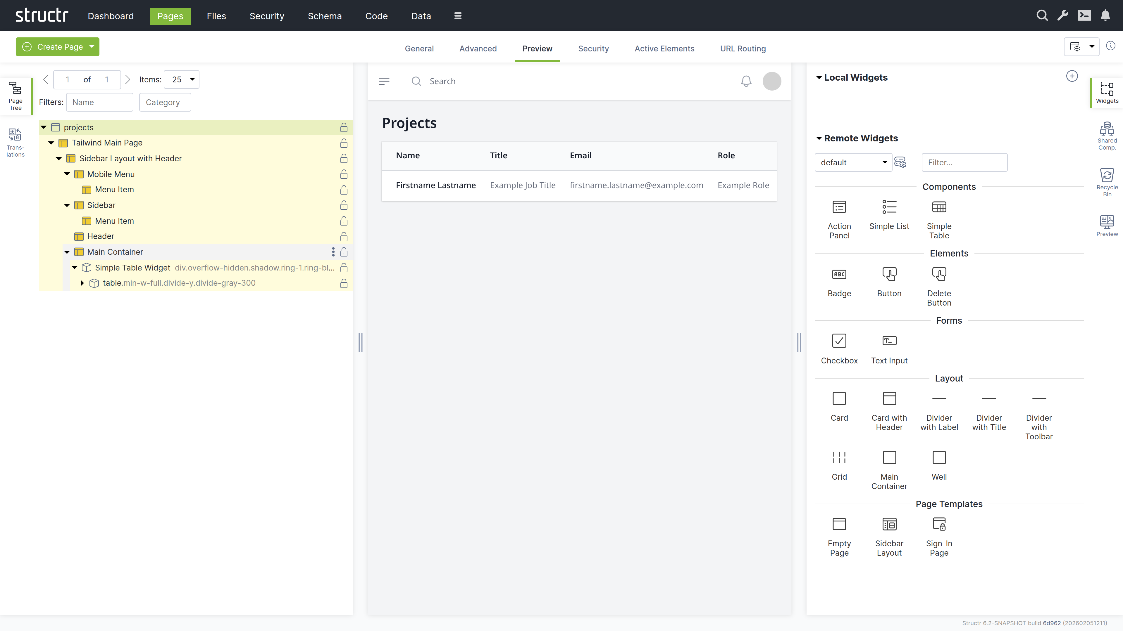
A Structr application’s user interface consists of one or more HTML pages. Each page is rendered by the page rendering engine and served at a specific URL. The Pages area provides a visual editor for those pages and allows you to configure all aspects of the user interface.
Pages and Elements
Individual pages consist of larger template blocks, nested HTML elements, or a combination of both. You can also use reusable elements called Shared Components and insertable templates known as Widgets to build your interface. Widgets can be assembled into widget libraries with enforced nesting rules, and some Widgets produce data-driven components that render tables, lists, and forms directly from a DataSource.
Read more about Pages & Templates. Read more about Widgets & Components.
CSS, Javascript, Images
Static resources like CSS files, JavaScript files, images and videos are stored in the integrated filesystem in the Files area and can be accessed directly via their full path, allowing you to reference them in your pages using standard HTML tags or CSS. Please note that the visibility restrictions also apply to files and folders.
Read more about the Filesystem.
Navigation and Error Handling
Pages in Structr are accessible at URLs that match their names. For example, a page named “index” is available at /index.
Error Page
When a user navigates to a non-existent page, Structr returns a 404 Not Found error by default. To provide a custom error page instead, set its showOnErrorCodes attribute to “404” and Structr will display this page for any 404 errors.
Start Page
When users navigate to the root URL (/), Structr displays the visible page with the lowest value in its position attribute, which you can set on the General tab of the page. If a page has a URL route for /, that route takes precedence over the position lookup. Note that the start page must be visible to public users, otherwise they will receive a 404 error instead of seeing your start page.
Read more about Navigation & Routing.
Dynamic Content
All content is rendered on the server and sent to the client as HTML. To create dynamic content based on your data, you can insert values from database objects into pages using template expressions. To display multiple database objects, you use repeaters, which execute a database query and render the element once for each result. For more complex logic, you can embed larger script blocks directly in your page code to perform calculations or manipulate data before rendering
Template Expressions
<h2 title="${project.description}">${project.id}</h2>
Partial Reload
Individual elements can be addressed separately to render their content as HTML, making it easy to reload parts of the page without a complete page reload.
Read more about Dynamic Content.
User Input & Forms
To handle user input in a Structr application, you can configure Event Action Mappings (EAM) that connect DOM events to backend operations. For example, you can configure a click event on a button to create a new Project object. EAM passes values from input fields to the backend, so you can execute business logic with user input, create and update database objects with form data, or trigger custom workflows based on form submissions.
Read more about Event Action Mapping.
Implement Business Logic
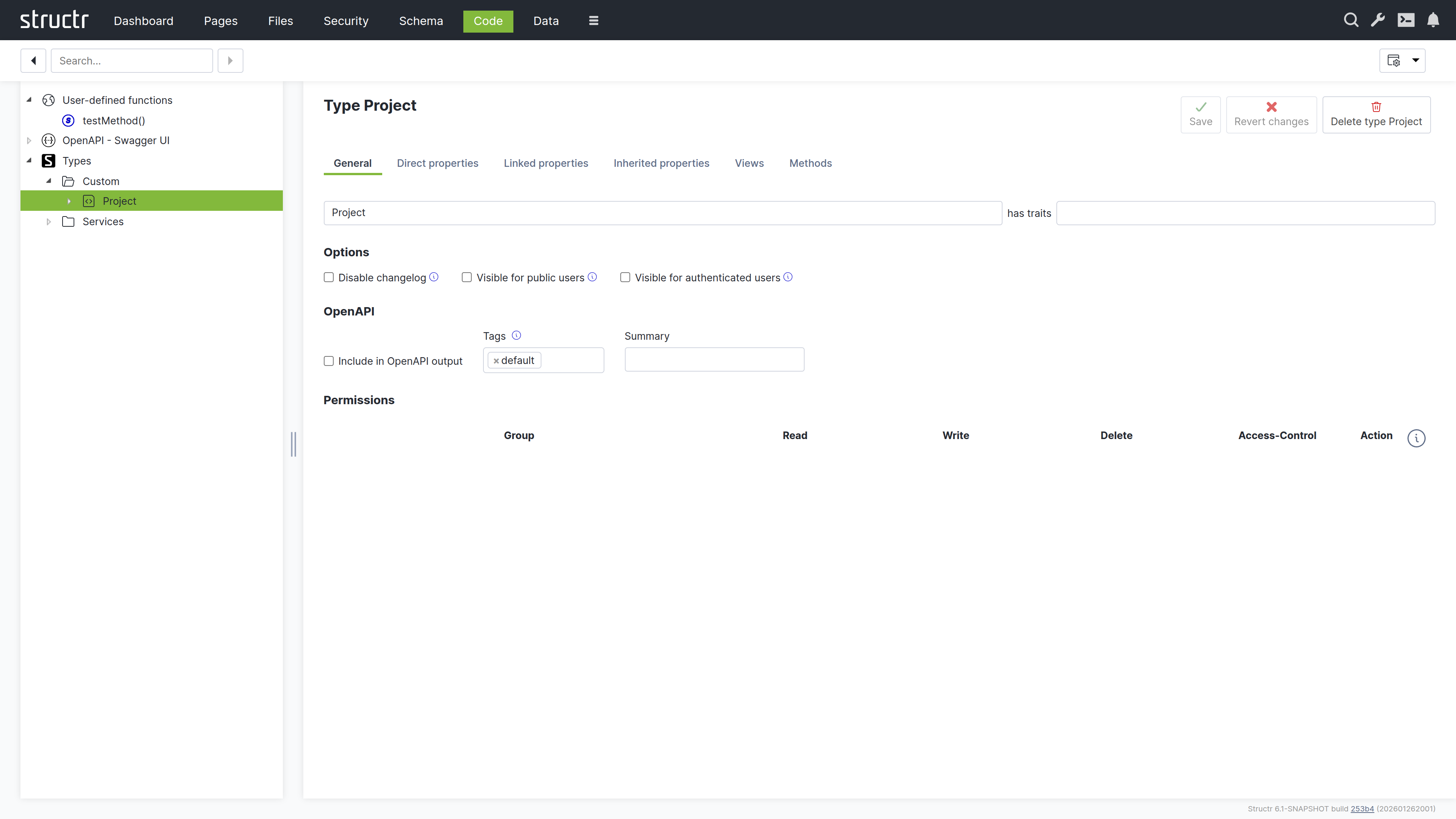
Structr offers a wide range of options for implementing business logic in your application. These include time-controlled processes like scheduled imports, event-driven processes triggered through external interfaces or the application front end, and lifecycle methods that respond to data creation, modification, and deletion in the database.
Methods
You can define methods on your custom types to encapsulate type-specific logic. These methods come in two forms: instance methods and static methods.
Instance Methods
Instance methods work on individual objects of a type and access their data through the this keyword. You can use them to calculate values, generate documents, or perform operations on specific instances. For example, an instance method on a Customer type can calculate the total value of all orders for that particular customer, or a method on an Invoice type can generate a PDF document for that specific invoice.
Static Methods
Static methods operate at the type level rather than on individual instances. They do not have access to this because they are not associated with a specific object. They are used for operations that affect multiple objects, such as finding all customers in a specific region, performing batch operations, or implementing factory patterns that create new instances with specific configurations.
Functions
Structr provides two categories of application-wide functions: built-in functions and user-defined functions.
Built-in Functions
Built-in functions offer ready-to-use functionality for common tasks like sending emails, making HTTP requests, parsing JSON and XML, working with files, and querying the database. These functions are available throughout the platform wherever you write script code.
Read more about Built-in functions.
User-defined Functions
You can also create user-defined functions for custom application-wide logic. These functions can be called from anywhere in your application and can be scheduled for automatic execution using the cron service, useful for maintenance tasks, periodic imports, or automated reports. For scheduling, Structr uses an extended cron syntax that supports second-precision scheduling, allowing for more granular control than standard cron expressions.
Lifecycle Methods
Lifecycle methods are optional instance methods that execute automatically in response to specific database events such as object creation, modification, or deletion. They must be added explicitly to a type in order to be executed. You can use them to validate data before it is saved, update related objects when changes occur, send notifications when specific conditions are met, or trigger workflows based on data changes.
Lifecycle methods have access to the object being modified through the this keyword, making them suitable for enforcing business rules and maintaining data consistency.
Read more about Business Logic.
Integrate With Other Systems
Structr provides integration options for external systems, including built-in authentication interfaces that you can configure. For other integrations, you can write custom business logic and interface code to connect to APIs, databases, message brokers, or other services based on your requirements.
OAuth
Structr supports OAuth 2.0 for user authentication, enabling integration with external identity providers such as Microsoft Entra ID, Google, Auth0, and other OAuth-compliant services. This allows users to authenticate using their existing organizational or social media credentials instead of maintaining separate login credentials for Structr.
Emails & SMTP
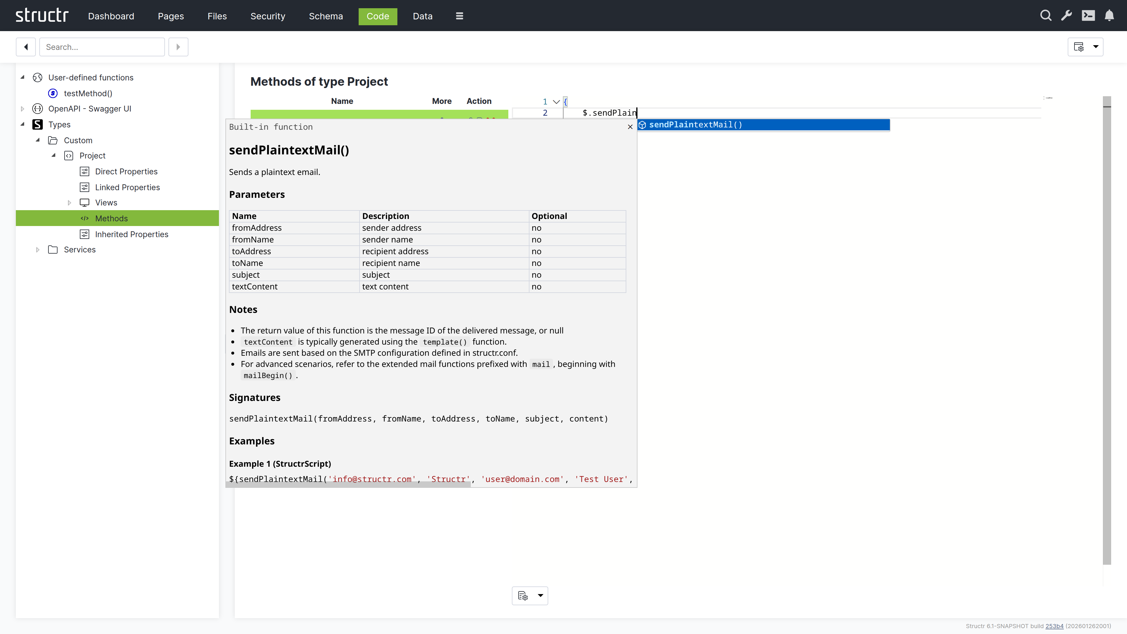
Structr allows you to send plain text or HTML emails with attachments from any business logic method. You can also retrieve emails from IMAP mailboxes and trigger automated responses to incoming messages through lifecycle methods or custom workflows.
Example
{
    let fromAddress = 'info@example.com';
    let fromName    = 'Example Sender';
    let toAddress   = 'recipient@example.com';
    let toName      = 'Example Recipient';
    let subject     = 'Hello world.';
    let content     = 'Example plaintext content';

    $.sendPlaintextMail(fromAddress, fromName, toAddress, toName, subject, content);
}
Read more about Emails & SMTP.
REST Interface
The REST interface allows you to exchange data with external systems and expose business logic methods as REST endpoints. Methods accept arbitrary JSON input and return structured JSON output, making it easy to build custom APIs and integrate Structr into existing workflows or architectures.
Views
Views control the JSON representation of types in the REST API. By default, the REST API uses the public view, which you can customize by adding or removing attributes to match your requirements. For advanced use cases, you can create additional custom views and access them via separate URLs.
Markdown Rendering Hint: MarkdownTopic(Example) not rendered because level 5 >= maxLevels (5)
Message Brokers
You can connect Structr to MQTT, Kafka, or Apache Pulsar by creating a custom type that extends one of Structr’s built-in client types (MQTTClient, KafkaClient, or PulsarClient) and implementing an onMessage lifecycle method to handle incoming messages.
When configured and activated, the client automatically connects to the message broker and executes your onMessage method whenever a new message arrives on the subscribed topics. This allows you to build event-driven applications that react to external events in real-time, process streaming data, or integrate with IoT devices and microservices architectures.
Read more about Message Brokers.
Other Databases
JDBC
The built-in jdbc() function allows you to execute SQL queries directly against external JDBC-compatible databases. Query results are automatically transformed into objects that can be used in any scripting context. Results can be displayed dynamically in frontend views, used in business logic for calculations and transformations, or imported and stored as Structr objects for further processing.
Example
{
    // get JDBC URL from structr.conf
    let url  = $.config('mysql.connection.string');
    let rows = $.jdbc(url, 'SELECT * from Project');

    for (let row of rows) {

        // handle rows..
    }
}
MongoDB
Similar to jdbc(), the built-in mongodb() function enables direct access to collections in external MongoDB databases.
Read more about Built-in functions.
Data Model
The process of creating a Structr application usually begins with the data model. This chapter focuses on the various steps required to define and implement your data model and serves as a guide to help you navigate the multitude of possibilities.
Data Model vs. Schema
The data model is the abstract design of your application’s data and defines the types of objects, their attributes, and how they relate to each other. The schema is the concrete implementation of that model inside Structr, defining the types, properties, relationships, methods, and constraints that the system enforces at runtime.
In Structr, the gap between the two is unusually small. Because Structr stores the schema itself as a graph in the underlying graph database, types map to nodes, relationships map to edges, and properties map to attributes on those nodes, closely mirroring the structure of the data model.
The Schema Editor is the primary tool for creating and editing the schema. Because the schema maps so directly to the data model, it effectively doubles as a data modeling tool. Throughout this chapter, we use data model when referring to the abstract design and schema when referring to the implementation in Structr.
A Primer on Data Modeling
The data model should mirror the attributes and relationships that objects have in the real world as closely as possible. A few basic rules help you determine whether an object should be modeled as a node, a relationship, or a property.
When to Use Nodes?
Most things that you would use a noun to describe should be modeled as nodes.
- real-world objects like people, companies, documents, products
- abstract objects that are distinct entities with a unique identity and one or more attributes
- properties that several objects can have in common, like an address or a category
- collections of property values (the items of a list, etc.)
- relationships between more than two objects (hyper-relationships)
When to Use Properties?
Most things that you would use an adjective to describe should be modeled as a properties.
- single values like an ID, a name, a color, etc.
- time or date values (if you are not using a time tree index)
When to Use Relationships?
Most things that you would use a verb to describe should be modeled as relationships.
- relationships between objects that are not based on a single property
- actions or activities
- facts
These rules apply at the data modeling level. When you translate them into the Structr schema, nodes become schema types, relationships become schema relationships, and properties become schema properties but the conceptual thinking stays the same.
Creating a Basic Type
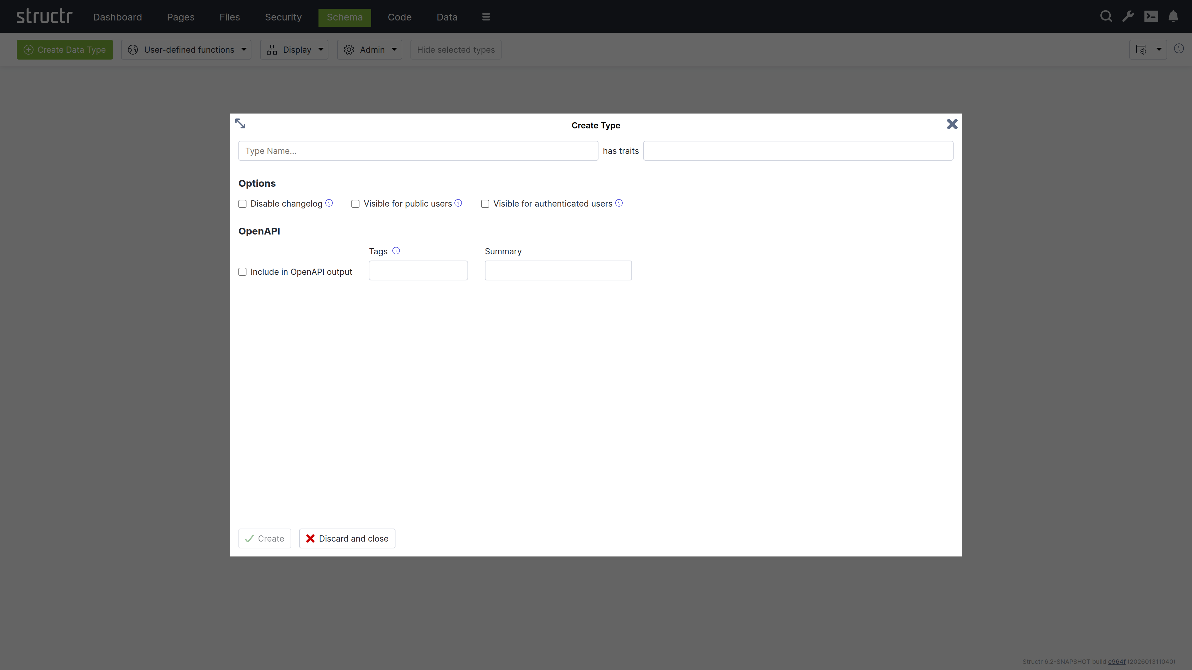
To create a new type in the schema, click the green “Create Data Type” button in the top left corner of the Schema area.
Name & Traits
When you create a new data type, you will first be asked to enter a name for the new type and, if desired, select one or more traits. You can choose from a list of built-in traits to take advantage of functionality provided by Structr.
Changelog
The Disable Changelog checkbox allows you to exclude this type from the changelog - if the changelog is activated in the Structr settings.
Read more about the Changelog.
Default Visibility
The two visibility checkboxes allow you to automatically make all instances of the new type public or visible to logged-in users. This is useful, for example, if the data is used in the application, such as the topics in a forum.
OpenAPI
The OpenAPI settings allow you to include the new types in the automatically generated OpenAPI description provided by Structr at /structr/openapi.
All types for which you activate the “Include in OpenAPI output” checkbox and enter the same tag will be provided together with the standard endpoints for login, logout, etc. at /structr/openapi/<tag>.json.
Other Ways to Create Types in the Schema
Like all other parts of the application, the schema definition itself is stored as a graph in the database. This means you can also create new types by adding objects of type SchemaNode with the name of the desired type in the name attribute, and you can also do this from a script or method using the create() function. This is another illustration of how closely the schema and the underlying graph structure are aligned: The schema is data in the same database it describes.
Extending a Type
When you click Create in the Create Type dialog, the new type is created and the dialog switches to an Edit Type dialog. You can also open the Edit Type dialog by hovering over a type node and clicking the pencil icon.
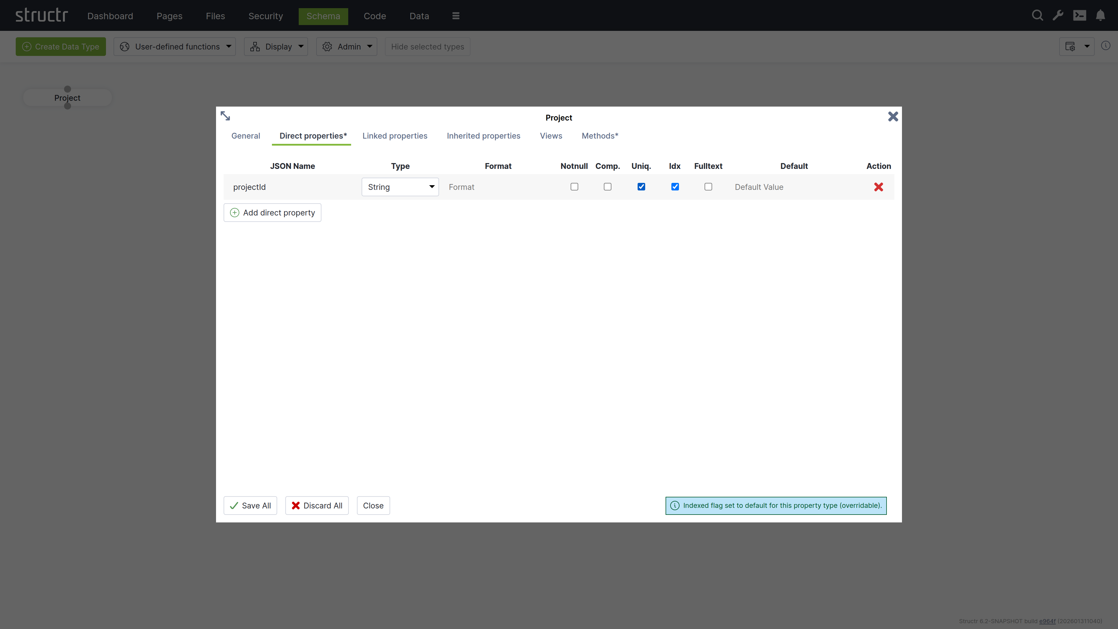
The dialog consists of six tabs that configure type properties or display type information.
General
The General tab is similar to the Create Type dialog and provides configuration options for name, traits, changelog and visibility checkboxes, and a Permissions table. The Permissions table allows you to grant specific groups access rights to all instances of the type.
Direct Properties
Direct properties are values stored locally on the node or relationship itself, directly attached to the object in the database. They typically hold simple values like strings, numbers, dates, or booleans, but can also have more complex types like Function or Cypher properties that compute their values dynamically. The Direct Properties tab displays a table where you add and edit these attributes. Each row represents an attribute with the following configuration options.
JSON Name & DB Name¹
JSON Name specifies the attribute name used to access the attribute in code, REST APIs, and other interfaces.
¹ There is an additional setting that is hidden by default: DB Name, which allows you to specify a different database name when working with a database schema you don’t control. Enable this setting through the “Show database name for direct properties” checkbox in the configuration menu in the upper right corner of the Schema area.
Type
Type specifies the attribute’s data type. Common types include String for text values, Integer for whole numbers, and Date for timestamps and date values. Additional types are available, including array versions of these primitive data types.
The type controls what values are accepted as input. For example, an integer attribute only accepts numeric input. A date attribute accepts string values in ISO-8601 format or according to a custom date pattern specified in the format column. Structr stores dates as long values with millisecond precision in the database.
| Type | Description |
|---|---|
Boolean | True/false values. Returns false instead of null when empty. |
Boolean[] | Array of boolean values. |
Byte[] | Binary data stored directly on the node. |
Count | Read-only integer that returns the number of elements in the collection property named in the Format field. |
Cypher | Read-only computed property that executes a Cypher query. |
Date | Date and time, stored as milliseconds. Accepts ISO-8601 or custom format patterns. |
Date[] | Array of date values. |
Double | Floating point numbers with decimal precision. |
Double[] | Array of double values. |
Encrypted | String stored with AES encryption. Automatically encrypted on write and decrypted on read with key from structr.conf. |
Enum | String constrained to allowed values defined in the Format field. |
Enum[] | Array of enum values, each constrained to the allowed values. |
Function | Computed property with read and write functions. Configure a type hint for proper indexing. |
Integer | 32-bit whole numbers. |
Integer[] | Array of integer values. |
Join | Read-only string that joins the values of the properties listed in the Format field into a single formatted string. |
Long | 64-bit whole numbers, for large values or identifiers. |
Notion | Exposes a property of a related node as if it were a property of this node. The Format field names the relationship property and the remote property, for example owner, name. |
Long[] | Array of long values. |
String | Text values. Supports fulltext indexing for advanced search. |
String[] | Array of strings. |
Thumbnail | Read-only property that returns a scaled version of an image. Configure dimensions in Format field as “width, height” or “width, height, crop”. |
ZonedDateTime | Date and time with timezone information preserved. |
For Boolean properties, Structr uses passive indexing – the value is written to the database at transaction end, ensuring Cypher queries can find objects with false values. Function properties also use passive indexing when indexed is enabled.
Format
The Format field is optional and has different meanings depending on the attribute type.
- For date attributes, the format specifies a date pattern following Java’s SimpleDateFormat specification. This allows you to accept date strings in custom formats beyond the default ISO-8601 format while still writing the millisecond-precision
longvalue into the database. - For enum attributes, the format field is interpreted as a comma-separated list of possible values. For example, “small, medium, large” defines an enum property that can only be set to one of those three values.
- For numeric attributes, the format specifies a valid range using mathematical interval notation, allowing you to enforce that input values fall within a certain interval. For example, [2,100[ accepts values from 2 (inclusive) to 100 (exclusive).
- For string attributes, the format is interpreted as a regular expression that validates input. All values written to the attribute must match this regular expression pattern.
Notnull
If you activate the not-null checkbox, the attribute becomes a mandatory attribute for this type, and the creation of objects without a value for this attribute is prevented with a validation error.
Please note that this only applies to newly created objects. If existing objects are modified after this change, the change can only be saved successfully if the mandatory attribute is also set.
Comp.
Comp. stands for Compound Uniqueness, which validates uniqueness across multiple attributes. When you activate the compound uniqueness checkbox on multiple attributes, the system ensures their combined values form a unique combination. For example, if you enable composite uniqueness on both firstName and lastName, the system allows multiple people named “John” and multiple people named “Smith”, but prevents creating two entries with the same combination of “John Smith”.
Uniq.
Uniq. stands for Unique, which validates that an attribute’s value is unique across all instances of the type. When you activate the uniqueness checkbox on an attribute, the system ensures no two instances have the same value for that attribute. For example, if you enable uniqueness on an email attribute, the system prevents creating two User instances with the same e-mail address.
Idx
Idx. stands for Indexed. When you activate the indexed checkbox on an attribute, the system creates a database index that improves query performance for that attribute. Indexing also speeds up uniqueness validation - not having an index on a unique property will massively impact object creation performance.
Fulltext
Fulltext stands for fulltext indexing. When you activate the fulltext checkbox on a string attribute, the system creates a fulltext index with advanced search capabilities and scoring.
You can query fulltext indexed attributes by passing the index name to the searchFulltext() function. The index name is automatically generated from the type and attribute name plus the string “fulltext”, e.g. Project_projectId_fulltext.
Default Value
The default value field specifies a value that is returned when an attribute has no value in the database. You can use default values to ensure attributes always return a meaningful value, even for newly created objects or when values have not been set.
Encrypted Properties
The EncryptedString property type stores text in encrypted format using AES encryption. The encryption key is stored in structr.conf.
Use this property type for sensitive data that should not be stored in plain text, such as API keys, tokens, or personal information that requires protection at the database level.
When you read an EncryptedString property, Structr automatically decrypts it. When you write to it, Structr encrypts the value before storing it.
Note that this protects data in the database but not during transmission – use HTTPS for transport encryption.
Linked Properties
In contrast to direct properties, linked properties are not stored on the node itself. They represent related objects that are reachable through relationships - single objects or collections of objects connected to the current node in the graph. Where direct properties hold simple values, linked properties provide access to complex objects in the vicinity of a node.
The Linked Properties tab displays a table with one row per relationship. Each row shows the property name for this side of the relationship, the relationship details, and the target type. You can edit the property name directly in the table and navigate to the target type by clicking it.
Inherited Properties
This section displays attributes inherited from traits or base classes along with their settings.
Views
The Views tab allows you to configure views for each type. A view is a named collection of attributes that can be accessed via REST and from within the scripting environment, controlling which attributes are included in REST interface output. Structr provides the following four default views.
public
The public view is the default view for REST responses when no view is specified in the request. By default, it contains only the attributes id, type, and name, but you can extend or modify it as needed.
custom
The custom view is automatically managed and contains all attributes of the type and its base classes or traits that you have added manually.
all
The all view is automatically managed by Structr and contains all attributes of the type and its base classes or traits. You cannot modify this view, and it displays only one level of properties while restricting the output of nested objects to id, type, and name to prevent recursion. The all view is intended for internal use and diagnostic purposes such as checking object completeness, and its use should generally be avoided in production applications.
ui
The ui view is an internal view used by the Structr Admin interface and cannot be modified. Like the all view, it displays only one level of properties and restricts the output of nested objects to id, type, and name.
Custom Views
You can create additional views beyond these default views and populate them with any attributes you need. Custom views allow you to tailor the REST output to specific use cases, such as creating a minimal view for list endpoints or a detailed view for single-object requests. You can access each view as its own endpoint by appending the view name to the REST URL of a type.
{{“JSON Nesting Depth”, h4, shortDescription}}
Methods
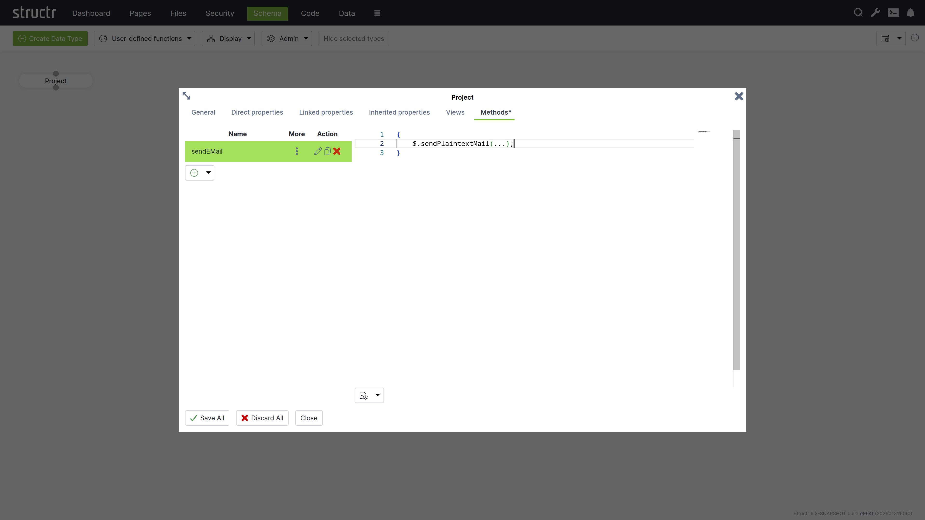
The Methods tab allows you to define custom methods and lifecycle methods for a type. The tab is divided into two sections: a method list on the left and a code editor on the right.
Method List
The left section displays a table of all methods defined on the type, with columns for name, options (three-dot menu), and action buttons. The action buttons let you edit, clone, or delete methods.
Below the table is a dropdown button for creating new methods. You can create either a custom method with a name of your choice, or select one of seven predefined lifecycle methods: onNodeCreation, onCreate, afterCreate, onSave, afterSave, onDelete and afterDelete. When you select a lifecycle method, the system assigns the method name automatically. The onNodeCreation method runs immediately after a node has been created, before onCreate and before the transaction is committed, so an error in this method still prevents the commit.
The three-dot menu in the options column provides access to method configuration settings:
Markdown Rendering Hint: MarkdownTopic(Method is Static) not rendered because level 5 >= maxLevels (5)
Markdown Rendering Hint: MarkdownTopic(Not Callable via HTTP) not rendered because level 5 >= maxLevels (5)
Markdown Rendering Hint: MarkdownTopic(HTTP Verb) not rendered because level 5 >= maxLevels (5)
Markdown Rendering Hint: MarkdownTopic(Wrap JavaScript in main()) not rendered because level 5 >= maxLevels (5)
Markdown Rendering Hint: MarkdownTopic(Return Result Object Only) not rendered because level 5 >= maxLevels (5)
Code Editor
The right section provides a code editor with autocompletion and syntax highlighting for editing method source code. You write methods in either StructrScript or JavaScript. To use JavaScript, enclose your code in curly braces {...}. Code without curly braces is interpreted as StructrScript.
Computed Properties
In addition to properties that store primitive values, Structr provides computed properties that execute code when their value is requested. These properties generate values dynamically based on the current state of the object and its relationships, enabling calculated attributes without storing redundant data.
Structr provides two types of computed properties:
Function Properties
Function Properties contain both a read function and a write function, allowing you to define custom logic for both retrieving and storing values.
Read Function
The read function executes when the property value is requested. It can execute StructrScript or JavaScript, perform calculations, call other methods, or aggregate data from related objects. You configure a type hint for function properties to inform the system what type of value the read function returns, which is essential for indexing.
Note: To enable the use of computed properties in database queries, Structr writes the generated values to the database at the end of each transaction and indexes them according to the configured type hint. This operation executes in the security context of the user making the query, hence read functions must return user-independent values that are globally valid.
If a read function returns different values for different users, the indexed value will reflect whichever user last triggered the calculation. This can cause other users to see incorrect data, as they will query against values calculated for a different user’s security context. Additionally, the type hint must accurately reflect the actual return type to ensure proper indexing behavior.
Write Function
The write function handles how incoming values are processed and stored when the property is set. Within the write function, you can access the incoming value using the value keyword, allowing you to validate, transform, or process the data before storing it.
Cypher Properties
Cypher properties are read-only computed properties that execute Cypher queries against the graph database. These properties are useful for traversing relationships, aggregating data, or performing complex graph queries. The result of the Cypher query becomes the property’s value when accessed.
Linking Two Types
To create a relationship between two types, click the lower dot on the start type and drag the green connector to the upper dot on the target type. This will open the Create Relationship dialog.
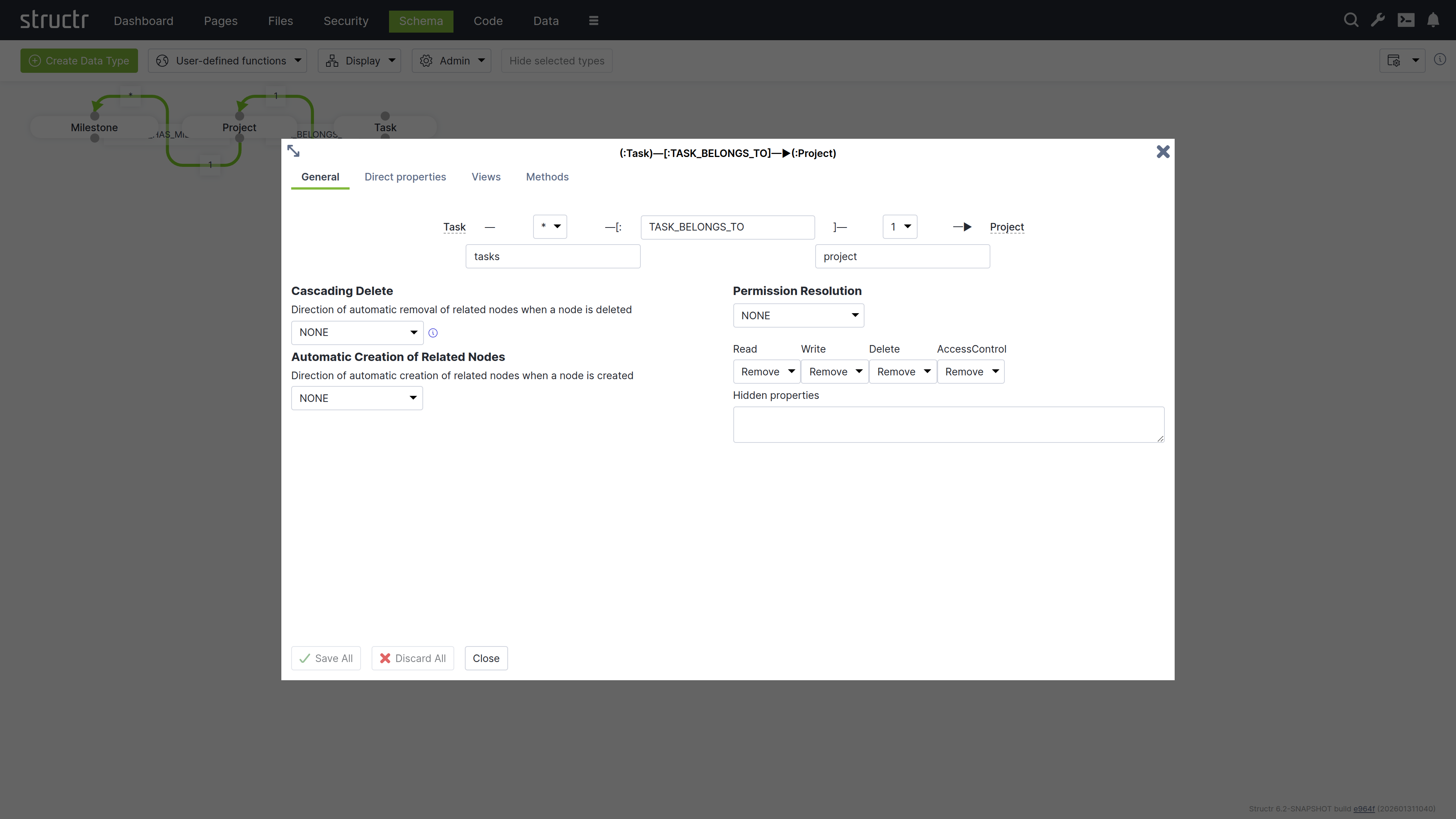
The Create Relationship Dialog consists of four areas.
Basic Relationship Properties
At the top of the dialog, you can configure the source cardinality, the relationship type, and the target cardinality. Below the cardinality selectors, you define the property names that determine how you access the relationship from each type in your code.
Cardinality
Select 1 or * from the dropdown for source and target cardinality to define how many objects can connect. Use 1 for single connections and * for multiple connections. For example, if each Project contains multiple Tasks but each Task belongs to one Project, select 1 for the source cardinality (Project side) and * for the target cardinality (Task side).
Relationship Type
Enter a name in the center input field that describes the relationship in the schema. This name corresponds directly to the relationship type stored in the graph database and is typically an action or connection like “OWNS”, “MANAGES”, or “BELONGS_TO”.
Note: Please be as specific as possible and try not to reuse existing relationship types, as this can lead to performance issues later on. For example, do not use “HAS” for everything, as you will then lose the advantage of being able to query different relationship types separately, and all data from the database will have to be filtered via the target type.
Property Names
Specify property names in the input fields below each cardinality selector to define the attribute names you use to retrieve related objects from each type. The property name on the Project side (e.g., tasks) lets you retrieve all tasks for a project, while the property name on the Task side (e.g., project) lets you access the parent project.
Structr suggests names automatically based on the type names and cardinalities - plural names for *-cardinality and singular names for 1-cardinality. You can change these suggestions to match your domain model.
Cascading Delete
The Cascading Delete dropdown controls deletion behavior for related objects. When you delete an object that has relationships to other objects, this setting determines whether those related objects are also deleted and how the deletion propagates through the relationship chain. When resolving cascading deletes, the system evaluates the access rights of each object to ensure that only objects you have permission to delete are affected.
Cascading Delete Options
The following cascading delete options exist.
| Name | Description |
|---|---|
NONE | No cascading delete |
SOURCE_TO_TARGET | If source is deleted, target will be deleted automatically. |
TARGET_TO_SOURCE | If target is deleted, source will be deleted automatically. |
ALWAYS | If any of the two nodes is deleted, the other will be deleted automatically. |
CONSTRAINT_BASED | Delete source or target node if deletion of the other side would result in a constraint violation on the node (e.g. not-null constraint). |
Automatic Creation of Related Nodes
The dropdown controls the automatic creation of related nodes. This feature allows Structr to function as a document database, transforming JSON documents into graph database structures based on your data model. When you send a JSON document that matches your schema, Structr creates the necessary objects and relationships in the graph database.
You can reference objects in your JSON using stub objects with any property that has a uniqueness constraint. The dropdown controls whether Structr creates the object if it doesn’t exist. Within a single document, the first reference to a unique property value creates the object and subsequent references to the same value use the newly created object. The dropdown determines how this automatic creation behavior propagates through nested relationships.
Example
{
    "name": "John Doe",
    "email": "john@example.com",
    "company": {
        "name": "Acme Corp"
    },
    "projects": [
        {
            "name": "Website Redesign",
            "status": "active"
        },
        {
            "name": "Mobile App",
            "status": "planning",
            "company": {
                "name": "Acme Corp"
            }
        }
    ]
}
This example shows a person with basic properties, a company referenced by name (stub object), and multiple projects. The second project also references “Acme Corp” - the first reference creates it, and the second reference uses the already-created company object.
Autocreation Options
The following automatic creation options exist.
| Name | Description |
|---|---|
NONE | No automatic creation of related nodes |
SOURCE_TO_TARGET | Target node will be created automatically if the input value is unique. |
TARGET_TO_SOURCE | Source node will be created automatically if the input value is unique. |
ALWAYS | Any of the two nodes will be created automatically if the input value is unique. |
Read more about the REST Interface.
Permission Resolution
Permission Resolution controls how access rights propagate between objects through relationships. This lets users access objects indirectly through relationships without needing direct permissions on those objects.
Propagation Direction
The Permission Resolution section begins with a dropdown showing the current propagation direction (initially None). This dropdown controls the flow of permissions through the relationship. You can configure permissions to propagate from source to target, from target to source, in both directions, or not at all. This determines which objects inherit access rights through the relationship.
Permission Types
You configure each permission type (read, write, delete, and access control) separately to control which permissions propagate in the configured direction. For example, you can keep read access while removing write and delete permissions, creating read-only access paths through your data model.
Hidden Properties
You can hide properties that should not be visible during indirect access: Structr removes these properties from the view. This is useful when you want to grant access to an object but restrict visibility of sensitive attributes like internal IDs or administrative fields.
Visual Indication in The Schema Editor
The schema editor displays relationships with permission resolution in orange instead of green, making it easy to identify which relationships include permission propagation rules.
Inheritance
Structr supports multiple inheritance through traits. When you create a type, you select one or more traits for it to inherit from, or leave the selection empty. Every type is composed on the base trait NodeInterface, which provides the default properties listed below. You can change the trait selection later when editing the type.
Order of Inherited Traits
The inheritance order is determined by the order in which you specify the traits. This is especially important when resolving properties or methods that exist on both traits.
Property Inheritance
Inherited properties are automatically visible on subtypes. All properties defined in parent traits become available on the inheriting type. You can override inherited properties by defining a property with the same name, which replaces the inherited property definition. The system detects conflicting properties and prevents their creation.
Default Properties
Every node in Structr has at least the following attributes that it inherits from the base trait NodeInterface.
| Name | Description | Type |
|---|---|---|
id | The primary identifer of the node, a UUIDv4 | string |
type | The type of the node | string |
name | The name of the node | string |
createdDate | The creation timestamp | date |
lastModifiedDate | The timestamp of the last modification | date |
visibleToPublicUsers | The “public visibility” flag | boolean |
visibleToAuthenticatedUsers | The “authenticated visibility” flag | boolean |
View Inheritance
Views are inherited from parent traits to child types. All views defined in parent traits become available on the child type. You can override inherited views by defining a view with the same name, which replaces the inherited view definition.
Method Inheritance
Schema methods are inherited from parent traits to child types. All methods defined in parent traits become available on the child type. You can override inherited methods by defining a method with the same name. Overridden methods are not called automatically, only your override executes.
You can call parent methods from child implementations using the syntax $.SuperType.methodName(), where SuperType is the name of the parent trait. For example, if your type Article inherits from a trait Content with a validate() method, you call $.Content.validate() from your Article.validate() method to execute the parent validation before adding your own.
Lifecycle Method Inheritance
Lifecycle methods follow different inheritance rules than regular methods. All lifecycle methods in the type hierarchy are called automatically, regardless of whether child types override them. This ensures that initialization, validation, and cleanup logic defined in parent traits always executes.
System Types
System types are built-in types that provide core functionality in Structr. They include types for users and groups, files and folders, pages and templates, email handling, and more. Each system type comes with predefined properties and methods. You can use these types directly or extend them in your schema to add custom properties and behavior. For details on extending types, see the Data Model chapter.
| Name | Description |
|---|---|
Group | |
MailTemplate | |
File | |
Image | |
Folder | |
Page | |
Scratchpad | |
Site | |
Template | |
User | |
Widget | |
MessageClient | |
EMailMessage | |
Mailbox | |
DataFeed |
Transactions & Indexing
All database operations in Structr follow ACID principles, ensuring your data remains consistent even in complex scenarios.
All-or-Nothing Operations
Transactions in Structr follow an all-or-nothing model. Either all changes within a transaction are committed to the database, or the entire transaction is rolled back and no changes are persisted. This prevents partial updates that could leave your data in an inconsistent state.
Thread-Level Transaction Handling
Structr handles each incoming request in a top-level transaction per thread. All operations performed during request processing occur within this transaction context, ensuring related changes are grouped together atomically.
Transaction Isolation
Structr transactions provide read-your-own-writes isolation. Within a transaction, you immediately see changes you’ve made, but you cannot see uncommitted changes from other concurrent transactions. Data from other transactions only becomes visible after those transactions are committed successfully. This isolation ensures concurrent operations don’t interfere with each other.
Two-Step Transaction Process
Structr uses a two-step transaction model:
Step 1: Pre-Commit Lifecycle Methods and Validation
During the transaction, the lifecycle methods onCreate, onSave, and onDelete are executed as objects are created, modified, or deleted. These methods are executed before validation occurs. If an object is created and then modified in the same transaction, only onCreate is executed. If an object is created, modified, and deleted in the same transaction, no lifecycle methods are executed. After all operations are completed, Structr validates all changes according to your schema constraints. If validation fails, the transaction is rolled back automatically and no changes are persisted. If validation succeeds, the transaction is committed.
Step 2: Post-Commit Lifecycle Methods
After the transaction is committed successfully and data is securely stored in the database, the lifecycle methods afterCreate, afterSave, and afterDelete are executed in a separate follow-up transaction. These methods are guaranteed to be executed only when data has been safely persisted, which makes them the best place for notifications like sending emails etc.
The Modifications Object
In onSave methods, you can access the modifications keyword to see exactly what changed. This read-only object contains four elements:
| Key | Contents |
|---|---|
before | Previous values of changed local properties |
after | New values of changed local properties |
added | Relationships that were added |
removed | Relationships that were removed |
Example – checking what changed in onSave:
{
    let modifications = $.retrieve('modifications');

    if (modifications.after.status === 'published') {
        // Status was changed to published
        $.log('Object published by ' + $.me.name);
    }
}
Example modifications object when visibility flags were changed:
{
    "before": {"visibleToAuthenticatedUsers": false, "visibleToPublicUsers": false},
    "after": {"visibleToAuthenticatedUsers": true, "visibleToPublicUsers": true},
    "added": {},
    "removed": {}
}
Example when a relationship was removed (note that removed contains UUIDs):
{
    "before": {},
    "after": {},
    "added": {},
    "removed": {"owner": "5ba37699ca8f4a8b92ded77c93629f0e"}
}
For “to-many” relationships, the values are arrays of UUIDs. For “to-one” relationships, the value is a single UUID string.
Multiple Lifecycle Methods
You can define multiple lifecycle methods of the same type on a single type by adding a suffix. For example, onCreate01, onCreate02, and onCreateValidation are all called when an object is created. This allows you to organize complex initialization or validation logic into separate methods.
onDelete Limitations
In onDelete methods, the object has already been deleted from the database. Using the this keyword results in an error. If you need to access object data during deletion, store the relevant values before the delete operation or use the modifications object.
Passive Indexing
Passive indexing is the term for reading a dynamic value from a property (e.g. Function Property or Boolean Property) at application level, and writing it into the database at the end of each transaction, so the value is visible to Cypher. This is important for BooleanProperty, because its getProperty() method returns false instead of null even if there is no actual value in the database. Hence a Cypher query for this property with the value false would not return any results. Structr resolves this by reading all passively indexed properties of an entity, and writing them into the database at the end of a transaction.
Processing Large Datasets
When processing large amounts of data, keeping everything in a single transaction can cause memory issues and long-running locks. Structr provides $.doInNewTransaction() to split work into smaller, independent transactions.
Why Use Separate Transactions?
- Each transaction holds all modified objects in memory until commit
- Long-running transactions can block other operations
- If a large transaction fails, all work is lost
- Smaller transactions allow partial progress and better error recovery
Basic Pattern
The simplest approach collects all IDs first, then processes them in batches:
{
    const pageSize = 100;
    const ids = $.find('Item').map(i => i.id);

    // Divide IDs into chunks
    const chunks = ids.reduce((acc, _, i) =>
        i % pageSize === 0 ? [...acc, ids.slice(i, i + pageSize)] : acc, []);

    for (const [page, batch] of chunks.entries()) {
        $.doInNewTransaction(() => {
            $.log('Processing batch ' + (page + 1));

            for (const id of batch) {
                const item = $.find('Item', id);
                // Process item
            }
        });
    }

    $.log('Processing finished');
}
This pattern is fail-safe: if one batch fails, previously completed batches remain committed.
Iterative Pattern with Return Value
For simpler cases, use the return value to control iteration. Return true to continue processing, false to stop:
{
    let page = 1;
    const pageSize = 100;

    $.doInNewTransaction(() => {
        const items = $.find('Item', $.predicate.page(page++, pageSize));

        if (items.length === 0) {
            $.log('Processing finished');
            return false; // Stop iteration
        }

        $.log('Processing batch ' + page);

        for (const item of items) {
            // Process item
        }

        return true; // Continue with next batch
    });
}
Choosing a Batch Size
The optimal batch size depends on your use case:
- Smaller batches (50-100) for complex operations or large objects
- Larger batches (500-1000) for simple updates
- Monitor memory usage and adjust accordingly
Data Creation & Import
This chapter provides an overview of the different ways in which data can be created or imported into Structr.
Note: Before you can import data into Structr, you need to define a schema. Structr can only access and manage objects that it can identify (using a UUID in the
idproperty) and map to a type in the schema (using thetypeproperty).
Importing CSV Data
You can import CSV data in two different ways:
- with the simple import dialog in the Data section
- with the CSV Import Wizard in the Files section
Simple Import Dialog
The simple CSV import dialog in the Data section is a tool to quickly import a limited dataset, based on very simple rules. The import is limited to a single type, the input can have a maximum size of 100,000 characters, and the columns in the CSV file must exactly match the property names of the target type. If you need more options, you can use the CSV Import Wizard in the Files section.
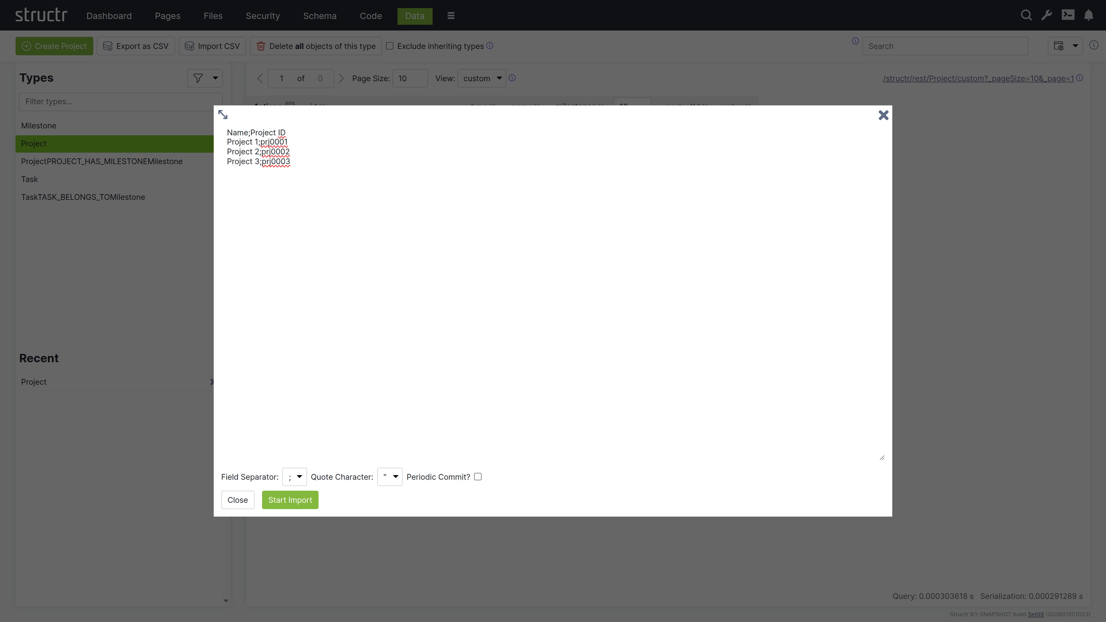
Import Wizard
The CSV Import Wizard allows you to import large and complex CSV files by mapping fields from the input document to properties of one or more schema types. You can also use a transformation function to modify values before the importing. The wizard recognizes fields with similar or identical names in the data to be imported and automatically selectes the corresponding target field in the data model.
The import wizard can be found in the Files section, because it is based on files in Structr Filesystem. This means that you need to upload the CSV file to Structr before you can import the data. The reason for that is that it is not possible to handle large amounts of data using copy & paste in your browser.
Once you uploaded a CSV file, you can open the Import Wizard by clicking on the “Import CSV” button in the context menu of the file. If the menu item is not there, you probably need to change the content type of the file to text/csv in the “General” settings.
The Import Wizard
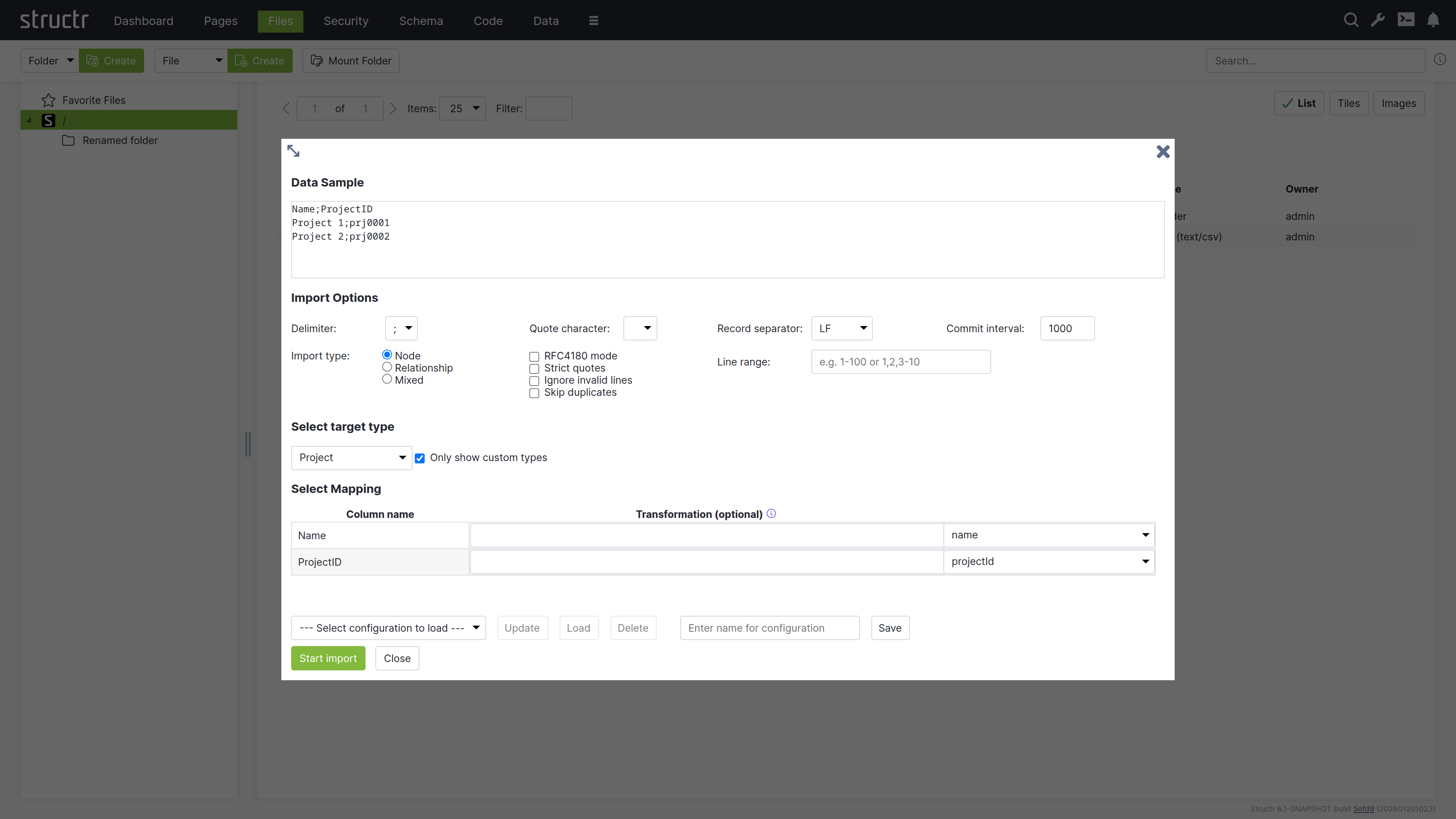
Markdown Rendering Hint: MarkdownTopic(Data Sample) not rendered because level 5 >= maxLevels (5)
Markdown Rendering Hint: MarkdownTopic(Import Options) not rendered because level 5 >= maxLevels (5)
Markdown Rendering Hint: MarkdownTopic(Commit Interval) not rendered because level 5 >= maxLevels (5)
Markdown Rendering Hint: MarkdownTopic(Import Type) not rendered because level 5 >= maxLevels (5)
Markdown Rendering Hint: MarkdownTopic(Select Target Type) not rendered because level 5 >= maxLevels (5)
Markdown Rendering Hint: MarkdownTopic(Start Import) not rendered because level 5 >= maxLevels (5)
Mixed Import Mode
The Mixed Import Mode is a special mode that allows you to distribute the input from a single row to several different data types and relationships. It requires the data model to contain relationships between the types and allows you to use these relationships automatically. Please not that this is a very experimental feature that is very likely to change in the future.
Storing Import Configurations for Later
At the bottom of the CSV import dialog is a row of buttons that allow you to save the current configuration and to load or delete a saved configuration. If a saved configurations exist, you can select one from the list and click the “Load” button to restore the saved settings.
Importing XML Data
Structr also offers an import wizard for XML documents, with a configurable mapping of XML structures to database objects. The XML Importer allows mapping of XML attributes to fields of the data model, but also allows mapping of entire XML elements (tags) to schema types. A nested object structure stored in an XML element can be transferred directly to a corresponding graph structure. The same applies to RDF triples stored in an XML document; these can be imported very easily with the appropriate data model.
The XML Import Wizard
The following screenshot shows the import dialog for an XML file that contains some sample projects. You can see and navigate the document structure on the left side, and configure the mapping actions on the right.
Note: Just like for CSV, the XML Import Wizard can be found in the context menu of XML files in the Files section, but only if the content type is
text/xmlorapplication/xml.
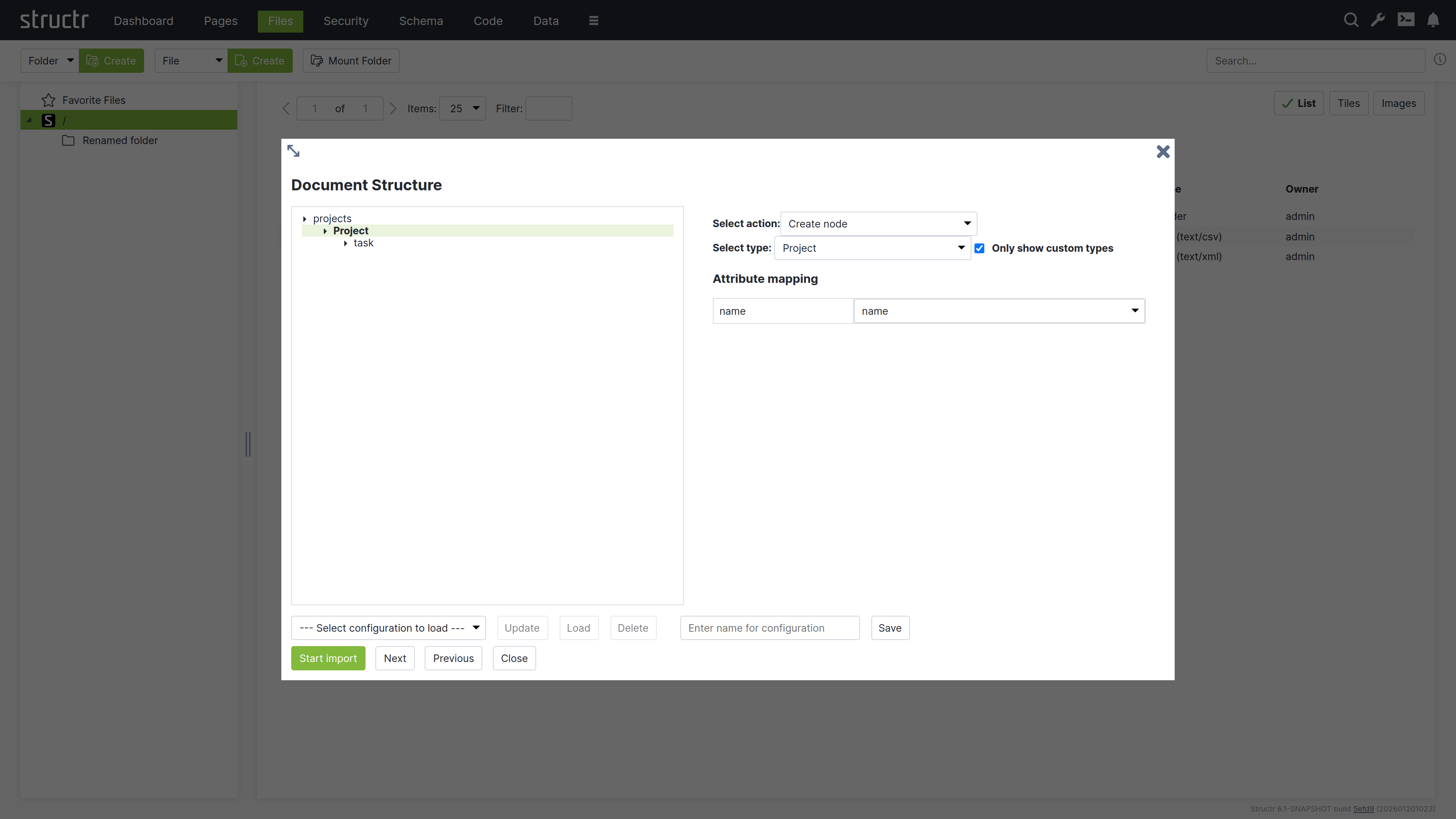
You can click on an element in the structure of the XML file to select one of the following actions.
- create a node
- set a property on a node that was created on a higher level
- skip this element
- ignore the whole branch
Create Nodes
If you select Create node, you will see a select box with a list of target types to choose from. The importer will create a new node of the selected type whenever it encounters a matching XML element in the input document. If the XML element has attributes, you can assign a target attribute from the selected type, like originId for the CustomerID attribute.
Set Properties
The Set property action allows you to import the text content of an element into a property of a schema type. If you select this action, you will see a select box with the properties of the target type you chose for the enclosing element.
If the element has attributes you want to import, you should consider using the Create node action instead.
Create Connected Nodes
If you select the Create node action for an element that is inside another element with the Create node action, the importer will create a relationship between the two based on the schema configuration. In this example, we select the target type CustomerAddress for the <FullAddress> element inside the <Customer> element, and the import wizard shows the contextual property addresses.
Start Import
When you are finished configuring the import mapping, you can click the “Start import” button to start the import. Structr will show status update notifications for the import progress in the upper right corner.
Storing Import Configurations for Later
At the bottom of the XML import dialog is a row of buttons that allow you to save the current configuration and to load or delete a saved configuration. If a saved configurations exist, you can select one from the list and click the “Load” button to restore the saved settings.
To save the current configuration you can enter the desired name in the input field next to the “Save” button and click “Save”.
Importing JSON Data
Since Javascript Object Notation (JSON) is the default format for all data going over the REST interface, you can import JSON data very easily using REST. You can find more information about that in the REST Interface chapter and in the Core Concepts chapter.
Create Nodes
To create data in Structr, you can use the HTTP POST verb with a JSON document in the request body. The target URL for the POST request is determined by the type of object you want to create. Structr automatically creates corresponding REST Endpoints for all types in the data model and makes them available under /structr/rest/<Type>. In the following example, we create a new Project node, so the REST URL is /structr/rest/Project, which addresses the Collection Resource for that type.
Request
$ curl -HX-User:admin -HX-Password:admin http://localhost:8082/structr/rest/Project -XPOST -d '{
    "name": "Project #1",
    "description": "My first project"
}'
The request body can contain any property that is defined in the data model for the given type. Structr will add some internal properties to the node once it is created, especially the UUID and the type property.
Response
{
    "result": [
        "46b4cbfce4624f4a98578148229b77c2"
    ],
    "result_count": 1,
    "page_count": 1,
    "result_count_time": "0.000333649",
    "serialization_time": "0.001035385"
}
You can see that Structr has created a new object and assigned a UUID, which you can use to make a second request to the Entity Resource.
Result
$ curl -HX-User:admin -HX-Password:admin http://localhost:8082/structr/rest/Project/46b4cbfce4624f4a98578148229b77c2
{
    "result": {
        "name": "Project #1",
        "type": "Project",
        "id": "46b4cbfce4624f4a98578148229b77c2",
        "description": "My first project"
    },
    "query_time": "0.004160732",
    "result_count": 1,
    "page_count": 1,
    "result_count_time": "0.000097147",
    "serialization_time": "0.000428520"
}
Create Relationships
In most cases, relationships in the database can be managed automatically by Structr, using Contextual Properties. A contextual property is a property that manages the association between two objects. In the following example, the tasks property on the type Project is such a property.
Contextual properties use information from the data model to automatically create relationship in the database when objects are assigned.
You can manage the relationships between a project and its tasks by simply assigning one or more tasks to the project.
Request
$ curl -HX-User:admin -HX-Password:admin http://localhost:8082/structr/rest/Project -XPOST -d '{
    "name": "Project #2",
    "description": "Another project",
    "tasks": [
        {
            "name": "Task #1",
            "description": "The first task of this project"
        },
        {
            "name": "Task #2",
            "description": "Example Task"
        }
    ]
}'
Result
You can examine the result of the two operations above by making a GET request to the Projects Collection Resource.
$ curl -HX-User:admin -HX-Password:admin http://localhost:8082/structr/rest/Project?sort=name
{
    "result": [
        {
            "name": "Project #1",
            "type": "Project",
            "id": "46b4cbfce4624f4a98578148229b77c2",
            "description": "My first project",
            "tasks": []
        },
        {
            "name": "Project #2",
            "type": "Project",
            "id": "897a3ad3b2b8441f898d41a1179a06b7",
            "description": "Another project",
            "tasks": [
                {
                    "id": "960f8b7acde14528a14bdcc812500eef",
                    "type": "Task",
                    "name": "Task #1"
                },
                {
                    "id": "0ea250b7743b46ed9b7e24411caafe06",
                    "type": "Task",
                    "name": "Task #2"
                }
            ]
        }
    ],
    "query_time": "0.000090662",
    "result_count": 2,
    "page_count": 1,
    "result_count_time": "0.000092554",
    "serialization_time": "0.000454289"
}
Please note that this example needs the setting “Automatic Creation of Related Nodes” to be active on the relationship between Project and Task to work.
If you want to create a relationship between two objects directly, you can use the Collection Resource for the corresponding relationship type and provide the UUIDs of the source and target nodes in the sourceId and targetId properties of the request. This allows you to set properties on the relationship object.
Learn More
If you want to learn more about the REST API, please read the REST Interface chapter or the Core Concepts chapter.
Using Scripting to Create Data
The Structr Scripting Engine provides a number of built-in functions to create, modify and delete nodes and relationships in the database.
Create Nodes
To create nodes in a scripting environment, you can use the create() function. The create function uses a syntax very similar to the request body of a REST POST request as shown in the following Javascript example.
${{
    // create new project
    let newProject = $.create('Project', {
        "name": "Project #1",
        "description": "My first project"
    });

    // change the description
    newProject.description = "This project was updated.";
}}
After creating the object, you can use it in your script as if it were a normal object. You can use dot-notation to read and write properties, and you can even assign other objects like in the next example.
Create Relationships
To create relationships in a scripting environment, you can use the contextual properties that were introduced in the JSON section above. In the example below, we create a Project and two Task objects and use the contextual attribute tasks to let Structr create the relationships.
${{
    // create new project
    let project = $.create('Project', {
        "name": "Project #2",
        "description": "My second project"
    });

    let task1 = $.create('Task', { "name": "Task #1" });
    let task2 = $.create('Task', { "name": "Task #2" });

    project.tasks = [ task1, task2 ];
}}
Contextual properties use information from the data model to automatically create relationship in the database when objects are assigned.
Importing Data From Webservices
Structr provides a number of built-in functions to access external data sources and transform the data: GET, PUT, POST, from_csv, from_json, from_xml. You can then use JavaScript to process the results and create objects using the create() function mentioned in the previous section.
The following example shows how to use built-in functions in a schema method to consume a webservice and process the results.
{
    let url = "https://example.datasource.url/customers.json";
    let data = $.GET(url, "application/json", { parseResponse: true }).body;

    data.entries.forEach(entry => {

        $.create("Customer", {
            name: entry.name,
            title: entry.title
        });
    });
}
Using Cypher to Create Data
You can use your own Cypher queries to create data in the underlying database as long as you make sure that the type attribute always contains the name of the target type in the Structr data model.
Please note that the data will not be visible immediately, because it first needs to be initialized with a UUID and the type labels of the inheritance hierarchy.
To initialize the data for use with Structr, please refer to the next section, “Initializing existing data in Neo4j”.
Accessing Existing Data in Neo4j
Data in a Neo4j database is available in Structr if the following requirements are met:
- For all data types in Neo4j that should be accessed through Structr, data types must exist in Structr that match the node label. Create these types in the Schema Editor.
- The
typeattribute of every node instance is set to the primary type (=simple class name). This is necessary because Neo4j labels don’t have a reliable order. - Nodes and relationships have an
idString property with a UUID as value. Use the “Add UUIDs” function from Schema section -> Admin -> Indexing. - The primary type (simple class name) as well as the supertypes and implementing interfaces have to be set as labels in Neo4j. Use the maintenance command “Apply Labels” from Schema -> Admin -> Indexing to set all necessary labels.
It is recommended to rebuild the index and flush the caches after running the above maintenance commands.
Importing Data from JDBC Sources
Importing data from a SQL database is possible via the jdbc() function in the Structr scripting engine. You can execute an SQL query on a server and process or display the result in your application. The code for that is essentially the same as for the “Import from Webservices” example above.
{
    let url = "jdbc:mysql://localhost:3306/customer";
    let query = "SELECT name, title FROM Customer";
    let rows = $.jdbc(url, query);

    rows.forEach(row => {

        $.create("Customer", {
            name: row.name,
            title: row.title
        });
    });
}
The jdbc() function returns the result rows as a list of objects, one per row, with the column names as keys. It accepts the JDBC URL and the SQL query as parameters, optionally followed by a username and a password: $.jdbc(url, query, username, password). The credentials can also be included in the JDBC connection string. Structr loads the JDBC driver via the standard DriverManager mechanism based on the URL. Please note that the driver JAR is most likely not shipped with the Structr distribution, so you have to put it in the lib directory of your Structr installation manually.
Pages & Templates
After defining a first version of the data model, the next step is usually to build a user interface. This can be done in the Pages area.
Working with Pages
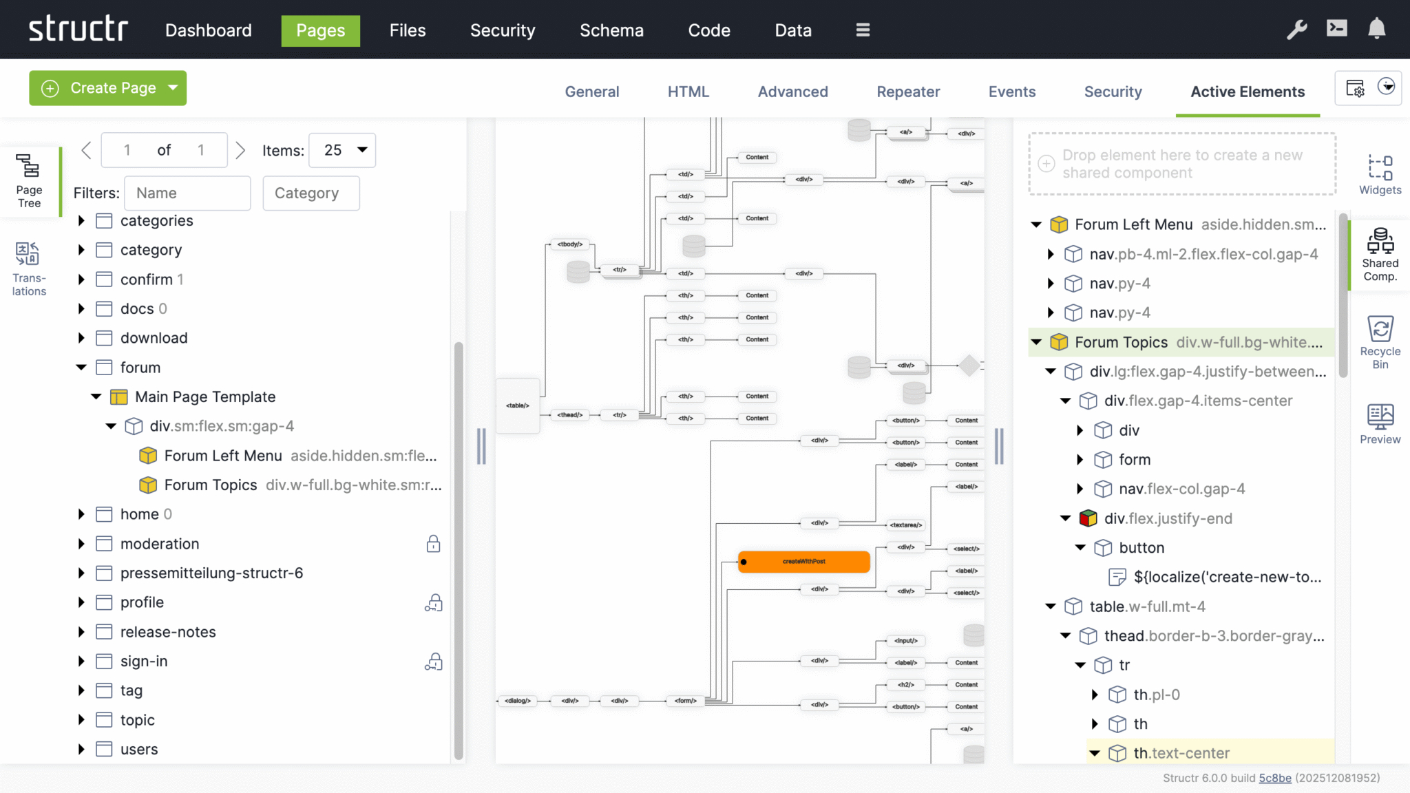
A page in Structr consists of HTML elements, template blocks, content elements, or a combination of these. Pages are rendered on the server, so the browser receives fully rendered HTML rather than JavaScript that builds the page client-side.
Why Server-Side Rendering
Modern web development often defaults to client-side frameworks where JavaScript builds the page in the browser. This approach has trade-offs: users wait for JavaScript to load and execute before seeing content, build pipelines add complexity, and search engines may not index pages correctly.
In Structr, the server renders complete HTML and sends it to the browser, ready to display. There is no build step, no hydration, no waiting for JavaScript to construct the page. When something looks wrong, you debug in one place rather than tracing through client-side state management and component lifecycles.
From Design to Application
The Structr way of building applications is to start with an HTML structure or design template and make it dynamic by adding repeaters and data bindings. This approach lets you convert a page layout directly into a working application – the design stays intact while you add functionality. It works especially well with professionally designed web application templates from sources like ThemeForest.
Modifying the Page Tree
Once you have created a page, you can modify it by adding and arranging elements in the page tree. Add elements by right-clicking and selecting from the context menu, or by dragging widgets from the Widgets flyout into the page.
Element Types
HTML elements provide the familiar tag-based structure - <div>, <section>, <article>, and other standard tags. Template elements contain larger blocks of markup and can include logic that pre-processes data for use further down the page. Content elements insert text or dynamic values wherever text appears: in headings, labels, table cells, or paragraphs. Widgets are pre-built page fragments that you can drag into your page to add common functionality. Shared components are reusable elements that you define once and reference across multiple pages. Changes to a shared component are reflected everywhere it is used.
Static Resources
Static resources like CSS files, JavaScript files, and images are stored in the Structr file system and can be included in your pages by referencing their path. For details on how to work with files, including dynamic file content with template expressions, see the Files chapter.
Dynamic Content
Pages can produce static output or dynamic content that changes based on data, user permissions, or request parameters. Template expressions let you insert dynamic values in content elements, HTML attributes, or template markup.
Repeaters
To display collections of database objects - such as a list of users or a product catalog - configure an element as a repeater. The repeater retrieves a collection of objects and renders the element once for each result. For example, a <tr> element configured as a repeater produces one table row for each object in the collection. You can call methods on your types to retrieve the data, or call flows if you use Flows.
Partial Reload
For updates without full page reloads, you can configure individual elements to refresh independently - after a delay, when they become visible, or at regular intervals. Event action mappings can also trigger partial reloads in response to user interactions, updating specific parts of the page while keeping the rest intact.
Controlling Visibility
Show and hide conditions determine whether a part of the page appears in the output, based on runtime data or user state. Visibility flags and permissions offer another layer of control - you can make entire branches of the page tree visible only to specific users or groups, for example an admin menu that only administrators can see.
Preview and Testing
The preview tab shows how your page is rendered. You can assign a preview detail object and request parameters in the page settings to test how your page behaves with different data. The preview also allows you to edit content directly - clicking on text in the preview selects the corresponding content element, where you can modify it in place.
Creating a Page
When you click the green “Create Page” button in the upper left corner of the Pages section, you can choose whether to create a page from a template or import one from a URL.
Create Page Dialog
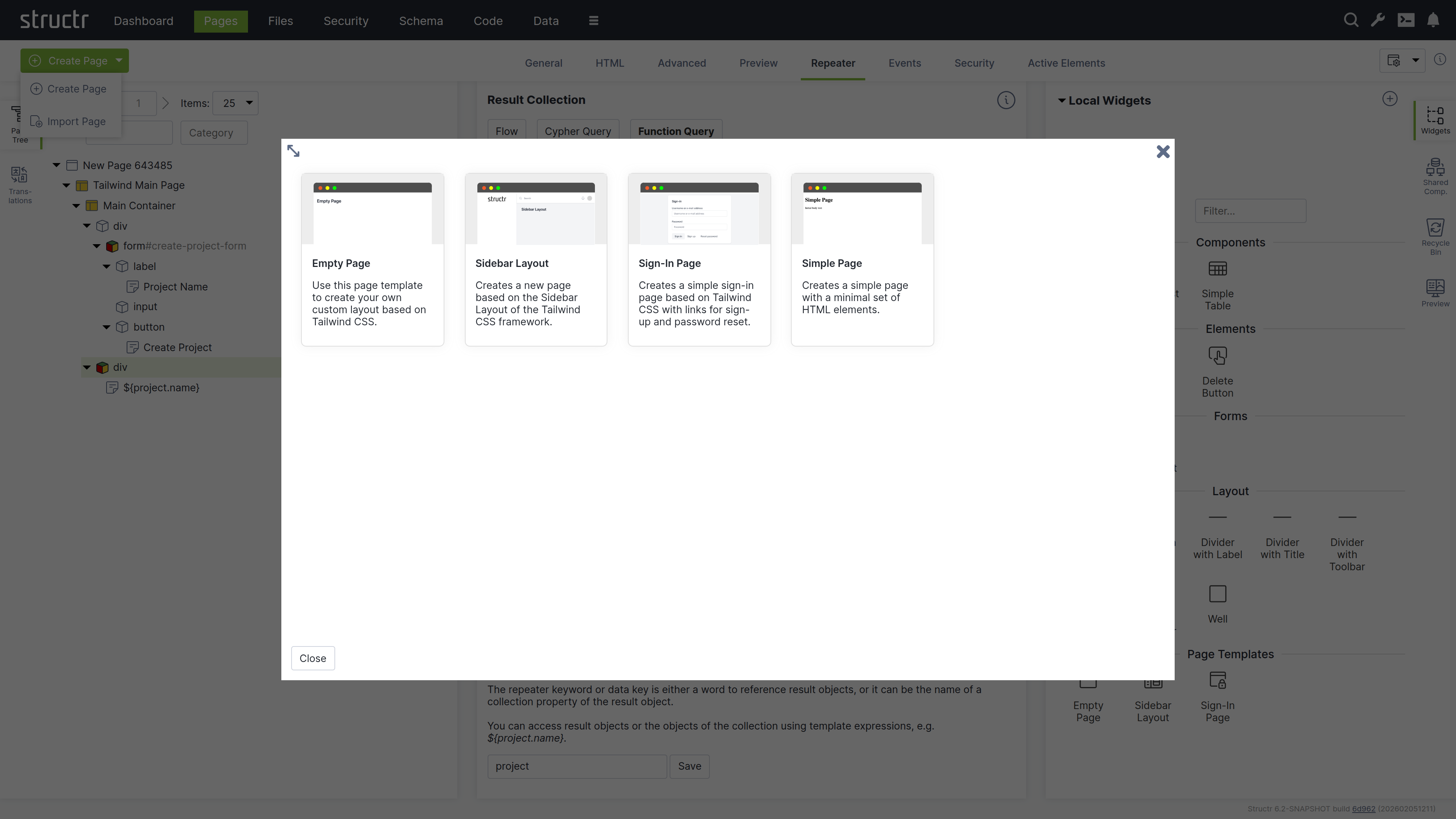
Templates
When you select “Create Page”, you will see a list of templates that are used to create the structure of the new page. Three of them are built in: Empty Page creates a page without children, Simple Page creates a page with a minimal set of HTML elements, and Custom Page creates a page from HTML source code or from a URL. All other tiles are page template widgets. The default widget set contributes the Default Page, a layout with header, sidebar and menu based on Tailwind CSS.
When you create a page from a template, you import a pre-built page structure. This can include content, repeaters, permissions, and also shared components for reuse across your site. The Simple Page option, on the other hand, creates a minimal page with only the standard HTML elements <html>, <head>, and <body>.
Page Templates Are Widgets
Page templates are widgets with the isPageTemplate flag enabled. Structr displays all page template widgets of your application in the “Create Page” dialog. If none exist yet, the dialog offers to import the default widget set from structr.com, which contains the Default Page template.
Import Page Dialog
The Import Page dialog lets you create pages from HTML source code or by importing from external URLs.
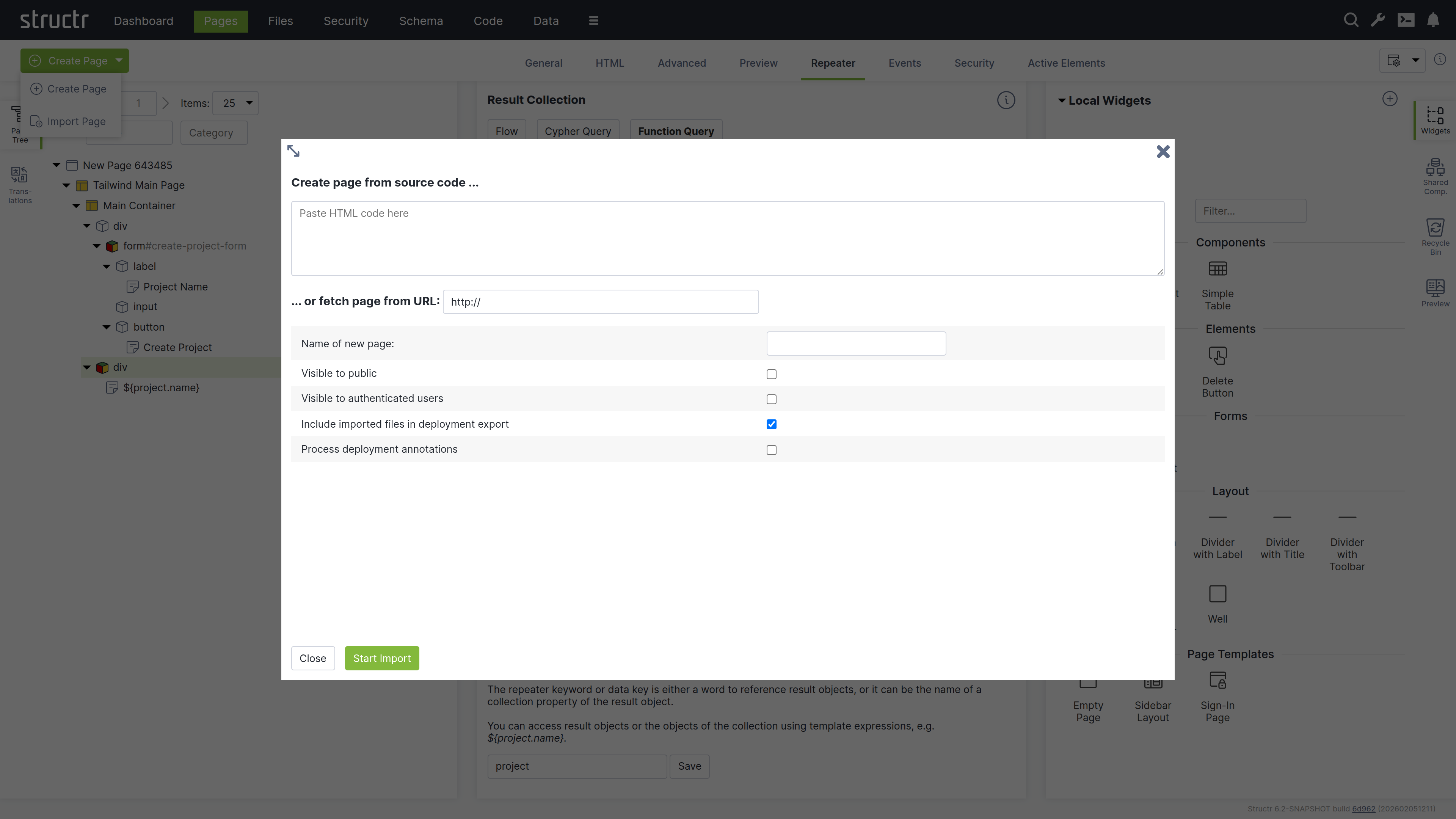
Create Page From Source Code
Paste your HTML code into the textarea. You can then configure the import options below before creating the page.
Fetch Page From URL
You can also import a page from an external URL using the text input below the textarea. This imports the page including all static resources like CSS, JavaScript, and images.
Configuration Options
Below the import options, you configure the name and visibility flags of the new page. You can also mark imported files to be included when exporting your application and enable parsing of deployment annotations in the imported HTML.
Deployment Annotations
Deployment annotations are special markers that Structr inserts when exporting HTML. They preserve Structr-specific attributes such as content types for content elements and visibility settings for individual HTML elements.
The Page Element
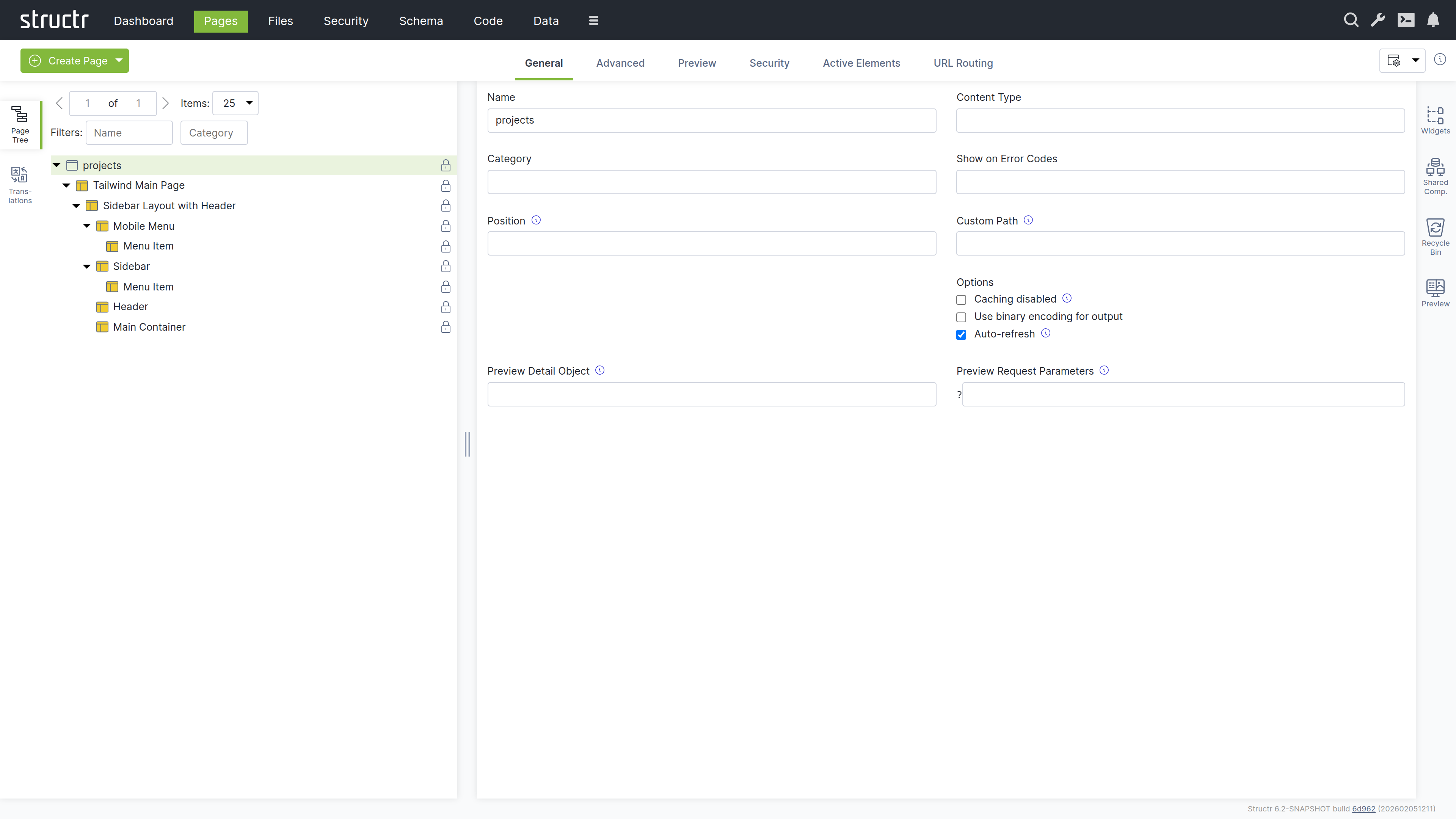
The Page element sits at the top of a page’s element tree and represents the page itself. Below the Page element, there is either a single Template element (the Main Page Template) or an <html> element containing <head> and <body> elements. Templates can also be used to create non-HTML pages: by setting the content type to application/json, text/xml, or text/plain, you can make the page return any content you want.
Appearance
Page elements appear as an expandable tree item with a little window icon, the page name and optional position attribute on the left, and a lock icon on the right. Click the lock icon to open the Access Control dialog. The icon’s appearance indicates the visibility settings: no icon means both visibility flags are enabled, while a lock icon with a key means only one flag is enabled.
Interaction
When you hover over the Page element with your mouse, two additional icons appear: one opens the context menu (described below) and one opens the live page in a new tab. Note that you can also open the context menu by right-clicking the page element. Left-clicking the Page element opens the detail settings in the main area of the screen in the center.
Access Control Dialog
Clicking the lock icon on the page element opens the access control dialog for that page. The Access Control dialog is a standardized interface used across nearly all data types in Structr, with only minor variations based on the specific type you’re working with.
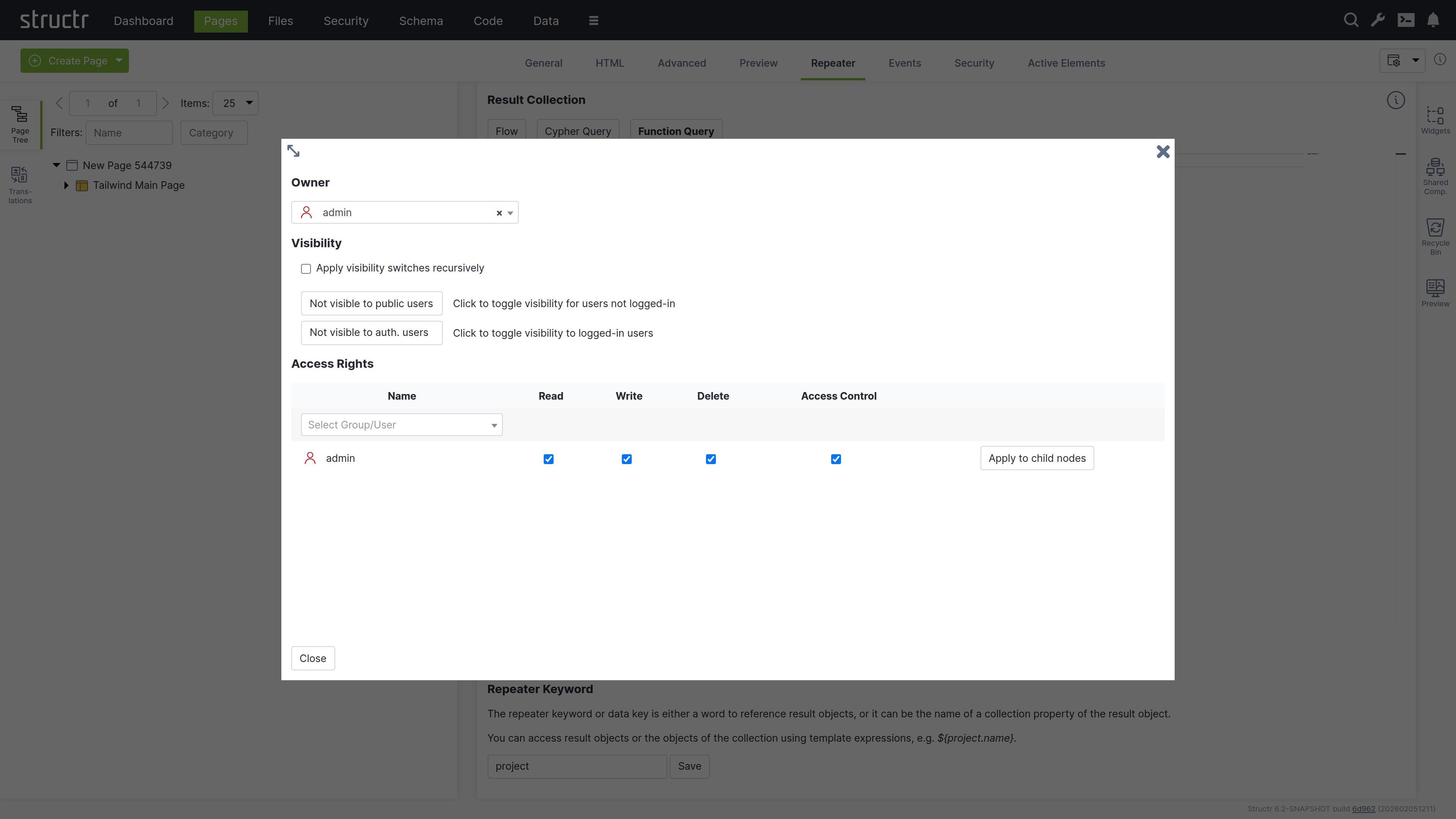
Owner
At the top of the dialog, you’ll see the current owner of the object. Use the dropdown to either assign a new owner or remove ownership entirely. These changes affect only the selected object by modifying its OWNS relationship in the database.
Visibility
The visibility section lets you control who can see the current object and its children using the familiar visibility flags for authenticated and unauthenticated users. If you check “Apply visibility switches recursively”, Structr propagates your visibility settings down through the entire hierarchy, which is especially useful when working with Pages, HTML elements, Templates, and Folders.
Permissions
The permissions table at the bottom lets you grant read, write, delete, and access control permissions to specific users or groups. Use the dropdown in the first row to add permissions for additional users or groups. In certain contexts, you can apply these permissions recursively to child objects as well. Remove a permission by unchecking the last checkbox in its row. These changes affect only the selected object by modifying its SECURITY relationships in the database.
Permissions Influence Rendering
Visibility flags and permissions don’t just control database access, they also determine what renders in the page output. You can make entire branches of the HTML tree visible only to specific user groups or administrators, allowing you to create permission-based page structures. For example, an admin navigation menu can be visible only to users with administrative permissions.
For conditional rendering based on runtime conditions, see the Show and Hide Conditions section in the Dynamic Content chapter.
The General Tab
The General tab of a page contains important settings that affect how the page is rendered for users and displayed in the preview.
Name
The page name identifies the page in the page tree and determines its URL. A page named “about” is accessible at /about.
Content Type
The content type can be used to control the page’s output format. The default is text/html, but you can use application/json for JSON responses, text/xml for XML, or any other content type including binary. The content type is sent along with the response in the ContentType HTTP header, so it can also include the charset.
Category
The category field can be used to organize your pages into groups: assign a category to the page, and you can then use the category filter to show only pages from that category.
Show on Error Codes
You can configure this page to be displayed when specific HTTP errors occur. Enter a comma-separated list of status codes, for example, 404 when content isn’t found or users lack permission, 401 when authorization is required, or 403 when access is forbidden.
Position
When users access the root URL of your application, Structr uses the position attribute to determine which page is displayed. Among all visible pages, the one with the lowest position value is shown. See the Navigation & Routing chapter for a detailed explanation of page ordering and selection.
Caching disabled
Enable this when your page contains dynamic data that changes frequently or personalized content. Structr sends cache control headers that prevent browsers and proxies from caching the page output. Pages for authenticated users are never cached, so this flag only affects public users.
Use binary encoding for output
Enable this if your page generates binary data to make Structr use the correct character encoding automatically.
Only reachable via URL Routes
Enable this if your page should only be reachable via its URL Routes. A page with this flag enabled, can not be accessed via its name, UUID, and position lookup for the root ‘/’ path. Only lookup via URL Routes and error codes (if set) still works.
This is intended for situations where reaching a page via multiple way would be considered duplicate content and could hurt SEO ratings.
If all pages have this flag, all access must be organized via URL Routes. To have a defined starting page for the root URL of the application, one page must have a URL route “/”.
Preview Detail Object
The preview detail object allows you to assign a fixed object that Structr uses as the detail object when rendering the preview, making it available under the current keyword.
Preview Request Parameters
The preview request parameters field allows you to provide fixed parameters that Structr includes when rendering the preview.
The Advanced Tab
The Advanced tab provides a raw view of the current object, showing all its attributes grouped by category, in an editable table for quick access. This tab includes the base attributes like id, type, createdBy, createdDate, lastModifiedDate, and hidden that are not available elsewhere.
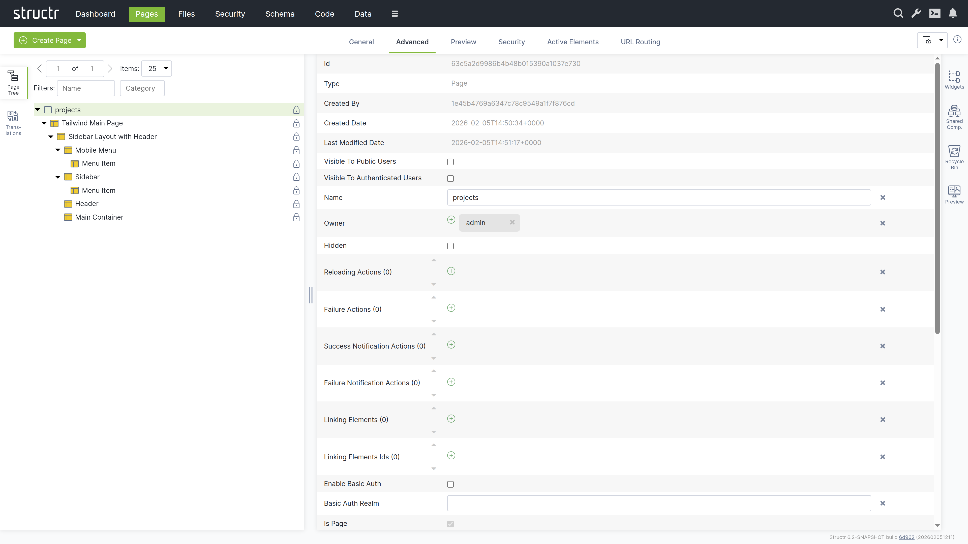
Hidden Flag
The hidden flag prevents rendering of the element and all its children. When you enable this flag, Structr excludes the element from the page output entirely, making it useful for temporarily disabling parts of your page structure without deleting them.
The Preview Tab
The Preview tab displays how your page appears to visitors, while also allowing you to edit text content directly. Hovering over elements highlights them in both the preview and the page tree. You can click highlighted elements to edit them inline or select them in the tree for detailed editing. This inline editing capability is especially valuable for repeater-generated lists or tables, where you can access and modify the underlying template expressions directly in context.
Preview Settings
You can configure the preview in the page’s General tab settings. Assign a specific object to make it available under the current keyword for testing, or provide fixed request parameters to test your page with specific data. These settings help you preview how your page renders with different objects and parameters.
The Security Tab
The Security tab contains the Access Control settings for the current page, with owner, visibility flags and individual user / group access rights, just as the Access Control dialog.
The Active Elements Tab
The Active Elements tab provides a structural overview of the page. Key page components are highlighted, such as templates, repeaters and elements with event action mappings. Clicking a component jumps directly to its location in the page tree.
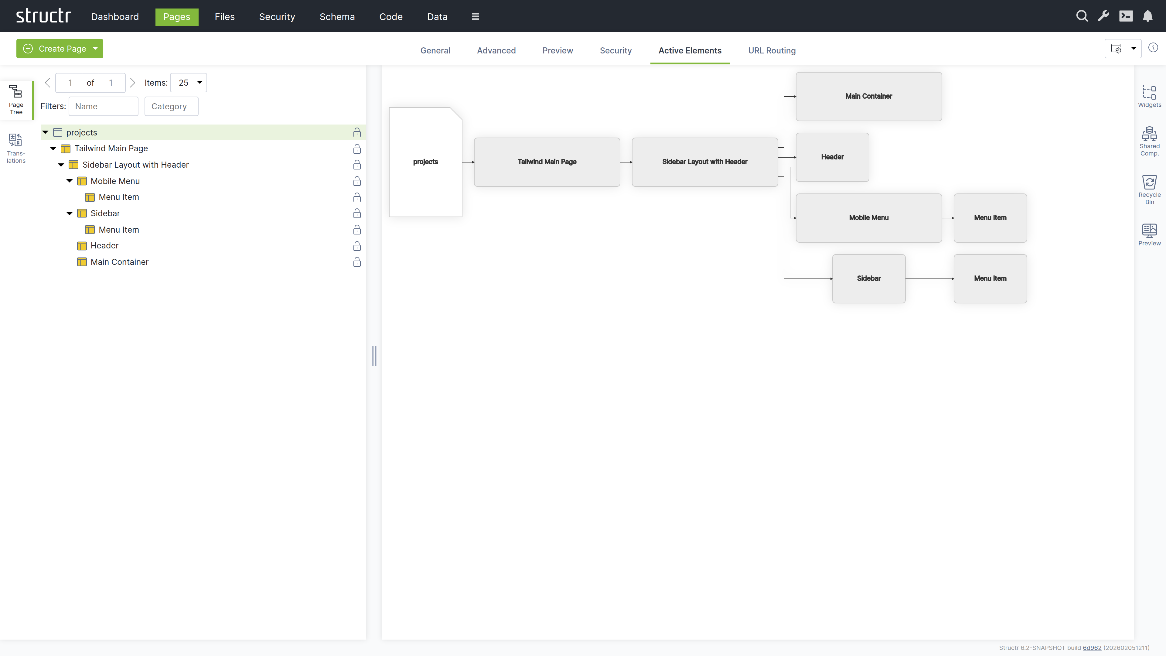
The URL Routing Tab
The URL Routing tab allows you to configure additional URL paths under which the page is made available. You can define typed parameters in the path that Structr automatically validates and makes available in the page under the corresponding key.
How it works
You start by writing a path expression with placeholders (e.g., /project/{lang}/{name}). For each placeholder, the dialog displays a type selection field, and the variable is made available in the page under its respective name when present in the path.
The arguments are optional, meaning empty path segments (e.g., /projects//my-example-page) can be passed, in which case the variable is not set (null value).
The HTML Element
HTML elements form the structured content of a page. An element always has a tag and can include both global attributes like id, class, and style, additional tag-specific attributes defined by the HTML specification, and custom data attributes. HTML elements can be inserted anywhere in the page tree, as Structr does not strictly enforce valid HTML.
HTML elements automatically render their tag, all attributes with non-null values, and their children. An empty string causes the attribute to be output as a boolean attribute without a value (e.g., <option selected>).
Appearance
HTML elements appear as expandable tree items with a box icon, showing their tag name and CSS classes. You can rename HTML elements to better communicate their purpose - when renamed, the custom name is displayed in the tree instead of the tag. Elements configured as repeaters display a colored box icon with red, green, and yellow instead of the standard box. The lock icon on the right indicates visibility settings: no icon means both visibility flags are enabled, a lock icon with a key means only one flag is enabled.
Interaction
When you hover over an HTML element with your mouse, the context menu icon appears. You can also open the context menu by right-clicking the element. Left-clicking the HTML element selects it in the page tree and opens the detail settings in the main area of the screen in the center. Clicking the lock icon opens the Access Control dialog.
The General Tab
The General tab of an HTML element contains important settings that affect how the element is rendered and displayed in the page tree.
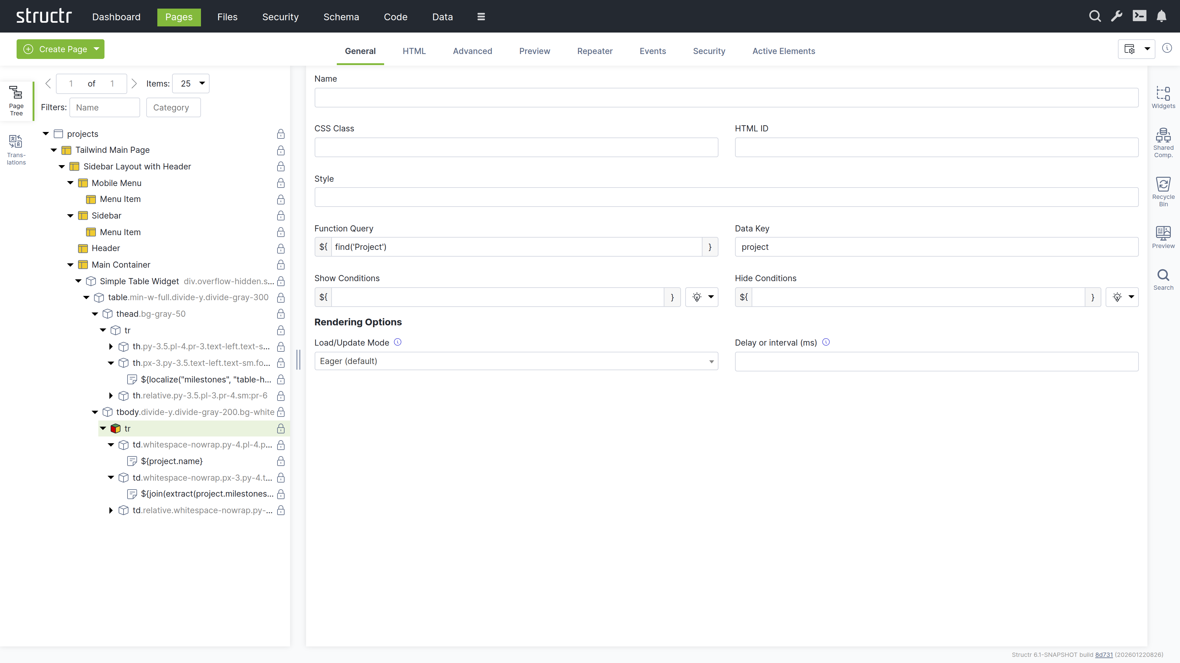
Name
The name is used to identify the element in the page tree and can help communicate the element’s purpose in your page structure.
CSS Class
You can specify one or more CSS classes (separated by spaces) that will be applied to the element when rendered. You can also create dynamic CSS classes by inserting template expressions - this is the primary use case for StructrScript expressions. For example: button ${current.status} to apply a class based on the current data object’s status.
HTML ID
This sets the element’s unique identifier in the DOM, which can be used for styling, scripting, or linking.
Style
Use this to apply inline styles to the element. Template expressions allow you to generate dynamic styles as well. For example: color: ${current.textColor} to set a color based on the current data object.
Function Query
An auto-script field (surrounded with ${ and }) for defining repeater queries. This allows you to write a script expression that retrieves data to be iterated over by the repeater.
Data Key
Specifies the data key for the repeater. This defines the variable name under which each item from the Function Query result will be available during iteration. Note that data keys with the same names in nested repeaters overwrite each other.
Show Conditions
Defines when the element should be shown. The element is rendered only when this expression evaluates to true. Show conditions are evaluated at rendering time, before the page rendering engine starts rendering the element. For example: me.isAdmin to show the element only to admin users. This is an auto-script field.
Hide Conditions
Like Show Conditions, but defines when the element should be hidden. The element is not rendered when this expression evaluates to true. This is also an auto-script field evaluated at rendering time.
Load / Update Mode
Configuration for rendering behavior of the element. This setting allows you to enable delayed rendering or lazy loading for this element.
| Name | Description |
|---|---|
Eager | Renders the element in the initial server-side rendering run. |
When page has finished loading | Renders the element after the initial rendering run is done. |
With a delay after page has finished loading | Renders the element after a configurable number of milliseconds after the page has finished loading. |
When element becomes visible | Renders the element when it is scrolled into view. |
With periodic updates | Renders the element and refreshes its content after a configurable number of milliseconds. |
Delay or Interval (ms)
Configures the number of milliseconds for delayed and / or periodic refresh according to the load / update mode setting above.
The HTML Tab
The HTML tab enables management of HTML-specific attributes for an element. In addition to the global attributes (class, id, and style), the tab displays the type-specific attributes for each element. For example, <option> elements have the selected and value attributes.
There is a button that allows you to add custom attributes that will be included in the HTML output. We recommend prefixing custom attributes with data-, though this is not required. You can also use attributes required by JavaScript frameworks, such as is.
At the end of each row is a small cross icon that allows you to remove the attribute’s value (i.e., set it to null).
Show All
The “Show all attributes” button reveals the complete list of HTML attributes, including event handlers like onclick, ondrag, or onmouseover. By default, only attributes with values are displayed. Attributes containing an empty string display a special warning icon because the distinction between null and empty string is important, but not immediately visible.
REST API Representation
If you retrieve HTML elements via REST, you will see that HTML attributes are prefixed with _html_ to uniquely identify them. This reflects how Structr handles these attributes internally - for example, to distinguish between _html_id (the HTML id attribute) and id (the element’s internal UUID). While the user interface hides this implementation detail, it remains visible in the REST API.
The Advanced Tab
Like the Advanced tab for Page elements, this tab provides a raw view of the current HTML element, showing all its attributes grouped by category in an editable table for quick access.
The Preview Tab
Like the Preview tab for Page elements, this tab displays the same rendered output for all elements within a page, as the preview always renders from the root of the page hierarchy. This means whether you are viewing the Page element itself or any child element, you will see the complete page output here.
The Repeater Tab
The Repeater tab allows you to configure an element to render dynamically based on a data source, repeating its output for each object in a collection.
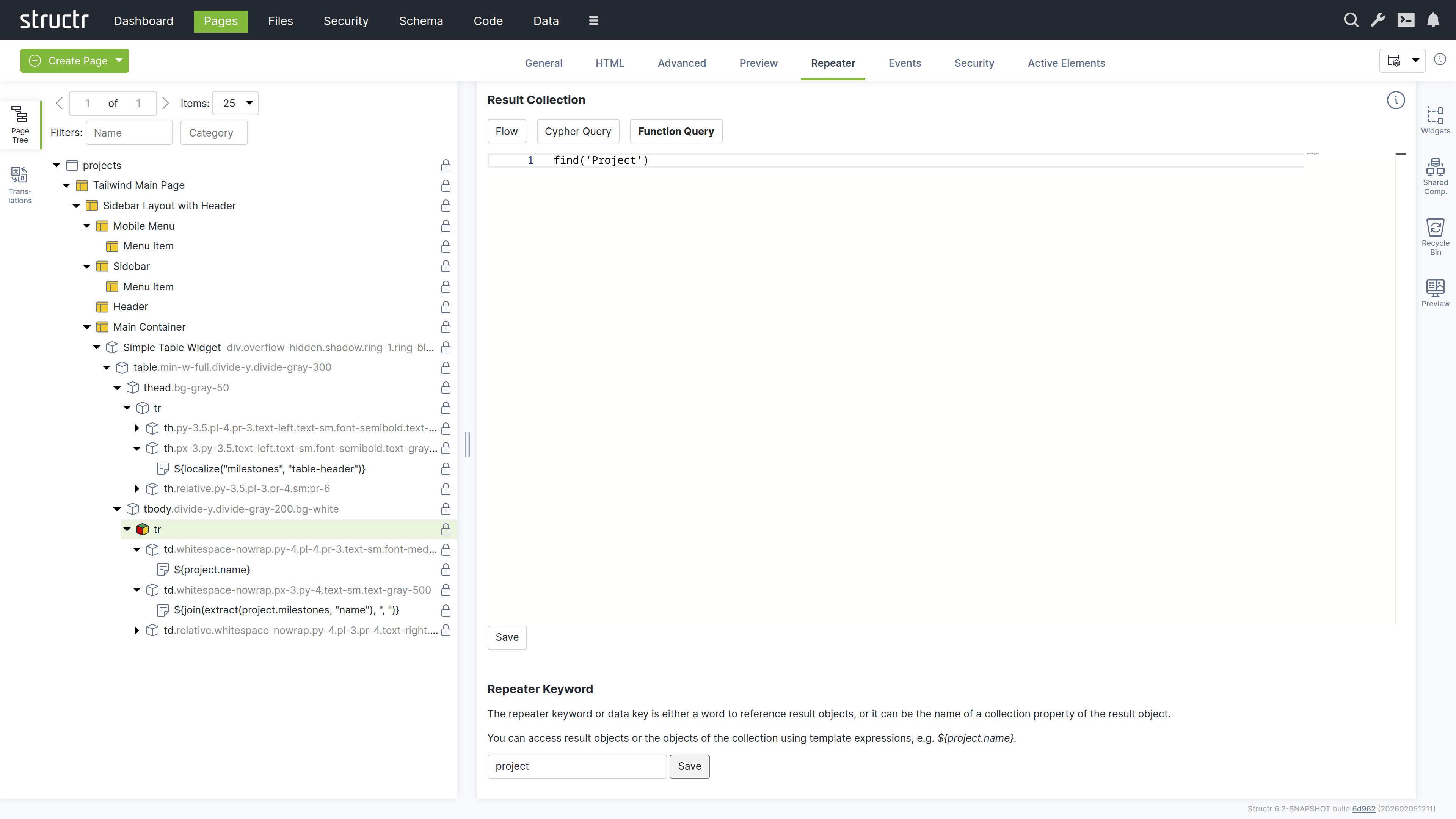
Result Collection
At the top, you select the repeater source: Flow, Cypher Query, or Function Query (a scripting expression).
By default, these should yield a collection of graph objects (e.g. nodes, map-like objects).
For Function queries, single graph objects are allowed as a convenience and collections containing non-map objects (e.g. simple strings) are automatically wrapped (similar to the toGraphObject() function) to be usable in a repeater context.
Example
Result of function query = ["string1", 2, "string3", true]
Value used in repeater = [{value="string1"}, {value=2}, {value="string3"}, {value=true}]
Repeater Keyword
The repeater keyword or data key field defines the variable name for accessing each object in the result.
How it works
The repeater and its children are rendered once for each object returned by the source. The data key is available throughout the rendering and can be referenced in content nodes, templates, and attributes.
Example
For example, a repeater with the Function Query find('Project') and data key project would render once for each Project object returned by the query. Within the repeater’s children, you could use ${project.name} to display each project’s name.
The Events Tab
The Events tab allows you to configure Event Action Mappings for individual elements.
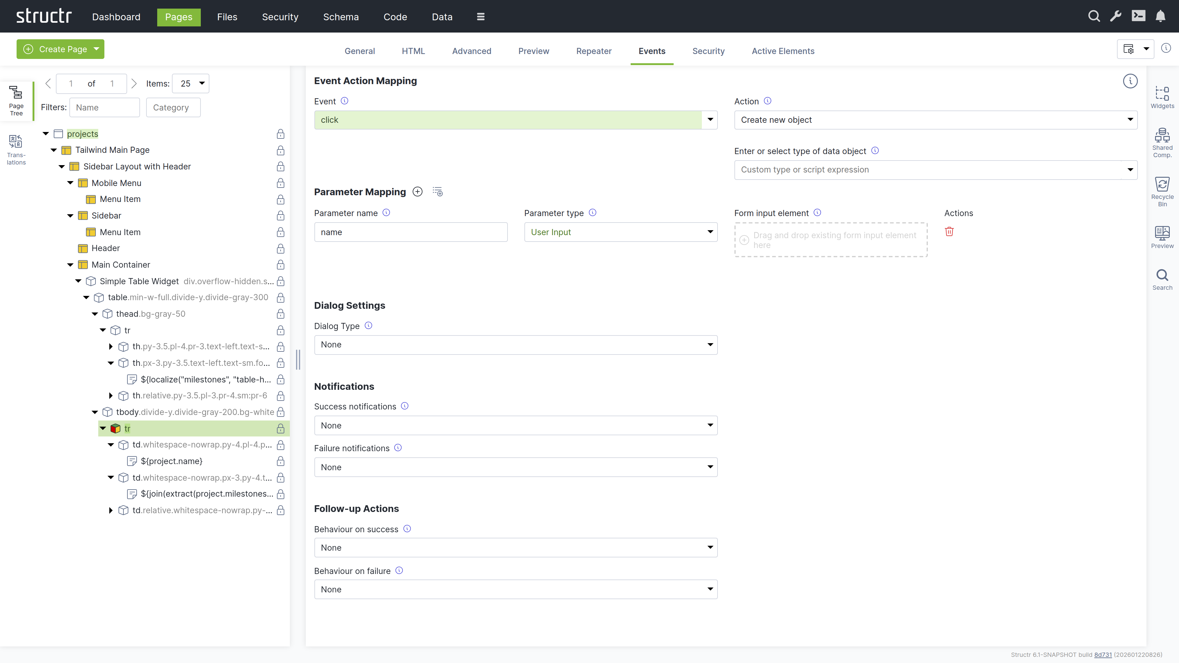
How it works
You start by selecting the DOM event that the Event Action Mapping should respond to in the Event field. After selecting an event, the Action field appears where you select the action to perform.
Actions include creating objects, modifying objects, login, logout, and more. Once you have selected an action, additional input fields appear progressively, allowing you to configure the mapping step-by-step.
Parameter Mapping
Below the configuration fields, there is a Parameter Mapping section where you can add individual parameters. When the action configuration includes a type, the parameters can be automatically populated based on the attributes of that type using the second button next to the Parameter Mapping heading.
Confirmation Dialog
This section determines whether the action requires confirmation. When Dialog Type is set to Confirm Dialog, a window.confirm dialog is displayed before the Event Action is executed.
Notifications
This section allows you to display notifications based on whether the action was executed successfully or not. The following options are available: System Alert, Inline Text Message, Custom Elements, and the option to send a custom JavaScript event.
Follow-up Actions
Additionally, you can configure follow-up actions to be performed after the main Event Action. For example, you can reload the entire page or individual elements. You can navigate to a new page based on the action’s result. You can also trigger a custom JavaScript event here. You can access variables returned from the action in the follow-up configuration.
Further Information
For detailed instructions about how to configure the individual settings of Event Action Mappings, see the Event Action Mapping chapter below.
The Process Tab
The Process tab holds the settings that connect an element to a BPMN process. The Component Binding section attaches the component configuration of a process-bound component to a user task of a process, so that the component can derive its data source from the subject type of that process. Below it, the Process Visibility section lets you add visibility rules that show or hide the element depending on the state of a process instance or of one of its steps. See the BPMN Process Control chapter for details.
The Link Tab
The Link tab appears for elements that can reference another resource, namely a, link, script, img, video and object elements. It shows the pages, files and images of the application and lets you pick the one the element links to.
The Security Tab
The Security tab contains the Access Control settings for the current element, with owner, visibility flags and individual user / group access rights.
The Active Elements Tab
The Active Elements tab displays the same structural overview as its counterpart on page elements, but scoped to the current element and its descendants.
Templates and Content Elements
Template and content elements contain text or markup that is output directly into the page, instead of building structure from nested HTML elements. They have a content type setting that controls how the text is processed before rendering - Markdown, AsciiDoc, and several other markup dialects are automatically converted to HTML, while plaintext, XML, JSON, and other formats are output as-is.
Content elements are the simpler variant: they output their text and cannot have children. Template elements can have children, but this is where they differ fundamentally from HTML elements.
Note that when using a template element as the root of a page, it must include the DOCTYPE declaration that an HTML element would output automatically.
Composable Page Structures
Unlike HTML elements, templates do not render their children automatically. If you don’t explicitly call render(children), the children exist in the page tree but produce no output. This is intentional as it gives you full control over placement rather than forcing a fixed parent-child rendering order.
The result is a composable system. A template can define a layout with multiple insertion points - a sidebar, a navigation area, a main content section - and then render specific children into each slot. Using the render() function, you control exactly where each child appears in the output. This lets you build complex page structures from reusable, composable building blocks.
Including External Content
You can also use include() or includeChild() in a template to pull content from other parts of the page tree or from objects in the database.
Appearance
Template elements appear as expandable tree items with an application icon, showing their name or #template when unnamed. Content elements are not expandable because they cannot have children - they display a document icon and show the first few words of their content, or #content when empty. Elements configured as repeaters display a yellow icon. Rename template elements to better communicate their purpose.
Interaction
The lock icon on the right indicates visibility settings: no icon means both visibility flags are enabled, a lock icon with a key means only one flag is enabled. When you hover over a template or content element, the context menu icon appears. You can also open the context menu by right-clicking the element. Left-clicking selects it in the page tree and opens the detail settings in the main area. Clicking the lock icon opens the Access Control dialog.
The General Tab
The General tab of template and content elements contains the name field and the following four configuration options, which work the same as on HTML elements:
Function Query
An auto-script field for defining repeater queries. This allows you to write a script expression that retrieves data to be iterated over by the repeater.
Data Key
Specifies the data key for the repeater. This defines the variable name under which each item from the Function Query result will be available during iteration. Note that data keys with the same names in nested repeaters overwrite each other.
Show Conditions
Defines when the element should be shown. The element is rendered only when this expression evaluates to true. Show conditions are evaluated at rendering time, before the page rendering engine starts rendering the element. For example: me.isAdmin to show the element only to admin users. This is an auto-script field.
Hide Conditions
Like Show Conditions, but defines when the element should be hidden. The element is not rendered when this expression evaluates to true. This is also an auto-script field evaluated at rendering time.
The Advanced Tab
Like the Advanced tab for HTML elements, this tab provides a raw view of the current template element, showing all its attributes grouped by category in an editable table for quick access.
The Preview Tab
Like the Preview tab for Page elements, this tab displays the same rendered output for all elements within a page, as the preview always renders from the root of the page hierarchy. This means whether you are viewing the Page element itself or any child element, you will see the complete page output here.
The Editor Tab
The Editor tab is where you edit the actual content of template and content elements. It provides a full-featured code editor based on Monaco (the editor from VS Code) with syntax highlighting and autocompletion. At the bottom of the tab, the content type selector controls how the text is processed before rendering. Select Markdown or AsciiDoc to have your content converted to HTML, or choose plaintext, XML, JSON, or other formats for direct output. For HTML templates like the Main Page Template, set the content type to text/html to output the markup directly.
The Repeater Tab
The Repeater tab provides the same configuration options as on HTML elements, allowing you to configure the element as a repeater with a data source and data key.
The Security Tab
The Security tab contains the Access Control settings for the current element, with owner, visibility flags and individual user / group access rights.
The Active Elements Tab
The Active Elements tab displays the same structural overview as its counterpart on page elements, but scoped to the current element and its descendants.
The Context Menu
The context menu provides quick access to common operations on page elements. Open it by right-clicking an element in the page tree or by clicking the context menu icon that appears when hovering over an element.
The context menu varies depending on the element type. For page elements, it only allows inserting an <html> element or a template element, cloning the page, expanding or collapsing the tree, and deleting the page. For content elements, the insert options are limited to Insert Before and Insert After, since content elements cannot have children. The following sections describe the full context menu available for HTML and template elements.
Suggested Widgets (when available)
This menu item appears when a local Widget exists whose selectors property matches the current element. Selectors are standard CSS selectors, so you can match against any HTML attribute: table matches table elements, div.container matches div elements with the container class, and #sidebar matches the element with that id. In addition, Structr makes the componentType attribute available as type for selector matching. Widget libraries use this to enforce nesting rules, for example [type='container'] makes a Widget appear inside any element whose componentType is container. See the Creating Widgets chapter for details on the component type system.
Suggested HTML element (when available)
This menu item appears for elements that have commonly used child elements. For example, when you open the context menu on a <table> element, Structr suggests <thead>, <tbody>, <tr>, and other table-related elements. Similarly, a <ul> element suggests <li>, a <select> suggests <option>, and so on. This speeds up page building by offering the most relevant elements for your current context.
Insert HTML Element
This submenu lets you insert an HTML element as a child of the selected element. It contains submenus with alphabetically grouped tag names and includes an option to insert a custom element with a tag name you specify.
Insert Content Element
This submenu lets you insert a template or content element as a child of the selected element.
Insert Div Element
Quickly inserts a <div> element as a child of the selected element.
Insert Before
This submenu lets you insert a new element as a sibling before the selected element. It contains the same options as the main insert menu: Insert HTML Element, Insert Content Element, and Insert Div Element.
Insert After
This submenu lets you insert a new element as a sibling after the selected element. It contains the same options as the main insert menu: Insert HTML Element, Insert Content Element, and Insert Div Element.
Clone
Creates a copy of the selected element including all its children and inserts it immediately after the original.
Wrap Element In
This submenu lets you wrap the selected element in a new parent element. It contains Insert HTML Element, Insert Template Element, and Insert Div Element options. Content elements are not available here because they cannot have children. The selected element becomes a child of the newly created element. When Widgets exist that fit the parent of the selected element and provide a content area for it, they appear at the top of the submenu under “Suggested Widgets”. See the Creating Widgets chapter for the matching rules.
Replace Element With
This submenu lets you replace the selected element with a different element type while preserving its children. It contains Insert HTML Element and Insert Div Element options. Content elements are not available here because they cannot have children. Widgets that fit the parent of the selected element appear at the top of the submenu under “Suggested Widgets”. Replacing an element with a Widget transfers matching content areas and repeaters to the new Widget, as described in the Creating Widgets chapter.
Select / Deselect Element
Selects or deselects the element. A selected element displays a dashed border in the page tree and can be cloned or moved to a different location using the context menu.
Clone Selected Element Here (when available)
This menu item appears when an element is selected. It clones the selected element and inserts the copy as a child of the element where you opened the context menu.
Move Selected Element Here (when available)
This menu item appears when an element is selected. It moves the selected element from its current position and inserts it as a child of the element where you opened the context menu.
Convert to Shared Component (when available)
This menu item appears for HTML and template elements. It converts the element and its children into a Shared Component that can be reused across multiple pages. Changes to the Shared Component are reflected everywhere it is used.
Expand / Collapse
This submenu controls the visibility of children in the page tree. It offers three options: expand subtree, expand subtree recursively, and collapse subtree.
Remove Node
Removes the selected element and all its children from the page. Removed elements are moved to the Recycle Bin and can be restored from there.
Translations
Structr supports building localized frontends, allowing you to serve content in multiple languages. Instead of hardcoded text, you use the localize() function in content elements or templates to reference translations stored in the database. Structr then looks up the translation for the current locale and displays it. If no translation is found, the key itself is returned.
The typical workflow is to first add localize() calls in your page, then open the Translations flyout to create the corresponding translations for each language.
For example, to translate a table header for a list of database objects, create a content element inside the <th> element with the following content:
${localize('column_name')}
Using domains
If the same key needs different translations in different contexts, add a domain as second parameter:
${localize('title', 'movies')}
${localize('title', 'books')}
Managing translations
The Structr Admin UI provides two places to manage translations: the Translations flyout in the Pages area and the dedicated Localization area. The Translations flyout allows you to manage translations per page and shows which translations are used in a specific page. The Localization area is for managing translations independent of pages.
Using the Translations flyout
Select a page from the dropdown at the top, enter a language code, and click the refresh button to load the translations. Structr scans the selected page for occurrences of the localize() function and lists them. For each translation, the flyout shows the key, domain, locale, and the localized text. You can create, edit, and delete translations directly here. When you change the page or language, click the refresh button to update the list.
Note that the list is empty until you use the localize() function in your page.
How it works
Translations are stored as Localization objects in the database. Each object has four values: the key, the domain, the locale, and the translated text.
When you call localize(), Structr searches for a matching translation in the following order:
- Key, domain, and full locale (e.g.
en_US) - Key and full locale, without domain
- Key, domain, and language only (e.g.
en) - Key and language only, without domain
Structr stops searching as soon as it finds a match. If no translation is found, Structr can try again with a fallback locale (configurable in structr.conf). If there is still no match, the function returns the key itself.
Locale resolution
Structr determines the current locale in the following order of priority:
- Request parameter
locale - User locale
- Cookie
locale - Browser locale
- Default locale of the Java process
Widgets and Shared Components
Widgets are reusable building blocks that you can insert into your pages from the context menu or the Widgets flyout. They range from simple HTML snippets to complete, configurable page templates. Shared Components are referenced elements that stay in sync across all pages where they are used. Widgets can define Shared Components in their source code, which forms the basis for building widget libraries with enforced nesting rules using the component type system. Some Widgets produce data-driven components that render their content from a DataSource at runtime, with configurable fields, pagination, and filtering.
For details on using Widgets, Shared Components and data-driven components, see the Widgets & Components chapter. For writing your own Widgets, including the component type system and widget libraries, see the Creating Widgets chapter.
Additional Tools
The Pages area includes several additional tools for managing and searching page elements.
Recycle Bin
When you remove an element from a page, Structr does not delete it permanently. Instead, it moves the element to the Recycle Bin. This soft-delete approach allows you to restore elements that were removed by accident.
Pages are not soft-deleted. When you delete a page, Structr removes the page itself but moves all its child elements to the Recycle Bin.
The Recycle Bin flyout shows all elements that have been removed from pages, including their children. To restore an element, drag it back into the page tree on the left. The context menu lets you permanently delete individual elements. At the top of the flyout, the “Delete All” button permanently deletes all elements in the Recycle Bin.
The Recycle Bin is not cleared automatically, but its contents are not included in deployment exports. The flyout is located on the right side of the Pages area.
Preview
The Preview flyout shows a preview of the current page, just like the Preview tab in the center panel. This allows you to keep the preview visible while working with other tabs in the center panel. The flyout is located on the right side of the Pages area.
Navigation & Routing
Pages in Structr are accessible at URLs that match their names. A page named “about” is available at /about, a page named “products” at /products. This simplicity is intentional: in Structr, the URL is not just an address – it determines what is displayed and which data is available.
Why URLs Matter in Structr
In client-side frameworks, URLs are often an afterthought. The application manages its own state, and the URL is updated to reflect it – or sometimes ignored entirely. This leads to applications where the back button breaks, bookmarks don’t work, and sharing a link doesn’t show the same content.
Structr takes the opposite approach. The URL is the source of truth. When a user navigates to /projects/a3f8b2c1-..., Structr resolves that UUID, makes the object available under current, and renders the page with that context. No client-side state management, no hydration, no synchronization problems.
This has practical benefits: every application state has a unique, shareable URL. The back button works as expected. Users can bookmark any page, including detail views. And because the server knows exactly what to render from the URL alone, debugging becomes straightforward – you can see the entire application state in the address bar.
URLs as Entry Points
Because Structr resolves objects directly from URLs, every page can serve as an entry point. Users don’t have to navigate through your application to reach a specific record – they can go there directly. This is particularly valuable for applications where users share links, receive notifications with deep links, or return to specific items via bookmarks.
The current keyword makes this seamless. You build your detail pages using current.name, current.price, or any other attribute, and Structr populates them automatically based on the URL. The same page works whether the user clicked through from a list or arrived via a direct link.
How Structr resolves pages
When a request comes in, Structr determines which page to display based on several factors:
-
URL Routing: Structr first checks if any page has a URL route that matches the request path. If a match is found, that page is displayed.
-
Page Name: If no route matches, Structr looks for a page whose name matches the URL path.
-
Visibility and Permissions: The page must be visible to the current user. For public users,
visibleToPublicUsersmust be enabled. For authenticated users, eithervisibleToAuthenticatedUsersor specific permissions must grant access.
If multiple pages have the same name and the same permissions, Structr cannot distinguish between them and only one will be displayed.
Pages vs. static files
It is important to understand the difference between dynamic pages and static files when it comes to URL resolution.
For dynamic pages (Page nodes with their tree of Template and DOM elements), Structr uses the first path segment to determine which page to display. Everything after the second slash is treated as additional data for that page. For example, /product, /product/, and /product/index.html all resolve to the page named product. A URL like /product/a3f8b2c1... where the second part is a UUID, also resolves to the product page, and the second segment (the UUID) is automatically looked up in the database and the resolved object made available under the current keyword (see “The current keyword” below). If htmlservlet.resolveproperties is configured, the second segment can also be a non-UUID value, e.g. a human-readable parameter like a name or slug instead of a UUID. This is the standard behavior unless custom URL routing is configured.
For static files served from the virtual filesystem, Structr resolves paths exactly. A request to /product or /product/ resolves to the folder named product, not to a file like index.html inside it. Unlike traditional web servers such as Apache or Nginx, Structr does not automatically map directory paths to index files.
This distinction matters when migrating static websites into Structr’s virtual filesystem. If your static HTML files use directory-style links like href="/product/", those links will resolve to the folder rather than to an index.html file within it. You need to use explicit file references like href="/product/index.html" instead.
The start page
When users navigate to the root URL (/), Structr first checks whether a page has a URL route for /. Such a route takes precedence over the position lookup described next. Without a matching route, Structr displays a start page based on one of two configurations:
- A page with the lowest
positionvalue among all visible pages - A page with “404” configured in
showOnErrorCodes
If neither configuration exists, Structr returns a standard 404 error. The start page must be visible to public users, otherwise they also receive a 404 error – Structr does not distinguish between non-existent pages and pages without access to avoid leaking information.
Error pages
You can configure a page to be displayed when specific HTTP errors occur. Set the showOnErrorCodes attribute to a comma-separated list of status codes, for example “404” for pages not found or “403” for access denied.
If no error page is configured, Structr returns a standard HTTP error response.
The current keyword
Structr can automatically resolve objects from URLs and make them available under the current keyword. This is one of Structr’s core features and enables detail pages without additional configuration.
Note that UUID resolution only works on direct page URLs and partials, not on URL routes. URL routing and UUID resolution are independent mechanisms.
UUID resolution
When you append a UUID to a page URL, Structr automatically recognizes it and looks up the corresponding object in the database. If the object exists and is visible to the current user, it becomes available under current.
For example, navigating to /products/a3f8b2c1d4e5f6a7b8c9d0e1f2a3b4c5 makes the Product object with that ID available as current. You can then use ${current.name}, ${current.price}, and other attributes in your template expressions.
This is useful for populating forms with data. Create a form that uses current to fill its input fields, then call the page with the object UUID appended to load that object’s data into the form.
Resolving by other attributes
By default, Structr resolves objects by UUID and by name, because the default value of the setting htmlservlet.resolveproperties is NodeInterface.name. To resolve objects by other attributes, configure this setting in structr.conf. The format is a comma-separated list of Type.attribute entries:
htmlservlet.resolveproperties = Product.name, Article.title, Project.urlPath
With this configuration, navigating to /products/my-product-name resolves the Product with that name and makes it available as current.
URL Routing
In the URL Routing tab of a page, you define path expressions using placeholders following the pattern /static-page-part/{param1}/{param2}/.../{paramN}/{paramN} that allow URL parameters to be mapped to a page and multiple parameters.
By default, Structr automatically maps pages to URLs based only on their name. URL Routing extends this by allowing the user to define custom routing schemes with typed parameters that Structr validates and makes available in the page, giving the user full control over the URL structure beyond the built-in automatic routing.
A page can have multiple routes. Structr evaluates all URL routes (sorted by priority) before checking page names. The priority can be changed via drag and drop in the user interface.
This means that custom routes take precedence over the default name-based resolution. If a route matches, the corresponding page is rendered and the matched parameters are made available using their placeholder names. In StructrScript, parameters are accessed with using paramName in a scripting context ${...}. In JavaScript contexts ${{...}}, the parameters can be accessed using $.paramName.
Multiple routes can point to the same page, allowing a single page to serve different URL patterns. For example, a product page could be reachable via both /product/{id} and /shop/{category}/{id}.
Note: Using a UUID to automatically resolve to a
currentobject, which is possible with default page access, is not possible with URL Routes. If such functionality is desired, a separate path parameter must be explicitly introduced in the route.
Path Parameters and Configuration
Path parameters can be defined using {param} syntax. These parameters are automatically extracted and validated and can be further configured (e.g. type, default values, behaviour).
Parameters can be optional (default) or required. If a parameter is required, the route will only match for an incoming request if a parameter value is present.
Parameters can also have default values. If a parameter value is missing (and the parameter is optional), the default value will be used instead. If a parameter value is present but fails to parse for the given parameter type, the default value will only be used if the useDefaultIfInvalid flag is set. This does not affect if the route matches or not.
Furthermore, the original parameter value from URL (as a string) is always made available as _ + paramName (e.g. _param for {param}) to enable users to do custom error handling or other tasks.
Note: Do not use parameter names that are also used as data keys in repeaters, as they will not work. For other built-in functionality, warnings will be generated in the configuration dialog for URL Routes.
Note: URLs are limited to a maximum length of 8192 characters. This constrains the maximum size of transferable data via parameters.
Parameter Types
The parameter types available are: String, Base64UrlString, Integer, Long, Double, Float, Date, Boolean, Node. All parameters undergo conversion from the string representation in the URL to their configured parameter type.
String
Any input (following URL compliance rules) is accepted as-is and returned without conversion. This is the default type. For any unknown type, Structr logs a warning and falls back to this behavior.
Base64UrlString
The Base64UrlString type represents Base64URL-encoded data. By default, decoded values are interpreted as a UTF-8 string.
If you need to transport arbitrary binary data, you can set the content charset to ISO-8859-1. This allows a direct byte-to-character mapping without data loss.
Using Base64URL encoding helps avoid common pitfalls of URL data transmission. Reserved characters such as / or %, as well as special path segments like /./ and /../, can interfere with routing and normalization. Encoding the data prevents these issues by ensuring the path segment remains structurally safe.
If conversion fails, a warning is logged. If the parameter is configured to return the default value in such error cases, the default value is returned. Otherwise null is returned.
Double, Float, Integer, or Long
The input string is parsed using the Java parsing method specific for the type.
If parsing fails, a warning is logged that identifies the target type and parameter name. If the parameter is configured to return the default value in such error cases, the default value is returned. Otherwise null is returned.
Boolean
The input is converted to true only if the input equals “true” ignoring case, and false only if the input equals “false” ignoring case.
Any other input is treated as invalid and a warning is logged. If the parameter is configured to return the default value in such cases, the default value is returned. Otherwise null is returned.
Date
A date parameter can have a custom format the user can configure (e.g. yyyyMMdd). If no custom format is configured, the input is parsed as an ISO 8601 date string. The following formats are supported:
yyyy-MM-dd'T'HH:mm:ss.SSSXXX(e.g.2026-02-14T12:34:56.000+01:00)yyyy-MM-dd'T'HH:mm:ssXXX(e.g.2026-02-14T12:34:56+01:00)yyyy-MM-dd'T'HH:mm:ssZ(e.g.2026-02-14T12:34:56Z)yyyy-MM-dd'T'HH:mm:ss.SSSZ(e.g.2026-02-14T12:34:56.000Z)
If parsing fails for a configured custom format or, if no custom format is configured, for all of the supported formats, a warning is logged. If the parameter is configured to return the default value in such error cases, the default value is parsed and returned according to the format. Otherwise null is returned.
Node
A node parameter can have a type configuration that determines which types of nodes can be found via the URL route. By default, this is empty and nodes of all types can be found. Given a type name A, all nodes of that type and inheriting types will be able to be found.
Node lookup uses the same basic mechanism as the current object resolution, meaning that by default UUIDs can be used but also all attributes configured in htmlservlet.resolveproperties.
If no value is given, the default value is used. If a value is given but no node can be found, the default value will NOT be used.
Matching Behavior
- Static parts of a route must match exactly.
- Parameters are matched greedily within a path segment.
This means multiple parameters in the same segment can lead to ambiguous matches:
/{var1}{var2}/→var1captures the entire segment,var2remains empty/{var1}_{var2}/→ works because_enforces a boundary
Use a separator character that cannot appear in either parameter.
Recommendation: Prefer a single parameter per path segment to avoid ambiguity. If values can be empty, add a prefix or suffix to ensure no empty URL segments can be present. Otherwise, a URL compliance violation has to be allowed.
Catch-All Routes
Routes without any static parts and no required parameters (e.g. /{variable}/) match almost any request, causing nearly all traffic - including requests for other pages and files - to be routed to that page.
To prevent unintended matches, include at least one static (or clearly structured) segment in the path. For easier reasoning about paths, it is recommended to put static parts at the start of the path, e.g.:
/users/{id}//api/{resource}/
However, catch-all routes can be useful in specific (mostly temporary) scenarios, such as debugging another clients’ behaviour.
URL Compliance
By default, no URL violations are allowed. When using plain string parameters (i.e. accepting arbitrary user input) via the path for URL Routing or GET methods, you may need to explicitly allow certain URL violations via the configuration key httpservice.uricompliance.allowedviolations. Relevant options include:
AMBIGUOUS_EMPTY_SEGMENT- allows empty path segmentsAMBIGUOUS_PATH_SEPARATOR- allows%2f(/) within user-provided valuesAMBIGUOUS_PATH_ENCODING- allows%25(%) within user-provided values
For URL Routing, the first violation can be circumvented by adding a static element to each path segment. The latter two violations can be avoided using a Base64UrlString parameter, since it produces URL-safe output by design.
When calling methods via GET and passing named parameters via path segments, the first violation can not be avoided when empty values are supposed to be valid. The latter two violations can be avoided by manually using URL-safe transport encodings like base64url for parameter values.
Example
Path: /blog/{lang}/{title}
In StructrScript:
${lang}
${title}
In JavaScript:
${{
    const language = $.lang;
    const title    = $.title;
}}
Use cases
URL Routing is particularly useful for:
- SEO-friendly URLs - using human-readable object names or slugs instead of UUIDs (e.g.
/product/ergonomic-keyboardinstead of/product?id=a3f8...) - Multilingual sites - including the language code as a path segment (e.g.
/en/about,/de/about) to serve localized content from a single page - Detail pages - passing identifiers via the URL so a single page template can render different content (e.g.
/user/{username},/order/{orderId}) - Hierarchical content - modeling category and subcategory structures directly in the URL (e.g.
/docs/{section}/{topic}) - Clean API-style endpoints - combining URL Routing with page methods to create RESTful-style interfaces served by Structr pages
Building navigation
This section covers different ways to implement navigation in your application.
Links between pages
Navigation between pages works like in any other web application: you use standard HTML links with the href attribute.
<a href="/about">About Us</a>
<a href="/products">Products</a>
If you need links that automatically update when a page is renamed, you can retrieve the page object via scripting and use its name attribute as the link target. This is uncommon – most applications use simple string-based links.
Navigation after actions
Event Action Mappings can navigate to another page after an action completes. This is commonly used to redirect users to a detail page after creating a new object. You specify the target page name in the follow-up action configuration.
For details on configuring navigation in Event Action Mappings, see the Event Action Mapping chapter.
Dynamic navigation menus
A common pattern in Structr is to generate navigation menus automatically. You implement the menu as a repeater that iterates over pages and creates a link for each one.
To control which pages appear in the menu, you can use visibility settings to include only pages visible to the current user, or add a custom attribute to the Page type (for example showInMenu) and filter by it.
<nav>
    <ul>
        <li data-structr-meta-function-query="find('Page', equals('showInMenu', true))" data-structr-meta-data-key="page">
            <a href="/${page.name}">${page.name}</a>
        </li>
    </ul>
</nav>
Request parameters
Request parameters from the URL query string are available via $.request in any scripting context.
For example, with the URL /products?category=electronics&sort=price:
$.request.category  // "electronics"
$.request.sort      // "price"
You can use request parameters in template expressions, show/hide conditions, function queries, and any other scripting context.
Deferred and periodic rendering
The Load/Update Mode setting on the General tab of an HTML element controls when the element is rendered: eagerly with the page, after the page has finished loading, with a delay, when the element becomes visible, or periodically at a fixed interval. See the Pages & Templates chapter for details.
Partials
Every element in a page is directly accessible via its UUID. This allows you to render individual elements independently from their page, which is useful for AJAX requests, dynamic updates, and partial reloads.
Rendering partials
To render a partial, simply use the element’s UUID as the URL:
/a3f8b2c1-d4e5-f6a7-b8c9-d0e1f2a3b4c5
Structr returns only the HTML of that element and its children. The content type is determined by any content or template elements contained in the partial.
Organizing partials
You can organize partials in two ways: create a separate page for each partial, or collect all partials in a single page. Since partials are addressed directly by UUID, their location does not matter. Keeping them in a single page can simplify maintenance.
Partials and the current keyword
UUID resolution for the current keyword also works with partials. Append an object UUID to the partial URL to make that object available under current when the partial renders.
When a URL contains two UUIDs, Structr resolves the first one as the partial and the second one as the detail object:
/a3f8b2c1-d4e5-f6a7-b8c9-d0e1f2a3b4c5/b4c5d6e7-f8a9-b0c1-d2e3-f4a5b6c7d8e9
In this example, the first UUID addresses the partial and the second UUID is resolved as the current object.
Partial reloads
Instead of reloading the entire page, you can update individual elements independently. Configure this via Event Action Mapping by specifying the target element either by its CSS ID or by linking it directly in the mapping configuration.
For details on configuring partial reloads, see the Event Action Mapping chapter.
Dynamic Content
Structr renders all page content on the server. To display data from the database or other sources, you use template expressions and scripting. Template expressions let you insert dynamic values into your pages, while scripting gives you full control over data retrieval and processing. This chapter builds on the concepts introduced in the Pages & Templates chapter.
How Structr Differs from Client-Side Frameworks
If you are familiar with client-side frameworks like React, Vue, or Angular, Structr’s approach to dynamic content may feel different at first. Understanding these differences helps you work with Structr effectively.
Server-Side by Default
Structr is not a rich-client stack. Like other server-side rendering approaches, most of the work happens on the server. Structr follows principles similar to the ROCA style (Resource-Oriented Client Architecture): the server renders HTML, the URL identifies resources, and the server controls the application logic.
Everything is Accessible
What sets Structr apart is how accessible everything is. All the layers of a typical web application exist – data model, business logic, rendering, user interaction – but they are thin and within reach. You sit in a control room where everything is at your fingertips, rather than having to dig through separate codebases for each concern.
The data model can be changed live without migrations – existing data immediately gets the new attributes. Repeaters give you direct access to query results. Template expressions let you bind data to elements without intermediate layers. Event Action Mappings connect user input directly to backend operations.
State on the Server
Structr does have state management, but it happens on the server by default. The URL determines what is displayed, and the current keyword gives you the object resolved from the URL. For user-specific state, you can store values directly on the user object via me, or create dedicated Settings objects in the database.
A Different Mindset
Structr brings data and frontend closer together than traditional frameworks. You access data directly in your page elements through template expressions and repeaters, without the need for client-side state management or passing data through component hierarchies. This directness can feel unfamiliar at first, but once you embrace it, you may find that many common tasks require less code than you expect.
Template Expressions

Template expressions allow you to insert dynamic values anywhere in your pages. You can use them in content elements, template elements, and HTML attributes.
StructrScript vs. JavaScript
Structr supports two scripting syntaxes: StructrScript and JavaScript.
StructrScript
StructrScript uses single braces ${...} and is designed for simple, one-line expressions. It works well in HTML attributes, show conditions, and simple function queries. Typical uses include property access and function calls:
${current.name}
${project.status}
${empty(current)}
${is(current.isActive, 'active')}
${if(equal(current.status, 'draft'), 'Draft', 'Published')}
StructrScript is purely functional – you cannot declare variables or perform arithmetic operations directly. It also supports default values using the ! syntax:
${request.page!1}
This returns the value of the page request parameter, or 1 if the parameter is not set.
JavaScript
JavaScript uses double braces ${{...}} and opens a full scripting context. Use it when you need calculations, intermediate values, or more complex logic:
${{ current.price * current.quantity }}
${{
    let total = 0;
    for (let item of items) {
        total += item.amount;
    }
    return total;
}}
In JavaScript, you handle missing values with standard JavaScript syntax, for example using the logical OR operator to fall back to a default value:
${{ $.request.page || 1 }}
As a rule of thumb: if it fits in a single-line input field, use StructrScript. If you need variables, loops, or calculations, switch to JavaScript.
Keywords
Template expressions have access to built-in keywords that provide context about the current request, user, and page. The most commonly used keywords are:
current– the object resolved from the URL (see Navigation & Routing)me– the current userpage– the current pagerequest– HTTP request parametersnow– the current timestamp
For a complete list of available keywords, see the System Keywords reference.
Functions
Structr provides a wide range of built-in functions for string manipulation, date formatting, collections, logic, and more. Some commonly used functions include:
empty()– checks if a value is null or emptyis()– returns a value if a condition is true, null otherwiseequal()– compares two valuesif()– conditional expressionfind()– queries the databasedateFormat()– formats dates
For a complete list of available functions, see the Built-in Functions reference.
Dynamic Attribute Values
You can use template expressions in any HTML attribute. This allows you to create elements that change their appearance or behavior based on data, such as dynamic CSS classes, inline styles, or link URLs.
<a href="/projects/${project.id}">${project.name}</a>
The is() function is useful for conditionally adding values. It returns null when the condition is false, which means the value is omitted from the output.
<tr class="project-row ${is(project.isUrgent, 'urgent')}">
Structr handles attribute values as follows: attributes with null values are not rendered at all, and attributes with an empty string are rendered as boolean attributes without a value.
The examples above show complete HTML markup as you would write it in a Template element. For regular HTML elements like Div or Link, you enter only the expression (e.g., /projects/${project.id}) in the attribute field in the properties panel.
Auto-Script Fields
Some input fields in the Structr UI are marked as auto-script fields. These fields automatically interpret their content as script expressions, so you do not need the ${...} wrapper. Auto-script fields include Function Query, Show Conditions, and Hide Conditions. You can recognize auto-script fields in the Admin User Interface by their characteristic ${} prefix displayed next to the input field.
Auto-script fields are a natural fit for StructrScript expressions since they are typically single-line inputs.
Repeaters
To display collections of data, you configure an element as a repeater. The repeater executes a query and renders the element once for each result. This is the primary way to display lists, tables, and other data-driven content in Structr.
Repeater Basics
A repeater has two essential settings: a data source and a data key. The data key is the variable name under which each object is available during rendering.
For the data source, you can choose one of three options:
- Flow: A Structr Flow that returns a collection
- Cypher Query: A Neo4j Cypher query
- Function Query: A script expression
Only one data source can be active at a time.
Filtering and Sorting
In JavaScript, you can refine your query by passing an object with filter criteria to $.find(). For sorting, use the $.predicate.sort() function.
$.find('Project', { status: 'active' }, $.predicate.sort('name'))
This returns all projects with status “active”, sorted by name.
Pagination
For large result sets, use pagination to limit the number of items displayed. Structr provides a page() predicate that works with request parameters.
In StructrScript:
find('Project', page(1, 25))
In JavaScript:
$.find('Project', $.predicate.sort('name'), $.predicate.page(1, 25))
The first argument is the page number (starting at 1), the second is the page size. You can make the page number dynamic using request parameters:
find('Project', sort('name'), page(request.page!1))
This reads the page number from the URL (e.g., /projects?page=2) and defaults to page 1 if not set.
Performance Considerations
Structr can render thousands of objects and generate several megabytes of HTML without problems. However, displaying large amounts of data rarely makes sense for users. A page with thousands of table rows is difficult to navigate and slow to load in the browser.
Best practices:
- Always limit result sets with pagination or a reasonable maximum
- Use filtering to show only relevant data
- Consider whether users really need to see all data at once, or whether search and filters are more appropriate
Nested Repeaters
Repeaters can be nested to display hierarchical data. The inner repeater can use relationships from the outer repeater’s data key as its function query.
For example, to display a list of projects with their tasks, you create an outer repeater with find('Project') and data key project. Inside, you add an inner repeater with project.tasks and data key task. The outer repeater iterates over all projects, and for each project, the inner repeater iterates over its tasks.
Note that data keys in nested repeaters must be unique. If you use the same data key in a nested repeater, the inner value overwrites the outer one.
Empty Results
When a repeater query returns no results, the element is not rendered at all. If you want to display a message when there are no results, add a sibling element with a show condition that checks for empty results:
empty(find('Project', { status: 'active' }))
This element only appears when there are no active projects.
Static Data
A Function Query can also return static data directly by defining a JavaScript object or array. This is useful for prototyping or for data that does not come from the database:
${{ [{ name: 'Draft' }, { name: 'Active' }, { name: 'Completed' }] }}
Data-Driven Components
Repeaters give you full control over how data is queried and rendered, but they require you to build the HTML structure manually: you create the elements, configure the query, set up the data key, and write the template expressions yourself. For common patterns like tables, lists, and forms, data-driven components offer a higher-level approach. You point a data-driven component at a DataSource, configure which fields to display in a dialog, and the component handles the rendering, pagination, filtering, and field layout automatically. See the Widgets & Components chapter for details.
Show and Hide Conditions
Show and hide conditions control whether an element appears in the page output. Structr evaluates these conditions at render time, before the element and its children are rendered.
How It Works
Each element can have a show condition, a hide condition, or both. The element is rendered only when the show condition evaluates to true (if set) and the hide condition evaluates to false (if set). If both are set, both must be satisfied for the element to render.
Show and hide conditions are auto-script fields. You write the expression directly without the ${...} wrapper.
Complex Conditions
For conditions with multiple criteria, use the and() and or() functions:
and(not(empty(current)), equal(current.status, 'active'))
This shows the element only when current exists AND has status “active”.
or(equal(me.role, 'admin'), equal(current.owner, me))
This shows the element when the user is an admin OR is the owner of the current object.
You can nest these functions for more complex logic:
and(not(empty(current)), or(equal(me.role, 'admin'), equal(current.owner, me)))
Show Conditions vs. Permissions
Show and hide conditions control visual output only. They are not a security mechanism. To restrict access to data, use visibility flags and permissions instead. For details, see the Access Control section in the Overview chapter.
Combining List and Detail View
A common pattern in Structr is to implement both a list view and a detail view on the same page. You control which view is displayed using show and hide conditions based on the current keyword.
When a user navigates to /projects, no object is resolved and current is empty – the list view is displayed. When a user navigates to /projects/a3f8b2c1-..., Structr resolves the Project object and makes it available as current – the detail view is displayed.
To implement this, you create two sibling elements: one for the list view with a show condition of empty(current), and one for the detail view with a show condition of not(empty(current)). Only one of them is rendered, depending on whether an object was resolved from the URL.
Side-by-Side Layout
A more advanced version displays both views side by side, similar to an email inbox. The list remains visible on the left, and the detail view appears on the right when an item is selected. You can highlight the selected item in the list by adding a dynamic CSS class that compares each item with current:
${is(equal(project, current), 'selected')}
This layout is easy to build using card components or similar block-level elements. Each card has a header and content area, one for the project list and one for the project details. This eliminates the need for separate pages and routing logic that you would typically write in other frameworks.
Page Functions
Structr provides several functions that are specifically designed for use in pages and templates.
render()
The render() function outputs child elements at a specific position. Templates and Shared Components do not render their children automatically, so you use render(children) to control where they appear. You can also render specific children using render(first(children)) or render(nth(children, 2)).
include()
The include() function lets you include content from other elements or objects. You can include elements from other parts of the page tree or render objects from the database.
includeChild()
The includeChild() function works like include(), but specifically for child elements. It allows you to include a child element by name or position.
localize()
The localize() function returns a translated string for the current locale. You pass a key and optionally a domain. For details on translations, see the Translations section in the Pages & Templates chapter.
Next Steps
This chapter covered how to display dynamic content: template expressions for values, repeaters for collections, and show/hide conditions for conditional rendering.
To handle user input – forms, button clicks, and other interactions – see the Event Action Mapping chapter.
Event Action Mapping
Event Action Mapping is Structr’s declarative approach to handling user interactions. It connects DOM events directly to backend operations. When a user clicks a button, submits a form, or changes an input field, Structr can respond by creating, updating, or deleting data, calling methods, or navigating to another page.
Basics
An Event Action Mapping defines a flow: when an event fires (like click or submit), Structr executes an action (like creating an object or calling a method) with the configured parameters (mapped from input fields or expressions), and then performs a follow-up action (like navigating to another page or refreshing part of the UI).
Elements with Event Action Mappings are marked with an orange icon in the Active Elements tab. The icon resembles a process diagram, reflecting the flow-based nature of the mapping.
Why Event Action Mapping
In traditional web development, handling user interactions requires multiple layers: JavaScript event listeners on the client, API endpoints on the server, and code to connect them. Frameworks help manage this complexity, but you still need to understand their abstractions, maintain the code, and keep client and server in sync.
Event Action Mapping takes a different approach. You configure what should happen when an event fires, and Structr handles the communication between client and server. This keeps the simplicity of server-side rendering while adding the interactivity users expect from modern web applications. Because the configuration is declarative, you can see at a glance what each element does - the behavior is defined directly on the element in the Pages area, not scattered across separate code files.
Debouncing and Event Options
Event Action Mapping does not debounce requests by default. You enable debouncing per element by adding a data-structr-options attribute to the element that carries the mapping. The attribute holds a JSON object (with double quotes) and the key delay sets the debounce delay in milliseconds. When events fire in quick succession within that delay, Structr waits until they stop before sending the request. This is useful for input fields with an input event, where you do not want to send a request for every keystroke.
<input type="text" name="query" data-structr-options='{"delay": 300}'>
The same JSON object accepts two more keys. By default, Structr calls preventDefault() and stopPropagation() on every handled event, so a form does not submit natively and the event does not reach parent elements. Set preventDefault or stopPropagation to false in the options to keep the browser’s default behavior or let the event bubble.
The Frontend Library
To enable Event Action Mapping, your page must include the Structr frontend library:
<script type="module" defer src="/structr/js/frontend/frontend.js"></script>
This script listens for configured events and sends the corresponding requests to the server. The page templates included with Structr already include this library, so you only need to add it manually if you create your own page template from scratch.
Events
Events are DOM events that trigger an action. You configure which event to listen for on each element.
Configuring an Event
To add an Event Action Mapping, select an element in the page tree and open the Event Action Mapping panel. Select the event you want to react to - for example click for a button or submit for a form. Then configure the action, parameters, and follow-up behavior.
Available Events
The input field provides suggestions for commonly used events like click, submit, change, input, keydown, and mouseover. You are not limited to these suggestions - the event field accepts any DOM event name, giving you full flexibility to react to any event the browser supports.
Choosing the Right Event
The choice of event depends on the element and the desired behavior. For buttons, click is the typical choice. For forms, you usually listen for submit on the form element rather than click on the submit button. For checkboxes and radio buttons, use change instead of click - the value only updates after the click event completes.
Auto-Save Input Fields
Event Action Mapping does not require a <form> element. You can wire up individual input fields to save their values independently, for example by listening for change on each field and triggering an update action. This allows for auto-save interfaces where each field saves immediately when the user makes a change.
When you bind an Event Action Mapping directly to an input field, you do not need to configure parameter mapping. If the field has a name attribute, it automatically sends its current value with that name as the parameter. This makes auto-save setups particularly simple - just set the field’s name to match the property you want to update.
For example, consider a project detail page with two independently saving fields:
<input type="text" name="name" value="${current.name}">
<input type="text" name="description" value="${current.description}">
Each input gets its own Event Action Mapping: set the event to change, the action to “Update object”, and the UUID to ${current.id}. No parameter mapping is needed - Structr reads the field’s name attribute and current value automatically. When the user changes a field and moves to the next one, the value is saved immediately.
Actions
Actions define what happens when an event fires. Each action type has its own configuration options. Most actions require parameters to specify which data to send to the server.
Data Operations
Data operations create, modify, or delete objects in the database.
Create New Object
Creates a new object in the database. You specify the type to create in the “Enter or select type of data object” field and map input fields to the object’s properties using the parameter mapping. Each parameter name corresponds to a property on the new object.
Markdown Rendering Hint: MarkdownTopic(Example: Create Form) not rendered because level 5 >= maxLevels (5)
Markdown Rendering Hint: MarkdownTopic(Dynamic Type Selection) not rendered because level 5 >= maxLevels (5)
Update Object
The Update Object action updates an existing object in the database. You enter a template expression in the “UUID of data object to update” field that resolves to the UUID of the object you want to update, for example ${current.id}. Note that this field is not an auto-script field, so you need to include the ${...} wrapper.
The configured parameter mapping determines which properties are updated. Each parameter name corresponds to a property on the object - only the mapped properties are modified, other properties remain unchanged.
Markdown Rendering Hint: MarkdownTopic(Example: Edit Form) not rendered because level 5 >= maxLevels (5)
Edit Forms with Other Input Types
The example above uses text and date inputs, which load their current values via the value attribute. For <select> elements, Structr provides a different mechanism: the Selected Values Expression field on the General tab of <option> elements. This field accepts a template expression that resolves to the currently selected value or values. Structr automatically compares the result with each option’s value attribute and sets the selected attribute on matching options.
For to-one relationships, the expression points to the single related object, for example current.manager. For to-many relationships, it points to the collection, for example current.tags. Structr handles both cases automatically. The Advanced Example at the end of this chapter demonstrates this for all four relationship cardinalities.
Delete Object
Deletes an object from the database. You enter a template expression in the “UUID of data object to delete” field that resolves to the object’s ID, for example ${current.id}. Note that this field is not an auto-script field, so you need to include the ${...} wrapper.
The delete operation removes only the specified object. Related objects are not automatically deleted - relationships are removed, but the related objects remain in the database.
Markdown Rendering Hint: MarkdownTopic(Example: Delete Button in a List) not rendered because level 5 >= maxLevels (5)
Creating Related Objects Inline
When a form creates a new object that should belong to an existing object, you can use a hidden input to establish the relationship. The hidden input carries the UUID of the parent object, so Structr links the two automatically.
For example, a project page at /project/{id} might include a form to add tasks:
<form id="add-task-form">
    <input type="text" name="name" placeholder="New task..." required>
    <input type="hidden" name="project" value="${current.id}">
    <button type="submit">Add Task</button>
</form>
The Event Action Mapping on this form uses the “Create new object” action with type Task. When the user submits the form, Structr creates a new Task and sets its project relationship to the current project because the hidden input passes the project’s UUID as the project property.
Authentication
Authentication actions manage user sessions.
Sign In
Authenticates a user and starts a session. You provide two parameters: name or eMail to identify the user, and password for authentication. On success, the user is logged in and subsequent page requests have access to the user object via the me keyword. Use a success follow-up action to navigate to a protected area of your application.
If the user has two-factor authentication enabled, additional configuration is required. See the Security chapter for details on setting up the login process for these users.
Sign Out
Ends the current user session. This action requires no parameters. The action itself does not reload the page, so the user still sees the content that was rendered while logged in. Configure “Reload the current page” or “Navigate to a new page” as the success follow-up action to show the signed-out state.
Sign Up
Creates a new user account. You map an input field to the eMail parameter. The e-mail address is required because Structr sends the registration confirmation to it; a sign up without an e-mail address is rejected.
Reset Password
Initiates the password reset process for a user. You map an input field to the eMail parameter.
Pagination
Pagination actions navigate through paged data. They work together with the “Request parameter for page” parameter type to control which page of results is displayed.
To use pagination, you first need a repeater configured with paging. The function query uses the page() function with a request parameter:
find('Project', page(request.page!1, 10))
This query finds all projects, displays 10 per page, and reads the current page number from the page request parameter. The !1 specifies a default value of 1 if the parameter is not set.
To configure a pagination action, add a parameter with type “Request parameter for page” and set the parameter name to match the request parameter used in your function query (e.g. page). Configure a follow-up action to reload the element containing the paginated data.
Next Page
Increments the page number by one.
Previous Page
Decrements the page number by one, with a minimum of 1.
Custom Logic
Custom logic actions execute your own code.
Execute Method
Calls a method defined in your data model. The field “UUID or type of data object to call method on” determines where the method is looked up: a template expression that resolves to a UUID, for example ${current.id}, calls an instance method on that object; a type name like Project calls a static method of that type; an empty field calls a user-defined function. You enter the method name in the method field. Parameters you define in the mapping become available under $.arguments in the method body. The method’s return value is available in notifications and follow-up actions. For details on defining methods, see the Business Logic chapter.
Execute Flow
Executes a Structr Flow. You select the flow to execute and map parameters that become available as flow inputs. The flow’s return value is available in notifications and follow-up actions. For details on creating flows, see the Flows chapter.
Process
Control Process
Starts a BPMN process instance or completes the step of an instance that is waiting for user input. You select the process and the step the element belongs to, and the mapped parameters become the data of that step. The response includes the instance UUID and a pre-built URL of the instance page, so a “Navigate to a new page” follow-up action can use {result.url}. The Events tab also offers process-related events, for example when a process has completed, has failed, or is awaiting someone else’s action. For details, see the BPMN Process Control chapter.
Parameters
Parameters define which data is sent with an action. To add a parameter, click the plus button next to the “Parameter Mapping” heading. Each parameter has a name and a type that determines where the value comes from.
For Create New Object and Update Object actions, there is an additional button “Add parameters for all properties”. When you have selected a type, this button automatically creates parameter mappings for all properties of that type. This saves time when you need to map many fields at once.
User Input
Links to an input field on the page. When you select this type, a drop area appears where you can drag and drop an input element from the page tree. Structr automatically establishes the connection between the parameter and the input field.
When the action fires, Structr reads the current value from the input field. If the input field is inside a repeater, Structr automatically finds the correct element within the current repeater context.
Constant value
A fixed value that is always sent with the action. Template expressions are not supported here, but you can use special keywords to send structured data:
json(...)- sends a JSON object, for examplejson({"status": "active", "count": 5})data()- sends data from the DataTransfer object of a drag and drop event, useful when handlingdropevents where the dragged element has attached JSON data
Eval. expression
A template expression that is evaluated on the server when the page renders. This allows you to include data that was already known at page render time - for example, the ID of the current object or request parameters. The field supports mixed content, so you need to use the ${...} syntax for expressions.
Request parameter for page
Used for pagination actions. When you select this type, the parameter name specifies which request parameter controls the page number. This works together with the pagination actions (Next Page, Previous Page) to navigate through paged data.
Request parameter for page size
The counterpart for the page size, intended for repeaters whose function query reads the number of results per page from a request parameter, for example page(request.page!1, request.pageSize!10). The type is offered in the Events tab, but the server does not yet render a value for it, so a parameter of this type currently has no effect. To let users change the page size, pass the request parameter in the URL of a “Navigate to a new page” follow-up action instead.
When Parameters Are Evaluated
Understanding when each parameter type is evaluated is important for choosing the right type:
| Parameter Type | Evaluated | Use Case |
|---|---|---|
| User Input | When action fires | Form fields, user-entered data |
| Constant value | Never (static) | Fixed values, JSON data |
| Eval. expression | When page renders | Object IDs, request parameters |
| Request parameter for page | When action fires | Pagination |
| Request parameter for page size | Not yet implemented | Pagination |
This distinction explains why the object UUID uses ${current.id} in the “UUID of object to update” field (evaluated at render time) while field values use “User Input” (evaluated at submit time).
Confirmation Dialog
The Confirmation Dialog section of the Events tab lets you ask the user for confirmation before the action runs. This is useful for destructive actions like “Delete object”. The “Dialog Type” select offers “No confirmation”, which is the default, and “Use window.confirm”, which shows the browser’s built-in confirmation dialog. The fields “Dialog Title” and “Dialog Text” define the content of the dialog. Both accept static text or a template expression like ${current.name}, which is evaluated when the page renders. Structr shows the title and the text separated by a blank line, and if the user cancels the dialog, the action is not executed.
Notifications
Notifications provide visual feedback to the user about whether an action succeeded or failed. You configure success notifications and failure notifications separately - each can use a different notification type, or none at all. If you do not configure a failure notification, failed actions fail silently without any feedback to the user.
None
No notification is shown. This is the default for both success and failure.
System Alert
Displays a browser alert dialog with a status message. The message includes the HTTP status code and the server’s response message if available:
✅ Operation successful (200)
❌ Operation failed (422: Unable to commit transaction)
Inline Text Message
Displays the status message on the page, directly after the element that triggered the action. The “Display duration (ms)” field controls how long the message stays before it disappears automatically. The default is 5000 milliseconds, and a value of -1 keeps the message visible until the next action clears it.
The “Message text” field replaces the wording of the message while the icon is kept. The text can contain the placeholders {status} and {message}, which are filled from the response when the message is shown, for example Saved ({status}). Template expressions like ${me.name} are evaluated when the page renders. Leave the field empty to use the default text. The “CSS class” field sets a class on the message element. Setting a class removes the built-in styling completely, including the positioning, so the class has to place the message itself.
For validation errors, the specific error messages are included:
❌ Operation failed (422: Unable to commit transaction, validation failed)
test must not be empty
Additionally, the input element for each invalid property receives a red border and a data-error attribute containing the error type. On success, these error indicators are cleared automatically.
Custom dialog element(s) defined by CSS ID(s)
Shows an element selected by a CSS selector by removing its hidden class. The element is hidden again after 5 seconds. You need to define the hidden class in your CSS, for example with display: none.
You can specify multiple selectors separated by commas - each selector is processed separately. Note that for each selector, only the first matching element is shown. If you use a class selector like .my-dialog and multiple elements have this class, only the first one will be displayed.
This option does not have access to the result data - it simply shows and hides the element. Result placeholders like {result.id} are not available in the selector.
Custom dialog element(s) defined by linked element(s)
Same as above, but instead of entering a CSS selector, you drag and drop an element from the page tree onto the drop target that appears when this option is selected.
Raise a Custom Event
Dispatches a custom DOM event that you can handle with JavaScript. You specify the event name in an input field. See the section “Custom Events” under Custom JavaScript Integration for details.
Notifications and Result Data
The built-in notification types have no access to the properties of the action result. The inline text message can include the HTTP status and the server’s response message via the {status} and {message} placeholders, but not result properties like the name of a newly created object. The system alert and the custom dialog types display fixed content. If you need to show result data in a notification, use “Raise a custom event” and handle the display logic in JavaScript.
In contrast, follow-up actions support result placeholders like {result.id}. See the section “Accessing Result Properties” for details.
Follow-up Actions
Follow-up actions define what happens after an action completes. In the UI, these are labeled “Behavior on Success” and “Behavior on Failure”. You configure success and failure behavior separately - each can use a different follow-up action type, or none at all.
None
No follow-up action. This is the default for both success and failure.
Reload the Current Page
Reloads the entire page. This is the simplest way to ensure the page reflects any changes made by the action, but it loses any client-side state and may feel slow for users.
Refresh page section(s) defined by CSS ID(s)
Reloads specific parts of the page selected by CSS selectors. Only the matched elements are re-rendered on the server and replaced in the browser. This is useful for updating a list after creating or deleting an item without reloading the entire page.
You can specify multiple selectors separated by commas. Unlike notifications, all matching elements are reloaded - if you use a class selector like .my-list and multiple elements have this class, all of them will be refreshed.
Result placeholders like {result.id} are not available here - the selectors are static and cannot depend on the action result.
Refresh page section defined by linked element(s)
Same as above, but instead of entering CSS selectors, you drag and drop elements from the page tree onto the drop target that appears when this option is selected.
Show/hide page section(s) defined by CSS id(s)
Shows or hides parts of the page without reloading them. You enter comma-separated CSS selectors for the sections to show and for the sections to hide, by id like #detail or by class like .form. Structr removes the hidden class from the matching elements of the first list and adds it to the matching elements of the second list, so you need to define the hidden class in your CSS. A typical use is a form that disappears after a successful submit while a detail section appears in its place.
The optional field “URL to load shown section(s) from” turns the shown sections into URL-bound partials: instead of only removing the hidden class, Structr loads the sections from the given URL. The URL uses the same syntax as “Navigate to a new page”, so ${current.id} is resolved when the page renders and {result.id} is resolved from the action result, for example /project/${current.id}?processInstance={result.id}.
The checkbox “Restrict to current repeater element” limits the selectors to the repeater element that contains the triggering element. Ids cannot repeat inside a repeater, so you target repeater sections with a shared class, and this option pins the match to the current iteration. It has no effect outside a repeater.
Show/hide page section(s) defined by linked element(s)
Same as above, but instead of entering CSS selectors, you drag and drop the elements to show and to hide from the page tree onto the drop targets. The optional URL field and the repeater restriction are available here as well.
Let enclosing component decide
Delegates the follow-up behavior to the component that contains the element. This option is meant for elements inside reusable components, for example a form inside a shared component, where the component defines what happens after the action instead of the element itself.
Navigate to a New Page
Navigates to another page. You enter a URL which can include result placeholders like {result.id}. A common pattern is to navigate to the detail page of a newly created object with a URL like /project/{result.id}.
Accessing Result Properties
You access properties from the action result using simple curly braces: {result.id}, {result.name}, and so on. Nested paths are also supported. The result contains all properties included in the type’s public view. For details on configuring views, see the Data Model chapter.
If the action is “Execute method” and the method returns a scalar value like a string or a number instead of an object, the placeholder {result} inserts that value directly, for example /search?query={result}.
This syntax differs from template expressions, which use ${...} with a dollar sign. The distinction is intentional. Template expressions are evaluated on the server when the page renders - before the action runs and before any result exists. The curly brace placeholders are resolved on the client after the action completes.
Note that this placeholder syntax is only available in “Navigate to a New Page” and in the URL field of the show/hide follow-up actions. For “Refresh page section(s)”, result properties are passed as request parameters but cannot be used in the CSS selector. For “Raise a Custom Event”, the result is available in the event’s detail.result object.
Raise a Custom Event
Dispatches a custom DOM event that you can handle with JavaScript. You specify the event name in an input field. See the section “Custom Events” under Custom JavaScript Integration for details.
Sign Out
Ends the current user session and reloads the page. This is useful as a failure follow-up action when an action requires authentication - if the session has expired, the user is signed out and can log in again.
How Partial Reload Works
When you use “Refresh page section(s)”, only the selected elements are re-rendered on the server and replaced in the browser. Event listeners are automatically re-bound to the new content, and request parameters (for example from pagination) are preserved.
After a partial reload, the reloaded element dispatches a structr-reload event. The event does not bubble, so you attach the listener to the element itself. You can listen for this event to run custom JavaScript after the content updates. If an input field had focus before the reload, Structr attempts to restore focus to the same field in the new content.
Validation
There are two approaches to validating user input: client-side validation before the request is sent, and server-side validation when the data is processed.
Client-Side Validation
For client-side validation, you can use standard HTML5 validation attributes on your form fields. Event Action Mapping automatically checks these constraints before sending the request - if validation fails, the browser shows an error message and the action is not executed.
HTML5 Validation Attributes
The following attributes are available:
required- the field must have a valuepattern- the value must match a regular expressionminandmax- for numeric rangesminlengthandmaxlength- for text length
Example:
<input type="text" name="name" required minlength="3" maxlength="100">
<input type="email" name="email" required>
<input type="number" name="budget" min="0" max="1000000">
Validation Events
HTML provides validation-related events that can be useful in combination with custom JavaScript:
invalid- fires when a field fails validationinput- fires when the value changes, useful for live validation feedbackchange- fires when the field loses focus after the value changed
These events are primarily useful for custom JavaScript validation logic, not for Event Action Mapping actions. For details on integrating custom JavaScript, see the Custom JavaScript Integration section.
Validation CSS Pseudo-Classes
The browser automatically applies CSS pseudo-classes to form fields based on their validation state:
:valid- the field value meets all constraints:invalid- the field value fails validation:required- the field is required:optional- the field is not required
You can use these pseudo-classes to style fields differently based on their validation state, for example showing a red border on invalid fields or a green checkmark on valid ones.
For more complex validation logic, you need to implement custom JavaScript.
Server-Side Validation
Server-side validation happens when the data reaches the backend. Structr validates the data against the constraints defined in your data model. If validation fails, the server returns an error response that you can display to the user using a failure notification.
Schema Constraints
The data model provides several validation options:
- Properties marked as not-null must have a value. Creating or updating an object without a required property fails with a validation error.
- Properties marked as unique must have a value that no other object of the same type has. This is useful for email addresses, usernames, or other identifiers.
- Multiple properties can be marked for compound uniqueness, ensuring their combined values are unique across all objects of the type.
- String properties can have a format pattern that the value must match, defined as a regular expression.
- Numeric properties can have minimum and maximum values.
Lifecycle Methods
For complex validation that goes beyond schema constraints, you can implement validation logic in lifecycle methods. The onCreate and onSave methods are called before an object is created or modified, allowing you to validate the data and throw an error if it is invalid. For details on lifecycle methods, see the Business Logic chapter.
Handling Validation Errors
When server-side validation fails, Structr returns an error response with details about which constraints were violated. You can display this information to the user using a failure notification.
The Inline Text Message notification type is particularly useful here because it displays each validation error with its property name and also marks the corresponding input elements with a red border. See the Notifications section for details.
Custom JavaScript Integration
Event Action Mapping covers the most common interaction patterns, but sometimes you need more control. Structr provides several ways to integrate custom JavaScript logic with Event Action Mapping.
Custom Events
The “Raise a Custom Event” option in notifications and follow-up actions allows you to break out of the Event Action Mapping framework. When configured, Structr dispatches a DOM event that you can listen for in your own JavaScript code.
You specify the event name in an input field. The event bubbles up through the DOM and includes a detail object with three properties:
result- the result returned by the actionstatus- the HTTP status codeelement- the DOM element that triggered the action
Example:
document.addEventListener('project-created', (event) => {
    console.log('New project ID:', event.detail.result.id);
    console.log('Status:', event.detail.status);
});
This lets you combine the simplicity of Event Action Mapping with custom logic - for example, using Event Action Mapping to handle form submission and data creation, then raising a custom event to trigger a complex animation, update a third-party component, or perform additional client-side processing.
Built-in Events
Structr automatically fires several events during action execution that you can listen for.
structr-action-started
Fired when an action starts executing. The event target is the element that triggered the action.
document.addEventListener('structr-action-started', (event) => {
    console.log('Action started on:', event.target);
});
structr-action-finished
Fired when an action completes, regardless of whether it succeeded or failed. The event target is the element that triggered the action.
document.addEventListener('structr-action-finished', (event) => {
    console.log('Action finished on:', event.target);
});
structr-reload
Fired after a partial reload completes. The event target is the element that was reloaded. This is useful for reinitializing JavaScript components or running setup code after content has been replaced.
Unlike the custom events above, this event is dispatched without bubbling, so a listener on document does not receive it. Attach the listener to the reloaded element itself. Since the reload replaces the element with a new node, register the listener again in the handler if you need it for subsequent reloads:
function onReload(event) {
    console.log('Element reloaded:', event.target);
    event.target.addEventListener('structr-reload', onReload);
}

document.getElementById('project-list').addEventListener('structr-reload', onReload);
CSS Class During Execution
While an action is running, the triggering element receives the CSS class structr-action-running. This class is added when the action starts and removed when it finishes. You can use this to style elements during execution - for example, to show a loading indicator or disable a button:
.structr-action-running {
    opacity: 0.5;
    pointer-events: none;
}

.structr-action-running::after {
    content: ' Loading...';
}
Advanced Example
The examples earlier in this chapter show simple forms that map input fields to primitive properties like strings and dates. In practice, most forms also need to set relationships to other objects. This section shows how to build a form that handles all four relationship cardinalities.
The Data Model
The example uses a project management scenario with the following types and relationships:
| Type | Relationship | Target Type | Cardinality | Meaning |
|---|---|---|---|---|
| Project | manager | Employee | many-to-one | Each project has one manager, but an employee can manage multiple projects. |
| Project | client | Client | one-to-one | Each project has exactly one client, and each client has exactly one project. |
| Project | tags | Tag | many-to-many | A project can have multiple tags, and a tag can be assigned to multiple projects. |
| Project | tasks | Task | one-to-many | A project has multiple tasks, but each task belongs to exactly one project. |
How Relationship Properties Work in Forms
To set a relationship property in a form, you pass the UUID of the related object as the parameter value. Structr uses the UUID to find the target object and creates or updates the relationship.
For to-one relationships (many-to-one and one-to-one), you pass a single UUID. A <select> element is the natural choice here because the user picks one item from a list. Each <option> has the UUID of a related object as its value.
For to-many relationships (one-to-many and many-to-many), you pass multiple UUIDs. A <select> element with the multiple attribute is the natural choice here. Each <option> has the UUID of a related object as its value, and the browser collects all selected values into an array.
Structr manages relationships completely. When you submit the form, Structr sets the relationship to exactly the objects you pass. Old relationships that are no longer in the submitted data are removed automatically.
The Form
The following form contains relationship selectors for all four cardinalities on a Project. The page is accessible at /advanced/{id} where {id} is the project’s UUID.
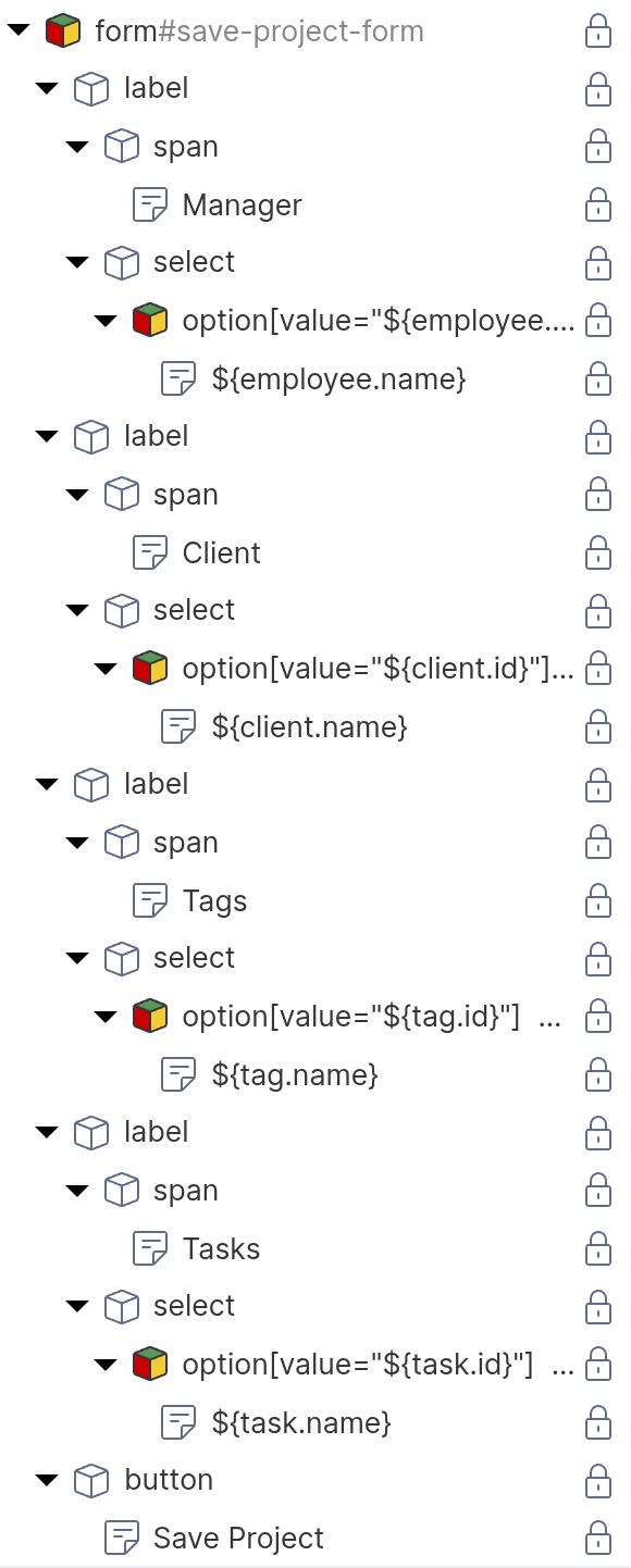
<form id="advanced-project-form">
    <label>
        <span>Manager</span>
        <select name="manager">
            <!-- repeater: find('Employee'), data key: employee -->
            <option value="${employee.id}">
                ${employee.name}
            </option>
        </select>
    </label>
    <label>
        <span>Client</span>
        <select name="client">
            <!-- repeater: find('Client'), data key: client -->
            <option value="${client.id}">
                ${client.name}
            </option>
        </select>
    </label>
    <label>
        <span>Tags</span>
        <select name="tags" multiple>
            <!-- repeater: find('Tag'), data key: tag -->
            <option value="${tag.id}">
                ${tag.name}
            </option>
        </select>
    </label>
    <label>
        <span>Tasks</span>
        <select name="tasks" multiple>
            <!-- repeater: find('Task'), data key: task -->
            <option value="${task.id}">
                ${task.name}
            </option>
        </select>
    </label>
    <button type="submit">Save Project</button>
</form>
Each <option> element is configured as a repeater that iterates over the available objects of the respective type. The HTML shows only one <option> per <select>, but at runtime, the repeater produces one option for each object returned by its function query. For details on repeaters and function queries, see the Dynamic Content chapter.
Configuring the Event Action Mapping
Select the form element in the page tree and configure the Event Action Mapping:
- Set the Event to
submit. - Select “Update object” as the Action.
- In the UUID field, enter
${current.id}. - In the type field, enter
Project. - Under Parameter Mapping, add a parameter for each property:
| Parameter Name | Parameter Type | Mapped Element | Purpose |
|---|---|---|---|
| manager | User Input | manager select | To-one: sends one UUID |
| client | User Input | client select | To-one: sends one UUID |
| tags | User Input | tags select | To-many: sends array of UUIDs |
| tasks | User Input | tasks select | To-many: sends array of UUIDs |
- Under Behavior on Success, select “Reload the current page”.
The Action Mapping configuration looks like this:
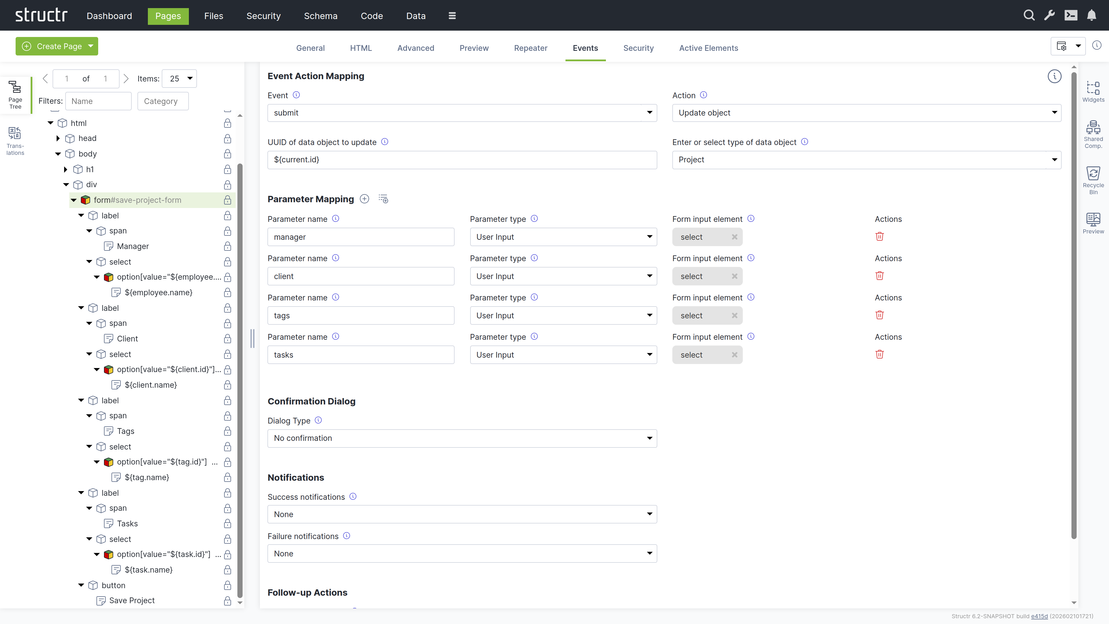
Each <option> element needs to know whether it should be pre-selected when the form loads. As described earlier in this chapter, Structr provides the Selected Values Expression field on the General tab of <option> elements for this purpose. The field contains a template expression that resolves to the current value of the property, for example current.manager or current.tags. Structr compares each option’s value attribute against the result and sets the selected attribute on matching options.
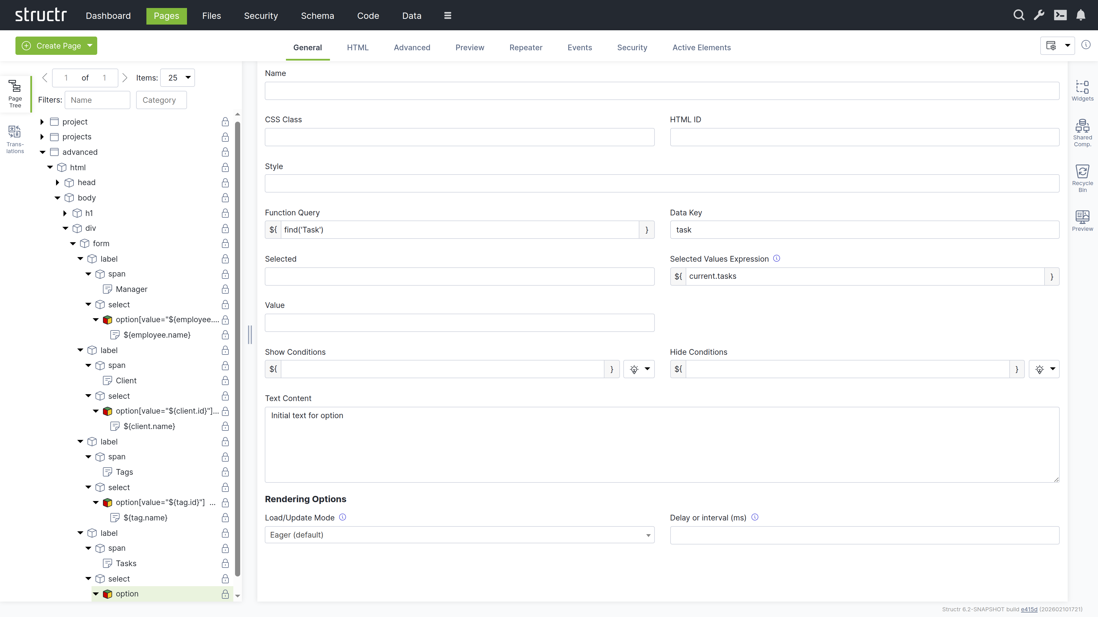
What Happens for Each Cardinality
Many-to-One (Manager)
The <select> element contains one <option> per employee. The repeater iterates over all employees and renders an option for each one. When the user selects a manager and submits the form, Structr receives the UUID of the selected employee and sets the manager relationship on the project. If a manager was previously set, the old relationship is removed and replaced with the new one.
The Selected Values Expression field on the <option> element is set to current.manager. Structr compares each employee’s UUID against the current manager and sets the selected attribute on the matching option, so the current manager is pre-selected when the form loads.
One-to-One (Client)
From a form perspective, one-to-one works the same as many-to-one. The user selects a single client from a dropdown, and Structr sets the relationship. The Selected Values Expression field is set to current.client. The difference is in the data model constraint: since the relationship is one-to-one, assigning a client to this project automatically removes that client from any other project it was previously assigned to. This enforcement happens on the server side and requires no special handling in the form.
Many-to-Many (Tags)
Each tag is rendered as an <option> inside a <select multiple> element by a repeater. When the form is submitted, the browser collects the values of all selected options, and Structr receives them as an array of UUIDs. Structr then sets the tags relationship to exactly these objects, adding new relationships and removing any that are no longer in the array.
The Selected Values Expression field on the <option> element is set to current.tags. Structr checks whether each tag is contained in the project’s current tags collection and marks the matching options as selected.
One-to-Many (Tasks)
The <select multiple> element lists all available tasks. The repeater iterates over all tasks, and the Selected Values Expression field on the <option> element is set to current.tasks. Structr checks whether each task is in the project’s current tasks collection and marks the matching options as selected. When the form is submitted, Structr receives the array of selected task UUIDs and updates the tasks relationship. Since each task can only belong to one project, assigning a task to this project automatically removes it from its previous project.
For one-to-many relationships, the inline creation pattern described earlier in the “Creating Related Objects Inline” section is often a simpler alternative to the multi-select approach shown here.
BPMN Process Control
BPMN Process Control connects page elements to running business processes. It is an action of the Event Action Mapping system: when a user clicks a button or submits a form, Structr can start a new process instance, complete or claim a user task, send a signal, or perform administrative operations such as reassigning a task or suspending a process. All of this is configured declaratively on the element, without writing any code.
This chapter explains how the Control process action works. For a hands-on walkthrough that builds a complete process-based app, see the tutorial “Building A BPMN Process Based App”.
Basics
The action is configured on an element’s Events tab by selecting the action Control process. Configuration is operation-first: choose the Operation, and the action shows exactly the fields that operation needs.
- Operation: what to do (start an instance, complete a task, …). See the table below.
- Process: the process the action operates on. Required for every operation.
- Process step: the user task (or catch event) the action targets. Shown only for task-level operations and signals; whole-process operations do not need it.
- Data type: the subject type to instantiate. Shown only for
Complete a task and create the subject, and filled automatically from the Subject type declared on the process. - ID expression: a script expression that identifies the concrete process instance (or task instance) at runtime, typically
${current.id}.
Like every Event Action Mapping, the action supports parameter mappings, notifications and follow-up actions; the process-specific behaviour of these is described below.
Process operations
| Operation | Group | Who may call it | Effect |
|---|---|---|---|
| Start a new process instance | Start | any user with read access on the process definition | creates a ProcessInstance, sets the caller as initiator, places the token at the start event and advances to the first wait state |
| Claim a task | Tasks | a candidate assignee (directly or via group) | reserves an available task for the caller |
| Complete a task | Tasks | the task’s participant (the task UI is the gate) | completes the task, routes submitted parameters, advances the process |
| Complete a task and create the subject | Tasks | the task’s participant | creates the subject object, transfers submitted parameters into it, attaches it to the instance, completes the task |
| Release a task back to the pool | Tasks | the current assignee | returns a reserved task to available |
| Decline a task (vote, reversible) | Tasks | a candidate assignee | records a decline vote; no state change, reversible by claiming |
| Delegate a task to someone else | Tasks | the current assignee, or a candidate while the task is available | hands the task to another user or group |
| Cancel a task (admin) | Tasks (admin) | users with access control on the task | cancels the task without advancing the process |
| Make a task available again (admin) | Tasks (admin) | users with access control on the task | clears the assignee and returns the task to the candidate pool |
| Reassign a task to a chosen user (admin) | Tasks (admin) | users with access control on the task | sets a new assignee directly, overriding candidate declarations |
| Send a signal to a running process | Signals | participants of the instance | resumes a waiting intermediate catch event |
| Suspend a running process (admin) | Lifecycle (admin) | administrative users | pauses token advancement; tokens stay in place |
| Resume a suspended process (admin) | Lifecycle (admin) | administrative users | continues a suspended instance |
| Terminate a process (admin) | Lifecycle (admin) | administrative users | ends the instance; all waiting tokens are consumed without advancement |
Participant operations follow the standard human-task vocabulary: users claim, complete, release, decline and delegate their own work. Administrative operations require access control permission and exist for routing and lifecycle intervention.
Starting a process
The start operation needs only the Process. Two ways to select it:
- Static: pick the process in the Process dropdown. This is the normal case for a dedicated start button.
- Dynamic: leave the Process empty and set a Dynamic process UUID expression instead, for example
${current.id}on a process catalog page where each row is bound to a different process. The expression is resolved at page render time and takes precedence over the static selection. Dynamic selection is honoured for the start operation only.
The start operation’s response contains a ready-made URL of the new instance’s page: the page bound as the process’s Instance page (a setting on the Process tab of the BPMN editor), or, when no page is bound, a path built from the slugified process name, for example /request-process/<instance-uuid>. A follow-up action Navigate to a new page with Success URL {result.url} therefore drops the user directly onto the freshly created instance’s page.
Parameters declared on a start action are stored as initial process parameters of the new instance, where process listeners and later steps can read them.
Targeting tasks: the ID expression
Task-level operations act on one concrete TaskInstance. The action finds it through the ID expression:
- If the expression resolves to a TaskInstance UUID, that task is used directly.
- If it resolves to a ProcessInstance UUID (the typical
${current.id}on an instance page), the engine locates the caller’s active task for the configured Process step on that instance.
The second form is the common pattern: the instance page receives the process instance as its current object via the UUID path segment of the URL, and every task action on the page targets its step with ${current.id}. The Process step must be set for this resolution to work; an action without it fails with an explanatory error.
The subject contract
A process instance operates on at most one domain object: the subject (a LeaveRequest, an Invoice, a Request). The connection between process and page is a declared contract:
- The process declares what it works on: the Subject type on the Process tab of the BPMN editor names the schema type. An instance has exactly one subject, so the type is a property of the process, not of a single task. Each user task can narrow which fields of the subject it shows and writes through its Form view and Writable view.
- The page consumes the declaration: when the operation
Complete a task and create the subjectis selected and the step is chosen, the action’s Data type is filled from the process’s Subject type automatically.
Complete a task and create the subject is the standard entry point for the first user task of a process. In one step it creates the subject object, transfers the submitted parameters into it, attaches it to the process instance, and completes the task. The subject is created by the engine rather than by the submitting user, so the submitter does not become its owner; access flows through the engine’s participant grants on the instance instead.
How parameters are routed
Form values reach the operation as named parameters, declared in the action’s Parameter Mapping section (parameter type User Input, with the input element linked to the parameter). On completion, the engine routes each parameter by name:
- A parameter whose name matches a property of the subject’s type is written to the subject: a parameter
titlebecomes the subject’stitle. - Any other parameter is stored as a process parameter value on the instance, readable by listeners, gateway conditions and later steps.
The parameter names are the contract. The reserved names id and type are never written to the subject. Subsequent tasks use the plain Complete a task operation, since the subject already exists; the same routing rule then updates it.
Showing and hiding elements by process state
Pages that host process actions usually adapt to the state of the process: the form for a task should show only while that task is open, a confirmation only after completion. Process Visibility Rules (internal type: VisibilityMapping) declare this on the element’s Process tab, one rule per element, no code:
| Visible when in state | Meaning |
|---|---|
| A task is available to claim | the bound step’s task is available |
| A task is reserved by me | the current user holds the bound step’s task |
| A task is reserved by someone else | another user holds the task |
| A task has been completed | the bound step’s task is completed |
| A task has been cancelled | the bound step’s task is cancelled |
| Process has completed | the instance reached an end event |
| Process has been terminated | the instance was terminated |
| Process has failed | the instance is in a failure state |
| Process is awaiting someone else’s action | a task is open, but not for the current user |
| No process instance exists for me yet | the current user has no active instance of the process |
| I already have a running instance | the current user has an active instance of the process |
Task-scoped and most process-scoped states evaluate against the page’s current object, so they belong on the instance page. The two states at the bottom query the database for the current user’s instances and work on any page, which makes them the right choice for start buttons and catalog pages. Multiple rules on one element are OR-combined, and a rule hides the element’s entire subtree, so it belongs on exactly the element it should control.
Automatic steps
Not every step of a process needs a person. The engine executes gateways, script tasks and service tasks on its own while it advances the token, and pauses only at user tasks, message catch events and timers.
Gateways follow the sequence flow whose condition evaluates to true. A condition written in BPMN style as ${...} is evaluated as JavaScript, so the comparison operators of other BPMN tools work unchanged; a condition written as a Structr expression is evaluated as StructrScript. The default attribute of the gateway names the flow to take when no condition matches, and a flow without a condition serves as fallback when there is no default. Set the attribute in the BPMN attributes editor of the gateway.
Script tasks run their script body. Service tasks run a script body as well when they have one, for example an expression imported from Camunda, and are passed through when they have none. The script format attribute selects the language. Scripts imported from Camunda or Flowable are transpiled to Structr JavaScript on the fly. A failing automatic task is logged and does not stop the instance.
Inside these scripts, the keyword process gives access to the process variables: the properties of the subject merged with the parameter values stored on the instance, where a parameter value wins over a subject property of the same name. Assigning $.process.name = value stores a new parameter value on the instance, routed like a submitted form parameter, so a script task can prepare data that a later gateway condition or user task reads.
Timers
Timer start events, intermediate timer events and timer boundary events are supported. A timer definition of type timeDuration takes an ISO 8601 duration such as PT30M, P1D or P2DT3H and fires that long after the token arrives. A definition of type timeDate takes an ISO 8601 instant such as 2026-04-25T14:30:00Z and fires at that time; an instant without zone is interpreted in the server’s time zone. Cycles of type timeCycle are not supported yet and are ignored with a warning. A boundary timer with cancelActivity set to true interrupts the task it is attached to when it fires.
Timers are stored as nodes, so pending timers survive a restart, and timers that elapsed while the server was down fire on startup. The ProcessTimerService polls for due timers every five seconds and fires each one in its own transaction. The service is part of the default service list. If you have customized configured.services in structr.conf, make sure the service is still listed, otherwise timers are created but never fire.
Event handlers
A handler is a schema method that the engine runs when a task or a process instance passes through a lifecycle event. You create handlers in the BPMN editor: the Element tab of a user task and the Process tab of the process each have an “Add handler” button that asks for the event and the phase and creates a method named after the step, the phase and the event, for example reviewRequest_afterCompleted. Open the method in the Code area to write its body. Handler names are scoped per process and version, so two processes can both have an onCreated handler without conflict.
| Level | Events |
|---|---|
| Task | created, assigned, claimed, available, declined, completed, cancelled |
| Process | created, started, subjectAttached, completed, terminated, suspended, resumed |
The phase decides when the method runs. on runs inside the engine’s transaction before the transition is committed; an exception thrown by the method rolls the transition back, which turns the handler into a validation or veto step. after is the default and runs after the commit, so it only fires when the transition actually persisted. Use it for side effects such as notifications, audit entries or derived data. There is one handler per event and phase.
Handlers receive named arguments, which you read via $.args as in any other schema method. A task handler gets task, processInstance, subject (when one is attached) and eventName, plus all parameter values of the instance by name. On the completed event the just-submitted form parameters are included before they are persisted, so an on handler can inspect or reject them. A process handler gets processInstance, subject, eventName and the parameter values. The task or instance is also available as this.
Versions
Every process carries a version. Importing a BPMN file whose process id already exists does not overwrite the process but creates the next version, and copies the handler methods of the previous version onto it so that existing logic keeps working. Instances always execute the version they were started on, which lets you change a model while older instances complete on the old one. The process pickers in the Events and Process tabs show the version next to the name, for example “Request Process (v2)”, so a page element is always bound to a specific version. Running instances keep their definition even when a later application deployment removes it; the definition disappears once those instances are finished.
Notification links and sessionless access
Participants who do not log in to your application, for example an external approver, can act on a task through a signed link. This requires the security level of the process definition to be set to low in its properties; the default high only allows access through the pages of the application while logged in.
The link is built in a handler, typically on the assigned or created event of the task:
{
    let instance = $.args.processInstance;
    let task     = $.args.task;
    let token    = $.processToken(instance.id, task.id, 'review');
    let url      = $.processInstanceUrl(instance, token);

    $.processNotify('email', $.args.subject.approverEmail, 'Please review', 'Open the request: ' + url);
}
processToken(processInstanceId, taskId, action [, expiryMinutes]) creates a signed JSON Web Token that carries the instance, the task and the allowed action. It expires after 48 hours unless you pass a different expiry, and requires security.jwt.secret in structr.conf to have at least 32 characters. processInstanceUrl(instance [, token]) builds the absolute URL of the instance page and appends the token as ?token=. The base URL comes from the Site the instance page is assigned to, then from application.baseurl.override, then from the current request, so the function also works in handlers that run without a request. processNotify(channel, recipient, subject, message) sends the message. The channel email uses the SMTP configuration of the instance, the channel log writes to the server log and is useful while testing.
The instance page is responsible for honouring the token. It reads the token request parameter, validates it with validateProcessToken(token) inside doPrivileged, and checks that the returned processInstanceId matches the instance in the URL and that the task is still open before it renders the form and completes the task on the visitor’s behalf. The function returns the claims of a valid token and null for an invalid, expired or tampered one.
Process-bound components and page skeletons
Two features shorten the way from model to page. The “Create page skeleton” button on the Process tab of the BPMN editor generates the instance page with one section per human step, each already carrying the matching visibility rule, and binds it as the instance page. The process-bound components of the default widget set render the subject of the instance from the subject type of the process, so a form for a user task needs no manual field setup. Both are described in the Processes chapter of the Admin User Interface section and in the Widgets & Components chapter.
Related topics
- Event Action Mapping: events, actions, parameter mappings, notifications and follow-up actions in general.
- Processes (Admin User Interface): the BPMN editor, process settings, page skeletons and the monitoring views for instances and tasks.
- Building A BPMN Process Based App (Tutorials): a step-by-step walkthrough using the concepts of this chapter.
Business Logic
Business logic in Structr is event-driven. Code runs in response to data changes, scheduled times, user interactions, or external requests. You implement this logic in the schema – as methods on your types or as user-defined functions.
Why Event-Driven?
This architecture follows the ROCA style (Resource-Oriented Client Architecture): the server holds all business logic and state, while the client remains thin and focused on presentation. The frontend triggers events, but the logic itself lives in the schema, ensuring business rules are enforced consistently regardless of whether changes come from the UI, the REST API, or an external integration.
Building From the Data Model
Structr applications grow from the data model outward. You model your domain first, then add logic incrementally. Structr’s schema-optional graph database supports this approach: you can focus on one aspect, get it working, and add new types or relationships later without disrupting existing functionality. This makes Structr well-suited for rapid prototyping that evolves directly into production applications.
Implementing Logic
You define all business logic in the Code area of the Admin User Interface. Methods are organized by type, and user-defined functions appear in their own section. Structr provides a large library of built-in functions for common tasks like querying data, sending emails, making HTTP requests, and working with files.
Structr provides three mechanisms: lifecycle methods that react to data changes, schema methods that you call explicitly, and user-defined functions for application-wide logic.
Lifecycle Methods
To run code when data changes, you add lifecycle methods to your type. Open your type in the Code area, click the method dropdown below the method list, and select the event you want to handle.
Example: Setting Defaults on Create
{
    // onCreate lifecycle method on the Project type
    if ($.empty(this.startDate)) {
        this.startDate = new Date();
    }

    if ($.empty(this.status)) {
        this.status = 'draft';
    }

    this.projectNumber = $.Project.generateNextProjectNumber();
}
This code runs automatically whenever a new Project is created – whether through the UI, the REST API, or another script.
Available Lifecycle Methods
| Method | When it runs |
|---|---|
onCreate | Before a new object is saved for the first time |
onSave | Before an existing object is saved |
onDelete | Before an object is deleted |
afterCreate | After a new object has been committed to the database |
afterSave | After changes to an object have been committed |
afterDelete | After an object has been deleted from the database |
Example
The “before” methods run inside the transaction – if you throw an error, the operation is cancelled and no data is saved. The “after” methods run in a separate transaction after the data has been safely persisted, making them ideal for notifications:
{
    // afterSave lifecycle method on the Order type
    if (this.status === 'confirmed') {
        $.sendPlaintextMail(
            'orders@example.com',
            'Order System',
            this.customer.email,
            this.customer.name,
            'Order Confirmed',
            'Your order ' + this.orderNumber + ' has been confirmed.'
        );
    }
}
For a complete list of available functions like $.sendPlaintextMail(), see the Built-in Functions reference.
Other Callbacks
Certain built-in types provide additional callbacks for specific events:
| Method | Type | When it runs |
|---|---|---|
onNodeCreation | All types | During low-level node creation |
onUpload | File | When a file is uploaded |
onDownload | File | When a file is downloaded |
onOAuthLogin | User | When a user logs in via OAuth |
onStructrLogin | User-defined function | When a user logs in via Structr authentication |
onStructrLogout | User-defined function | When a user logs out |
onAcmeChallenge | User-defined function | When an ACME certificate challenge is received |
afterAcmeChallenge | User-defined function | After an ACME certificate challenge has finished |
Schema Methods
To create operations that users or external systems can trigger, you add schema methods to your types. These are custom methods that you call explicitly – via Event Action Mapping, REST, or from other code.
Instance Methods
Instance methods operate on a single object. Create one by clicking “Add method” in the Code area and giving it a name. Inside the method, use this to access the object’s data:
{
    // Instance method "calculateTotal" on the Invoice type
    let total = 0;

    for (let item of this.items) {
        total += item.quantity * item.unitPrice;
    }

    if (this.discount) {
        total = total * (1 - this.discount / 100);
    }

    return total;
}
You can then call this method on any Invoice object:
{
    let invoice = $.first($.find('Invoice', { number: '2026-001' }));
    let total = invoice.calculateTotal();
}
Static Methods
Static methods operate at the type level rather than on individual objects. Enable the “Method is static” checkbox when creating the method. Use them for operations that work with multiple objects:
{
    // Static method "findOverdue" on the Invoice type
    return $.find('Invoice', {
        status: 'unpaid',
        dueDate: $.predicate.lt(new Date())
    });
}
Service Classes
For logic that doesn’t belong to a specific data type, create a service class. A service class is a type that holds only methods – you can’t create instances of it or add properties. Use service classes to group related operations, like all methods for communicating with an external system.
To create a service class, go to the Code area and click “Create Service Class”. Service classes appear in their own branch in the tree.
{
    // Static method "generateMonthlyReport" on service class "ReportingService"
    let startDate = $.arguments.startDate;
    let endDate = $.arguments.endDate;

    let orders = $.find('Order', {
        orderDate: $.predicate.between(startDate, endDate),
        status: 'completed'
    });

    return {
        period: { start: startDate, end: endDate },
        orderCount: orders.length,
        totalRevenue: orders.reduce((sum, o) => sum + o.total, 0)
    };
}
Calling Methods on Objects
You can call methods on any Structr object, not just $.this. When you retrieve objects with $.find() or access them through relationships, they have all the methods defined on their type.
{
    // Call a method on a found object
    let invoice = $.first($.find('Invoice', { number: '2026-001' }));
    let total = invoice.calculateTotal();

    // Call methods in a loop
    for (let project of $.find('Project', { status: 'overdue' })) {
        project.sendReminder();
    }

    // Call methods through relationships
    $.this.customer.sendNotification('Your order has shipped');
}
This works because Structr objects are full objects with their schema methods attached. Any method you define on a type is available on every instance of that type, regardless of how you obtained the reference.
Calling Methods on System Types
Built-in types also come with methods. For example, Mailbox has a method to discover available folders on the mail server:
{
    let mailbox = $.first($.find('Mailbox', { name: 'Support Inbox' }));
    let folders = mailbox.getAvailableFoldersOnServer();
}
See the System Types reference for all methods available on built-in types.
Calling Methods from the Frontend
The examples above show how to call methods from within Structr code. To trigger methods from HTML pages, use Event Action Mapping. You configure a DOM event (like a button click) to call a method, and Structr handles the REST call automatically. The Event Action Mapping passes input values to the method and handles the response – displaying results, showing notifications, or triggering follow-up actions.
For details on configuring Event Action Mappings, see the Event Action Mapping chapter.
User-Defined Functions
User-defined functions provide application-wide logic that isn’t tied to a specific type. Create them in the Code area under “User-defined functions”.
Scheduled Execution
To run a function on a schedule, configure a cron expression for the function in structr.conf. Structr uses extended cron syntax that supports second-precision scheduling.
{
    // User-defined function with cron expression "0 0 2 * * *" (daily at 2 AM)

    // Syntax: dateAdd(date, years[, months[, days[, hours[, minutes[, seconds]]]]])
    let thirtyDaysAgo = $.dateAdd(new Date(), 0, 0, -30);
    let oldEntries    = $.find('LogEntry', { createdDate: $.predicate.lt(thirtyDaysAgo) });

    // delete() can take both collections and single elements
    $.delete(oldEntries);

    $.log('Deleted ' + oldEntries.length + ' old log entries');
}
Deferred Execution
To queue code for later execution without blocking the current request, use $.schedule(). This is useful for long-running operations that shouldn’t delay the response to the user.
External Events
External systems can trigger your business logic in several ways:
REST API
External systems can call your schema methods via REST, or create and modify data through Structr’s automatically generated endpoints. When data changes via REST, the same lifecycle methods execute as when changes come from the UI. For details on how to pass and access parameters when calling methods via REST, see the Method Parameters article.
Message Brokers
You can connect Structr to MQTT, Kafka, or Apache Pulsar. Incoming messages trigger lifecycle methods on specialized client types. See the Message Brokers chapter.
Structr can monitor inboxes and trigger logic when messages arrive. See the Email chapter.
Choosing the Right Mechanism
| If you need to… | Use… |
|---|---|
| Enforce rules whenever data changes | Lifecycle methods |
| Provide operations users can trigger | Schema methods |
| Run code on a schedule | User-defined functions with cron |
| Create reusable utilities | User-defined functions |
| Group related operations | Service classes |
Writing Code
You write business logic in the code editor in the Code area. When you select a method or function in the tree on the left, the editor opens on the right. The editor provides syntax highlighting and autocompletion for both JavaScript and StructrScript.
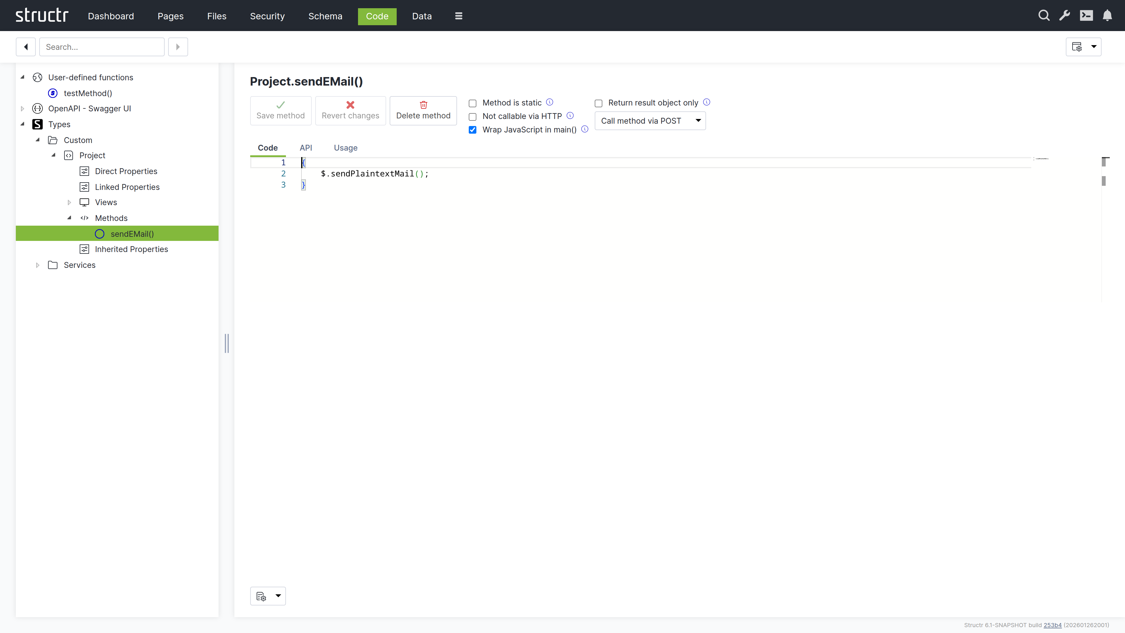
Structr supports two scripting languages: JavaScript and StructrScript. To use JavaScript, enclose your code in curly braces {…}. Code without curly braces is interpreted as StructrScript, a simpler expression language designed for template expressions.
The $ Object
In JavaScript, you access Structr’s functionality through the $ object:
{
    // Query data
    let projects = $.find('Project', { status: 'active' });

    // Create objects
    let task = $.create('Task', { name: 'New task', project: this });

    // Access the current user
    let user = $.me;

    // Call built-in functions
    $.log('Processing complete');
    $.sendPlaintextMail(...);
}
In StructrScript, you access functions directly without the $ prefix.
Calling Methods from Templates
You can call static methods from template expressions in your pages:
<span>${$.ReportingService.getActiveProjectCount()} active projects</span>
This lets you keep complex query logic in your schema methods while using the results in your templates.
Security
All code runs in the security context of the current user. Objects without read permission are invisible – they don’t appear in query results. Attempting to modify objects without write permission returns a 403 Forbidden error.
Admin Access
The admin user has full access to everything. Keep this in mind during development: if you only test as admin, permission problems won’t surface until a regular user tries the application. Test with non-admin users early.
Elevated Permissions
Sometimes you need to perform operations the current user isn’t allowed to do directly. Structr provides several functions for this.
Privileged Execution
$.doPrivileged() runs code with admin access:
{
    let projectId = this.project.id;

    $.doPrivileged(() => {
        // find() with a UUID string returns the object directly, not a collection
        let project = $.find('Project', projectId);
        project.taskCount = project.taskCount + 1;
    });
}
$.callPrivileged() calls a user-defined function with admin access:
{
    $.callPrivileged('updateStatistics', { projectId: this.project.id });
}
Executing as Another User
$.doAs() runs code as a specific user:
{
    $.doAs(targetUser, () => {
        // This code runs with targetUser's permissions
    });
}
Separate Transactions
$.doInNewTransaction() runs code in a separate transaction:
{
    $.doInNewTransaction(() => {
        // Changes here are committed independently
    });
}
Context Boundaries
These functions create a new context. You can’t use object references from the outer context directly – pass the UUID and retrieve the object inside:
{
    let id = this.id;  // Get the ID in the outer context

    $.doPrivileged(() => {
        // find() can be used to get a single object by ID
        let obj = $.find('MyType', id);  // Retrieve in inner context
        // ...
    });
}
Error Handling
When an error occurs, Structr rolls back the transaction and returns an HTTP error status – typically 422 Unprocessable Entity for validation errors.
Throwing Errors
To abort an operation with an error message:
{
    if (this.endDate < this.startDate) {
        $.error('endDate', 'invalidRange', 'End date must be after start date.');
    }
}
Or use $.assert() for simple condition checks:
{
    $.assert(this.endDate >= this.startDate, 422, 'End date must be after start date.');
}
Catching Errors
To handle errors without aborting the transaction:
{
    try {
        $.POST('https://external-api.example.com/notify', JSON.stringify(data));
    } catch (e) {
        $.log('Notification failed: ' + e.message);
    }
}
Errors During Development
In the Admin UI, scripting errors appear as pop-up notifications, making it easy to spot problems as they occur.
Development Tools
Logging
Write messages to the server log with $.log():
{
    $.log('Processing: ' + this.name);
}
Debugging
You can debug Structr’s JavaScript using Chrome DevTools. Enable the setting application.scripting.debugger in structr.conf and restart Structr. The Dashboard then shows the debugger URL in the “About Structr” section, and the URL also appears in the server log. Open the URL in Chrome to set breakpoints and step through your code.
Code Search
The Code area provides a search function to find text across all methods and functions. Structr also has a global search that spans all areas of the application.
Testing
Structr applications are best tested with integration tests that exercise the complete system. Unit testing individual methods isn’t directly supported because methods depend on the Structr runtime.
In practice, you write tests that create real objects, trigger operations, and verify results through the REST API. The tight integration between data model and business logic makes integration tests more meaningful than isolated unit tests.
Exposing Data
A significant part of business logic involves preparing data for consumers – your frontend, mobile apps, external systems, or reports.
Views
Views control which attributes appear when objects are serialized to JSON. The default public view contains only id, type, and name. You can customize it or create additional views:
GET /structr/rest/Project              → public view
GET /structr/rest/Project/summary      → summary view (custom)
GET /structr/rest/Project/all          → all attributes
Views are defined in the schema – they declare which attributes to include without any code.
Methods as API Endpoints
All schema methods are automatically exposed via REST. To call an instance method:
POST /structr/rest/Project/<uuid>/calculateTotal
To call a static method:
POST /structr/rest/Project/findOverdue
Configuring Methods
Visibility – To prevent external access, enable “Not callable via HTTP” in the method settings.
HTTP Verbs – By default, methods respond to POST. You can configure which verbs a method accepts – use GET for read-only operations.
Access Control – Resource Access Permissions let you control who can call specific endpoints. Configure them in the Security area.
Result Format – By default, results are wrapped in a metadata object. Enable “Return result object only” to return just the data – useful for external integrations.
For details on how to pass and access parameters when calling methods via REST, see the Method Parameters article.
OpenAPI
Structr automatically generates OpenAPI documentation for your endpoints at /structr/openapi. To include a type, enable “Include in OpenAPI output” and assign a tag. Types with the same tag are grouped at /structr/openapi/<tag>.json.
See the OpenAPI chapter for details.
Transforming Data
You can transform query results in JavaScript before returning them:
{
    let projects = $.find('Project', { status: 'active' });

    // Group by client
    let byClient = {};

    for (let project of projects) {
        let name = project.client.name;

        if ($.empty(byClient[name])) {
            byClient[name] = { client: name, projects: [], total: 0 };
        }

        byClient[name].projects.push({ name: project.name, budget: project.budget });
        byClient[name].total += project.budget || 0;
    }

    return Object.values(byClient);
}
Traversing the Graph
The graph database lets you follow relationships across multiple levels efficiently:
{
    // Collect all team members across all projects
    let members = new Set();

    for (let project of this.projects) {
        for (let member of project.team) {
            members.add(member);
        }
    }

    return [...members].map(m => ({ id: m.id, name: m.name, email: m.email }));
}
For complex traversals, use Cypher queries with $.cypher(). Results are automatically instantiated as Structr entities.
Building External Interfaces
When external systems need your data, create a service class that handles the transformation:
{
    // Static method on "ERPExportService"
    let projects = $.find('Project', { status: 'active' });

    return projects.map(p => ({
        externalId: p.erpId,
        title: p.name,
        customerNumber: p.client.erpCustomerNumber,
        startDate: p.startDate.toISOString().split('T')[0]
    }));
}
This keeps transformation logic in one place, making it easy to adjust when requirements change.
Widgets & Components
Widgets and Shared Components are the two ways to reuse page elements in Structr. A Shared Component is a piece of page structure that exists once and is referenced from many pages. A Widget is a building block that you insert into a page, from a simple heading to a complete table that renders records from your database. This chapter explains how to use both when you build an application. Writing your own Widgets is covered in the Creating Widgets chapter.
Shared Components
A Shared Component is a reusable structure of HTML elements that you can insert into any page via drag and drop. Unlike a Widget, where Structr copies the content into the page, inserting a Shared Component creates a reference to the original. When you edit a Shared Component, the changes are immediately visible on all pages that use it. A typical example is the Main Page Template, which defines the overall layout and is shared across all pages of an application.
How it works
When you drag a Shared Component onto a page, Structr creates a copy of the root element that is linked to the original via a SYNC relationship. This link ensures that changes to the original Shared Component are automatically propagated to all copies.
This has two important consequences:
-
Single source of truth: The Shared Component exists only once. Any changes you make to it are immediately reflected everywhere it is used.
-
Smaller page trees: Pages that use Shared Components contain only the linked root element, not copies of the entire element structure.
Creating Shared Components
To create a Shared Component, drag an element from the page tree into the Shared Components flyout on the right side of the Pages area. Structr moves the element from the page tree into the Shared Components area and replaces it in the page tree with a linked copy. From this point on, the element in the page tree is a reference to the Shared Component.
Alternatively, you can right-click an element in the page tree and select “Convert to Shared Component” from the context menu.
Deleting Shared Components
When you delete a Shared Component, Structr does not remove the linked copies from the pages. Instead, it converts the linked copies into independent elements that no longer share content with each other. This means that deleting a Shared Component does not break your pages, but it does remove the synchronization between the copies.
Rendering children
When a Shared Component is inserted into a page, the linked copy in the page tree can have its own children. This is what makes Shared Components useful as templates: the Shared Component defines the outer structure, and the children in each page provide the specific content.
Within a Shared Component, the render(children) function determines where the children of the linked copy are rendered. For example, a Shared Component with the following content:
<div class="panel">
    <div class="panel-header">Panel</div>
    <div class="panel-body">
        ${render(children)}
    </div>
</div>
renders the children that were added to the linked copy in the page tree at the position of the ${render(children)} expression. This allows the Shared Component to define the structure and styling while each page provides its own content.
Customization at render time
Because Shared Components are rendered in the context of the page they are used in, you can use template expressions to customize the output based on the page, the current user, or other context information. For example, a Shared Component for a navigation menu could highlight the current page:
<nav>
    <a href="/" class="${page.name == 'home' ? 'active' : ''}">Home</a>
    <a href="/about" class="${page.name == 'about' ? 'active' : ''}">About</a>
</nav>
Structr evaluates the template expressions when rendering each page, so the same Shared Component produces different output depending on where it is used. Template expressions are explained in the Dynamic Content chapter.
Synchronization of Attributes
Structr synchronizes the content and structure of a Shared Component with all its linked copies. However, some attributes are page-specific and are not synchronized. These include the name of the element, visibility flags, and the data-structr-* attributes used for event handling. This allows you to give each linked copy a different name and visibility settings while sharing the same content structure.
Widgets
Widgets are reusable building blocks for your pages. They range from simple HTML snippets to complete, configurable components with their own logic and styling. When you insert a Widget, Structr copies its content into the page tree as ordinary elements. You can edit the result like any other element, and later changes to the Widget do not affect pages that already use it.
All Widgets are stored in the database of your application. There is no connection to a remote server at runtime. The default widget set from structr.com is imported into your application with a single click and behaves like any other set of local Widgets afterwards.
The Widgets Flyout
The Widgets flyout on the right side of the Pages area lists all Widgets of your application, grouped by category. The filter input at the top narrows the list by name. You can drag any Widget from the flyout into the page tree. Right-click a Widget to edit or delete it, or to open its advanced properties. The plus button in the upper right corner creates a new Widget, which is the entry point to the Creating Widgets chapter.
Importing the Default Widget Set
On a new application the flyout is empty and shows a tile labeled “Import Widget Set”. Clicking the tile downloads the default widget set from structr.com and imports it into your application. The same tile appears in the Create Page dialog when no page templates exist yet. After the import, the Widgets are ordinary local Widgets that you can edit, delete or extend.
The default set is organized in these categories:
| Category | Widgets | Purpose |
|---|---|---|
| Page Templates | Default Page | A complete page with header, sidebar and menu. Start new pages from it. |
| Layout | Grid | A six-column grid that arranges the components you place inside it. |
| Components | Table, List, Gallery, Accordion, Create Form, Edit Form, Card, Card with heading, Centered Card | Data-driven components that render records of a type, and static cards that group content. |
| Component Parts | Pagination | A pagination bar that you can add to a component. |
| Form Elements | Textfield, Textarea, Checkbox, Login Form, Login Form (2FA OTP) | Inputs for forms, and ready-made login forms. |
| Text | Heading, Page Heading, Label, Badge, Paragraph with static text | Content elements. |
| Actions | Action Button, Create Button, Delete Button | Buttons that call a method on a type, or create and delete records. |
| Render Templates | textfield, textarea, checkbox, datepicker, formatted-date, select, badge, related-link and others | Formats for single field values inside data-driven components. You choose them per field, you do not insert them. |
Inserting Widgets
The primary way to insert a Widget is through the context menu. When you right-click an element in the page tree, Structr shows the Widgets that fit at this position under “Suggested Widgets”, grouped by category. Each Widget declares where it belongs, so a Heading is suggested inside a card but not directly inside the page layout, and a Table is suggested in the main content area but not inside a form. Following the suggestions keeps your page structure valid without you having to know the rules.
Suggestions depend on the page you start from. The Widgets of the default set are designed for pages created from the Default Page template. If you create a page with the built-in Simple Page tile and right-click its body, no Suggested Widgets appear, because the plain HTML elements carry no information about what fits inside them. In that case, or whenever a Widget you want is not suggested, drag it from the Widgets flyout into the page tree instead. Drag and drop always works but does not check whether the position is valid.
Suggested Widgets also appear in two submenus of the context menu. “Wrap Element In” lists Widgets that can take the selected element as their content, for example a card around an existing heading. “Replace Element With” lists Widgets that can take the place of the selected element and, where the content areas match, keep its content.
If a Widget needs input before it can be inserted, the “Insert Widget” dialog opens. It shows the description of the Widget and the settings it asks for. The “Append Widget” button stays disabled until all required settings have values.
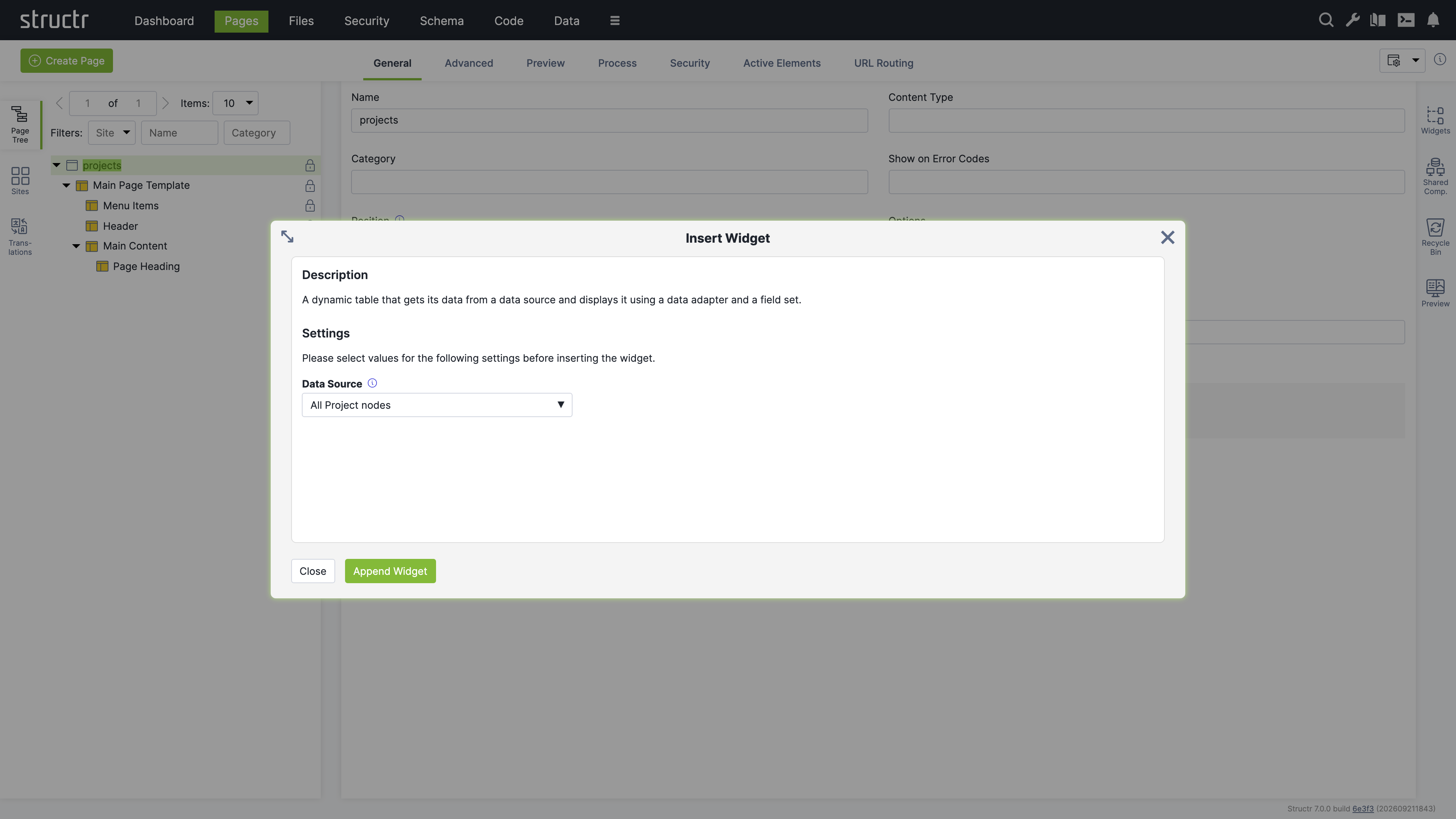
An inserted Widget inherits the visibility flags of its parent element. If the parent is visible to authenticated users only, all elements created by the Widget receive the same flags, so a new Widget is visible to the same audience as the surrounding page.
Page Templates
Widgets with the “Is Page Template” option appear in the Create Page dialog next to the built-in Empty Page, Simple Page and Custom Page tiles. A page template is a Widget that produces a whole page; it is not related to the Template element type of the page tree. When you create a page from a page template, Structr imports the complete page structure including content, repeaters, permissions and Shared Components. The Default Page of the default widget set creates the Main Page Template as a Shared Component, so all pages you create from it share one layout, and a change to the header or the menu appears on every page.
Widgets vs. Shared Components
| Aspect | Widget | Shared Component |
|---|---|---|
| Storage | Source code in the Widgets flyout | Part of your page tree |
| Insertion | Creates a copy | Creates a reference |
| Changes | Only affect new insertions | Immediately visible everywhere |
| Use case | Starting points, building blocks | Consistent layouts, headers, footers |
Examples
A Table and an Edit Form
This example builds a page that lists projects in a table and lets you edit the selected project in a form. It uses only the default widget set and the dialogs described in this chapter. If you have not created a type yet, the example creates one for you.
Import the default widget set from the Widgets flyout if you have not done so. Then click Create Page and choose the Default Page template. Name the page projects. Expand the page in the page tree. You see the Main Page Template with its Menu Items, Header and Main Content, and a Page Heading inside Main Content.
Right-click Main Content and choose Suggested Widgets, then Components, then Table. The Insert Widget dialog opens and asks for the data source. If you already have a type, open the Data Source menu, choose Use Existing Data Source, then Custom Types, then the entry for your type, for example “All Project nodes”. If you have no type yet, choose Create New Data Source and Create New Custom Type. Enter Project as the name, add the attributes description of type String and dueDate of type Date, and check “Create example data”. Click Append Widget.
The Table appears in the page tree below Page Heading. Select it. The General tab now shows the component configuration dialog, and the Preview flyout on the right shows the table with the records of your type. If you created the type with example data, five example projects are already there.
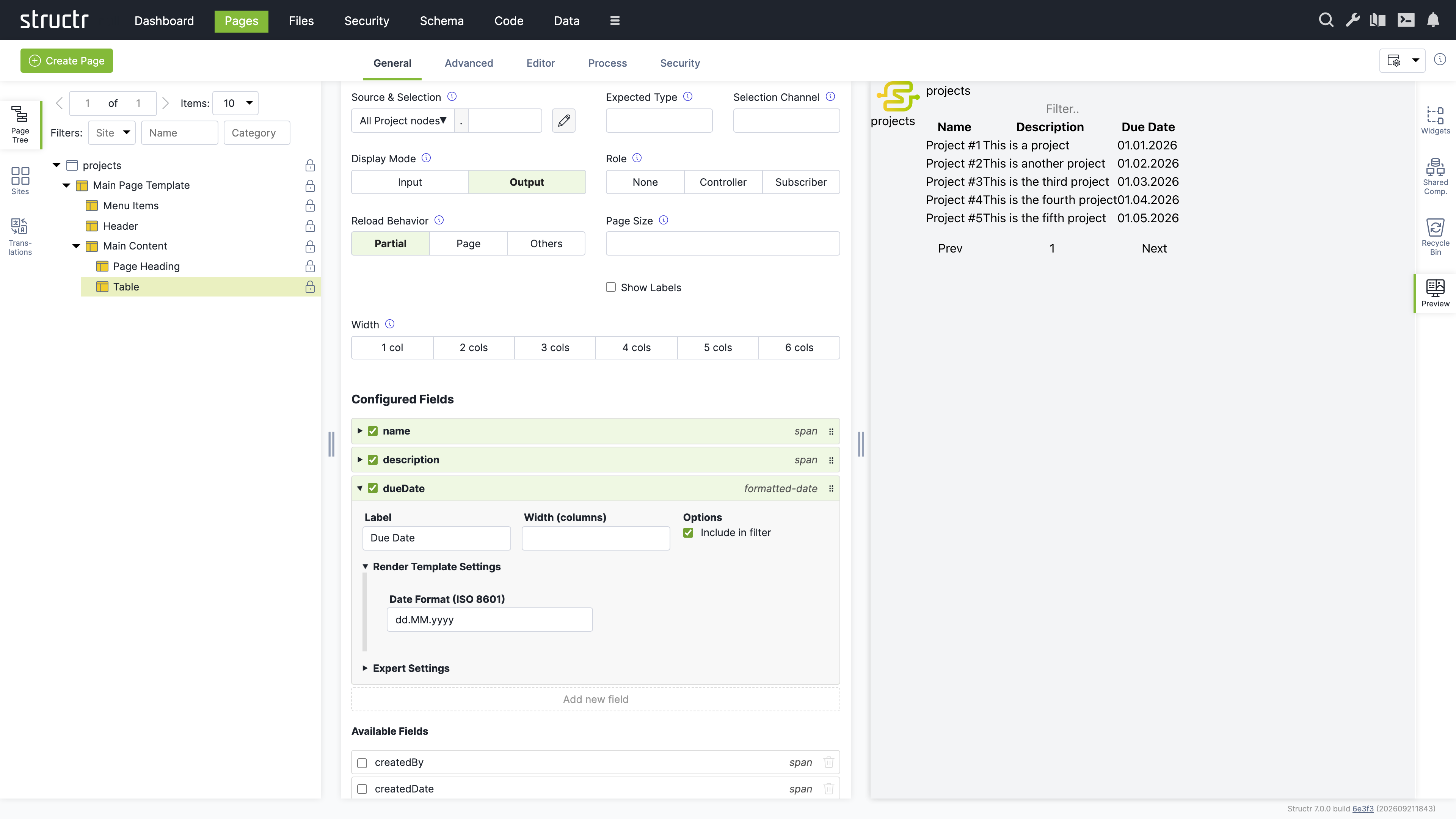
The list under Configured Fields shows the columns of the table. Click a field in the Available Fields list below to add it as a column, for example description and dueDate. Each configured field shows the name of its render template on the right. Click the template name of the dueDate field and choose formatted-date. Then click the field itself to expand its details, open Render Template Settings and enter dd.MM.yyyy as the date format. The preview updates after every change. The filter input above the table and the pagination below it work without any further setup.
Now connect a form to the table. In the configuration dialog of the Table, set Role to Controller and enter current as the Selection Channel. From now on, clicking a row in the table selects that project and writes its id to the URL.
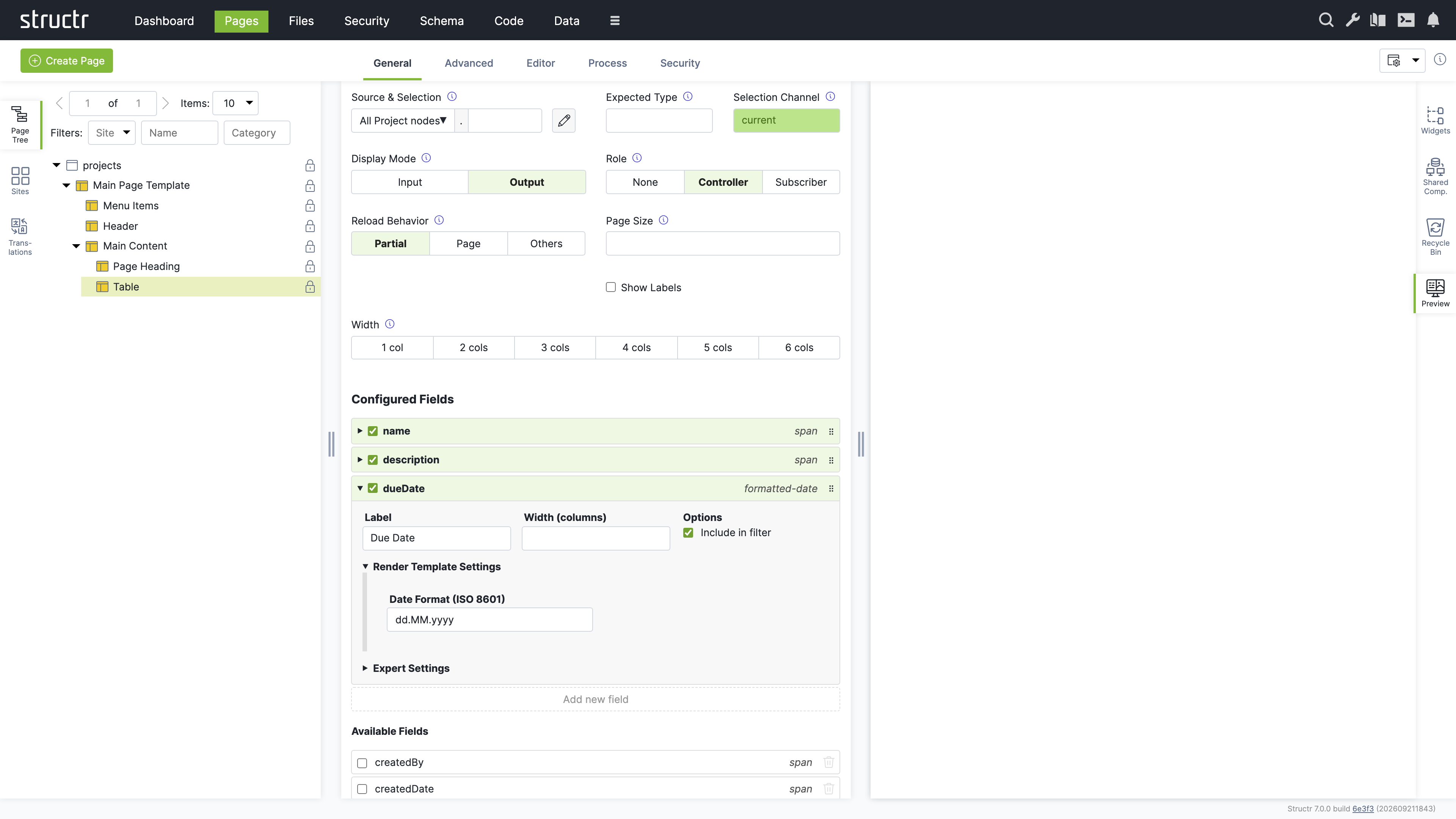
Right-click Main Content again and choose Suggested Widgets, Components, Edit Form. In the Data Source menu choose Use Existing Data Source, then Channels, then current. Click Append Widget. Select the Edit Form in the page tree and add the same fields as in the table. For description choose the textarea template and for dueDate the datepicker template.
Open the page in a new browser tab. Click a row in the table and the form below shows the selected project. Change the description, click Save, and the table refreshes with the new value. Click a column header to sort, or type into the filter input to narrow the list. Everything you see in the page was produced by two Widgets and their configuration dialogs.
Data-Driven Components
The Table and the Edit Form in the example above are data-driven components. You point them at a data source such as a type, choose which fields to show, and the component renders the records at runtime. This section explains the settings you meet in the component configuration dialog and what they are for. The chapter Dynamic Content explains repeaters, the lower-level way to render data, which give you full control over the markup at the cost of building it yourself.
The Component Configuration Dialog
The dialog appears in the General tab of the properties panel when you select a data-driven component in the page tree. It contains the following settings.
Source & Selection
This field shows the data source of the component and an optional second part after the dot. The data source is chosen from the same menu as in the Insert Widget dialog. The second part is a property name that Structr follows on the object delivered by the data source. This chapter calls it the transform, because it transforms one object into the collection or value the component shows. The pencil button opens a script-based or query-based data source in the Code area.
Expected Type
This field names the type that the component expects from its data source. Structr uses it to fill the Available Fields list and to check compatibility. For types it is filled automatically. You only need it when the data source is a channel or a transform that does not reveal its type.
Selection Channel
This field names the channel that the component writes to when it is a controller. It is required as soon as the Role is not None. Use current for the common case of one list and one detail view on a page.
Display Mode
This toggle switches between Output and Input. In output mode each field is shown with its render template, in input mode with its edit template, which is typically an input element. Tables and lists use Output, forms use Input. The setting is preset by the Widget, so you rarely change it.
Role
This toggle sets the component to None, Controller or Subscriber. None is the default and right for a component that stands alone. A Controller lets the user select a record and publishes the selection. A Subscriber shows the record that a controller selected. See Channels below.
Reload Behavior
This toggle controls what happens after the user changes data or a selection. Partial is the default and reloads only the components that are affected, including this one. Page reloads the whole page and is the choice when other parts of the page depend on the data as well. Others reloads the affected components but not this one, which keeps the input state of a form after saving.
Page Size
This field sets the number of records per page. The default is 10.
Show Labels
This checkbox controls whether the field labels are rendered. Forms usually show labels, tables show them in the header row instead.
Width
This toggle sets the width of the component in the six-column grid of the page layout, from one to six columns. Components inside a Grid widget sit side by side when their widths add up to six.
Configured Fields and Available Fields
The lower part of the dialog shows two lists. Configured Fields are the fields that the component renders, in the order in which they are rendered. Available Fields are all other fields that the data source delivers.
When you first assign a data source, the Configured Fields list contains only the name field, or the attributes you created together with a new type. Click a field in the Available Fields list to add it. Drag the handle on the right side of an entry to reorder the fields. Uncheck the checkbox of a field to remove it. The “Add new field” button creates a field that has no counterpart in the data source, for example a computed column with its own value expression.
Each configured field shows its render template on the right. Click the template name to choose a different one. The dropdown offers only templates that fit the data type of the field, so a date field offers formatted-date and datepicker while a text field offers textfield and textarea. Structr marks a field as stale when the data source no longer delivers it, typically because the property was deleted from the type, and warns when a field has no template for the active display mode.
Click a field to expand its details. The label is the text shown in the table header or next to the input. The width in columns from 1 to 6 controls how much of the six-column grid the field takes, so two fields with width 3 sit side by side in a form. The “Include in filter” checkbox controls whether the field takes part in the text filter.
Render Template Settings
This section shows the parameters of the selected render template, for example the date format of formatted-date or the detail page of related-link. If the template has no parameters, the section says so.
Expert Settings
This section is for cases the defaults do not cover. The value expression is the script expression that produces the value of the field, normally the property of the record. The data type controls which render templates are offered. The column data source and column data key turn one field into several columns, one per object of another data source, for example one column per category. The edit mode condition is a script expression that decides per field and per record whether the field is editable, regardless of the display mode of the component. Use it to make single columns of a table editable, or to lock fields once a record reaches a certain state.
Data Sources
A data source delivers the records that a component shows. The data source menu groups them as follows.
Custom Types and System Types
These two groups list your own types and the built-in types File, Folder, Group, Image, Page and User. A type as data source delivers all its records, and the Available Fields list shows its properties. This is the most common choice.
User-defined Data Sources
Script-based and query-based data sources are created in the Code area under Data Sources, or directly from the Insert Widget dialog by choosing Create New Data Source. A script-based data source runs a script that returns a collection, and is the choice when the records come from several types or need computation. A query-based data source holds a type and a query that you assemble in a query builder without writing code, and is the choice for a filtered or sorted subset of one type. When you create either kind from the Insert Widget dialog, Structr creates an empty data source and you fill it in the Code area afterwards. The pencil button in the configuration dialog takes you there.
Channels
This group lists current and the selection channels of all controllers in your application. A channel as data source delivers the single record that a controller selected, and is what turns a component into a subscriber. The entry parent delivers the record that a surrounding component or repeater provides under that name, for components nested inside another component.
Folders and Processes
The Folders group delivers the root folders of the file system or the files of a folder you pick. The Processes group appears when the process module is installed and delivers the running processes.
Compatibility
Structr checks that the data source fits the component. A component that shows a single record, such as the Edit Form, cannot be bound to a data source that delivers a collection, and a transform cannot be applied to a collection. If you choose an incompatible combination, Structr rejects the change with a message that names the data source and the component. Choose a channel for single-record components and a type or a user-defined data source for collection components.
Channels
A channel connects a controller to its subscribers. When the user selects a record in a controller, the controller writes the id of the record into a URL parameter named after the channel. Every subscriber that uses the channel as its data source detects the new value and reloads with the selected record. No event wiring is needed, the URL is the shared state, and because it is in the URL, the selection survives a page refresh and can be bookmarked.
The channel current is always available. It stores the id in the path of the URL, so a detail page can be opened directly as /projects/<id>. Any other channel name stores the id as a query parameter, for example project=<id>, which lets several independent selections coexist on one page.
The typical pattern is the list-detail layout from the example above: a Table as controller with current as selection channel, and an Edit Form as subscriber with current as data source. A page can also have several controllers with different channel names, and a subscriber can show a related collection instead of the selected record itself by entering a transform. A task list on a project page, for example, uses current as data source and tasks as transform, and shows the tasks of the selected project with pagination and filtering.
When several components on a page depend on each other, Structr works out the order in which they have to reload and resets the dependent selections when an upstream selection changes. You do not have to configure this.
Render Templates
A render template controls how a single field value is displayed inside a data-driven component. Like a page template, it is a Widget and not a Template element. The default set includes templates for text, multi-line text, checkboxes, dates in a chosen format, date pickers, selects for enums and relationships, badges and links to related records. You choose the template per field in the Configured Fields list, and the dropdown offers only templates that match the data type of the field. Some templates have parameters, which appear in the Render Template Settings section of the field. The related-link template, for example, asks for the detail page to link to and the property to use as the link text.
Render templates are Widgets, and Structr instantiates them the first time a component needs them. You never insert them yourself. If none of the shipped templates fits, you can write your own, which is described in the Creating Widgets chapter.
Sorting, Filtering and Pagination
The components of the default set support sorting, filtering and pagination without configuration. Clicking a column header of a Table sorts by that field and toggles the direction on the next click. The filter input performs a contains-search across all fields that have “Include in filter” enabled. The pagination bar below a Table or List shows the neighbouring pages and hides buttons that would lead outside the valid range. Page size is set in the configuration dialog. Sort order, filter text and current page are stored in the URL, so they survive a refresh and can be shared as a link.
Process-Bound Components
When the process module is installed, a data-driven component can be bound to a user task of a BPMN process instead of a data source. The component then shows the subject of the process instance that the page is displaying, and the type of the subject appears as a read-only Expected Type. You create such components with the process widgets and change the binding on the Process tab of the properties panel. The BPMN Process Control chapter covers processes and their pages.
Related Topics
- Creating Widgets - Writing your own Widgets, page templates, data-driven components and render templates
- Pages & Templates - The page tree, the context menu and the Create Page dialog
- Dynamic Content - Template expressions and repeaters
- Data Model - Defining the types that data-driven components display
Scheduled Tasks
Some tasks need to run automatically at regular intervals: cleaning up temporary data, sending scheduled reports, synchronizing with external systems, or performing routine maintenance. Structr’s CronService executes schema methods on a schedule you define, without requiring external tools like system cron or task schedulers.
How It Works
The CronService runs in the background and monitors configured schedules. When a scheduled time is reached, it executes the corresponding schema method. To use scheduled tasks, you need two things: a schema method that performs the work, and a cron expression that defines when it runs. The schema method can be any user-defined function, static method or service class method.
Scheduled tasks start running only after Structr has fully started. If a scheduled time passes during startup or while Structr is shut down, that execution is skipped - Structr does not retroactively run missed tasks.
Configuring Tasks
Register your tasks in structr.conf using the CronService.tasks setting. This accepts a whitespace-separated list of schema method names:
CronService.tasks = cleanupExpiredSessions dailyReport weeklyMaintenance MyServiceClass.myFunction SomeType.someFunction
For each task, define a cron expression that determines when it runs:
cleanupExpiredSessions.cronExpression = 0 0 * * * *
dailyReport.cronExpression = 0 0 8 * * *
weeklyMaintenance.cronExpression = 0 0 3 * * 0
MyServiceClass.myFunction.cronExpression = 0 * * * * *
SomeType.someFunction.cronExpression = 0 * * * * *
Note that structr.conf only contains settings that differ from Structr’s defaults. The CronService is active by default, so you only need to add your task configuration - no additional setup is required.
Applying Configuration Changes
The CronService reads its configuration only at startup. When you add, edit, or remove a scheduled task in structr.conf, you must restart the CronService for the changes to take effect.
To restart the CronService:
- Open the Configuration Interface
- Navigate to the Services tab
- Find “CronService” in the list
- Click “Restart”
Alternatively, restart Structr entirely. Simply saving changes to structr.conf is not sufficient - the service must be restarted.
Note: Forgetting to restart the CronService is a common reason why newly configured tasks do not run. If your task is not executing at the expected time, verify that you restarted the service after changing the configuration.
Execution Context
Scheduled tasks run as the superuser in a privileged context. This means:
- The task has full access to all data and operations
$.merefers to the superuser (displayed asSuperUser(superadmin, 00000000000000000000000000000000)in logs)$.thisis not available since there is no “current object” - the method is not attached to an instance
The superuser object has only a name and ID, no additional attributes. If your task needs user-specific information, query for the relevant user objects explicitly rather than relying on $.me.
Since tasks run with full privileges, they bypass all permission checks. This is intentional - maintenance tasks typically need to access and modify data across the entire system. However, it also means you should be careful about what your scheduled tasks do.
Creating a Scheduled Task
A scheduled task is simply a static schema method. Create it like any other method:
- Open the Code area
- Select “User-defined functions” or any Type/Service class
- Create a new method with a descriptive name (this name goes into
CronService.tasks) - For Type/Service class methods, make sure to configure it as “static”
- Write the method logic
The method runs without parameters and any return value is ignored. Use logging to track what the task does.
Example: Cleanup Expired Sessions
This example deletes sessions that have been inactive for more than 24 hours:
{
    // dateAdd(date, years, months, days, ...) - subtract one day
    let cutoff = $.dateAdd(new Date(), 0, 0, -1);
    let expiredSessions = $.find('Session', { lastActivity: $.predicate.lt(cutoff) });

    $.log('Cleanup: Found ' + $.size(expiredSessions) + ' expired sessions');

    for (let session of expiredSessions) {
        $.delete(session);
    }

    $.log('Cleanup: Deleted expired sessions');
}
Example: Daily Summary
This example logs a daily summary of new registrations:
{
    let yesterday = $.dateAdd(new Date(), 0, 0, -1);
    let newUsers = $.find('User', { createdDate: $.predicate.gte(yesterday) });

    $.log('Daily Summary: ' + $.size(newUsers) + ' new users registered in the last 24 hours');

    if ($.size(newUsers) > 0) {
        for (let user of newUsers) {
            $.log('  - ' + user.name + ' (' + user.eMail + ')');
        }
    }
}
Testing
You can test a scheduled task before configuring it in the CronService. Since scheduled tasks are regular schema methods, you can execute them manually using the Run button in the Code area. This lets you verify that the method works correctly before scheduling it for automatic execution.
When testing, keep in mind that the manual execution also runs in a privileged context, so the behavior should be identical to scheduled execution.
Logging and Debugging
The CronService does not automatically log when a task starts or completes. If you want to track executions, add logging statements to your method:
{
    $.log('Starting scheduled task: cleanupExpiredSessions');

    // ... task logic ...

    $.log('Completed scheduled task: cleanupExpiredSessions');
}
Log output appears in the server log, which you can view in the Dashboard under “Server Log” or directly in the log file on the server.
Identifying Cron Log Entries
Log entries from scheduled tasks show the thread name in brackets. Cron tasks run on threads named Thread-NN:
2026-02-02 08:00:00.123 [Thread-96] INFO org.structr.core.script.Scripting - Starting scheduled task: cleanupExpiredSessions
This helps you distinguish scheduled task output from other log entries.
Error Handling
When a scheduled task throws an exception, Structr logs the error and continues with the next scheduled execution. The failed task is not retried immediately - it simply runs again at the next scheduled time.
Error log entries look like this:
2026-02-02 11:41:10.664 [Thread-96] WARN  org.structr.core.script.Scripting - myCronJob[static]:myCronJob:2:8: TypeError: Cannot read property 'this' of undefined
2026-02-02 11:41:10.666 [Thread-96] WARN  org.structr.cron.CronService - Exception while executing cron task myCronJob: FrameworkException(422): Server-side scripting error (TypeError: Cannot read property 'this' of undefined)
The log shows both the script error (with line and column number) and the CronService wrapper exception. Use this information to debug failing tasks.
If you need more sophisticated error handling - such as sending notifications when tasks fail - implement it within the task itself using try-catch blocks.
Parallel Execution
By default, Structr prevents a scheduled task from starting while a previous execution is still running. If a task is still running when its next scheduled time arrives, Structr logs a warning and skips that execution:
2026-02-02 11:45:10.664 [CronService] WARN org.structr.cron.CronService - Prevented parallel execution of 'myCronJob' - if this happens regularly you should consider adjusting the cronExpression!
If you see this warning regularly, your task is taking longer than the interval between runs. You should either optimize the task to run faster, or increase the interval in the cron expression.
If your use case requires parallel execution, enable it in structr.conf:
CronService.allowparallelexecution = true
Use this setting with caution. Parallel executions of the same task can lead to race conditions or duplicate processing if your method is not designed for it. For example, a cleanup task that deletes old records might process the same records twice if two instances run simultaneously.
Cron Expression Syntax
A cron expression consists of six fields that specify when the task should run:
<seconds> <minutes> <hours> <day-of-month> <month> <day-of-week>
| Field | Allowed Values |
|---|---|
| Seconds | 0–59 |
| Minutes | 0–59 |
| Hours | 0–23 |
| Day of month | 1–31 |
| Month | 1–12 |
| Day of week | 0–6 (0 = Sunday) |
Each field supports several notations:
| Notation | Meaning | Example |
|---|---|---|
* | Every possible value | * * * * * * runs every second |
x | At the specific value | 0 30 * * * * runs at minute 30 |
x-y | Range from x to y | 0 0 9-17 * * * runs hourly from 9 AM to 5 PM |
*/x | Every multiple of x | 0 */15 * * * * runs every 15 minutes |
x,y,z | At specific values | 0 0 8,12,18 * * * runs at 8 AM, noon, and 6 PM |
Common Patterns
| Expression | Schedule |
|---|---|
0 0 * * * * | Every hour at minute 0 |
0 */15 * * * * | Every 15 minutes |
0 0 0 * * * | Every day at midnight |
0 0 8 * * 1-5 | Every weekday at 8 AM |
0 0 3 * * 0 | Every Sunday at 3 AM |
0 0 0 1 * * | First day of every month at midnight |
Complete Configuration Example
This example configures three scheduled tasks: a cleanup that runs every hour, a daily report at 8 AM, and weekly maintenance on Sundays at 3 AM:
# Register tasks
CronService.tasks = cleanupExpiredSessions dailyReport weeklyMaintenance MyServiceClass.myFunction SomeType.someFunction

# Every hour
cleanupExpiredSessions.cronExpression = 0 0 * * * *

# Every day at 8 AM
dailyReport.cronExpression = 0 0 8 * * *

# Every Sunday at 3 AM
weeklyMaintenance.cronExpression = 0 0 3 * * 0

# Every minute
MyServiceClass.myFunction.cronExpression = 0 * * * * *

# Every minute
SomeType.someFunction.cronExpression = 0 * * * * *
Related Topics
- Business Logic - Creating schema methods that scheduled tasks can execute
- Configuration - Managing Structr settings in structr.conf
- Logging - Viewing and configuring server logs
Best Practices
Structr gives you a lot of freedom in how you build applications. The schema is optional, the data model can change at any time, and there are often multiple ways to achieve the same result. This flexibility is powerful, but it also means that Structr doesn’t force you into patterns that other frameworks impose by default.
This chapter collects practices that have proven useful in real projects. None of them are strict rules – Structr will happily let you do things differently. But if you’re unsure how to approach something, these recommendations are a good starting point.
Security
Security requires attention at multiple levels. A system is only as strong as its weakest link.
Enable HTTPS
All production deployments should use HTTPS. Structr integrates with Let’s Encrypt for free SSL certificates:
- Configure
letsencrypt.domainsinstructr.confwith your domain - Request the certificate with the
letsencryptmaintenance command, for example viaPOST /structr/rest/maintenance/letsencrypt - Enable HTTPS:
application.https.enabled = true - Configure ports:
application.http.port = 80andapplication.https.port = 443 - Force HTTPS:
httpservice.force.https = true
Automate Certificate Renewal
Let’s Encrypt certificates expire after 90 days. Create a user-defined function that runs the letsencrypt maintenance command via $.maintenance('letsencrypt', { server: 'production', challenge: 'http', wait: 10, reload: true }) and register it as a scheduled task in CronService.tasks. The SSL Configuration chapter describes the complete setup.
Enable Password Security Rules
Configure password complexity requirements in structr.conf:
security.passwordpolicy.complexity.minlength = 8
security.passwordpolicy.complexity.enforce = true
security.passwordpolicy.complexity.requiredigits = true
security.passwordpolicy.complexity.requirelowercase = true
security.passwordpolicy.complexity.requireuppercase = true
security.passwordpolicy.complexity.requirenonalphanumeric = true
security.passwordpolicy.maxfailedattempts = 4
Use the LoginServlet for Authentication
Configure your login form to POST directly to /structr/login instead of implementing authentication in JavaScript. This handles session management automatically.
Secure File Permissions
On the server filesystem, protect sensitive files:
structr.confshould be readable only by the Structr process (mode 600)- Follow Neo4j’s file permission recommendations for database files
Use Encrypted String Properties
For sensitive data like API keys or personal information, use the EncryptedString property type. Data is encrypted using AES with a key configured in structr.conf or set via $.set_encryption_key().
Use Parameterized Cypher Queries
Always use parameters instead of string concatenation when building Cypher queries. This protects against injection attacks and improves readability.
Recommended:
$.cypher('MATCH (n) WHERE n.name CONTAINS $searchTerm', { searchTerm: 'Admin' })
Not recommended:
$.cypher('MATCH (n) WHERE n.name CONTAINS "' + searchTerm + '"')
The parameterized version passes values safely to the database regardless of special characters or malicious input.
Use Group-Based Permissions for Type Access
Grant groups access to all instances of a type directly in the schema. This is simpler than managing individual object permissions.
Set Visibility Flags Consistently
Login pages should be visibleToPublicUsers but not visibleToAuthenticatedUsers. Protected pages should be visibleToAuthenticatedUsers only.
Test With Non-Admin Users Early
Admin users bypass all permission checks. If you only test as admin, permission problems won’t surface until a regular user tries the application.
Data Modeling
Use Unique Relationship Types
Don’t use generic names like HAS for all relationships. Specific names like PROJECT_HAS_TASK allow the database to query relationships directly without filtering in code.
Index Properties You Query Frequently
Especially properties with uniqueness constraints – without an index, uniqueness validation slows down object creation significantly.
Use Traits for Shared Functionality
If multiple types need the same properties or methods, define them in a trait and inherit from it. Structr supports multiple inheritance through traits, so a type can combine functionality from several sources.
Use Self-Referencing Relationships for Tree Structures
A type can have a relationship to itself – for example, a Folder type with a parent relationship pointing to another Folder. This is the natural way to model hierarchies in a graph database.
Business Logic
Use “After” Lifecycle Methods for Side Effects
Email notifications, external API calls, and other side effects belong in afterCreate or afterSave, not in onCreate or onSave. The “after” methods run in a separate transaction after data is safely persisted.
Use Service Classes for Cross-Type Logic
Logic that doesn’t belong to a specific type – like report generation or external system integration – should live in a service class.
Pass UUIDs Into Privileged Contexts
When using $.doPrivileged() or $.doAs(), pass the object’s UUID and retrieve it inside the new context. Object references from the outer context carry the wrong security context.
Pages and Templates
Start With a Page Import
Instead of building pages from scratch, import an existing HTML template or page. Structr parses the HTML structure and creates the corresponding DOM elements, which you can then make dynamic with repeaters and data bindings.
Use Shared Components for Repeated Elements
Headers, footers, and navigation menus should be Shared Components. Changes propagate automatically to all pages that use them.
Use Template Elements for Complex Markup Blocks
Template elements contain larger blocks of HTML and can include logic that pre-processes data. Use them when you need more control than simple DOM elements provide – for example, when building a page layout with multiple insertion points.
Call render(children) in Templates
Templates don’t render their children automatically. If content disappears when you move it into a template, you probably forgot this.
Use Pagination for Lists
Structr can render thousands of objects, but users can’t navigate thousands of table rows. Always limit result sets with page() or a reasonable maximum.
Create Widgets for Repeated Patterns
Widgets are reusable page fragments that can be dragged into any page. If you find yourself building the same UI pattern multiple times, turn it into a widget.
Performance
Create Views for Your API Consumers
The default public view contains only id, type, and name. Create dedicated views with exactly the properties each consumer needs – this reduces data transfer and improves response times.
Use Cypher for Complex Graph Traversals
For queries that traverse multiple relationship levels, $.cypher() is often faster than nested $.find() calls. Results are automatically instantiated as Structr entities.
Handle Long-Running Operations Gracefully
Backend operations that involve complex database queries or iterate over large datasets can delay page rendering. Use one of these strategies to keep pages responsive:
Lazy Loading
Load data asynchronously after the initial page render. The page displays immediately, and results appear once the query completes. This works well for dashboard widgets or secondary content that users don’t need instantly.
Caching
Use the cache() function to compute expensive results once and reuse them for a configurable period:
${cache('my-cache-key', 3600, () => expensive_query())}
This is ideal for data that changes infrequently, such as aggregated statistics or reports.
System Context Queries
Permission resolution adds overhead to every query. For backend operations where you already control access, running queries in the system context bypasses these checks:
{
    let projects = $.doPrivileged(() => $.find('Project'));
}
Use this only when the surrounding logic already enforces appropriate access control.
What You Don’t Need to Do
Structr handles many things automatically that other platforms require you to implement manually:
- Transactions – Every request runs in a transaction automatically
- Session management – The LoginServlet handles this
- REST endpoints – Created automatically for all schema types
- Relationship management – Handled based on schema cardinality
- Input validation – Schema constraints are enforced automatically
If you find yourself implementing any of these manually, there’s probably a simpler way.
Troubleshooting
When something doesn’t work as expected, Structr provides several tools to help you identify and resolve the issue. This chapter covers common problems and how to diagnose them.
Server Log
The server log is your primary tool for diagnosing problems. You can view it in the Dashboard under “Server Log”, or directly in the log file on the server.
Enable Query Logging
If you need to see exactly what database queries Structr is executing, enable query logging in the configuration:
log.cypher.debug = true
After saving this setting, all Cypher queries are written to the server log. This is useful when you suspect a query is returning unexpected results or causing performance issues. Remember to disable it again after debugging – query logging generates a lot of output.
Error Messages
When an error occurs, Structr returns an HTTP status code and an error response object:
{
    "code": 422,
    "message": "Unable to commit transaction, validation failed",
    "errors": [
        {
            "type": "Project",
            "property": "name",
            "token": "must_not_be_empty"
        }
    ]
}
Common Status Codes
| Code | Meaning |
|---|---|
| 401 | Not authenticated – user needs to log in |
| 403 | Forbidden – user lacks permission for this operation |
| 404 | Not found – object or endpoint doesn’t exist |
| 422 | Validation failed – data doesn’t meet schema constraints |
| 500 | Server error – check the server log for details |
Common Problems
Unable to Commit Transaction, Validation Failed
A create or update request returns status 422 with the message “Unable to commit transaction, validation failed”. The errors array of the response names the type, the property and a token like must_not_be_empty or already_taken for each violated constraint. Fix the submitted data, or adjust the constraint in the schema if it is too strict.
401 Access Denied for a REST Call
A REST request made by a non-admin user or an anonymous visitor returns status 401 with the message “Access denied”. Structr grants access to REST resources only through Resource Access Permissions, and a call without a matching permission for the resource signature and the HTTP method is rejected even if the user may read the objects. The server log contains a line starting with “Found no resource access permission for” that names the signature and the method. Create the permission in the Security area with the flags the caller needs, and make sure the permission itself is visible to the caller.
Enum Values Are Rejected
Saving an Enum property fails with the message “Enum values must be separated by commas and can not contain spaces”. The format field of an Enum property holds the allowed values as a comma-separated list, and a value with a space in it is rejected. Replace the spaces, for example with underscores, and save again.
Event Action Mappings Do Nothing
Clicking a button with an Event Action Mapping has no effect and no request appears in the browser’s network tab. Event Action Mapping needs the Structr frontend library, which binds the configured events and sends the requests. Include <script type="module" defer src="/structr/js/frontend/frontend.js"></script> in the page, as described in the Event Action Mapping chapter.
Page Returns 404 Although It Exists
A page that is visible in the Pages area returns status 404 in the browser. Structr treats a page that the current user is not allowed to see as not found, so this happens when the visibility flags do not match the visitor. Check that the page is visibleToPublicUsers for anonymous visitors or visibleToAuthenticatedUsers for logged-in users, and that the page is not restricted to another site. If a page is configured to be shown on error code 404, Structr renders that page instead of the container’s error page.