Building Applications
Pages & Templates
After defining a first version of the data model, the next step is usually to build a user interface. This can be done in the Pages area.
Working with Pages
A page in Structr consists of HTML elements, template blocks, content elements, or a combination of these. Pages are rendered on the server, so the browser receives fully rendered HTML rather than JavaScript that builds the page client-side.
Why Server-Side Rendering
Modern web development often defaults to client-side frameworks where JavaScript builds the page in the browser. This approach has trade-offs: users wait for JavaScript to load and execute before seeing content, build pipelines add complexity, and search engines may not index pages correctly.
In Structr, the server renders complete HTML and sends it to the browser, ready to display. There is no build step, no hydration, no waiting for JavaScript to construct the page. When something looks wrong, you debug in one place rather than tracing through client-side state management and component lifecycles.
From Design to Application
The Structr way of building applications is to start with an HTML structure or design template and make it dynamic by adding repeaters and data bindings. This approach lets you convert a page layout directly into a working application – the design stays intact while you add functionality. It works especially well with professionally designed web application templates from sources like ThemeForest.
Modifying the Page Tree
Once you have created a page, you can modify it by adding and arranging elements in the page tree. Add elements by right-clicking and selecting from the context menu, or by dragging widgets from the Widgets flyout into the page.
Element Types
HTML elements provide the familiar tag-based structure - <div>, <section>, <article>, and other standard tags. Template elements contain larger blocks of markup and can include logic that pre-processes data for use further down the page. Content elements insert text or dynamic values wherever text appears: in headings, labels, table cells, or paragraphs. Widgets are pre-built page fragments that you can drag into your page to add common functionality. Shared components are reusable elements that you define once and reference across multiple pages. Changes to a shared component are reflected everywhere it is used.
Static Resources
Static resources like CSS files, JavaScript files, and images are stored in the Structr file system and can be included in your pages by referencing their path. For details on how to work with files, including dynamic file content with template expressions, see the Files chapter.
Dynamic Content
Pages can produce static output or dynamic content that changes based on data, user permissions, or request parameters. Template expressions let you insert dynamic values in content elements, HTML attributes, or template markup.
Repeaters
To display collections of database objects - such as a list of users or a product catalog - configure an element as a repeater. The repeater retrieves a collection of objects and renders the element once for each result. For example, a <tr> element configured as a repeater produces one table row for each object in the collection. You can call methods on your types to retrieve the data, or call flows if you use Flows.
Partial Reload
For updates without full page reloads, you can configure individual elements to refresh independently - after a delay, when they become visible, or at regular intervals. Event action mappings can also trigger partial reloads in response to user interactions, updating specific parts of the page while keeping the rest intact.
Controlling Visibility
Show and hide conditions determine whether a part of the page appears in the output, based on runtime data or user state. Visibility flags and permissions offer another layer of control - you can make entire branches of the page tree visible only to specific users or groups, for example an admin menu that only administrators can see.
Preview and Testing
The preview tab shows how your page is rendered. You can assign a preview detail object and request parameters in the page settings to test how your page behaves with different data. The preview also allows you to edit content directly - clicking on text in the preview selects the corresponding content element, where you can modify it in place.
Creating a Page
When you click the green “Create Page” button in the upper left corner of the Pages section, you can choose whether to create a page from a template or import one from a URL.
Create Page Dialog
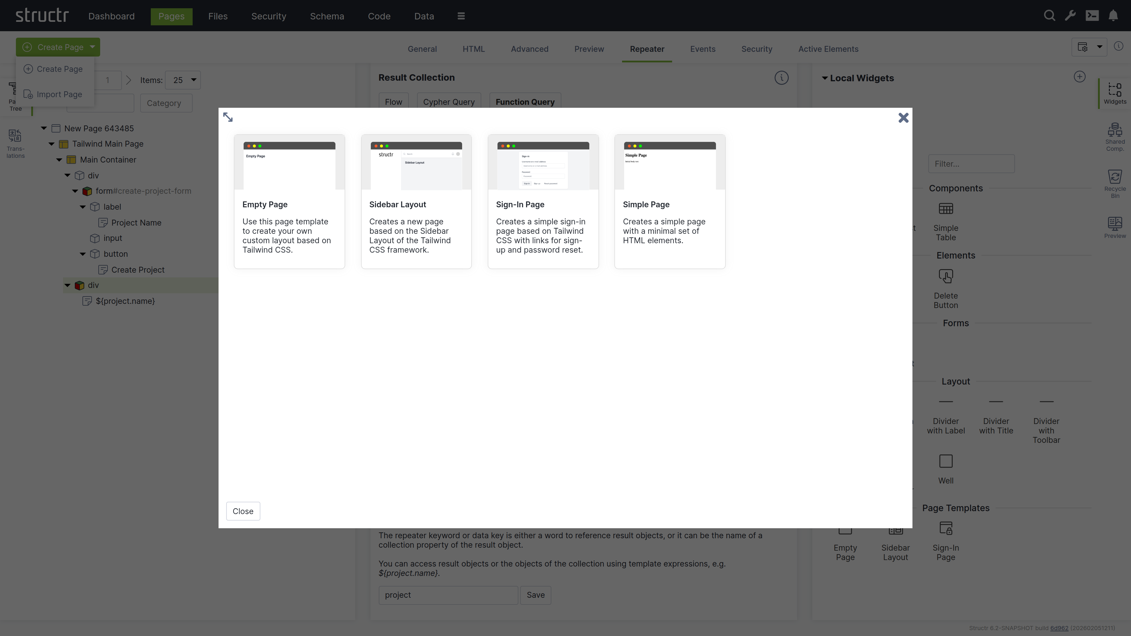
Templates
When you select “Create Page”, you will see a list of templates that are used to create the structure of the new page. Templates are based on the Tailwind CSS framework and range from simple layouts like the Empty Page to more complex structures with sidebars and navigation menus, as well as specialized templates like the Sign-In Page.
When you create a page from a template, you import a pre-built page structure. This can include content, repeaters, permissions, and also shared components for reuse across your site. The Simple Page option, on the other hand, creates a minimal page with only the standard HTML elements <html>, <head>, and <body>.
Page Templates Are Widgets
Page templates are widgets with the isPageTemplate flag enabled. Structr looks at the widget server and your local widget collection and displays local and remote page templates together in the “Create Page” dialog.
Import Page Dialog
The Import Page dialog lets you create pages from HTML source code or by importing from external URLs.
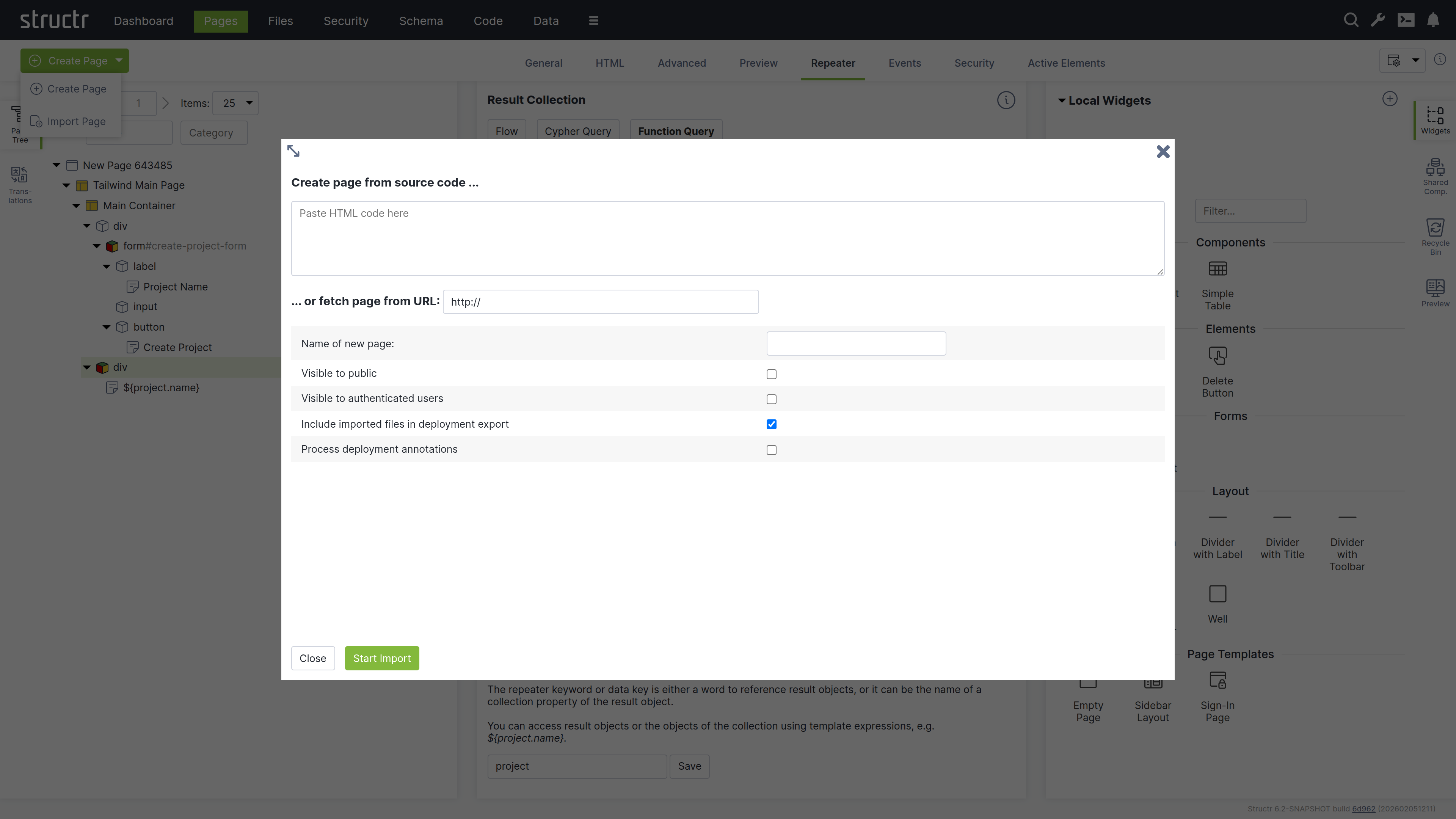
Create Page From Source Code
Paste your HTML code into the textarea. You can then configure the import options below before creating the page.
Fetch Page From URL
You can also import a page from an external URL using the text input below the textarea. This imports the page including all static resources like CSS, JavaScript, and images.
Configuration Options
Below the import options, you configure the name and visibility flags of the new page. You can also mark imported files to be included when exporting your application and enable parsing of deployment annotations in the imported HTML.
Deployment Annotations
Deployment annotations are special markers that Structr inserts when exporting HTML. They preserve Structr-specific attributes such as content types for content elements and visibility settings for individual HTML elements.
The Page Element
The Page element sits at the top of a page’s element tree and represents the page itself. Below the Page element, there is either a single Template element (the Main Page Template) or an <html> element containing <head> and <body> elements. Templates can also be used to create non-HTML pages: by setting the content type to application/json, text/xml, or text/plain, you can make the page return any content you want.
Appearance
Page elements appear as an expandable tree item with a little window icon, the page name and optional position attribute on the left, and a lock icon on the right. Click the lock icon to open the Access Control dialog. The icon’s appearance indicates the visibility settings: no icon means both visibility flags are enabled, while a lock icon with a key means only one flag is enabled.
Interaction
When you hover over the Page element with your mouse, two additional icons appear: one opens the context menu (described below) and one opens the live page in a new tab. Note that you can also open the context menu by right-clicking the page element. Left-clicking the Page element opens the detail settings in the main area of the screen in the center.
Access Control Dialog
Clicking the lock icon on the page element opens the access control dialog for that page. The Access Control dialog is a standardized interface used across nearly all data types in Structr, with only minor variations based on the specific type you’re working with.
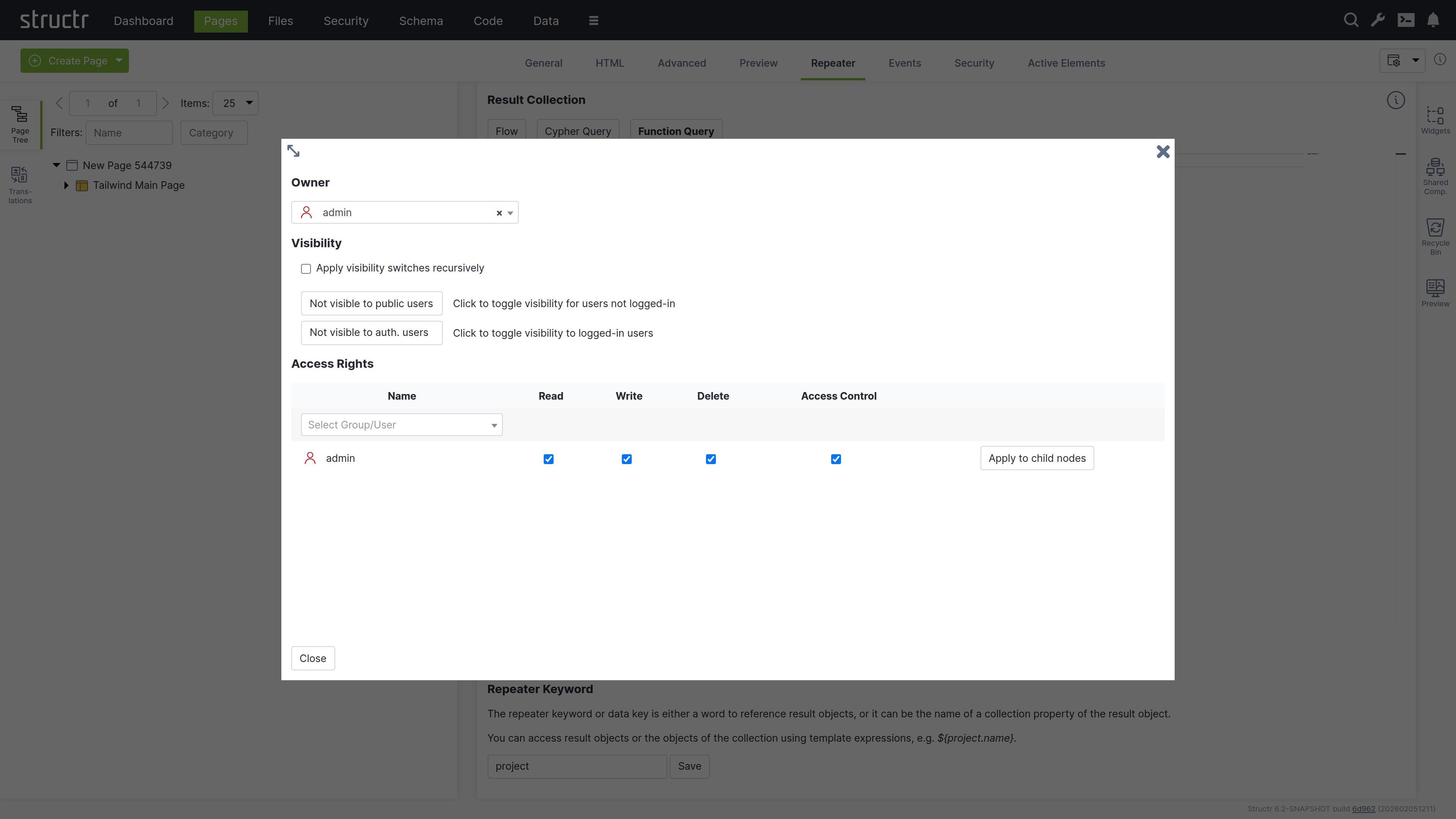
Owner
At the top of the dialog, you’ll see the current owner of the object. Use the dropdown to either assign a new owner or remove ownership entirely. These changes affect only the selected object by modifying its OWNS relationship in the database.
Visibility
The visibility section lets you control who can see the current object and its children using the familiar visibility flags for authenticated and unauthenticated users. If you check “Apply visibility switches recursively”, Structr propagates your visibility settings down through the entire hierarchy, which is especially useful when working with Pages, HTML elements, Templates, and Folders.
Permissions
The permissions table at the bottom lets you grant read, write, delete, and access control permissions to specific users or groups. Use the dropdown in the first row to add permissions for additional users or groups. In certain contexts, you can apply these permissions recursively to child objects as well. Remove a permission by unchecking the last checkbox in its row. These changes affect only the selected object by modifying its SECURITY relationships in the database.
Permissions Influence Rendering
Visibility flags and permissions don’t just control database access, they also determine what renders in the page output. You can make entire branches of the HTML tree visible only to specific user groups or administrators, allowing you to create permission-based page structures. For example, an admin navigation menu can be visible only to users with administrative permissions.
For conditional rendering based on runtime conditions, see the Show and Hide Conditions section in the Dynamic Content chapter.
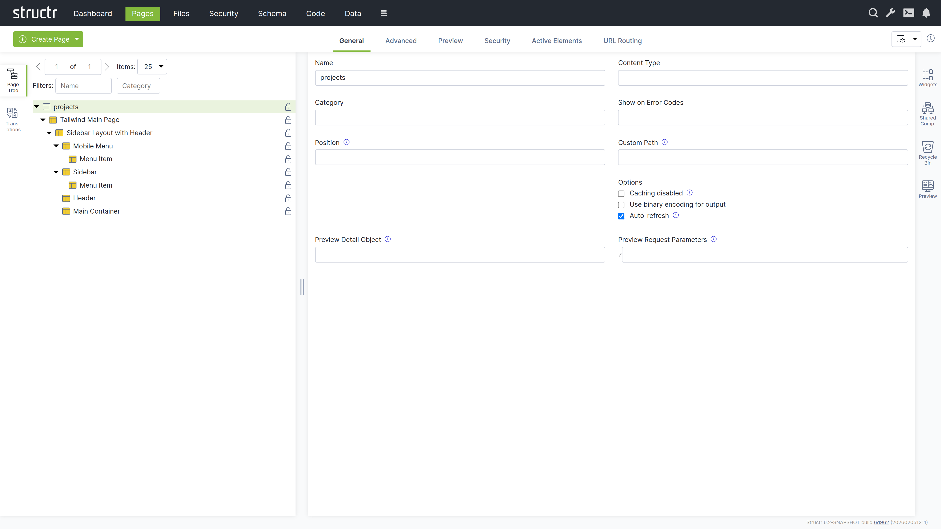
The General Tab
The General tab of a page contains important settings that affect how the page is rendered for users and displayed in the preview.
Name
The page name identifies the page in the page tree and determines its URL. A page named “about” is accessible at /about.
Content Type
The content type can be used to control the page’s output format. The default is text/html, but you can use application/json for JSON responses, text/xml for XML, or any other content type including binary. The content type is sent along with the response in the ContentType HTTP header, so it can also include the charset.
Category
The category field can be used to organize your pages into groups: assign a category to the page, and you can then use the category filter to show only pages from that category.
Show on Error Codes
You can configure this page to be displayed when specific HTTP errors occur. Enter a comma-separated list of status codes, for example, 404 when content isn’t found or users lack permission, 401 when authorization is required, or 403 when access is forbidden.
Position
When users access the root URL of your application, Structr uses the position attribute to determine which page is displayed. Among all visible pages, the one with the lowest position value is shown. See the Navigation & Routing chapter for a detailed explanation of page ordering and selection.
Custom Path
You can assign an alternative URL to the page using this field. Note that URL routing has replaced this setting and provides more flexibility, including support for type-safe path-based arguments that are directly mapped to keywords you can use in your page.
Caching disabled
Enable this when your page contains dynamic data that changes frequently or personalized content. Structr sends cache control headers that prevent browsers and proxies from caching the page output. Pages for authenticated users are never cached, so this flag only affects public users.
Use binary encoding for output
Enable this if your page generates binary data to make Structr use the correct character encoding automatically.
Autorefresh
Enable this to automatically reload the page preview in the Structr Admin UI whenever you make changes.
Preview Detail Object
The preview detail object allows you to assign a fixed object that Structr uses as the detail object when rendering the preview, making it available under the current keyword.
Preview Request Parameters
The preview request parameters field allows you to provide fixed parameters that Structr includes when rendering the preview.
The Advanced Tab
The Advanced tab provides a raw view of the current object, showing all its attributes grouped by category, in an editable table for quick access. This tab includes the base attributes like id, type, createdBy, createdDate, lastModifiedDate, and hidden that are not available elsewhere.
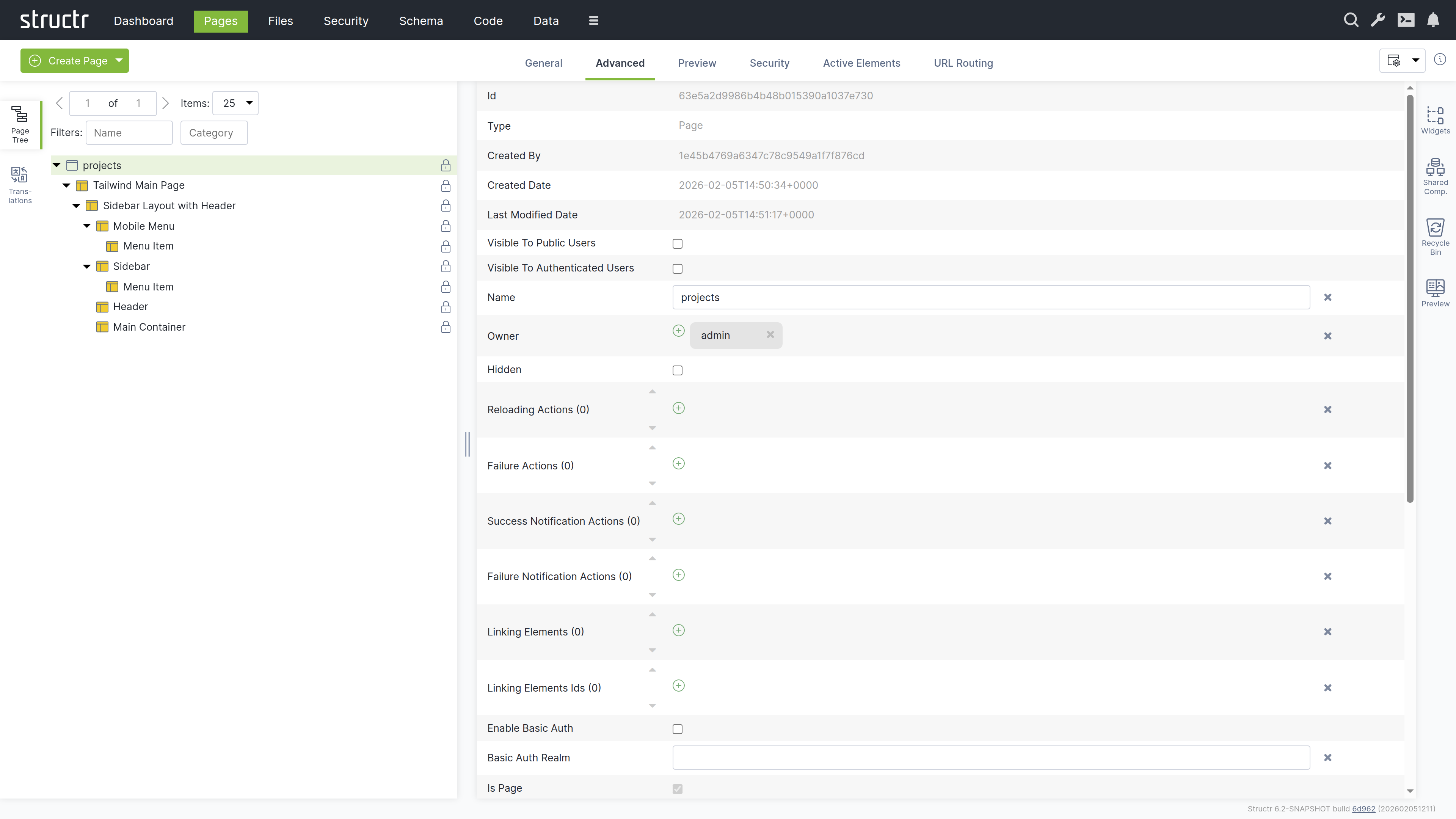
The hidden flag prevents rendering of the element and all its children. When you enable this flag, Structr excludes the element from the page output entirely, making it useful for temporarily disabling parts of your page structure without deleting them.
The Preview Tab
The Preview tab displays how your page appears to visitors, while also allowing you to edit text content directly. Hovering over elements highlights them in both the preview and the page tree. You can click highlighted elements to edit them inline or select them in the tree for detailed editing. This inline editing capability is especially valuable for repeater-generated lists or tables, where you can access and modify the underlying template expressions directly in context.
Preview Settings
You can configure the preview in the page’s General tab settings. Assign a specific object to make it available under the current keyword for testing, or provide fixed request parameters to test your page with specific data. These settings help you preview how your page renders with different objects and parameters.
The Security Tab
The Security tab contains the Access Control settings for the current page, with owner, visibility flags and individual user / group access rights, just as the Access Control dialog.
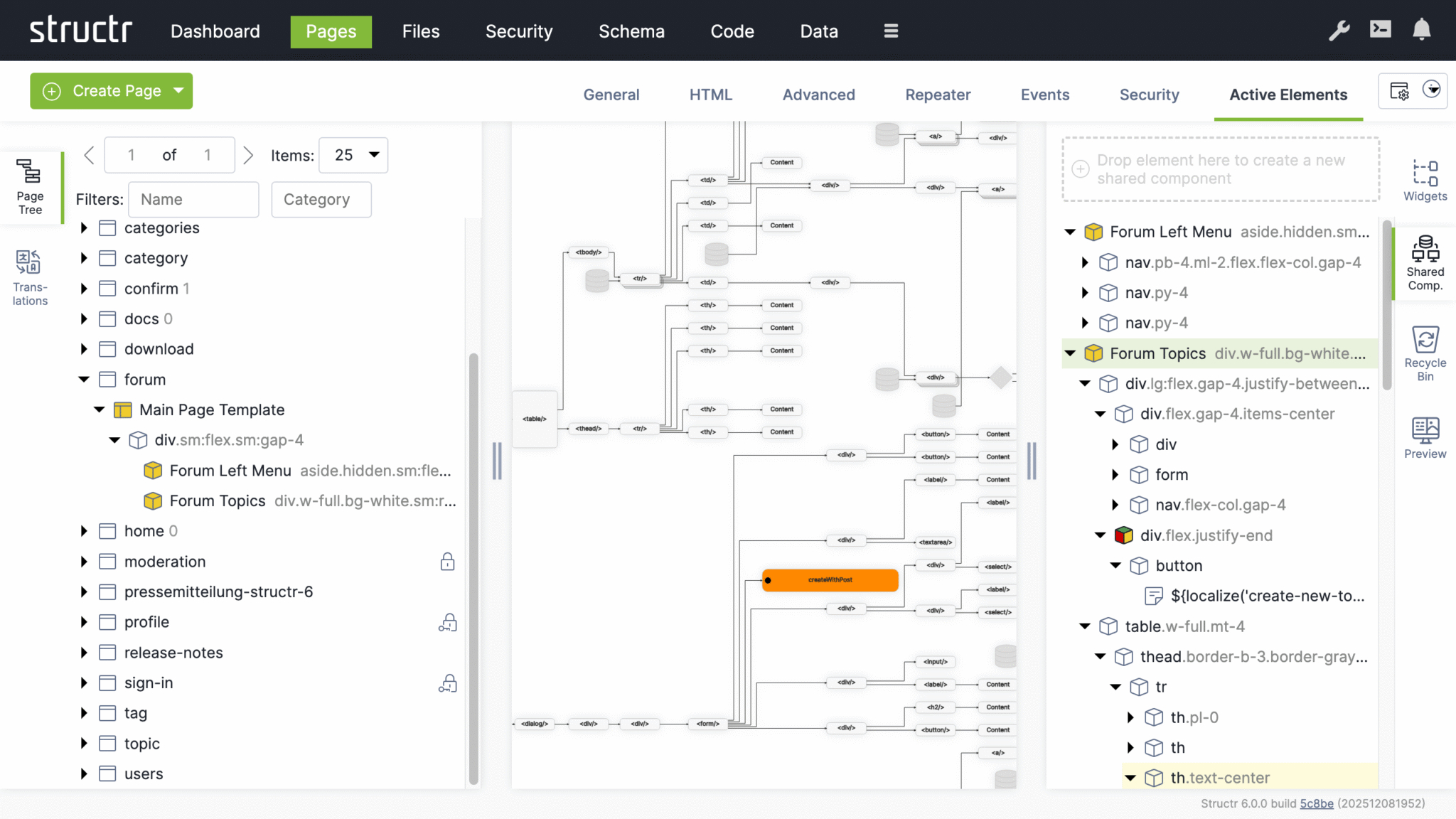
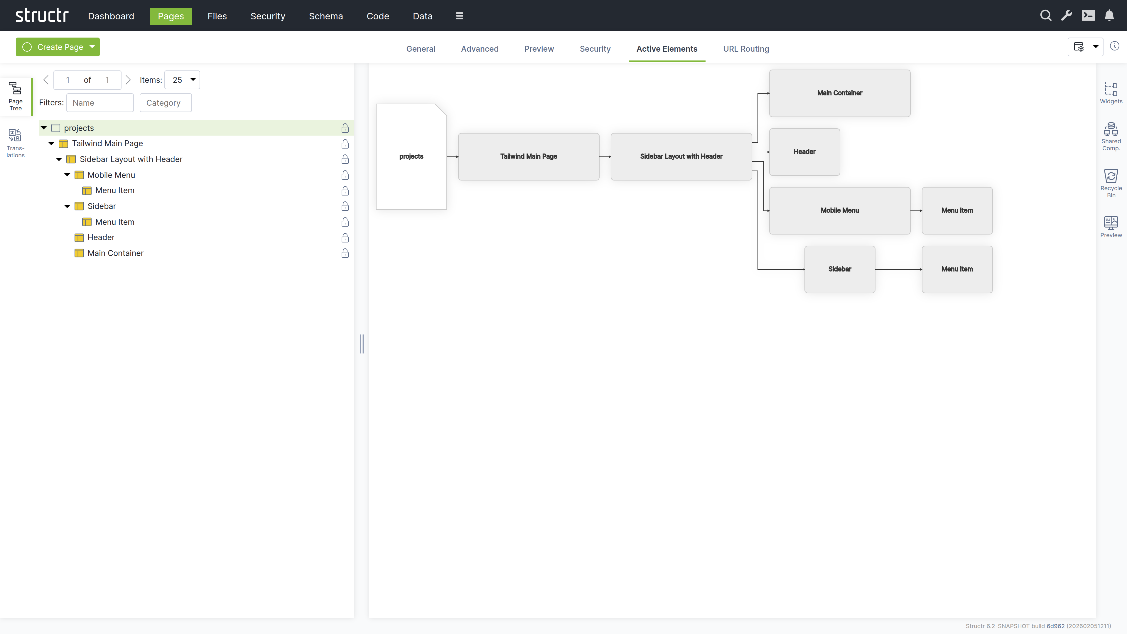
The Active Elements Tab
The Active Elements tab provides a structural overview of the page. Key page components are highlighted, such as templates, repeaters and elements with event action mappings. Clicking a component jumps directly to its location in the page tree.
The URL Routing Tab
The URL Routing tab allows you to configure additional URL paths under which the page is made available. You can define typed parameters in the path that Structr automatically validates and makes available in the page under the corresponding key.
How it works
You start by writing a path expression with placeholders (e.g., /project/{lang}/{name}). For each placeholder, the dialog displays a type selection field, and the variable is made available in the page under its respective name when present in the path.
The arguments are optional, meaning empty path segments (e.g., /projects//my-example-page) can be passed, in which case the variable is not set (null value).
The HTML Element
HTML elements form the structured content of a page. An element always has a tag and can include both global attributes like id, class, and style, additional tag-specific attributes defined by the HTML specification, and custom data attributes. HTML elements can be inserted anywhere in the page tree, as Structr does not strictly enforce valid HTML.
HTML elements automatically render their tag, all attributes with non-null values, and their children. An empty string causes the attribute to be output as a boolean attribute without a value (e.g., <option selected>).
Appearance
HTML elements appear as expandable tree items with a box icon, showing their tag name and CSS classes. You can rename HTML elements to better communicate their purpose - when renamed, the custom name is displayed in the tree instead of the tag. Elements configured as repeaters display a colored box icon with red, green, and yellow instead of the standard box. The lock icon on the right indicates visibility settings: no icon means both visibility flags are enabled, a lock icon with a key means only one flag is enabled.
Interaction
When you hover over an HTML element with your mouse, the context menu icon appears. You can also open the context menu by right-clicking the element. Left-clicking the HTML element selects it in the page tree and opens the detail settings in the main area of the screen in the center. Clicking the lock icon opens the Access Control dialog.
The General Tab
The General tab of an HTML element contains important settings that affect how the element is rendered and displayed in the page tree.
Name
The name is used to identify the element in the page tree and can help communicate the element’s purpose in your page structure.
CSS Class
You can specify one or more CSS classes (separated by spaces) that will be applied to the element when rendered. You can also create dynamic CSS classes by inserting template expressions - this is the primary use case for StructrScript expressions. For example: button ${current.status} to apply a class based on the current data object’s status.
HTML ID
This sets the element’s unique identifier in the DOM, which can be used for styling, scripting, or linking.
Style
Use this to apply inline styles to the element. Template expressions allow you to generate dynamic styles as well. For example: color: ${current.textColor} to set a color based on the current data object.
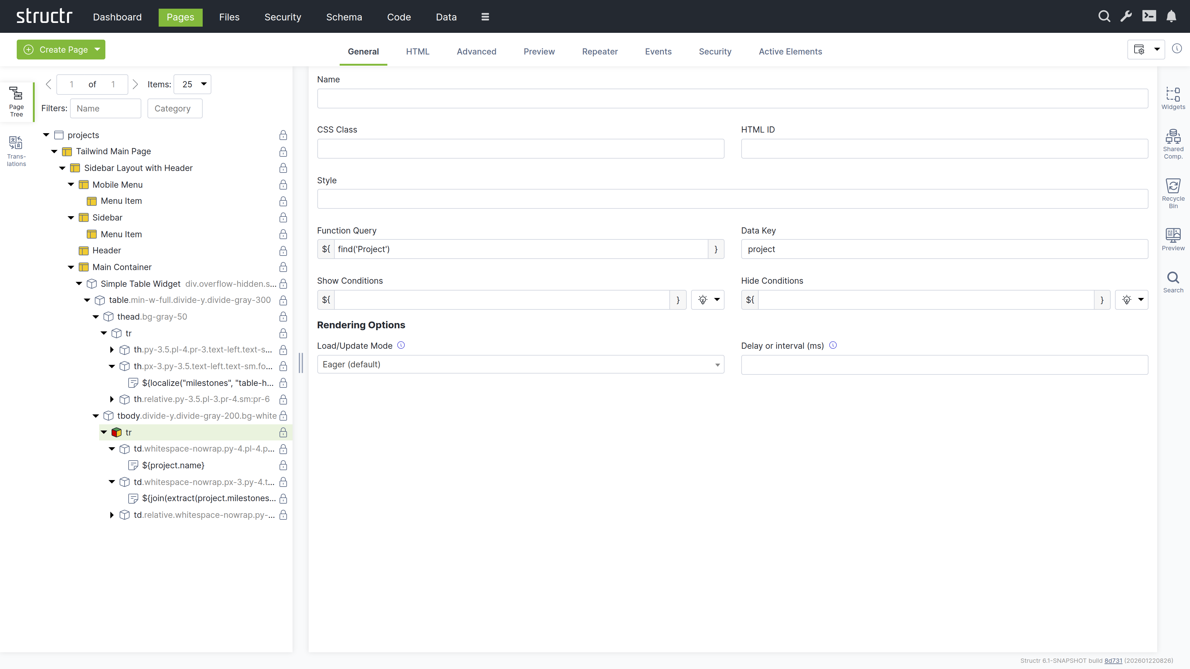
Function Query
An auto-script field (surrounded with ${ and }) for defining repeater queries. This allows you to write a script expression that retrieves data to be iterated over by the repeater.
Data Key
Specifies the data key for the repeater. This defines the variable name under which each item from the Function Query result will be available during iteration. Note that data keys with the same names in nested repeaters overwrite each other.
Show Conditions
Defines when the element should be shown. The element is rendered only when this expression evaluates to true. Show conditions are evaluated at rendering time, before the page rendering engine starts rendering the element. For example: me.isAdmin to show the element only to admin users. This is an auto-script field.
Hide Conditions
Like Show Conditions, but defines when the element should be hidden. The element is not rendered when this expression evaluates to true. This is also an auto-script field evaluated at rendering time.
Load / Update Mode
Configuration for rendering behavior of the element. This setting allows you to enable delayed rendering or lazy loading for this element.
| Name | Description |
|---|---|
Eager |
Renders the element in the initial server-side rendering run. |
When page has finished loading |
Renders the element after the initial rendering run is done. |
With a delay after page has finished loading |
Renders the element after a configurable number of milliseconds after the page has finished loading. |
When element becomes visible |
Renders the element when it is scrolled into view. |
With periodic updates |
Renders the element and refreshes its content after a configurable number of milliseconds. |
Delay or Interval (ms)
Configures the number of milliseconds for delayed and / or periodic refresh according to the load / update mode setting above.
The HTML Tab
The HTML tab enables management of HTML-specific attributes for an element. In addition to the global attributes (class, id, and style), the tab displays the type-specific attributes for each element. For example, <option> elements have the selected and value attributes.
There is a button that allows you to add custom attributes that will be included in the HTML output. We recommend prefixing custom attributes with data-, though this is not required. You can also use attributes required by JavaScript frameworks, such as is.
At the end of each row is a small cross icon that allows you to remove the attribute’s value (i.e., set it to null).
Show All
The “Show all attributes” button reveals the complete list of HTML attributes, including event handlers like onclick, ondrag, or onmouseover. By default, only attributes with values are displayed. Attributes containing an empty string display a special warning icon because the distinction between null and empty string is important, but not immediately visible.
REST API Representation
If you retrieve HTML elements via REST, you will see that HTML attributes are prefixed with _html_ to uniquely identify them. This reflects how Structr handles these attributes internally - for example, to distinguish between _html_id (the HTML id attribute) and id (the element’s internal UUID). While the user interface hides this implementation detail, it remains visible in the REST API.
The Advanced Tab
Like the Advanced tab for Page elements, this tab provides a raw view of the current HTML element, showing all its attributes grouped by category in an editable table for quick access.
The Preview Tab
Like the Preview tab for Page elements, this tab displays the same rendered output for all elements within a page, as the preview always renders from the root of the page hierarchy. This means whether you are viewing the Page element itself or any child element, you will see the complete page output here.
The Repeater Tab
The Repeater tab allows you to configure an element to render dynamically based on a data source, repeating its output for each object in a collection.
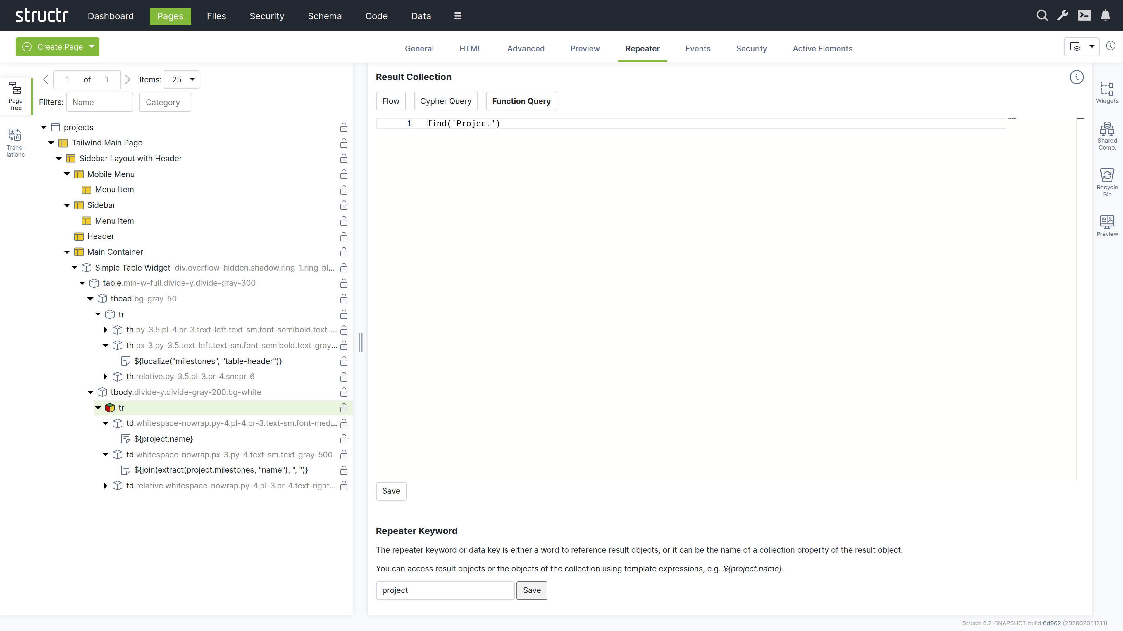
Result Collection
At the top, you select the repeater source: Flow, Cypher Query, or Function Query (a scripting expression).
Repeater Keyword
The repeater keyword or data key field defines the variable name for accessing each object in the result.
How it works
The repeater and its children are rendered once for each object returned by the source. The data key is available throughout the rendering and can be referenced in content nodes, templates, and attributes.
Example
For example, a repeater with the Function Query find('Project') and data key project would render once for each Project object returned by the query. Within the repeater’s children, you could use ${project.name} to display each project’s name.
The Events Tab
The Events tab allows you to configure Event Action Mappings for individual elements.
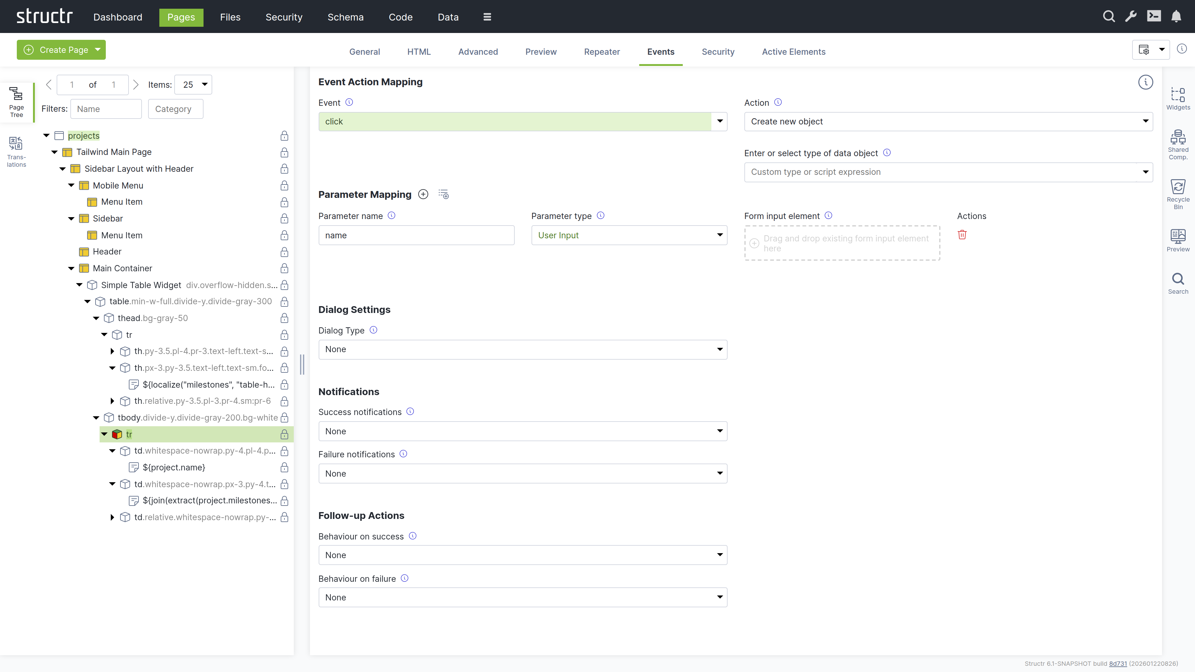
How it works
You start by selecting the DOM event that the Event Action Mapping should respond to in the Event field. After selecting an event, the Action field appears where you select the action to perform.
Actions include creating objects, modifying objects, login, logout, and more. Once you have selected an action, additional input fields appear progressively, allowing you to configure the mapping step-by-step.
Parameter Mapping
Below the configuration fields, there is a Parameter Mapping section where you can add individual parameters. When the action configuration includes a type, the parameters can be automatically populated based on the attributes of that type using the second button next to the Parameter Mapping heading.
Confirmation Dialog
This section determines whether the action requires confirmation. When Dialog Type is set to Confirm Dialog, a window.confirm dialog is displayed before the Event Action is executed.
Notifications
This section allows you to display notifications based on whether the action was executed successfully or not. The following options are available: System Alert, Inline Text Message, Custom Elements, and the option to send a custom JavaScript event.
Follow-up Actions
Additionally, you can configure follow-up actions to be performed after the main Event Action. For example, you can reload the entire page or individual elements. You can navigate to a new page based on the action’s result. You can also trigger a custom JavaScript event here. You can access variables returned from the action in the follow-up configuration.
Further Information
For detailed instructions about how to configure the individual settings of Event Action Mappings, see the Event Action Mapping chapter below.
The Security Tab
The Security tab contains the Access Control settings for the current element, with owner, visibility flags and individual user / group access rights.
The Active Elements Tab
The Active Elements tab displays the same structural overview as its counterpart on page elements, but scoped to the current element and its descendants.
Templates and Content Elements
Template and content elements contain text or markup that is output directly into the page, instead of building structure from nested HTML elements. They have a content type setting that controls how the text is processed before rendering - Markdown, AsciiDoc, and several other markup dialects are automatically converted to HTML, while plaintext, XML, JSON, and other formats are output as-is.
Content elements are the simpler variant: they output their text and cannot have children. Template elements can have children, but this is where they differ fundamentally from HTML elements.
Note that when using a template element as the root of a page, it must include the DOCTYPE declaration that an HTML element would output automatically.
Composable Page Structures
Unlike HTML elements, templates do not render their children automatically. If you don’t explicitly call render(children), the children exist in the page tree but produce no output. This is intentional as it gives you full control over placement rather than forcing a fixed parent-child rendering order.
The result is a composable system. A template can define a layout with multiple insertion points - a sidebar, a navigation area, a main content section - and then render specific children into each slot. Using the render() function, you control exactly where each child appears in the output. This lets you build complex page structures from reusable, composable building blocks.
Including External Content
You can also use include() or includeChild() in a template to pull content from other parts of the page tree or from objects in the database.
Appearance
Template elements appear as expandable tree items with an application icon, showing their name or #template when unnamed. Content elements are not expandable because they cannot have children - they display a document icon and show the first few words of their content, or #content when empty. Elements configured as repeaters display a yellow icon. Rename template elements to better communicate their purpose.
Interaction
The lock icon on the right indicates visibility settings: no icon means both visibility flags are enabled, a lock icon with a key means only one flag is enabled. When you hover over a template or content element, the context menu icon appears. You can also open the context menu by right-clicking the element. Left-clicking selects it in the page tree and opens the detail settings in the main area. Clicking the lock icon opens the Access Control dialog.
The General Tab
The General tab of template and content elements contains the name field and the following four configuration options, which work the same as on HTML elements:
Function Query
An auto-script field for defining repeater queries. This allows you to write a script expression that retrieves data to be iterated over by the repeater.
Data Key
Specifies the data key for the repeater. This defines the variable name under which each item from the Function Query result will be available during iteration. Note that data keys with the same names in nested repeaters overwrite each other.
Show Conditions
Defines when the element should be shown. The element is rendered only when this expression evaluates to true. Show conditions are evaluated at rendering time, before the page rendering engine starts rendering the element. For example: me.isAdmin to show the element only to admin users. This is an auto-script field.
Hide Conditions
Like Show Conditions, but defines when the element should be hidden. The element is not rendered when this expression evaluates to true. This is also an auto-script field evaluated at rendering time.
The Advanced Tab
Like the Advanced tab for HTML elements, this tab provides a raw view of the current template element, showing all its attributes grouped by category in an editable table for quick access.
The Preview Tab
Like the Preview tab for Page elements, this tab displays the same rendered output for all elements within a page, as the preview always renders from the root of the page hierarchy. This means whether you are viewing the Page element itself or any child element, you will see the complete page output here.
The Editor Tab
The Editor tab is where you edit the actual content of template and content elements. It provides a full-featured code editor based on Monaco (the editor from VS Code) with syntax highlighting and autocompletion. At the bottom of the tab, the content type selector controls how the text is processed before rendering. Select Markdown or AsciiDoc to have your content converted to HTML, or choose plaintext, XML, JSON, or other formats for direct output. For HTML templates like the Main Page Template, set the content type to text/html to output the markup directly.
The Repeater Tab
The Repeater tab provides the same configuration options as on HTML elements, allowing you to configure the element as a repeater with a data source and data key.
The Security Tab
The Security tab contains the Access Control settings for the current element, with owner, visibility flags and individual user / group access rights.
The Active Elements Tab
The Active Elements tab displays the same structural overview as its counterpart on page elements, but scoped to the current element and its descendants.
The Context Menu
The context menu provides quick access to common operations on page elements. Open it by right-clicking an element in the page tree or by clicking the context menu icon that appears when hovering over an element.
The context menu varies depending on the element type. For page elements, it only allows inserting an <html> element or a template element, cloning the page, expanding or collapsing the tree, and deleting the page. For content elements, the insert options are limited to Insert Before and Insert After, since content elements cannot have children. The following sections describe the full context menu available for HTML and template elements.
Suggested Widgets (when available)
This menu item appears when a local Widget exists whose selectors property matches the current element. Selectors are standard CSS selectors, so you can match against any HTML attribute: table matches table elements, div.container matches div elements with the container class, and #sidebar matches the element with that id. In addition, Structr makes the componentType attribute available as type for selector matching. Widget libraries use this to enforce nesting rules, for example [type='container'] makes a Widget appear inside any element whose componentType is container. See the Widgets & Components chapter for details on the component type system.
Suggested Elements (when available)
This menu item appears for elements that have commonly used child elements. For example, when you open the context menu on a <table> element, Structr suggests <thead>, <tbody>, <tr>, and other table-related elements. Similarly, a <ul> element suggests <li>, a <select> suggests <option>, and so on. This speeds up page building by offering the most relevant elements for your current context.
Insert HTML Element
This submenu lets you insert an HTML element as a child of the selected element. It contains submenus with alphabetically grouped tag names and includes an option to insert a custom element with a tag name you specify.
Insert Content Element
This submenu lets you insert a template or content element as a child of the selected element.
Insert Div Element
Quickly inserts a <div> element as a child of the selected element.
Insert Before
This submenu lets you insert a new element as a sibling before the selected element. It contains the same options as the main insert menu: Insert HTML Element, Insert Content Element, and Insert Div Element.
Insert After
This submenu lets you insert a new element as a sibling after the selected element. It contains the same options as the main insert menu: Insert HTML Element, Insert Content Element, and Insert Div Element.
Clone
Creates a copy of the selected element including all its children and inserts it immediately after the original.
Wrap Element In
This submenu lets you wrap the selected element in a new parent element. It contains Insert HTML Element, Insert Template Element, and Insert Div Element options. Content elements are not available here because they cannot have children. The selected element becomes a child of the newly created element.
Replace Element With
This submenu lets you replace the selected element with a different element type while preserving its children. It contains Insert HTML Element, Insert Template Element, and Insert Div Element options. Content elements are not available here because they cannot have children.
Select / Deselect Element
Selects or deselects the element. A selected element displays a dashed border in the page tree and can be cloned or moved to a different location using the context menu.
Clone Selected Element Here (when available)
This menu item appears when an element is selected. It clones the selected element and inserts the copy as a child of the element where you opened the context menu.
Move Selected Element Here (when available)
This menu item appears when an element is selected. It moves the selected element from its current position and inserts it as a child of the element where you opened the context menu.
Convert to Shared Component (when available)
This menu item appears for HTML and template elements. It converts the element and its children into a Shared Component that can be reused across multiple pages. Changes to the Shared Component are reflected everywhere it is used.
Expand / Collapse
This submenu controls the visibility of children in the page tree. It offers three options: expand subtree, expand subtree recursively, and collapse subtree.
Remove Node
Removes the selected element and all its children from the page. Removed elements are moved to the Recycle Bin and can be restored from there.
Translations
Structr supports building localized frontends, allowing you to serve content in multiple languages. Instead of hardcoded text, you use the localize() function in content elements or templates to reference translations stored in the database. Structr then looks up the translation for the current locale and displays it. If no translation is found, the key itself is returned.
The typical workflow is to first add localize() calls in your page, then open the Translations flyout to create the corresponding translations for each language.
For example, to translate a table header for a list of database objects, create a content element inside the <th> element with the following content:
${localize('column_name')}
Using domains
If the same key needs different translations in different contexts, add a domain as second parameter:
${localize('title', 'movies')}
${localize('title', 'books')}
Managing translations
The Structr Admin UI provides two places to manage translations: the Translations flyout in the Pages area and the dedicated Localization area. The Translations flyout allows you to manage translations per page and shows which translations are used in a specific page. The Localization area is for managing translations independent of pages.
Using the Translations flyout
Select a page from the dropdown at the top, enter a language code, and click the refresh button to load the translations. Structr scans the selected page for occurrences of the localize() function and lists them. For each translation, the flyout shows the key, domain, locale, and the localized text. You can create, edit, and delete translations directly here. When you change the page or language, click the refresh button to update the list.
Note that the list is empty until you use the localize() function in your page.
How it works
Translations are stored as Localization objects in the database. Each object has four values: the key, the domain, the locale, and the translated text.
When you call localize(), Structr searches for a matching translation in the following order:
- Key, domain, and full locale (e.g.
en_US) - Key and full locale, without domain
- Key, domain, and language only (e.g.
en) - Key and language only, without domain
Structr stops searching as soon as it finds a match. If no translation is found, Structr can try again with a fallback locale (configurable in structr.conf). If there is still no match, the function returns the key itself.
Locale resolution
Structr determines the current locale in the following order of priority:
- Request parameter
locale - User locale
- Cookie
locale - Browser locale
- Default locale of the Java process
Widgets and Shared Components
Widgets are reusable building blocks that you can insert into your pages from the context menu or the Widgets flyout. They range from simple HTML snippets to complete, configurable page templates. Shared Components are referenced elements that stay in sync across all pages where they are used. Widgets can define Shared Components in their source code, which forms the basis for building widget libraries with enforced nesting rules using the component type system. Some Widgets produce data-driven components that render their content from a DataSource at runtime, with configurable fields, pagination, and filtering.
For details on creating, configuring, and organizing Widgets and Shared Components, including the component type system, data-driven components, and how to build a widget library, see the Widgets & Components chapter.
Additional Tools
The Pages area includes several additional tools for managing and searching page elements.
Recycle Bin
When you remove an element from a page, Structr does not delete it permanently. Instead, it moves the element to the Recycle Bin. This soft-delete approach allows you to restore elements that were removed by accident.
Pages are not soft-deleted. When you delete a page, Structr removes the page itself but moves all its child elements to the Recycle Bin.
The Recycle Bin flyout shows all elements that have been removed from pages, including their children. To restore an element, drag it back into the page tree on the left. The context menu lets you permanently delete individual elements. At the top of the flyout, the “Delete All” button permanently deletes all elements in the Recycle Bin.
The Recycle Bin is not cleared automatically, but its contents are not included in deployment exports. The flyout is located on the right side of the Pages area.
Preview
The Preview flyout shows a preview of the current page, just like the Preview tab in the center panel. This allows you to keep the preview visible while working with other tabs in the center panel. The flyout is located on the right side of the Pages area.