Building Applications
Widgets & Components
Widgets and Shared Components are the two ways to reuse page elements in Structr. A Shared Component is a piece of page structure that exists once and is referenced from many pages. A Widget is a building block that you insert into a page, from a simple heading to a complete table that renders records from your database. This chapter explains how to use both when you build an application. Writing your own Widgets is covered in the Creating Widgets chapter.
Shared Components
A Shared Component is a reusable structure of HTML elements that you can insert into any page via drag and drop. Unlike a Widget, where Structr copies the content into the page, inserting a Shared Component creates a reference to the original. When you edit a Shared Component, the changes are immediately visible on all pages that use it. A typical example is the Main Page Template, which defines the overall layout and is shared across all pages of an application.
How it works
When you drag a Shared Component onto a page, Structr creates a copy of the root element that is linked to the original via a SYNC relationship. This link ensures that changes to the original Shared Component are automatically propagated to all copies.
This has two important consequences:
-
Single source of truth: The Shared Component exists only once. Any changes you make to it are immediately reflected everywhere it is used.
-
Smaller page trees: Pages that use Shared Components contain only the linked root element, not copies of the entire element structure.
Creating Shared Components
To create a Shared Component, drag an element from the page tree into the Shared Components flyout on the right side of the Pages area. Structr moves the element from the page tree into the Shared Components area and replaces it in the page tree with a linked copy. From this point on, the element in the page tree is a reference to the Shared Component.
Alternatively, you can right-click an element in the page tree and select “Convert to Shared Component” from the context menu.
Deleting Shared Components
When you delete a Shared Component, Structr does not remove the linked copies from the pages. Instead, it converts the linked copies into independent elements that no longer share content with each other. This means that deleting a Shared Component does not break your pages, but it does remove the synchronization between the copies.
Rendering children
When a Shared Component is inserted into a page, the linked copy in the page tree can have its own children. This is what makes Shared Components useful as templates: the Shared Component defines the outer structure, and the children in each page provide the specific content.
Within a Shared Component, the render(children) function determines where the children of the linked copy are rendered. For example, a Shared Component with the following content:
<div class="panel">
    <div class="panel-header">Panel</div>
    <div class="panel-body">
        ${render(children)}
    </div>
</div>
renders the children that were added to the linked copy in the page tree at the position of the ${render(children)} expression. This allows the Shared Component to define the structure and styling while each page provides its own content.
Customization at render time
Because Shared Components are rendered in the context of the page they are used in, you can use template expressions to customize the output based on the page, the current user, or other context information. For example, a Shared Component for a navigation menu could highlight the current page:
<nav>
    <a href="/" class="${if(equal(page.name, 'home'), 'active', '')}">Home</a>
    <a href="/about" class="${if(equal(page.name, 'about'), 'active', '')}">About</a>
</nav>
Structr evaluates the template expressions when rendering each page, so the same Shared Component produces different output depending on where it is used. Template expressions are explained in the Dynamic Content chapter.
Synchronization of Attributes
Structr synchronizes the content and structure of a Shared Component with all its linked copies. However, some attributes are page-specific and are not synchronized. These include the name of the element, visibility flags, and the data-structr-* attributes used for event handling. This allows you to give each linked copy a different name and visibility settings while sharing the same content structure.
Widgets
Widgets are reusable building blocks for your pages. They range from simple HTML snippets to complete, configurable components with their own logic and styling. When you insert a Widget, Structr copies its content into the page tree as ordinary elements. You can edit the result like any other element, and later changes to the Widget do not affect pages that already use it.
All Widgets are stored in the database of your application. There is no connection to a remote server at runtime. The default widget set from structr.com is imported into your application with a single click and behaves like any other set of local Widgets afterwards.
The Widgets Flyout
The Widgets flyout on the right side of the Pages area lists all Widgets of your application, grouped by category. The filter input at the top narrows the list by name. You can drag any Widget from the flyout into the page tree. Right-click a Widget to edit or delete it, or to open its advanced properties. The plus button in the upper right corner creates a new Widget, which is the entry point to the Creating Widgets chapter.
Importing the Default Widget Set
On a new application the flyout is empty and shows a tile labeled “Import Widget Set”. Clicking the tile downloads the default widget set from structr.com and imports it into your application. The same tile appears in the Create Page dialog when no page templates exist yet. After the import, the Widgets are ordinary local Widgets that you can edit, delete or extend.
The default set is organized in these categories:
| Category | Widgets | Purpose |
|---|---|---|
| Page Templates | Default Page | A complete page with header, sidebar and menu. Start new pages from it. |
| Layout | Grid | A six-column grid that arranges the components you place inside it. |
| Components | Table, List, Gallery, Accordion, Create Form, Edit Form, Card, Card with heading, Centered Card | Data-driven components that render records of a type, and static cards that group content. |
| Component Parts | Pagination | A pagination bar that you can add to a component. |
| Form Elements | Textfield, Textarea, Checkbox, Login Form, Login Form (2FA OTP) | Inputs for forms, and ready-made login forms. |
| Text | Heading, Page Heading, Label, Badge, Paragraph with static text | Content elements. |
| Actions | Action Button, Create Button, Delete Button | Buttons that call a method on a type, or create and delete records. |
| Render Templates | textfield, textarea, checkbox, datepicker, formatted-date, select, badge, related-link and others | Formats for single field values inside data-driven components. You choose them per field, you do not insert them. |
Inserting Widgets
The primary way to insert a Widget is through the context menu. When you right-click an element in the page tree, Structr shows the Widgets that fit at this position under “Suggested Widgets”, grouped by category. Each Widget declares where it belongs, so a Heading is suggested inside a card but not directly inside the page layout, and a Table is suggested in the main content area but not inside a form. Following the suggestions keeps your page structure valid without you having to know the rules.
Suggestions depend on the page you start from. The Widgets of the default set are designed for pages created from the Default Page template. If you create a page with the built-in Simple Page tile and right-click its body, no Suggested Widgets appear, because the plain HTML elements carry no information about what fits inside them. In that case, or whenever a Widget you want is not suggested, drag it from the Widgets flyout into the page tree instead. Drag and drop always works but does not check whether the position is valid.
Suggested Widgets also appear in two submenus of the context menu. “Wrap Element In” lists Widgets that can take the selected element as their content, for example a card around an existing heading. “Replace Element With” lists Widgets that can take the place of the selected element and, where the content areas match, keep its content.
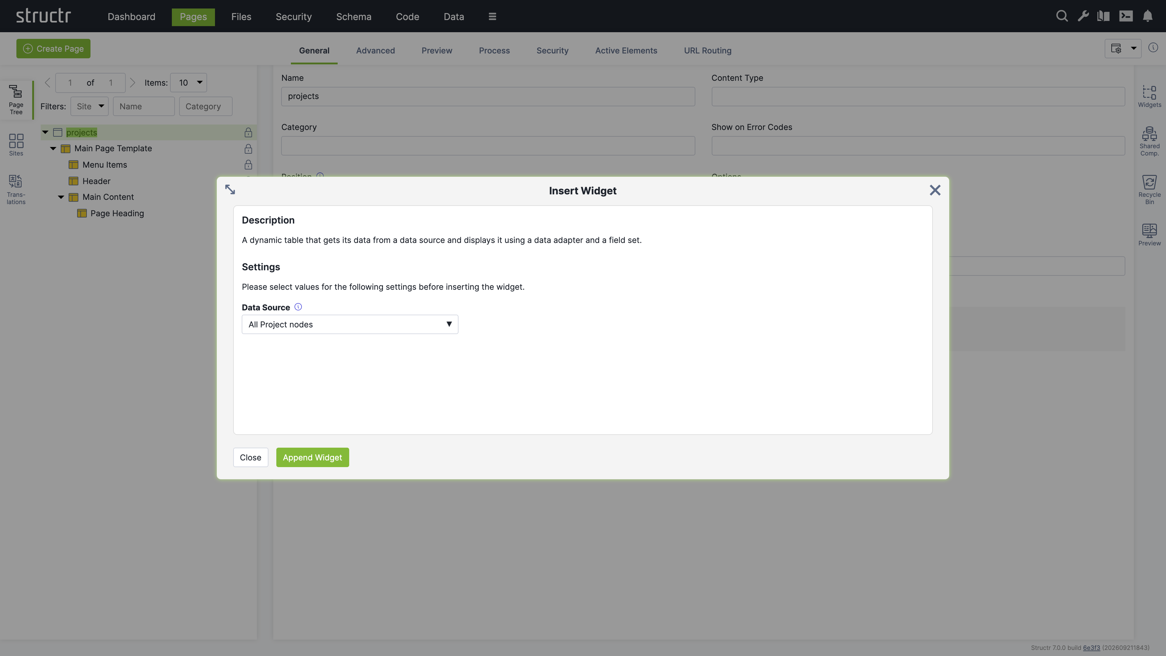
If a Widget needs input before it can be inserted, the “Insert Widget” dialog opens. It shows the description of the Widget and the settings it asks for. The “Append Widget” button stays disabled until all required settings have values.
An inserted Widget inherits the visibility flags of its parent element. If the parent is visible to authenticated users only, all elements created by the Widget receive the same flags, so a new Widget is visible to the same audience as the surrounding page.
Page Templates
Widgets with the “Is Page Template” option appear in the Create Page dialog next to the built-in Empty Page, Simple Page and Custom Page tiles. A page template is a Widget that produces a whole page; it is not related to the Template element type of the page tree. When you create a page from a page template, Structr imports the complete page structure including content, repeaters, permissions and Shared Components. The Default Page of the default widget set creates the Main Page Template as a Shared Component, so all pages you create from it share one layout, and a change to the header or the menu appears on every page.
Widgets vs. Shared Components
| Aspect | Widget | Shared Component |
|---|---|---|
| Storage | Source code in the Widgets flyout | Part of your page tree |
| Insertion | Creates a copy | Creates a reference |
| Changes | Only affect new insertions | Immediately visible everywhere |
| Use case | Starting points, building blocks | Consistent layouts, headers, footers |
Examples
A Table and an Edit Form
This example builds a page that lists projects in a table and lets you edit the selected project in a form. It uses only the default widget set and the dialogs described in this chapter. If you have not created a type yet, the example creates one for you.
Import the default widget set from the Widgets flyout if you have not done so. Then click Create Page and choose the Default Page template. Name the page projects. Expand the page in the page tree. You see the Main Page Template with its Menu Items, Header and Main Content, and a Page Heading inside Main Content.
Right-click Main Content and choose Suggested Widgets, then Components, then Table. The Insert Widget dialog opens and asks for the data source. If you already have a type, open the Data Source menu, choose Use Existing Data Source, then Custom Types, then the entry for your type, for example “All Project nodes”. If you have no type yet, choose Create New Data Source and Create New Custom Type. Enter Project as the name, add the attributes description of type String and dueDate of type Date, and check “Create example data”. Click Append Widget.
The Table appears in the page tree below Page Heading. Select it. The General tab now shows the component configuration dialog, and the Preview flyout on the right shows the table with the records of your type. If you created the type with example data, five example projects are already there.
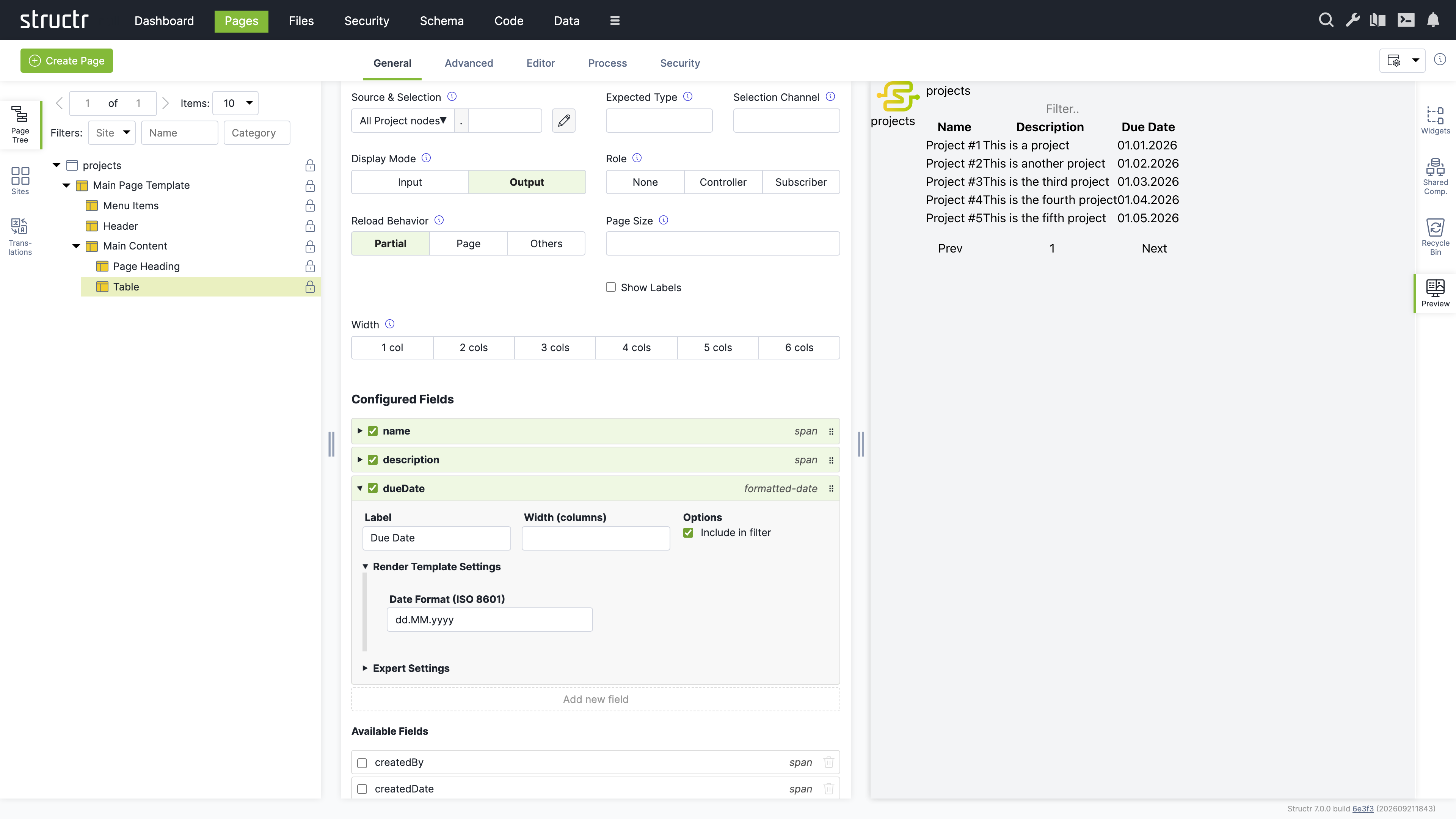
The list under Configured Fields shows the columns of the table. Click a field in the Available Fields list below to add it as a column, for example description and dueDate. Each configured field shows the name of its render template on the right. Click the template name of the dueDate field and choose formatted-date. Then click the field itself to expand its details, open Render Template Settings and enter dd.MM.yyyy as the date format. The preview updates after every change. The filter input above the table and the pagination below it work without any further setup.
Now connect a form to the table. In the configuration dialog of the Table, set Role to Controller and enter current as the Selection Channel. From now on, clicking a row in the table selects that project and writes its id to the URL.
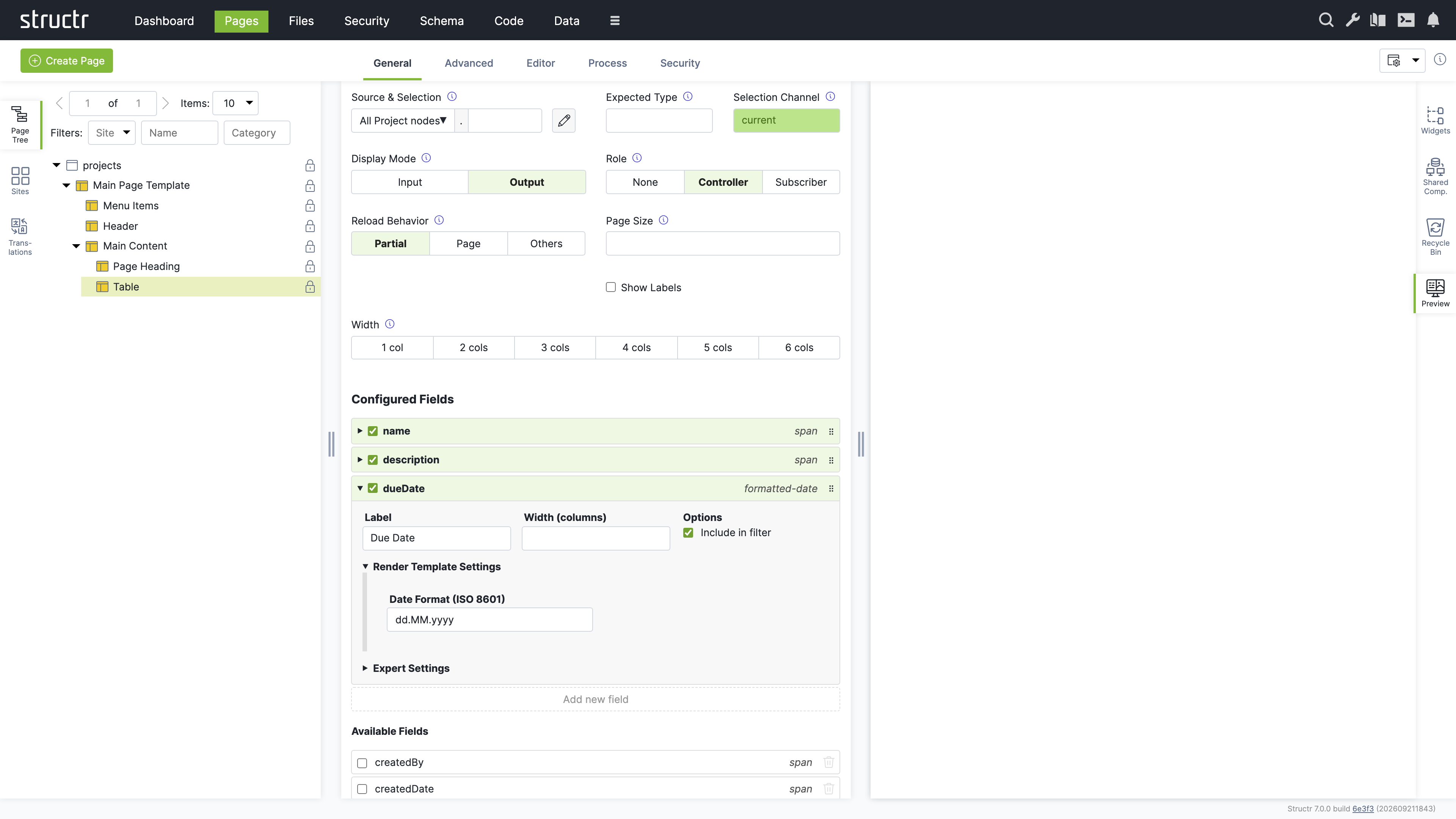
Right-click Main Content again and choose Suggested Widgets, Components, Edit Form. In the Data Source menu choose Use Existing Data Source, then Channels, then current. Click Append Widget. Select the Edit Form in the page tree and add the same fields as in the table. For description choose the textarea template and for dueDate the datepicker template.
Open the page in a new browser tab. Click a row in the table and the form below shows the selected project. Change the description, click Save, and the table refreshes with the new value. Click a column header to sort, or type into the filter input to narrow the list. Everything you see in the page was produced by two Widgets and their configuration dialogs.
Data-Driven Components
The Table and the Edit Form in the example above are data-driven components. You point them at a data source such as a type, choose which fields to show, and the component renders the records at runtime. This section explains the settings you meet in the component configuration dialog and what they are for. The chapter Dynamic Content explains repeaters, the lower-level way to render data, which give you full control over the markup at the cost of building it yourself.
The Component Configuration Dialog
The dialog appears in the General tab of the properties panel when you select a data-driven component in the page tree. It contains the following settings.
Source & Selection
This field shows the data source of the component and an optional second part after the dot. The data source is chosen from the same menu as in the Insert Widget dialog. The second part is a property name that Structr follows on the object delivered by the data source. This chapter calls it the transform, because it transforms one object into the collection or value the component shows. The pencil button opens a script-based or query-based data source in the Code area.
Expected Type
This field names the type that the component expects from its data source. Structr uses it to fill the Available Fields list and to check compatibility. For types it is filled automatically. You only need it when the data source is a channel or a transform that does not reveal its type.
Selection Channel
This field names the channel that the component writes to when it is a controller. It is required as soon as the Role is not None. Use current for the common case of one list and one detail view on a page.
Display Mode
This toggle switches between Output and Input. In output mode each field is shown with its render template, in input mode with its edit template, which is typically an input element. Tables and lists use Output, forms use Input. The setting is preset by the Widget, so you rarely change it.
Role
This toggle sets the component to None, Controller or Subscriber. None is the default and right for a component that stands alone. A Controller lets the user select a record and publishes the selection. A Subscriber shows the record that a controller selected. See Channels below.
Reload Behavior
This toggle controls what happens after the user changes data or a selection. Partial is the default and reloads only the components that are affected, including this one. Page reloads the whole page and is the choice when other parts of the page depend on the data as well. Others reloads the affected components but not this one, which keeps the input state of a form after saving.
Page Size
This field sets the number of records per page. The default is 10.
Show Labels
This checkbox controls whether the field labels are rendered. Forms usually show labels, tables show them in the header row instead.
Width
This toggle sets the width of the component in the six-column grid of the page layout, from one to six columns. Components inside a Grid widget sit side by side when their widths add up to six.
Configured Fields and Available Fields
The lower part of the dialog shows two lists. Configured Fields are the fields that the component renders, in the order in which they are rendered. Available Fields are all other fields that the data source delivers.
When you first assign a data source, the Configured Fields list contains only the name field, or the attributes you created together with a new type. Click a field in the Available Fields list to add it. Drag the handle on the right side of an entry to reorder the fields. Uncheck the checkbox of a field to remove it. The “Add new field” button creates a field that has no counterpart in the data source, for example a computed column with its own value expression.
Each configured field shows its render template on the right. Click the template name to choose a different one. The dropdown offers only templates that fit the data type of the field, so a date field offers formatted-date and datepicker while a text field offers textfield and textarea. Structr marks a field as stale when the data source no longer delivers it, typically because the property was deleted from the type, and warns when a field has no template for the active display mode.
Click a field to expand its details. The label is the text shown in the table header or next to the input. The width in columns from 1 to 6 controls how much of the six-column grid the field takes, so two fields with width 3 sit side by side in a form. The “Include in filter” checkbox controls whether the field takes part in the text filter.
Render Template Settings
This section shows the parameters of the selected render template, for example the date format of formatted-date or the detail page of related-link. If the template has no parameters, the section says so.
Expert Settings
This section is for cases the defaults do not cover. The value expression is the script expression that produces the value of the field, normally the property of the record. The data type controls which render templates are offered. The column data source and column data key turn one field into several columns, one per object of another data source, for example one column per category. The edit mode condition is a script expression that decides per field and per record whether the field is editable, regardless of the display mode of the component. Use it to make single columns of a table editable, or to lock fields once a record reaches a certain state.
Data Sources
A data source delivers the records that a component shows. The data source menu groups them as follows.
Custom Types and System Types
These two groups list your own types and the built-in types File, Folder, Group, Image, Page and User. A type as data source delivers all its records, and the Available Fields list shows its properties. This is the most common choice.
User-defined Data Sources
Script-based and query-based data sources are created in the Code area under Data Sources, or directly from the Insert Widget dialog by choosing Create New Data Source. A script-based data source runs a script that returns a collection, and is the choice when the records come from several types or need computation. A query-based data source holds a type and a query that you assemble in a query builder without writing code, and is the choice for a filtered or sorted subset of one type. When you create either kind from the Insert Widget dialog, Structr creates an empty data source and you fill it in the Code area afterwards. The pencil button in the configuration dialog takes you there.
Channels
This group lists current and the selection channels of all controllers in your application. A channel as data source delivers the single record that a controller selected, and is what turns a component into a subscriber. The entry parent delivers the record that a surrounding component or repeater provides under that name, for components nested inside another component.
Folders and Processes
The Folders group delivers the root folders of the file system or the files of a folder you pick. The Processes group appears when the process module is installed and delivers the running processes.
Compatibility
Structr checks that the data source fits the component. A component that shows a single record, such as the Edit Form, cannot be bound to a data source that delivers a collection, and a transform cannot be applied to a collection. If you choose an incompatible combination, Structr rejects the change with a message that names the data source and the component. Choose a channel for single-record components and a type or a user-defined data source for collection components.
Channels
A channel connects a controller to its subscribers. When the user selects a record in a controller, the controller writes the id of the record into a URL parameter named after the channel. Every subscriber that uses the channel as its data source detects the new value and reloads with the selected record. No event wiring is needed, the URL is the shared state, and because it is in the URL, the selection survives a page refresh and can be bookmarked.
The channel current is always available. It stores the id in the path of the URL, so a detail page can be opened directly as /projects/<id>. Any other channel name stores the id as a query parameter, for example project=<id>, which lets several independent selections coexist on one page.
The typical pattern is the list-detail layout from the example above: a Table as controller with current as selection channel, and an Edit Form as subscriber with current as data source. A page can also have several controllers with different channel names, and a subscriber can show a related collection instead of the selected record itself by entering a transform. A task list on a project page, for example, uses current as data source and tasks as transform, and shows the tasks of the selected project with pagination and filtering.
When several components on a page depend on each other, Structr works out the order in which they have to reload and resets the dependent selections when an upstream selection changes. You do not have to configure this.
Render Templates
A render template controls how a single field value is displayed inside a data-driven component. Like a page template, it is a Widget and not a Template element. The default set includes templates for text, multi-line text, checkboxes, dates in a chosen format, date pickers, selects for enums and relationships, badges and links to related records. You choose the template per field in the Configured Fields list, and the dropdown offers only templates that match the data type of the field. Some templates have parameters, which appear in the Render Template Settings section of the field. The related-link template, for example, asks for the detail page to link to and the property to use as the link text.
Render templates are Widgets, and Structr instantiates them the first time a component needs them. You never insert them yourself. If none of the shipped templates fits, you can write your own, which is described in the Creating Widgets chapter.
Sorting, Filtering and Pagination
The components of the default set support sorting, filtering and pagination without configuration. Clicking a column header of a Table sorts by that field and toggles the direction on the next click. The filter input performs a contains-search across all fields that have “Include in filter” enabled. The pagination bar below a Table or List shows the neighbouring pages and hides buttons that would lead outside the valid range. Page size is set in the configuration dialog. Sort order, filter text and current page are stored in the URL, so they survive a refresh and can be shared as a link.
Process-Bound Components
When the process module is installed, a data-driven component can be bound to a user task of a BPMN process instead of a data source. The component then shows the subject of the process instance that the page is displaying, and the type of the subject appears as a read-only Expected Type. You create such components with the process widgets and change the binding on the Process tab of the properties panel. The BPMN Process Control chapter covers processes and their pages.
Related Topics
- Creating Widgets - Writing your own Widgets, page templates, data-driven components and render templates
- Pages & Templates - The page tree, the context menu and the Create Page dialog
- Dynamic Content - Template expressions and repeaters
- Data Model - Defining the types that data-driven components display